


记录自己做过的图表
1、折线图
-
多条折线图
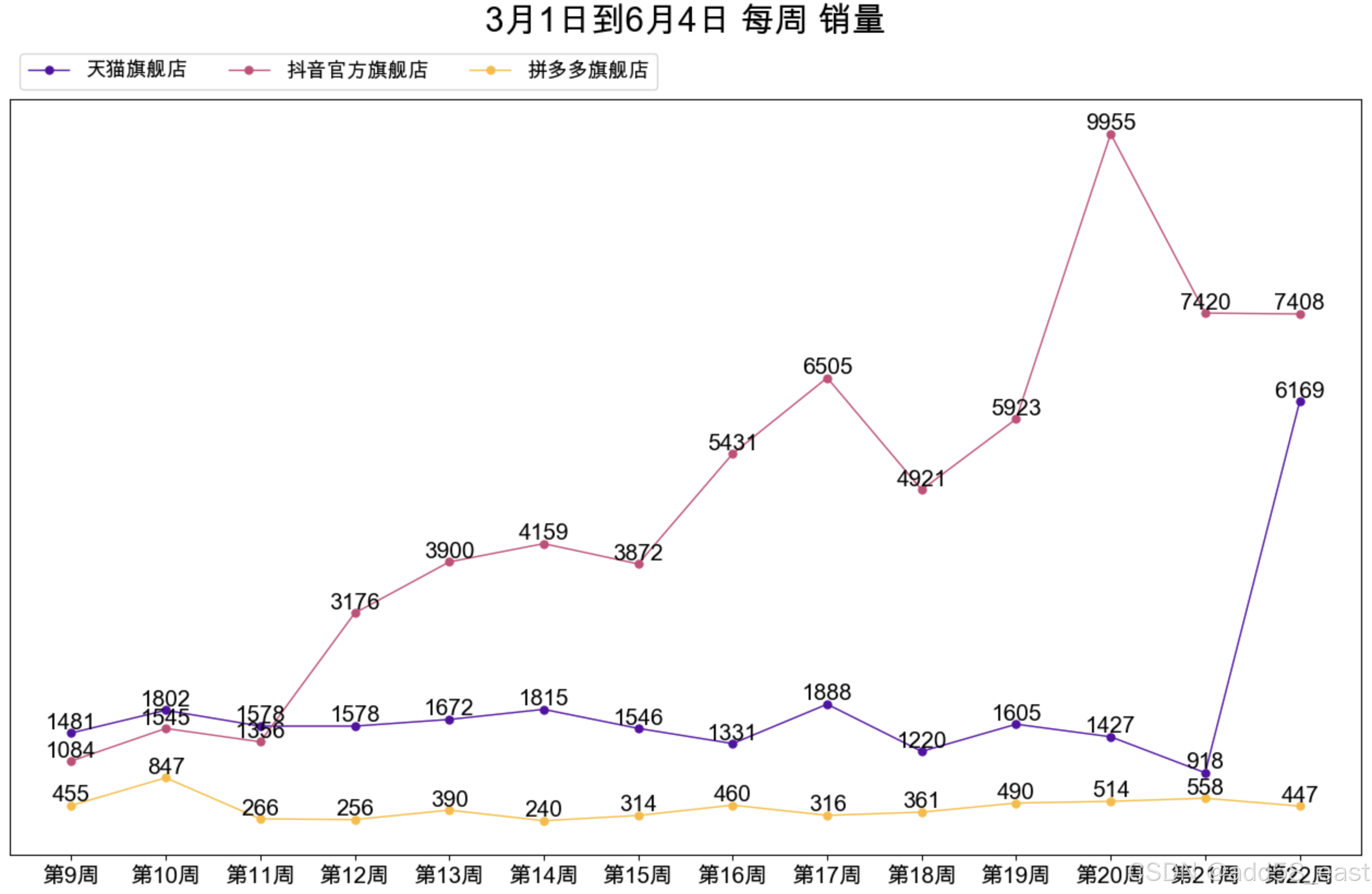
def add58_CutNumber(x,n):
    # 将x分成n 份
    avg = int(round(x/n,0))
    R = [avg*i for i in range(n+1)]
    return R

def add58_roundup(x):
    # x 数字
    # 将一个数值向上取整,比如:125变为150, 1245变为1500, 360变为400
    xx = int(round(x,0))# 取整后转为整数型
    str_a = list(str(xx))
    lengthx = len(str_a)
    if lengthx>3:
        if int(str_a[1-len(str_a)])<5:
            str_a[1-len(str_a)] = '5'
            str_a[2-len(str_a)] = '0'
            R1 = ''.join(str_a)
            R2 = int(R1)
            R = round(R2,2-len(str(R2)))
        else:
            R = round(xx,1-len(str(xx)))
    if lengthx==3:
        if int(str_a[1])<9:
            str_a[1] = str(int(str_a[1])+1)
            str_a[2] = '0'
            R1 = ''.join(str_a)
            R2 = int(R1)
            R = int(round(R2,0))
        else:
            R = round(xx,1-len(str(xx)))
    elif lengthx == 2:
        if int(str_a[-1])<5:
            str_a[-1] = '5'
            R1 = ''.join(str_a)
            R2 = int(R1)
            R = round(R2,2-len(str(R2)))
        else:
            R = round(xx,-1)
    elif lengthx == 1:
        R = xx + 1
    return R

def add58plot(df,title_label,yaxis_visible,text_type,font_size,ticklabel_rotation = 0):
    # yaxis_visible y轴刻度可见,值为True,False
    # text_type == 1,显示数据标签, 当不为1时,则开启y轴网格线
    # font_size, 字体显示大小,以数据标签字体大小为基准
    # ticklabel_rotation = 0, 行标签旋转角度,默认为0,不旋转
    # 当前的图表和子图可以使用plt.gcf()和plt.gca()获得,分别表示Get Current Figure和Get Current Axes。
    # 在pyplot模块中,许多函数都是对当前的Figure或Axes对象进行处理,
    # 比如说:plt.plot()实际上会通过plt.gca()获得当前的Axes对象ax,然后再调用ax.plot()方法实现真正的绘图。
    labels = list(df.index) # 提取分类显示标签
    results = df.to_dict(orient ='list') # 将数值结果转化为字典
    category_names = list(results.keys()) # 提取字典里面的类别 (键-key)
    data = np.array(list(results.values())) # 提取字典里面的数值 (值-value)
    category_colors = plt.get_cmap('plasma')(np.linspace(0.15, 0.85, data.shape[0]))
    y_max = data.max() # data 中的最大值
    y_maxR = add58_roundup(y_max) # 调用函数获取向上取整值
    y_li = add58_CutNumber(y_maxR,10) # 调用函数生成数列,用于y轴刻度显示
    # 设置占比显示的颜色,可以自定义,修改括号里面的参数即可
    ax=plt.gca()# Get Current Figure 当前的图表
    # ax.set_ylim(0,y_maxR) # 设置y轴的显示范围
    # ax.invert_xaxis()# 这个可以通过设置df中columns的顺序调整
    ax.yaxis.set_visible(yaxis_visible) # 设置y轴刻度不可见
    ax.set_yticks(y_li)# 使用axis .set_xticks固定刻度位置
    ax.set_yticklabels(labels=y_li, fontsize=font_size)
    # 有ax.set_xticks(range(len(labels))) 则不会报 UserWarning: FixedFormatter should only be used together with FixedLocator
    ax.set_xticks(range(len(labels)))# 使用axis .set_xticks固定刻度位置
    ax.set_xticklabels(labels=labels,rotation=ticklabel_rotation,fontsize=font_size) # 进行标签修改/添加的操作. 显示x轴标签,并旋转90度
    for i, (colname, color) in enumerate(zip(category_names, category_colors)):
        heights = data[i,:] # 计算出每次遍历时候的值
        R_values = [[x,y] for x,y in zip(heights,labels) if x>0]# 此处是对数据进行分析,取数据大于0的值, 比如作2022、2023对比是, 2022年数据有12个月, 23年数据可能只有4个月,其它的就不画图了
        R_heights = [x[0] for x in R_values]# 此处是取出数值
        R_labels = [x[1] for x in R_values]# 此处是取出标签
        ax.plot(R_labels, R_heights, color = color,linestyle = "-",linewidth = 1,marker = "o",markersize = 5,label =colname ) # 给制#状图
        if text_type == 1:
            for x,c in enumerate(R_heights):
                ax.text(x,c,str(int(c)), ha='center', va='bottom',color='k',rotation = 0,fontsize = font_size) # 添加文本标记
        else:# 不显示数据标签时,打开y轴网格线
            ax.grid(visible='True',axis='y')
    ax.legend(ncol=len(category_names), bbox_to_anchor=(0,1),loc="lower left",fontsize=0.9*font_size) # 设置图例
    # 设置标题
    font_dict={'fontsize': 1.5*font_size,'fontweight' : 8.2,'verticalalignment': 'baseline','horizontalalignment': 'center'}
    ax.set_title(title_label,fontdict=font_dict,loc='center',pad=3*font_size)
    return ax #返回图像

import pandas as pd
import numpy as np
import matplotlib.pyplot as plt
lii = [
        ['店铺名称', '第9周','第10周','第11周','第12周','第13周','第14周','第15周','第16周','第17周','第18周','第19周','第20周','第21周','第22周'],
        ['天猫SANHO旗舰店',	1481.0,	1802.0,	1578.0,	1578.0,	1672.0,	1815.0,	1546.0,	1331.0,	1888.0,	1220.0,	1605.0,	1427.0,	918.0,	6169.0],
        ['抖音官方旗舰店',	1084.0,	1545.0,	1356.0,	3176.0,	3900.0,	4159.0,	3872.0,	5431.0,	6505.0,	4921.0,	5923.0,	9955.0,	7420.0,	7408.0],
        ['拼多多SANHO旗舰店',	455.0,	847.0,	266.0,	256.0,	390.0,	240.0,	314.0,	460.0,	316.0,	361.0,	490.0,	514.0,	558.0,	447.0]
        ]
df_lii = pd.DataFrame(lii[1:],columns=lii[0])
# 设置第一行为索引
df_lii.set_index('店铺名称', inplace=True)

plt.figure(figsize=(16,9),dpi=100)

add58plot(
        df = df_lii.T, # 数据
        title_label = '3月1日到6月4日 每周 销量', # 表头名称
        yaxis_visible = False, # yaxis_visible y轴刻度可见,值为True,False
        text_type = 1, # text_type == 1,显示数据标签, 当不为1时,则开启y轴网格线
        font_size = 15, # ont_size, 字体显示大小,以数据标签字体大小为基准
        ticklabel_rotation = 0 # ticklabel_rotation = 0, 行标签旋转角度,默认为0,不旋转
        )
plt.show()
结果显示
折线图带目标线
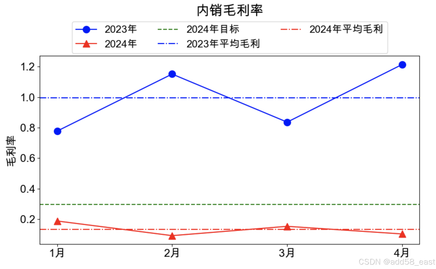
import matplotlib.pyplot as plt
import numpy as np

plt.rcParams["font.sans-serif"] = ["Arial Unicode MS"] # SimHei, Arial Unicode MS
plt.rcParams["font.family"] = ["Arial Unicode MS"]
plt.rcParams["axes.unicode_minus"] = False  # 用来正常显示负号

# 准备数据
Title = '内销毛利率'
x = ['1月','2月','3月','4月']
df_2023 = [0.776698,	1.150922,	0.835813,	1.214305	]
df_2024 = [0.187621,	0.092257,	0.153120,	0.103298]
y1 = [round(x,3) for x in df_2023]
y2 = [round(x,3) for x in df_2024]
y1_av = np.mean(df_2023)
y2_av = np.mean(df_2024)
goal_y = 0.296

# 创建一个图形和一个子图
plt.figure(figsize=(10, 5))

# 在子图中绘制两条折线
plt.plot(x, y1, color='blue', label='2023年', marker='o', markersize=10)
plt.plot(x, y2, color='red', label='2024年', marker='^', markersize=10)

# 在子图中绘制三条特殊线
plt.axhline(y=goal_y, color='green', linestyle='--', label='2024年目标')
# 水平线
plt.axhline(y=y1_av, color='blue', linestyle='-.', label='2023年平均毛利')
plt.axhline(y=y2_av, color='red', linestyle='-.', label='2024年平均毛利')

# 设置坐标轴标签,并使文字变大
# plt.xlabel('月份', fontsize=16)
plt.ylabel('毛利率', fontsize=16)

# 设置Y轴的范围
# plt.ylim(0.28, 0.45)

# 设置坐标轴刻度标签,并使文字变大
ax = plt.gca()  # 获取当前的Axes对象
ax.tick_params(axis='both', labelsize=16)  # 设置坐标轴刻度标签的字体大小

# 设置标题并显示图例
plt.title(Title,fontsize=20,pad=60)
plt.legend(loc='upper center', bbox_to_anchor=(0.5, 1.21), ncol=3,fontsize=15)  # 设置图例在上方,位于中间

# 显示图形
plt.show()
结果显示
2、旋风图
旋风图+同比+目标比
def barh_bj(x_li, y_new, y_old, aim, title_name, data_s, font_s):
# 旋风图对比两个年份的数据,同时右边分别显示同比增幅、目标比增幅
# x 旋风图第行名称 x_li
# y_n 新年份的数据 y_new
# y_o 旧年份的数据 y_lod
# m 为新年份目标数据 aim
# title_s 标题 title_name
# data_source 数据来源说明 data_s
import matplotlib.pyplot as plt
import numpy as np
plt.rcParams["font.sans-serif"] = ['Arial Unicode MS']
plt.rcParams['font.family'] = ['Arial Unicode MS']
plt.rcParams['axes.unicode_minus'] = False # 用来正常显示负号
x = x_li
y_n = [int(i / 10000) for i in y_new]
y_o = [int(i / 10000) for i in y_old]
m = [int(i / 10000) for i in aim]
title_s = title_name
font_size = font_s
data_source = data_s
############################################## 图表数值处理 ###################################################
x_value = np.arange(len(x))
# 求出数据y和z的最大值,取其1/4的值作为固定长度
y_n_max = max(y_n)
fix_temp = y_n_max / 4
# 增加一个固定维度,长度与上述数据一样
fix_value = [fix_temp for i in range(len(x))]
# 将y,y_o_fu其中一个维度变为负值,我们选择y_o_fu
y_o_fu = [-i for i in y_o] # 转为负值
############################################## 生成比较数据 ###################################################
# 生成一个y_n,y_o的对比涨幅
# 同比数据
x_bj_m = [(i - j) / j for i, j in zip(y_n, y_o)]
# 目标比数据
x_bj2_m = [(i - j) / j for i, j in zip(y_n, m)]
# 同比图表x 轴相对移动位置
x_move = fix_temp * 5 + y_n_max
# 目标比图表x 轴相对移动位置
x_move2 = x_move + fix_temp * 6
##### 以下是算出一个相对尺寸位置合适的同比、目标比的条形显示,避免太大,太小影响图表美观
# 同比与目标比之前的距离
balance = (x_move2 - x_move) * 0.4
bj_max = max(max(x_bj_m), max(x_bj2_m))
k = balance / bj_max
x_bj = [i * k for i in x_bj_m]
x_bj2 = [i * k for i in x_bj2_m]
# 设置画布大小
plt.figure(figsize=(64, 30))
############################################## 画图 ###################################################
# 画条形图,设置颜色和柱宽,将fix_value,y,y_o_fu依次画进图中
plt.barh(x_value, fix_value, color='w', height=0.5)
plt.barh(x_value,
y_n,
left=fix_value,
color='#0671A8',
label='y',
height=0.5)
plt.barh(x_value, y_o_fu, color='#F28526', height=0.5, label='z')
for i, j in zip(x_value, x_bj):
if int(j) >= 0:
plt.barh(i, j, left=x_move, color='#C3A932', height=0.5)
else:
plt.barh(i, j, left=x_move, color='#C72435', height=0.5)
for i, j in zip(x_value, x_bj2):
if int(j) >= 0:
plt.barh(i, j, left=x_move2, color='#C3A932', height=0.5)
else:
plt.barh(i, j, left=x_move2, color='#C72435', height=0.5)
############################################## 数据标签 ###################################################
# 添加数据标签,将fix_value的x标签显示出来,y和y_o_fu的数据标签显示出来
for a, b, c in zip(x_value, fix_value, x):
plt.text(b / 2,
a,
c,
ha='center',
va='center',
fontsize=1.3 * font_size)
# y_n 标签
for a, b in zip(x_value, y_n):
plt.text(b + fix_temp + y_n_max / 8,
a,
str(b) + '万',
ha='center',
va='center',
fontsize=1.3 * font_size)
# y_o 标签
for a, b in zip(x_value, y_o):
plt.text(-b - y_n_max / 8,
a,
str(b) + '万',
ha='center',
va='center',
fontsize=1.3 * font_size)
# 同比标签
for a, b, c in zip(x_value, x_bj, x_bj_m):
if b >= 0:
x_size = x_move + b + font_size * 2
plt.text(x_size,
a,
'%.1f%%' % (c * 100),
ha='center',
va='center',
fontsize=1.3 * font_size)
else:
x_size = x_move + b - font_size * 2
plt.text(x_size,
a,
'%.1f%%' % (c * 100),
ha='center',
va='center',
fontsize=1.3 * font_size)
# 目标比标签
for a, b, c in zip(x_value, x_bj2, x_bj2_m):
if b >= 0:
x_size = x_move2 + b + font_size * 2
plt.text(x_size,
a,
'%.1f%%' % (c * 100),
ha='center',
va='center',
fontsize=1.3 * font_size)
else:
x_size = x_move2 + b - font_size * 2
plt.text(x_size,
a,
'%.1f%%' % (c * 100),
ha='center',
va='center',
fontsize=1.3 * font_size)
############################################## 图表格式相关设计 ###################################################
ax = plt.gca() #获取整个表格边框
#wrap其实是换行的意思,默认是不换行的(默认值为False)
'''plt.text(0.2,
-0.02,
s="BBBBBBBB",
transform=ax.transAxes,
weight='light',
size=44,
family='sans-serif',
wrap=True)'''
#ax.spines['left'].set_position(('data', 0.5)) # 移动轴脊位置
#ax.spines['bottom'].set_position(('data', 0)) # 移动轴脊位置
ax.spines['right'].set_color('none') # 隐藏轴脊位置
ax.spines['top'].set_color('none') # 隐藏轴脊位置
ax.spines['left'].set_color('none') # 隐藏轴脊位置
ax.spines['bottom'].set_color('none') # 隐藏轴脊位置
# 添加图例,自定义位置
#plt.legend(bbox_to_anchor=(0.1, 1.05), frameon=False, ncol=2,fontsize=1.5*font_size)
# 添加标题,并设置字体
plt.title(label=title_s,
pad=80,
fontsize=3 * font_size,
)# bbox=dict(facecolor='#636466', alpha=0.65) 标题背景
# 增加垂直线
plt.axvline(x_move)
plt.axvline(x_move2)
# x轴的刻度值
y_o_l = max(np.array(y_o_fu)) # y_nld_label
y_n_l = fix_temp + abs(y_o_l) # y_new_label
plt.xticks(np.array([y_o_l, y_n_l, x_move, x_move2]),
['2002年', '2003年', '同比', '目标比'],
fontsize=2 * font_size)
plt.yticks([])
plt.text(0.05,
-0.10,
s=data_source,
transform=ax.transAxes,
weight='light',
size=font_size,
verticalalignment='bottom')
# 使布局更合理
# plt.tight_layout()
# plt.savefig(
# '/Users/add58/Library/Mobile Documents/com~apple~CloudDocs/Aothers/Apython/日常工具/图表/image/'
# + title_name + '.jpg')
plt.show()
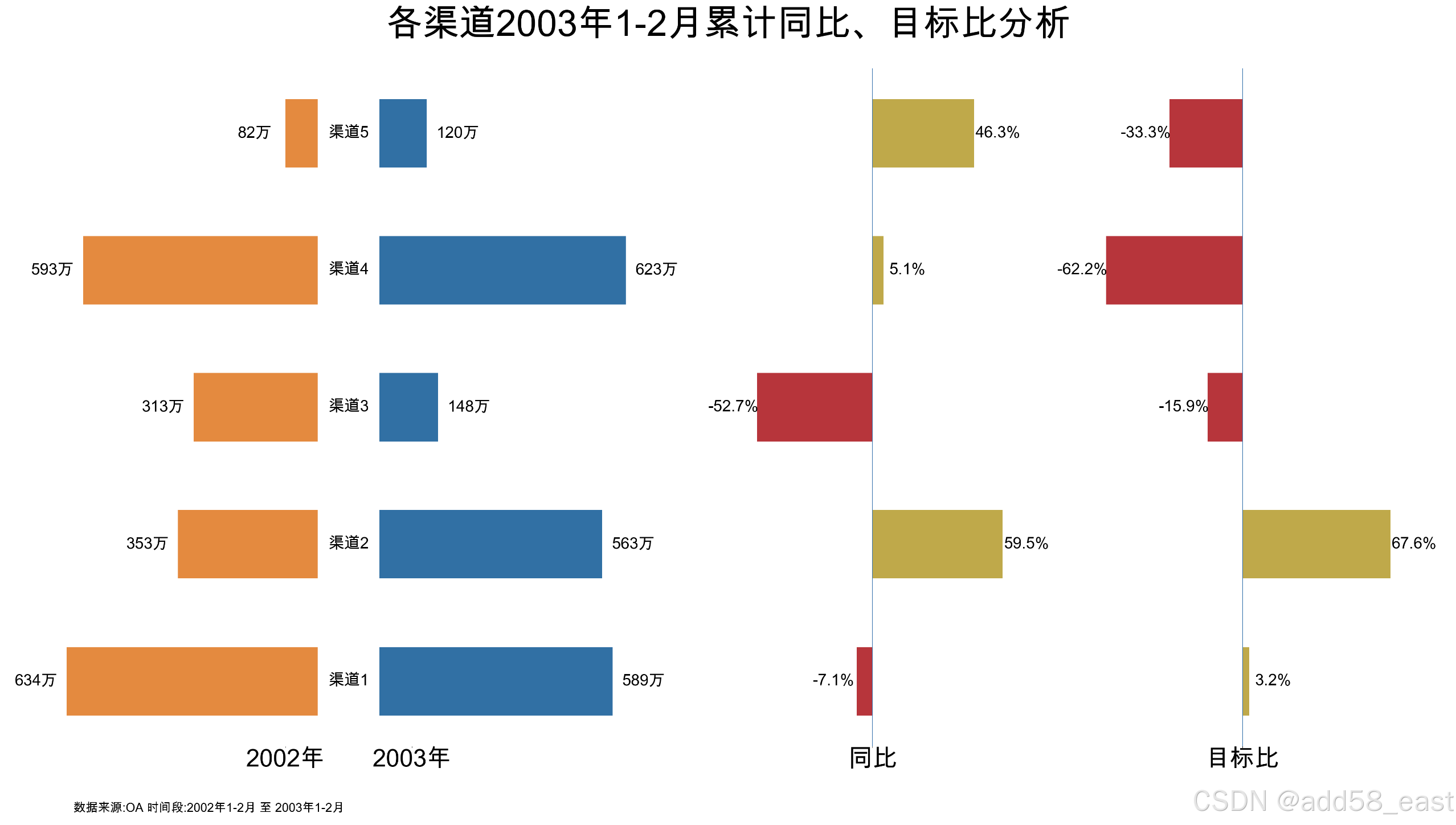
lii = [
['销售额', '2002年', '2003年', '2003年目标'],
['渠道1', 6347663.89, 5896472.77, 5712000],
['渠道2', 3537834.50, 5632009.50, 3360000],
['渠道3', 3130471.00, 1486665.50, 1760000],
['渠道4', 5938044.60, 6230080.36, 16500000],
['渠道5', 822048.45, 1209656.49, 1807000],
]
df_lii = pd.DataFrame(lii[1:],columns=lii[0])
# 设置第一行为索引
# df_lii.set_index('销售额', inplace=True)
y_old = list(df_lii.iloc[:, 1])
y_new = list(df_lii.iloc[:, 2])
aim = list(df_lii.iloc[:, 3])
data_s = """数据来源:OA 时间段:2002年1-2月 至 2003年1-2月"""
x_li = list(df_lii.iloc[:, 0])
font_s = 30
title_name = "各渠道2003年1-2月累计同比、目标比分析"
barh_bj(# 旋风图对比两个年份的数据,同时右边分别显示同比增幅、目标比增幅
x_li, # x 旋风图第行名称 x_li
y_new, # 新年份的数据 y_new
y_old, # 旧年份的数据 y_lod
aim, # 为新年份目标数据 aim
title_name, # 标题 title_name
data_s, # 备注信息(左下方)
font_s # 字体大小
)
结果显示
旋风图+对比
def barh_bj(x_li, y_new, y_old, title_name, data_s, font_s):
# 旋风图对比两个年份的数据,同时右边分别显示同比增幅、目标比增幅
# x 旋风图第行名称 x_li
# y_n 新年份的数据 y_new
# y_o 旧年份的数据 y_lod
# m 为新年份目标数据 aim
# title_s 标题 title_name
# data_source 数据来源说明 data_s
import matplotlib.pyplot as plt
import numpy as np
plt.rcParams["font.sans-serif"] = ['Arial Unicode MS']
plt.rcParams['font.family'] = ['Arial Unicode MS']
plt.rcParams['axes.unicode_minus'] = False # 用来正常显示负号
x = x_li
y_n = [int(i) for i in y_new]# 取整数
y_o = [int(i) for i in y_old]
title_s = title_name
font_size = font_s
data_source = data_s
############################################## 图表数值处理 ###################################################
x_value = np.arange(len(x))
# 求出数据y和z的最大值,取其1/4的值作为固定长度
y_n_max = max(y_n)
fix_temp = y_n_max / 4
# 增加一个固定维度,长度与上述数据一样
fix_value = [fix_temp for i in range(len(x))]
# 将y,y_o_fu其中一个维度变为负值,我们选择y_o_fu
y_o_fu = [-i for i in y_o] # 转为负值
############################################## 生成比较数据 ###################################################
# 同比图表x 轴相对移动位置
x_move = fix_temp * 8 + y_n_max
# 同比数据
x_bj_m = [(i - j) / j for i, j in zip(y_n, y_o)]
balance = x_move * 0.25 # 调整右侧图与左侧图的位置
bj_max = max(x_bj_m)
k = balance / bj_max
x_bj = [i * k for i in x_bj_m]
# 设置画布大小
plt.figure(figsize=(64, 30))
############################################## 画图 ###################################################
# 画条形图,设置颜色和柱宽,将fix_value,y,y_o_fu依次画进图中
plt.barh(x_value, fix_value, color='w', height=0.5)
plt.barh(x_value,
y_n,
left=fix_value,
color='#0671A8',
label='y',
height=0.5)
plt.barh(x_value, y_o_fu, color='#F28526', height=0.5, label='z')
for i, j in zip(x_value, x_bj):
if int(j) >= 0:
plt.barh(i, j, left=x_move, color='#C3A932', height=0.5)
else:
plt.barh(i, j, left=x_move, color='#C72435', height=0.5)
############################################## 数据标签 ###################################################
# 添加数据标签,将fix_value的x标签显示出来,y和y_o_fu的数据标签显示出来
for a, b, c in zip(x_value, fix_value, x):
plt.text(b / 2,
a,
c,
ha='center',
va='center',
fontsize=1.8 * font_size)
# y_n 标签
for a, b in zip(x_value, y_n):
plt.text(b + fix_temp + y_n_max / 8,# 显示的X坐标
a,# 显示的Y坐标
str(b),# 显示的值
ha='center',
va='center',
fontsize=1.5 * font_size)
# y_o 标签
for a, b in zip(x_value, y_o):
plt.text(-b - y_n_max / 8,
a,
str(b),
ha='center',
va='center',
fontsize=1.5 * font_size)
# 同比标签
for a, b, c in zip(x_value, x_bj, x_bj_m):
if b >= 0:
x_size = x_move + b + font_size * 0.3
plt.text(x_size,
a,
'%.1f%%' % (c * 100),
ha='center',
va='center',
fontsize=1.5 * font_size)
else:
x_size = x_move + b - font_size * 0.3
plt.text(x_size,
a,
'%.1f%%' % (c * 100),
ha='center',
va='center',
fontsize=1.5 * font_size)
############################################## 图表格式相关设计 ###################################################
ax = plt.gca() #获取整个表格边框
#ax.spines['left'].set_position(('data', 0.5)) # 移动轴脊位置
#ax.spines['bottom'].set_position(('data', 0)) # 移动轴脊位置
ax.spines['right'].set_color('none') # 隐藏轴脊位置
ax.spines['top'].set_color('none') # 隐藏轴脊位置
ax.spines['left'].set_color('none') # 隐藏轴脊位置
ax.spines['bottom'].set_color('none') # 隐藏轴脊位置
# 添加图例,自定义位置
#plt.legend(bbox_to_anchor=(0.1, 1.05), frameon=False, ncol=2,fontsize=1.5*font_size)
# 添加标题,并设置字体
plt.title(label=title_s,
pad=80,
fontsize=3 * font_size,
)# bbox=dict(facecolor='#636466', alpha=0.65) 标题背景
# 增加垂直线
plt.axvline(x_move)
# x轴的刻度值
y_o_l = max(np.array(y_o_fu)) # y_nld_label
y_n_l = fix_temp + abs(y_o_l) # y_new_label
plt.xticks(np.array([y_o_l, y_n_l, x_move]),
['A方案', 'B方案', 'A同比B'],
fontsize=2 * font_size)
plt.yticks([])
plt.text(0.05,
-0.10,
s=data_source,
transform=ax.transAxes,
weight='light',
size=font_size,
verticalalignment='bottom')
plt.show()
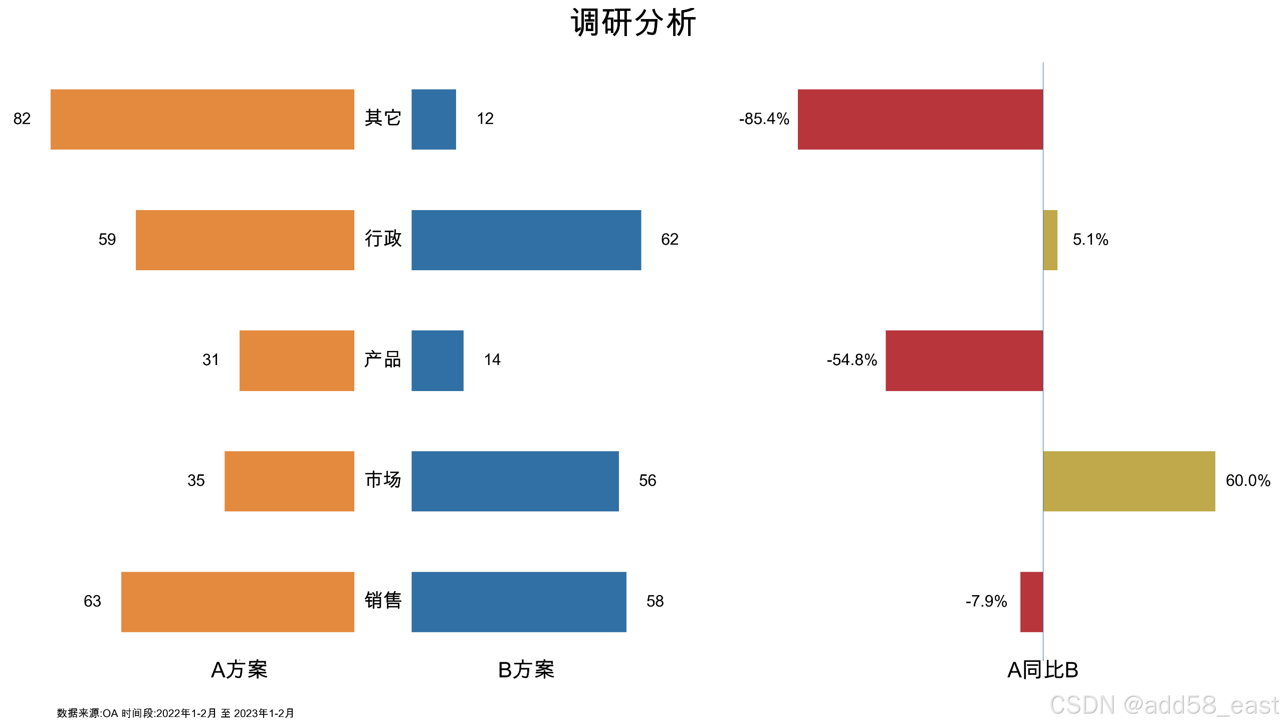
lii = [
['选项', 'A方案', 'B方案'],
['销售', 63.89, 58.77],
['市场', 35.50, 56.50],
['产品', 31.00, 14.50],
['行政', 59.60, 62.36],
['其它', 82.45, 12.49],
]
df_lii = pd.DataFrame(lii[1:],columns=lii[0])
# 设置第一行为索引
# df_lii.set_index('销售额', inplace=True)
y_old = list(df_lii.iloc[:, 1])
y_new = list(df_lii.iloc[:, 2])
data_s = """数据来源:OA 时间段:2022年1-2月 至 2023年1-2月"""
x_li = list(df_lii.iloc[:, 0])
font_s = 30
title_name = "调研分析"
barh_bj(# 旋风图对比两个年份的数据,同时右边分别显示同比增幅、目标比增幅
x_li, # x 旋风图第行名称 x_li
y_new, # 新年份的数据 y_new
y_old, # 旧年份的数据 y_lod
title_name, # 标题 title_name
data_s, # 备注信息(左下方)
font_s # 字体大小
)
结果显示
3、柱状图
普通柱状图
def add58bar0(df,yaxis_visible,text_type,font_size,ticklabel_rotation = 0):
# 堆积柱状图
# yaxis_visible y轴刻度可见,值为True,False
# text_type == 1,显示数据标签, 当不为1时,则适用于单个柱状图
# font_size, 字体显示大小,以数据标签字体大小为基准
# ticklabel_rotation = 0, 行标签旋转角度,默认为0,不旋转
# 当前的图表和子图可以使用plt.gcf()和plt.gca()获得,分别表示Get Current Figure和Get Current Axes。
# 在pyplot模块中,许多函数都是对当前的Figure或Axes对象进行处理,
# 比如说:plt.plot()实际上会通过plt.gca()获得当前的Axes对象ax,然后再调用ax.plot()方法实现真正的绘图。
labels = list(df.index) # 提取分类显示标签
results = df.to_dict(orient ='list') # 将数值结果转化为字典
category_names = list(results.keys()) # 提取字典里面的类别 (键-key)
data = np.array(list(results.values())) # 提取字典里面的数值 (值-value)
category_colors = plt.get_cmap('Dark2')(np.linspace(0.15, 0.85, data.shape[0]))
y_max = data.max() # data 中的最大值
y_maxR = add58_roundup(y_max) # 调用函数获取向上取整值
y_li = add58_CutNumber(y_maxR,10) # 调用函数生成数列,用于y轴刻度显示
# 设置占比显示的颜色,可以自定义,修改括号里面的参数即可
ax=plt.gca()# Get Current Figure 当前的图表
# ax.set_ylim(0,y_maxR) # 设置y轴的显示范围
# ax.invert_xaxis()# 这个可以通过设置df中columns的顺序调整
ax.yaxis.set_visible(yaxis_visible) # 设置y轴刻度不可见
ax.set_yticks(y_li)# 使用axis .set_xticks固定刻度位置
ax.set_yticklabels(labels=y_li, fontsize=font_size)
# 有ax.set_xticks(range(len(labels))) 则不会报 UserWarning: FixedFormatter should only be used together with FixedLocator
ax.set_xticks(range(len(labels)))# 使用axis .set_xticks固定刻度位置
ax.set_xticklabels(labels=labels,rotation=ticklabel_rotation,fontsize=font_size) # 进行标签修改/添加的操作. 显示x轴标签,并旋转90度
starts = 0 #绘制基准
for i, (colname, color) in enumerate(zip(category_names, category_colors)):
heights = data[i,:] # 计算出每次遍历时候的值
ax.bar(labels, heights, bottom=starts, width=0.5,label=colname, color=color) # 给制#状图,edgecolor ='gray'
xcenters = starts + heights/2 #进行文本标记位置的选定
starts += heights #核心一步,就是基于基准上的百分比累加
#print(starts) 这个变量就是能否百分比显示的关键,可以打印输出看一下
percentage_text = data[i,: ] #文本标记的数据
# r,g,b,_ = color # 这里进行像索的分割
# text_color ='white'if r * g * b < 0.15 else 'k' #根据颜色基调分配文本标记的颜色
if text_type == 1:
for y,(x, c) in enumerate(zip(xcenters, percentage_text)):
ax.text(y,x,str(int(c)), ha='center', va='center',color='k',rotation = 0,fontsize = font_size) # 添加文本标记
else:# 不显示数据标签时,打开y轴网格线
ax.grid(visible='True',axis='y')
all_text = data.sum(axis =0)
for a,b in enumerate(all_text):
ax.text(a,b,b,ha='center', va='bottom',color='r',rotation = 0,fontsize = 1.15*font_size) # 添加文本标记
ax.legend(ncol=len(category_names), bbox_to_anchor=(0,1),loc="lower left",fontsize=0.9*font_size) # 设置图例
return ax #返回图像
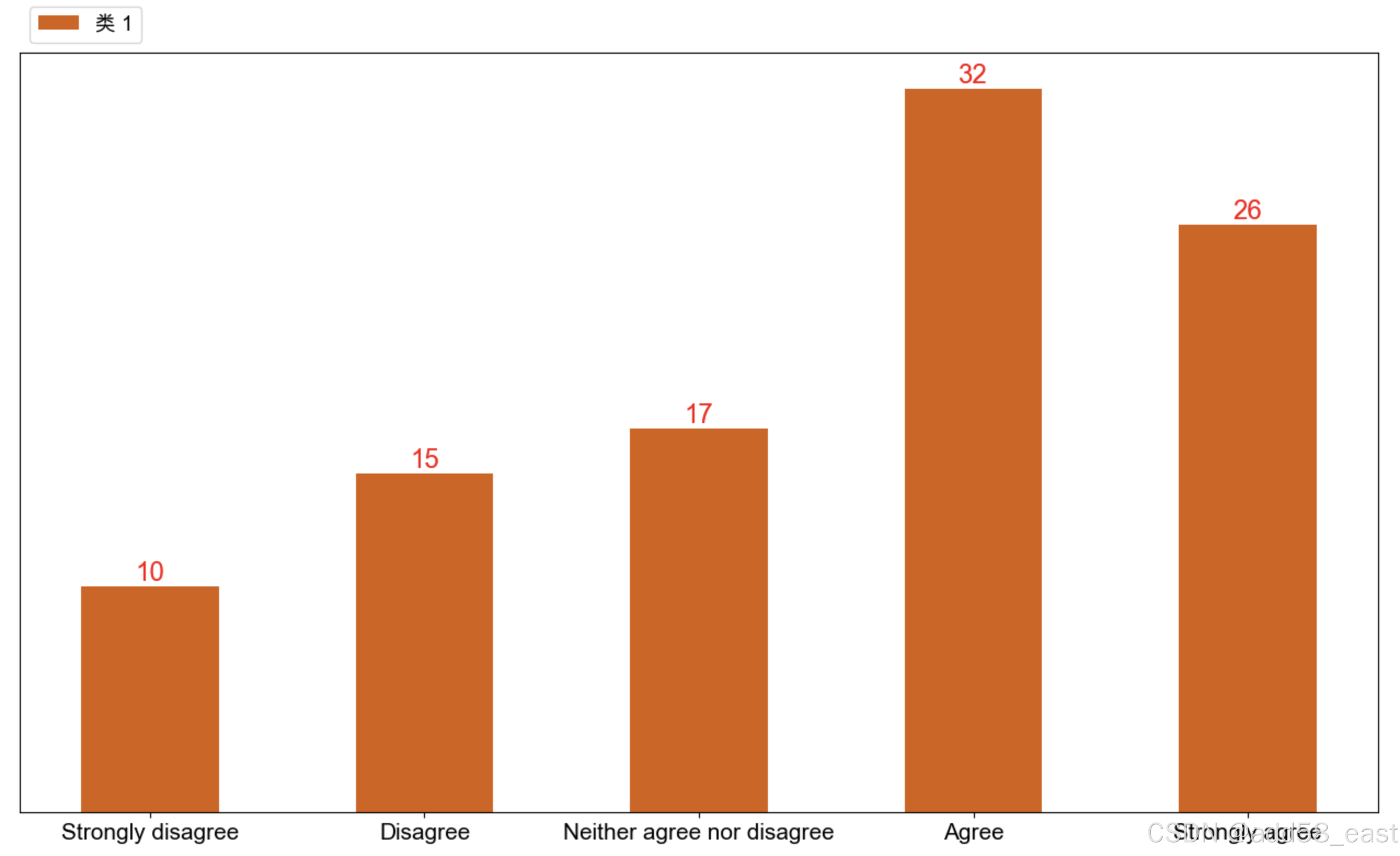
category_names = ['Strongly disagree', 'Disagree',
'Neither agree nor disagree', 'Agree', 'Strongly agree']
results = {
'类 1': [10, 15, 17, 32, 26],
}
df_X = pd.DataFrame(results,index=category_names)
plt.figure(figsize=(16,9),dpi=100)
add58bar0(
df = df_X,
yaxis_visible = False, # yaxis_visible y轴刻度可见,值为True,False
text_type = 0, # text_type == 1,显示数据标签, 当不为1时,则适用于单个柱状图
font_size = 15, # font_size, 字体显示大小,以数据标签字体大小为基准
ticklabel_rotation = 0 # ticklabel_rotation = 0, 行标签旋转角度,默认为0,不旋转
)
plt.show()结果显示
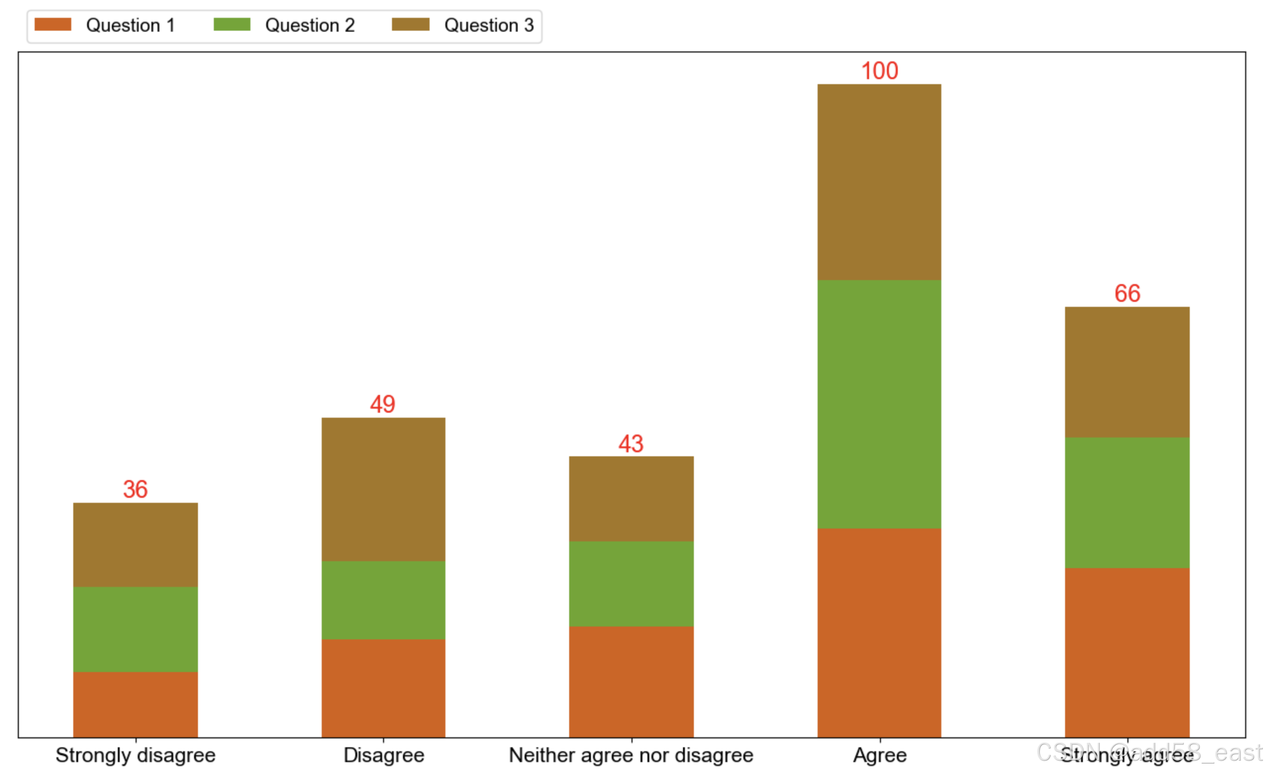
堆积柱状图
这里直接调用普通柱状图的函数即可
# 与普通柱状图的函数相同, 只是给的result的数据不一样
category_names = ['Strongly disagree', 'Disagree',
                'Neither agree nor disagree', 'Agree', 'Strongly agree']
results = {
    'Question 1': [10, 15, 17, 32, 26],
    'Question 2': [13, 12, 13, 38, 20],
    'Question 3': [13, 22, 13, 30, 20],
}
df_X = pd.DataFrame(results,index=category_names)

plt.figure(figsize=(16,9),dpi=100)
add58bar0(
    df = df_X,
    yaxis_visible = False, # yaxis_visible y轴刻度可见,值为True,False
    text_type = 0, # text_type == 1,显示数据标签, 当不为1时,则适用于单个柱状图
    font_size = 15, # font_size, 字体显示大小,以数据标签字体大小为基准
    ticklabel_rotation = 0 # ticklabel_rotation = 0, 行标签旋转角度,默认为0,不旋转
    )
plt.show()
结果显示
堆积百分比柱状图
import pandas as pd
import numpy as np
import matplotlib.pyplot as plt
def percentage_bar0(df,yaxis_visible,text_type,font_size,ticklabel_rotation = 0):
        # yaxis_visible y轴刻度可见,值为True,False
        # text_type == 1,显示数据标签, 当不为1时,则开启y轴网格线
        # font_size, 字体显示大小,以数据标签字体大小为基准
        # ticklabel_rotation = 0, 行标签旋转角度,默认为0,不旋转
        # 当前的图表和子图可以使用plt.gcf()和plt.gca()获得,分别表示Get Current Figure和Get Current Axes。
        # 在pyplot模块中,许多函数都是对当前的Figure或Axes对象进行处理,
        # 比如说:plt.plot()实际上会通过plt.gca()获得当前的Axes对象ax,然后再调用ax.plot()方法实现真正的绘图。
        labels = list(df.index) # 提取分类显示标签
        results = df.to_dict(orient ='list') # 将数值结果转化为字典
        category_names = list(results.keys()) # 提取字典里面的类别 (键-key)
        data = np.array(list(results.values())) # 提取字典里面的数值 (值-value)
        category_colors = plt.get_cmap('Dark2')(np.linspace(0.15, 0.85, data.shape[0]))
        # y_max = data.max() # data 中的最大值
        # y_maxR = add58_roundup(y_max) # 调用函数获取向上取整值
        # y_li = add58_CutNumber(y_maxR,10) # 调用函数生成数列,用于y轴刻度显示
        # 设置占比显示的颜色,可以自定义,修改括号里面的参数即可
        ax=plt.gca()# Get Current Figure 当前的图表
        ax.set_ylim(0,1) # 设置y轴的显示范围
        # ax.invert_xaxis()# 这个可以通过设置df中columns的顺序调整
        ax.yaxis.set_visible(yaxis_visible) # 设置y轴刻度不可见
        # ax.set_yticks(y_li)# 使用axis .set_xticks固定刻度位置
        # ax.set_yticklabels(labels=y_li, fontsize=font_size)
        # 有ax.set_xticks(range(len(labels))) 则不会报 UserWarning: FixedFormatter should only be used together with FixedLocator
        ax.set_xticks(range(len(labels)))# 使用axis .set_xticks固定刻度位置
        ax.set_xticklabels(labels=labels,rotation=ticklabel_rotation,fontsize=font_size) # 进行标签修改/添加的操作. 显示x轴标签,并旋转90度
        starts = 0 #绘制基准
        for i, (colname, color) in enumerate(zip(category_names, category_colors)):
            heights = data[i,:]/ data.sum(axis =0) #计算出每次遍历时候的百分比
            ax.bar(labels, heights, bottom=starts, width=0.5,label=colname, color=color,edgecolor ='gray') # 给制#状图
            xcenters = starts + heights/2 #进行文本标记位置的选定
            starts += heights #核心一步,就是基于基准上的百分比累加
            #print(starts) 这个变量就是能否百分比显示的关键,可以打印输出看一下
            percentage_text = data[i,: ]/ data.sum(axis =0) #文本标记的数据
            r,g,b,_ = color # 这里进行像索的分割
            text_color ='white'if r * g * b < 0.15 else 'k' #根据颜色基调分配文本标记的颜色
            if text_type == 1:
                for y,(x, c) in enumerate(zip(xcenters, percentage_text)):
                    ax.text(y,x,f'{round(c*100,1)}%', ha='center', va='center',color=text_color,rotation = 0,fontsize = font_size) #添加文本标记
            else:# 不显示数据标签时,打开y轴网格线
                ax.grid(visible='True',axis='y')
        ax.legend(ncol=len(category_names), bbox_to_anchor=(0,1),loc="lower left",fontsize=0.9*font_size) # 设置图例
        return ax #返回图像

category_names = ['Strongly disagree', 'Disagree',
                'Neither agree nor disagree', 'Agree', 'Strongly agree']
results = {
    'Question 1': [10, 15, 17, 32, 26],
    'Question 2': [13, 12, 13, 38, 20],
    'Question 3': [13, 22, 13, 30, 20],
}
df_X = pd.DataFrame(results,index=category_names)

plt.figure(figsize=(16,9),dpi=100)
percentage_bar0(
                df_X,
                yaxis_visible = False, # yaxis_visible y轴刻度可见,值为True,False
                text_type = 1, # text_type == 1,显示数据标签, 当不为1时,则开启y轴网格线
                font_size = 15, # font_size, 字体显示大小,以数据标签字体大小为基准
                ticklabel_rotation = 0 # ticklabel_rotation = 0, 行标签旋转角度,默认为0,不旋转
                )
plt.show()
结果显示

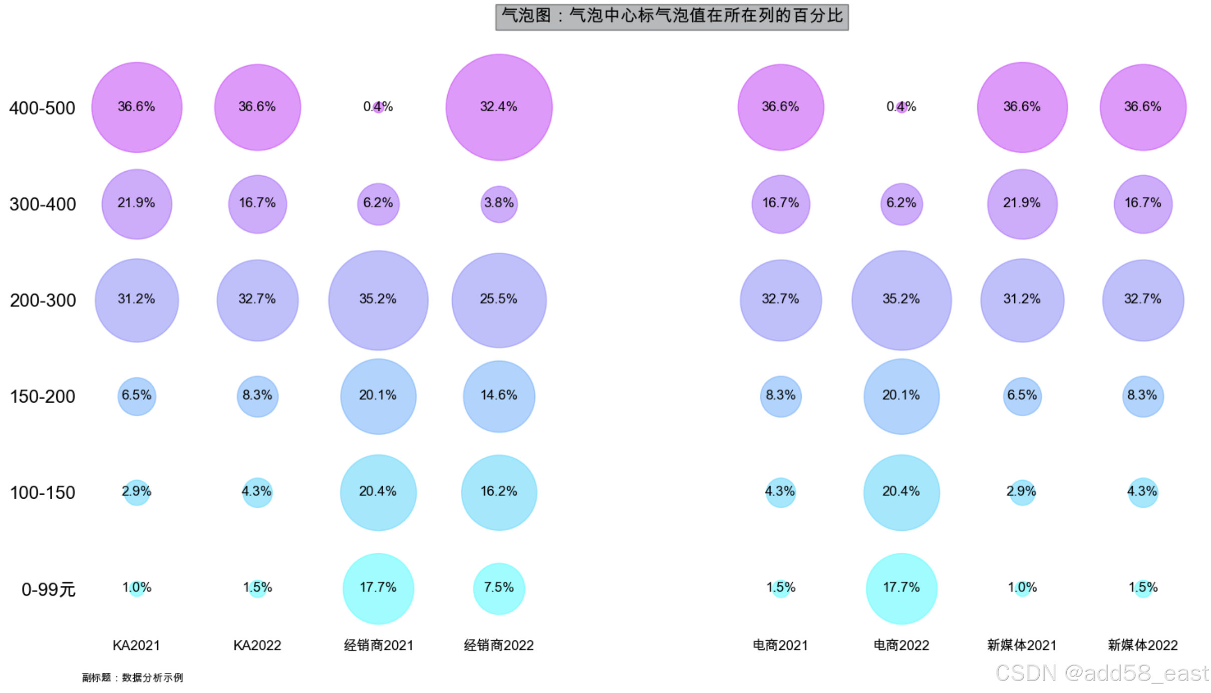
气泡图
此气泡图主要对比2年各渠道不同价格段的产品销售表现情况
气泡图函数
def add58_scatter(data_lists,cluster,scatter_factor,font_size):
    import numpy as np
    import matplotlib.pyplot as plt
    import matplotlib as mpl

    plt.rcParams["font.sans-serif"] = ["Arial Unicode MS"] # SimHei, Arial Unicode MS
    plt.rcParams["font.family"] = ["Arial Unicode MS"]
    plt.rcParams["axes.unicode_minus"] = False  # 用来正常显示负号
    # 提取数据并转换为NumPy数组
    data = np.array([row[1:] for row in data_lists[1:]], dtype=float)
    y_labels = np.array([row[0] for row in data_lists[1:]])
    x_labels = np.array(data_lists[0][1:])

    # 数据统一处理
    max_value = np.max(data)
    big_digits = 10 ** (len(str(max_value)) - 1)  # 计算统一除数
    data /= big_digits  # 统一除以这个数
    column_percentages = (data / data.sum(axis=0)) * 100  # 计算每列的百分比

    # 颜色设置
    cmap = mpl.colormaps['cool']
    colors = [cmap(i / data.shape[0]) for i in range(data.shape[0])]

    # 创建气泡图
    fig, ax = plt.subplots(figsize=(18, 9))

    # 绘制气泡图
    for i in range(data.shape[0]):
        for j in range(data.shape[1]):
            x_offset = (j // cluster) * cluster + (j % cluster) * 0.75  # 每两列为一组,组间距大一点
            ax.scatter(x_offset, i, s=data[i, j] * scatter_factor, color=colors[i], alpha=0.5)
            ax.text(x_offset, i, f'{column_percentages[i, j]:.1f}%', ha='center', va='center', color='black', size=2*font_size)

    # 设置坐标轴范围和标签
    ax.set_xlim(-0.35, (data.shape[1] // cluster) * cluster - 1)
    ax.set_ylim(-0.5, data.shape[0] - 0.35)
    ax.set_yticks(np.arange(data.shape[0]))
    ax.set_yticklabels(y_labels, fontsize=16)

    # 设置x轴刻度和标签
    num_groups = np.array([(j // cluster) * cluster + (j % cluster) * 0.75 for j in range(data.shape[1])])
    ax.set_xticks(num_groups)
    ax.set_xticklabels(x_labels, fontsize=2*font_size)

    # 设置标题
    ax.set_title('气泡图:气泡中心标气泡值在所在列的百分比', fontsize=2.5*font_size, bbox=dict(facecolor='#636466', alpha=0.45), pad=20)
    # 设置数据来源在左下角
    ax.text(0, -0.08, '副标题:数据分析示例', ha='left', va='bottom', fontsize=1.5*font_size, color='black', transform=ax.transAxes)

    # 隐藏不必要的坐标轴
    for spine in ['right', 'top', 'left', 'bottom']:
        ax.spines[spine].set_color('none')
    ax.tick_params(axis='both', which='both', length=0)

    # 调整子图间距并显示图形
    plt.subplots_adjust(left=0.1, right=0.9, top=0.9, bottom=0.1)
    plt.show()
使用方法
cluster: 分簇
scatter_factor: 气泡大小调整, 有时根据数据值不现, 有时气泡过大或过小, 可以用这个来调整
font_size: 图表上显示字体大小
# 示例数据
data_lists = [
    ['价格段', 'KA2021', 'KA2022', '经销商2021', '经销商2022', '电商2021', '电商2022', '新媒体2021', '新媒体2022'],
    ['0-99元', 177729, 232538, 3906485, 2050809, 232538, 3906485, 177729, 232538],
    ['100-150', 498004, 677512, 4494935, 4430212, 677512, 4494935, 498004, 677512],
    ['150-200', 1123636, 1308692, 4440318, 3999912, 1308692, 4440318, 1123636, 1308692],
    ['200-300', 5422673, 5161742, 7756673, 6963221, 5161742, 7756673, 5422673, 5161742],
    ['300-400', 3808425, 2633857, 1360772, 1035483, 2633857, 1360772, 3808425, 2633857],
    ['400-500', 6361474, 5782617, 90793, 8842097, 5782617, 90793, 6361474, 5782617]
]
cluster = 4
scatter_factor = 98000
font_size = 6
add58_scatter(data_lists,cluster,scatter_factor,font_size)
效果展示
当将 cluster 调整参数为2时, 即 cluster= 2 (其它参数不变)
效果如下:
瀑布图
瀑布图函数
功能说明:
1、生成一个瀑布图, 起始和最终值(汇总)用蓝色表标, 当有正值是用绿色表示, 当有负值时用红色表示
2、柱子的中间显示当前柱子的高度值, 其中负值(红色)显示负数
3、柱子上部显示数据为累积到该列值时的累积值, 其中有负值时显示在上部, 值仍为累积值.
4、generate_lists(values)函数是根据初始数据,生成一个累积值列表及一个示来放置累积值标签的y 轴位置的列表(这个列表函数花的时候占到了整体的80%,目前多次测试未发现问题, 但也不排除)
import matplotlib.pyplot as plt
import numpy as np

def generate_lists(values):
    # 函数作用是生成两个列表
    # 1、生成values的一个累计值列表
    # 2、生成一个瀑布图用的显示累计值位置Y轴列表
    list1 = [values[0]]  # 初始化第一个列表,累积和
    list2 = [values[0]]  # 初始化第二个列表
    cumulative_sum = values[0]  # 累积和初始值

    for value in values[1:]:  # 从第二个值开始遍历
        # 更新第一个列表(累积和)
        cumulative_sum += value
        list1.append(cumulative_sum)

        # 更新第二个列表
        if value > 0:
            # 如果当前值为正,则与第一个列表的当前值相同
            list2.append(cumulative_sum)
        else:
            # 如果当前值为负,则取第一个列表的前一个值
            list2.append(list1[-2])  # list1[-2] 是 list1 中最后一个元素的前一个元素

    return list1, list2

def add58waterfall(values,tilte,categories):
    # 一个瀑布图
    a,b = generate_lists(values)
    a = np.array(a,dtype=np.float32)
    b = np.array(b,dtype=np.float32)
    # 在累计值最前面增加一个元素0
    cumulative_values = np.insert(a,0,0)
    cumulative_values_size = np.insert(b,0,0)

    # 设置颜色
    colors = ['blue'] + ['green' if v >= 0 else 'red' for v in values[1:]] + ['blue']

    # 绘制瀑布图
    plt.figure(figsize=(10, 6))

    # 绘制每一列
    for i in range(len(cumulative_values) - 1):
        plt.bar(
            i, # X轴坐标
            cumulative_values[i + 1] - cumulative_values[i], # 条形的高度
            bottom=cumulative_values[i], # 条形底部位置
            color=colors[i], # 填充颜色
            edgecolor='black' # 边框为黑
            )
    # 绘最后一列, 最终值
    plt.bar(len(cumulative_values)-1, cumulative_values[-1], bottom=0, color=colors[-1], edgecolor='black')

    # 添加数据标签
    for i in range(len(cumulative_values)):
        plt.text(
            i - 1, # X坐标
            cumulative_values_size[i], # Y坐标
            str(cumulative_values[i]), # 显示文本内容
            ha='center', # 水平居中
            va='bottom', # 垂直居中
            fontsize=10
            )
        if i < len(values):
            plt.text(i, cumulative_values[i] + (values[i] / 2), str(values[i]), ha='center', va='center', fontsize=10, color='white')
    # 绘最后一列的数据标签
    plt.text(len(cumulative_values)-1, cumulative_values[-1], str(cumulative_values[-1]), ha='center', va='bottom', fontsize=10)

    # 设置标题和标签
    plt.title(tilte, fontsize=16)
    plt.xticks(range(len(categories) + 1), categories + ['汇总'])  # 设置 x 轴标签

    # 设置 Y 轴范围
    max_value = cumulative_values.max()  # 获取最大值
    plt.ylim(0, max_value * 1.1)  # Y 轴范围设置为最大值的 110%

    # 显示图形
    plt.axhline(0, color='black', linewidth=0.8)  # 添加水平线
    plt.grid(axis='y', linestyle='--', alpha=0.7)
    plt.tight_layout()
    plt.show()
使用方法
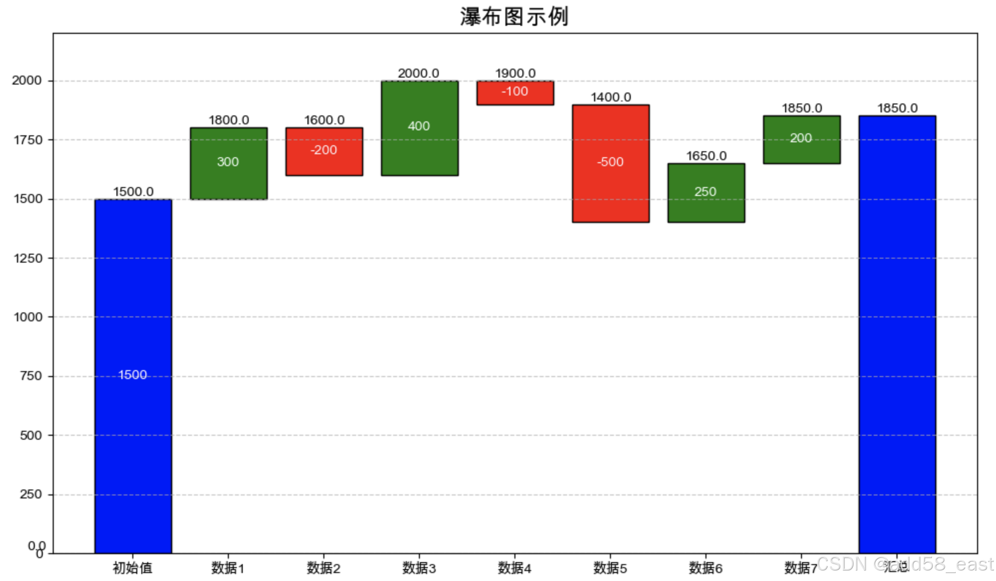
# 定义数据
categories = ['初始值', '数据1', '数据2', '数据3', '数据4', '数据5', '数据6','数据7',]
values = [1500, 300, -200, 400, -100, -500, 250,200]  # 收入和支出变化
tilte = '瀑布图示例'
add58waterfall(values,tilte,categories)
结果显示
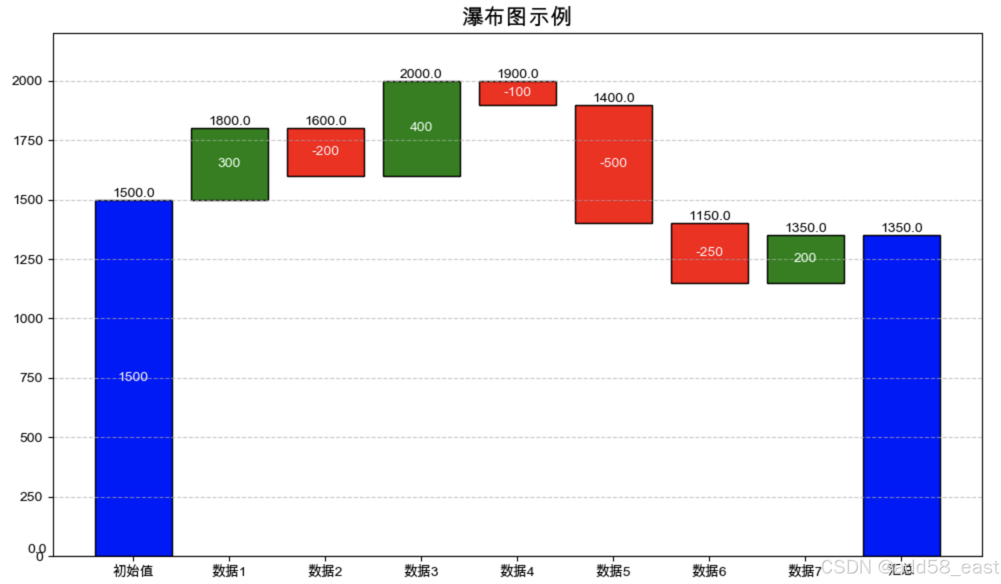
修改参数再测试, 将倒数第二个值从正值改为负值再看效果
# 定义数据
categories = ['初始值', '数据1', '数据2', '数据3', '数据4', '数据5', '数据6','数据7',]
values = [1500, 300, -200, 400, -100, -500, -250,200]  # 收入和支出变化
tilte = '瀑布图示例'
add58waterfall(values,tilte,categories)
结果显示


 被折叠的 条评论
为什么被折叠?
被折叠的 条评论
为什么被折叠?
 到【灌水乐园】发言


