


 本文详细介绍了如何使用CSS Flex布局实现元素的垂直居中。通过设置`display: flex;`、`flex-direction: column;`、`align-items: center;`和`justify-content: center;`四个关键属性,可以简便地达成这一目标,无需计算间距。此外,文中还提及了不使用Flex布局时,利用`transform: translate(-50%, -50%);`实现的自适应垂直居中方法。"
100062983,8747552,深入理解数据库设计与事务处理,"['数据库设计', '多表查询', '事务处理']
本文详细介绍了如何使用CSS Flex布局实现元素的垂直居中。通过设置`display: flex;`、`flex-direction: column;`、`align-items: center;`和`justify-content: center;`四个关键属性,可以简便地达成这一目标,无需计算间距。此外,文中还提及了不使用Flex布局时,利用`transform: translate(-50%, -50%);`实现的自适应垂直居中方法。"
100062983,8747552,深入理解数据库设计与事务处理,"['数据库设计', '多表查询', '事务处理']
先直接上代码~
<style>
        *{
            padding: 0;
            margin: 0;
        }
        ul{
            list-style: none;
            width: 700px;
            height: 500px;
            border: 1px solid #000;
            margin: 100px auto;
            display: flex;
            flex-direction: column;
            align-items: center;
            justify-content: center;
        }
        li{
            width: 100px;
            height: 100px;
            background-color: skyblue;
        }
        li:nth-child(2){
            background-color: yellowgreen;
        }
        li:nth-child(3){
            background-color: teal;
        }
    </style>
</head>
<body>
<ul>
    <li>1</li>
    <li>2</li>
    <li>3</li>
</ul>
</body>
核心代码是这四行:
display: flex;
flex-direction: column;
align-items: center;
justify-content: center;
1、display: flex;
使其变为伸缩容器
2、flex-direction: column;
改变主轴为从上到下方向(侧轴也同时随之改变)
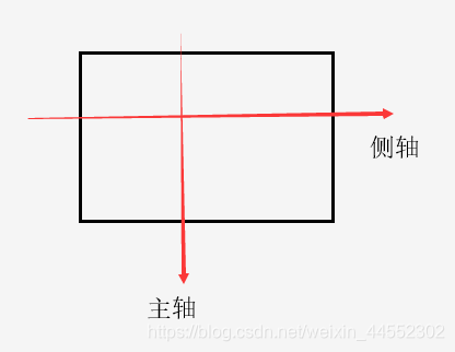
3、align-items: center;
侧轴对齐中点此时侧轴为水平,达到了水平居中的目的

4、justify-content: center;
主轴对齐中点,此时主轴为垂直,达到了垂直居中的目的
实现了垂直居中!

用Flex布局解决垂直居中问题是很方便简单的,不用计算左右距离和担心自适应问题
补充:
不用Flex布局的垂直居中:(这样也是自适应的)
position: absolute;
top: 50%;
left: 50%;
transform: translate(-50%,-50%);
transform: translate(-50%,-50%);负的,向回移动盒子的一半,居中
    <style>
        *{
            padding: 0;
            margin: 0;
        }
        .f{
            width: 200px;
            height: 200px;
            background-color: teal;
            position: absolute;
            top: 50%;
            left: 50%;
            transform: translate(-50%,-50%);
        }
        .s{
            width: 100px;
            height: 100px;
            background-color: tomato;
            position: absolute;
            top: 50%;
            left: 50%;
            transform: translate(-50%,-50%);
        }
    </style>
</head>
<body>
<div class="f">
    <div class="s"></div>
</div>
</body>

2、水平分布,垂直居中
display: flex;
flex-direction: row;
align-items: center;
因为主轴row,即使内容超出也会等比压缩,不会换行导致界面混乱
水平分布,垂直居中,用Flex就这么简单,不用计算margin-top什么的来垂直居中了。


 扫一扫
扫一扫


 1046
1046

 被折叠的 条评论
为什么被折叠?
被折叠的 条评论
为什么被折叠?
 到【灌水乐园】发言


