


XAMl样式有这么几类:
- 属性样式
- 内联样式
- 引用样式
而引用样式中又分为种样式:
- 页面级样式
- 应用程序级样式
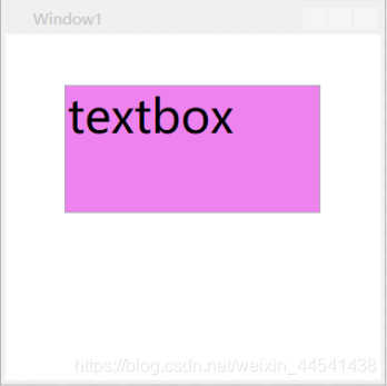
- 属性样式:
类似于在HTML中直接通过HTML元素属性设置的样式
适用于复用度不高的一些属性
示例:
<Window x:Class="WPFDemo01.啧啧啧.Window1"

        xmlns="http://schemas.microsoft.com/winfx/2006/xaml/presentation"

        xmlns:x="http://schemas.microsoft.com/winfx/2006/xaml"

        xmlns:d="http://schemas.microsoft.com/expression/blend/2008"

        xmlns:mc="http://schemas.openxmlformats.org/markup-compatibility/2006"

        xmlns:local="clr-namespace:WPFDemo01.啧啧啧"

        mc:Ignorable="d"

        Title="Window1" Height="300" Width="300">

    <!--" 属性样式-->

    <TextBox Text="textbox" Width="200" Height="100" Margin="40,40,40,40" HorizontalAlignment="Center"

VerticalAlignment="Top" Background="Violet" FontSize="36"/>

</Window>
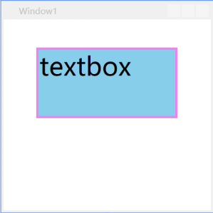
- 内联样式:
实际上是设置元素的Style属性
若内联样式与属性样式对同一属性进行设置,以属性设置的样式为准
<!--" 属性样式-->

    <TextBox Text="textbox" Width="200" Height="100"

             Margin="40,40,40,40" HorizontalAlignment="Center" VerticalAlignment="Top" Background="SkyBlue" FontSize="36">

        <!--内联样式-->

        <TextBox.Style>

            <!--TargetType指定控件-->

            <Style TargetType="TextBox">

                <!--Property指定控件属性-->

                <Setter Property="Background" Value="red"/>

                <Setter Property="BorderThickness" Value="3"/>

                <Setter Property="BorderBrush" Value="Violet" />

            </Style>

        </TextBox.Style>

</TextBox>
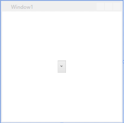
- 引用样式:
资源字典可在多处定义,因此引用样式也可以在多处定义
<!--页面级样式-->

    <Window.Resources>

        <!--操作控件:下拉框ComboBox-->

        <!--ComboBoxItem样式-->

        <Style TargetType="ComboBoxItem">

            <Setter Property="VerticalContentAlignment" Value="Center"/>

            <Setter Property="Height" Value="40"/>

            <Setter Property="Template">

                <Setter.Value>

                    <ControlTemplate TargetType="ComboBoxItem">

                        <Border Name="Back" Background="Transparent" BorderThickness="0,0,0,0" BorderBrush="#FF6A6A6A" >

                            <ContentPresenter ContentSource="{Binding Source}" Margin="{TemplateBinding Padding}" HorizontalAlignment="Left" VerticalAlignment="Center"></ContentPresenter>

                        </Border>

                        <ControlTemplate.Triggers>

                            <Trigger Property="IsHighlighted" Value="True">

                                <Setter TargetName="Back" Property="Background" Value="Pink"></Setter>

                            </Trigger>

                            <Trigger Property="IsSelected" Value="True">

                                <Setter TargetName="Back" Property="Background" Value="#FFCBE3FE"></Setter>

                            </Trigger>

                        </ControlTemplate.Triggers>

                    </ControlTemplate>

                </Setter.Value>

            </Setter>

        </Style>

    </Window.Resources>

    <Grid>

        <ComboBox Width="20" Height="30">

            <ComboBoxItem Content="请选择" Selected="1"/>

            <ComboBoxItem Content="请选择"/>

            <ComboBoxItem Content="请选择"/>

            <ComboBoxItem Content="请选择"/>

        </ComboBox>

</Grid>
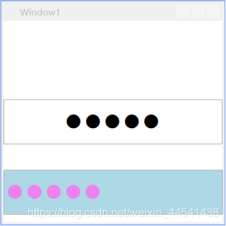
- 引用样式可以分为:
- 页面级样式(写在页面上)
页面级样式定义在页面的资源字典中,作用范围为整个页面
<!--页面级样式:多个样式-->

    <Window.Resources>

        <!--操作控件:PasswordBox密码框-->

        <!--带有key标签的样式-->

        <Style x:Key="pbStyle" TargetType="PasswordBox">

            <Setter Property="FontSize" Value="40"/>

            <!--字体大小-->

            <Setter Property="Background" Value="Transparent"/>

            <!--背景透明-->

            <Setter Property="HorizontalContentAlignment" Value="Center"/>

            <!--内容水平居中-->

        </Style>

        <Style TargetType="PasswordBox">

            <Setter Property="FontSize" Value="40"/>

            <!--字体大小-->

            <Setter Property="Foreground" Value="Violet" />

            <!--前景色蓝色-->

            <Setter Property="Background" Value="LightBlue"/>

            <!--背景蓝色-->

        </Style>

    </Window.Resources>

    <Grid>

        <!--指定应用的是第一种样式-->

        <PasswordBox Style="{StaticResource pbStyle}" Password="12345" Height="60"/>

        <!--引用的是页面级公共样式:第二种-->

        <PasswordBox Password="23456" Height="60" Margin="0,200,-0.4,10.4"/>

</Grid>
- 应用程序级样式(写在App.xaml里面)
与页面级样式的定义方式和应用方式相同,差别有两个方面:
- 定义位置不同
- 作用范围不同
<Application.Resources>

        <!--<ResourceDictionary>

            <ResourceDictionary.MergedDictionaries>

                <ResourceDictionary Source="Dictionary001.xaml" />

            </ResourceDictionary.MergedDictionaries>

        </ResourceDictionary>-->

        <!--定义按钮公共样式-->

        <Style x:Key="gBut" TargetType="{x:Type Button}">

            <!--手型-->

            <Setter Property="Cursor" Value="Hand"/>

            <!--宽度-->

            <Setter Property="Width" Value="150"/>

            <!--长度-->

            <Setter Property="Height" Value="80"/>

        </Style>

        <!--定义按钮样式1-->

        <!--BasedOn继承公共样式-->

        <Style x:Key="cBtn1" TargetType="{x:Type Button}" BasedOn="{StaticResource gBut}">

            <!--背景色-->

            <Setter Property="Background" Value="Black"/>

            <!--字号-->

            <Setter Property="FontSize" Value="24"/>

            <!--字颜色-->

            <Setter Property="Foreground" Value="Blue"/>

            <!--字间距-->

            <Setter Property="Margin" Value="20"/>

        </Style>

        <!--定义按钮样式2-->

        <Style x:Key="cBtn2" TargetType="{x:Type Button}" BasedOn="{StaticResource gBut}">

            <!--背景色-->

            <Setter Property="Background" Value="White"/>

            <!--字号-->

            <Setter Property="FontSize" Value="24"/>

            <!--字颜色-->

            <Setter Property="Foreground" Value="Red"/>

            <!--字间距-->

            <Setter Property="Margin" Value="10"/>

        </Style>

    </Application.Resources>


 扫一扫
扫一扫


 299
299

 被折叠的 条评论
为什么被折叠?
被折叠的 条评论
为什么被折叠?
 到【灌水乐园】发言


