


传统的布局横向排列不容易实现,使用弹性布局就可以更加方便地实现布局效果,
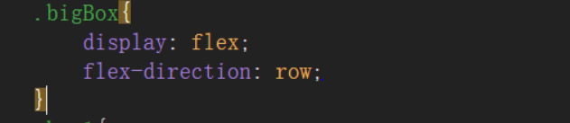
只要在外层的盒子使用flex布局,就可以实现盒子的一级内容出现弹性布局样式,而对第二级内容无影响,而且屏幕的大小变化不会挤压内容样式。
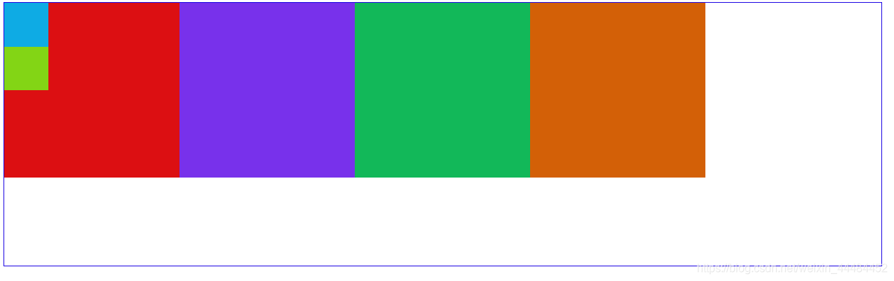
完全不使用定位和边距就可以实现的布局
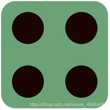
<style>
.fove{
	width: 300px;
	height: 300px;
	background: #6CA374;
	border-radius: 40px;
	display: flex;
	justify-content: space-around;
}
.fove div{
	height: 300px;
	width: 100px;
	display: inline-flex;
	justify-content: space-around;
	flex-wrap: wrap;
	align-items: center;
}
.fove div span{
	width: 90px;
	height: 90px;
	background: #190404;
	border-radius: 50%;
}
</style>
<body>
	<div class="fove fr">
		<div>
			<span class="doha1"></span>
			<span class="doha2"></span>
		</div>
		<div>
			<span class="doha4"></span>
			<span class="doha4"></span>
		</div>
	</div>
</body


 扫一扫
扫一扫


 662
662

 被折叠的 条评论
为什么被折叠?
被折叠的 条评论
为什么被折叠?
 到【灌水乐园】发言


