g2绘制点图,鼠标移入点上出现tooltip,对应的label消失

g2绘制点图,实现鼠标移入点上,tooltip展示,对应的label消失,鼠标移出之后,tooltip消失,对应的label展示出来。

在这里插入图片描述

思路:
  1. 给point注册鼠标移入事件,可以拿到当前移入的元素的数据,通过数组的findIndex方法,可以找到与当前移入元素的下标。
  2. label的格式是自定义的,用原生js可以获取所有的label数组,label的个数和总数据的个数是一一对应的,所以可以根据上面获取的下标,找到当前移入元素的label,设置样式,从而可以得到想要的效果。
  3. 鼠标移出后,样式回复初始值。
结合react实现,代码如下:
import React from 'react';
import G2 from '@antv/g2';

let toolIndex;//存储当前移入元素的下标
class ChangeLabel extends React.Component {
  constructor(props) {
    super(props)
    this.state = {}

  }
  componentDidMount() {
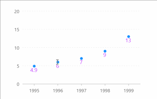
    const data = [
      { year: '1995', value: 4.9 },
      { year: '1996', value: 6 },
      { year: '1997', value: 7 },
      { year: '1998', value: 9 },
      { year: '1999', value: 13 }
    ];

    const chart = new G2.Chart({
      container: 'container',
      width: 400,
      height: 300
    });
    chart.source(data);
    chart.scale('value', {
      min: 0,
      max: 20
    });

    chart.tooltip({
      position: 'top',//top,bottom,left,right
      inPlot: false,//设置是否将 tooltip 限定在绘图区域内,默认为 true,即限定在绘图区域内
      crosshairs: {
        type: 'line'
      }
    });


    chart.point().position('year*value')
      .size(4)
      .shape('circle')
      .style({
        stroke: '#fff',
        lineWidth: 1
      })
      .label('year*value', function () {
        return {
          useHtml: true,
          htmlTemplate: function htmlTemplate(text, item) {
            var d = item.point;
            console.log(d);

            return (
              `<span class="g2-label" style="color:#b3f";font-size:12px" >` +
              d.value +
              "</span > "
            )
          },
          offsetY: 15,//偏移量
        }
      })

    //给point注册鼠标移入事件
    chart.on('point:mouseenter', ev => {

      toolIndex = data.findIndex(item => item.year == ev.data.point.year)

      let labelAll = document.querySelectorAll('.g2-label')

      labelAll[toolIndex].style.color = 'transparent'
    })
    
	//给point注册鼠标移出事件
    chart.on('point:mouseleave', ev => {
      let labelAll = document.querySelectorAll('.g2-label')
      labelAll[toolIndex].style.color = '#b3f'
    })
    chart.render();
  }

  render() {
    return (
      <div id='container'></div>
    )
  }
}
export default ChangeLabel
补充:
  • 图形元素事件,即组成图表的各种图形元素;
    我们以 『图形元素名』+ 『基础事件名』 的方式来组合图形元素上的事件,帮助用户进行更精准的事件监听,同时也给交互提供了更大的可能性。图形元素事件对象上都会携带 shape 属性,即表示当前被触发的图形元素
chart.on('point:click', ev => {});
chart.on('axis-label:click', ev => {});
  • 由于我们抛出的图形元素事件是通用的,所以当需要针对某一个具体的图形元素进行事件监听时,我们提供了一个 appendInfo 属性,用于帮助用户对特定的图形元素进行事件标识,该属性可用于以下四个接口:
chart.axis()
chart.legend()
chart.guide()
geom().label()

使用方式如下

chart.guide().line({
  top: true,
  start: ['min', 50],
  end: ['max', 50],
  text: {
    content: 'Safe sugar intake 50g/day',
    position: 'end',
    style: {
      textAlign: 'end'
    }
  },
  lineStyle: {
    endArrow: true,
    lineWidth: 10
  },
  appendInfo: {
    id: 'sugar'
  }
});

chart.on('guide-line:click', ev => {
  console.log('guide-line:click', ev.appendInfo); // {id: 'sugar'}
});
chart.on('guide-line-text:click', ev => {
  console.log('guide-line-text:click', ev.appendInfo); // {id: 'sugar'}
});
您好!要实现前端g2plot折线和柱状结合并且还有缩略轴,您可以按照以下步骤进行操作: 1. 导入所需的库和数据。 ```javascript import { Chart } from '@antv/g2'; import { DataView } from '@antv/data-set'; const data = [ { month: '2021-01', sales: 200, profit: 40 }, { month: '2021-02', sales: 300, profit: 60 }, { month: '2021-03', sales: 400, profit: 80 }, { month: '2021-04', sales: 500, profit: 100 }, { month: '2021-05', sales: 600, profit: 120 }, { month: '2021-06', sales: 700, profit: 140 }, { month: '2021-07', sales: 800, profit: 160 }, { month: '2021-08', sales: 900, profit: 180 }, { month: '2021-09', sales: 1000, profit: 200 }, { month: '2021-10', sales: 1100, profit: 220 }, { month: '2021-11', sales: 1200, profit: 240 }, { month: '2021-12', sales: 1300, profit: 260 }, ]; ``` 2. 数据处理。将数据按照需要的格式进行处理,并将时间格式转换为datetime类型。 ```javascript const ds = new DataView(); ds.source(data) .transform({ type: 'map', callback: (row) => { row.date = new Date(row.month).getTime(); return row; }, }) .transform({ type: 'sort-by', fields: ['date'], }); ``` 3. 绘制折线和柱状。 ```javascript const chart = new Chart({ container: 'container', autoFit: true, height: 500, }); chart.data(ds.rows); chart.axis('date', { label: { formatter: (value) => { return new Date(value).toLocaleDateString('en-US', { month: 'short', year: 'numeric', }); }, }, }); chart.line().position('date*sales'); chart .interval() .position('date*profit') .color('#2ecc71'); chart.render(); ``` 4. 绘制缩略轴。 ```javascript const sliderChart = new Chart({ container: 'slider-container', autoFit: true, height: 50, }); sliderChart.data(ds.rows); sliderChart.axis('date', { label: null, tickLine: null, }); sliderChart .interval() .position('date*sales') .color('#2ecc71'); sliderChart.tooltip(false); sliderChart.interaction('element-highlight'); sliderChart.render(); ``` 5. 合并表。使用Slider将折线、柱状和缩略轴合并在一起。 ```javascript const slider = new Slider({ dom: '#slider', width: 'auto', height: 26, padding: [10, 30, 0, 30], start: 0, end: 0.5, xAxis: { type: 'time', tickCount: 10, mask: 'MMM YY', }, yAxis: { type: 'linear', tickCount: 3, }, data: ds.rows, backgroundChart: { type: 'line', options: { xField: 'date', yField: 'sales', smooth: true, lineStyle: { lineWidth: 2, stroke: '#2ecc71', }, }, }, foregroundChart: { type: 'interval', options: { xField: 'date', yField: 'profit', color: '#2ecc71', }, }, }); slider.render(); ``` 这样,您就可以得到一个包含折线、柱状和缩略轴的可交互式数据可视化表了。
评论 2
添加红包

请填写红包祝福语或标题

红包个数最小为10个

红包金额最低5元

当前余额3.43前往充值 >
需支付:10.00
成就一亿技术人!
领取后你会自动成为博主和红包主的粉丝 规则
hope_wisdom
发出的红包
实付
使用余额支付
点击重新获取
扫码支付
钱包余额 0

抵扣说明:

1.余额是钱包充值的虚拟货币,按照1:1的比例进行支付金额的抵扣。
2.余额无法直接购买下载,可以购买VIP、付费专栏及课程。

余额充值