


1
import numpy as np
import matplotlib as mpl
import matplotlib.pyplot as plt
import pandas as pd
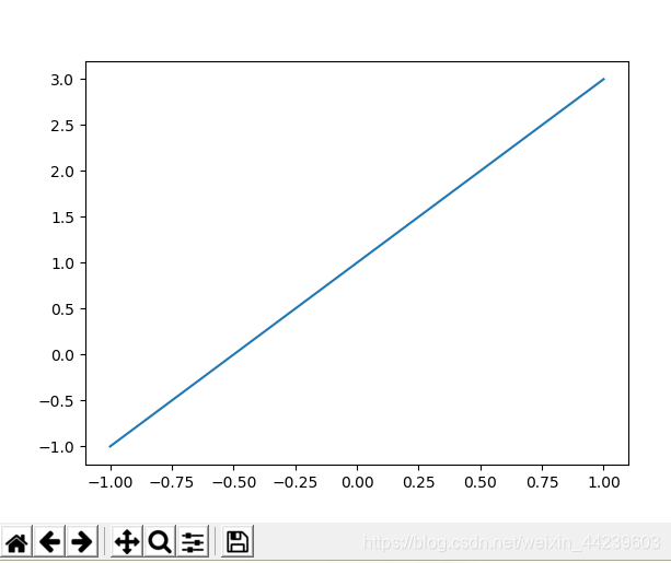
x = np.linspace(-1,1,50)
y = 2 * x + 1
plt.plot(x,y)
plt.show()
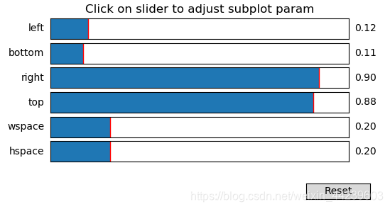
1 2 3 4 5 6 7
1:回到初始界面
2:回到前一步
3:后返一步
4:拖动图
5:选择地方,放大特定区域
6:调整图片位置
7:保存
2
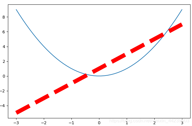
x = np.linspace(-3,3,50)
y1 = 2 * x + 1
y2 = x ** 2
plt.figure()
plt.plot(x,y1)

plt.figure(num=3,figsize=(8,5))   ##num:定义figure号码;figsize:图形长8,高是5
plt.plot(x,y2)
##color:颜色; linewidth:图形线宽; linestyle:图线形式; 将两个方程放入一个图
plt.plot(x,y1,color='red',linewidth = 10.0,linestyle = '--')
plt.show()
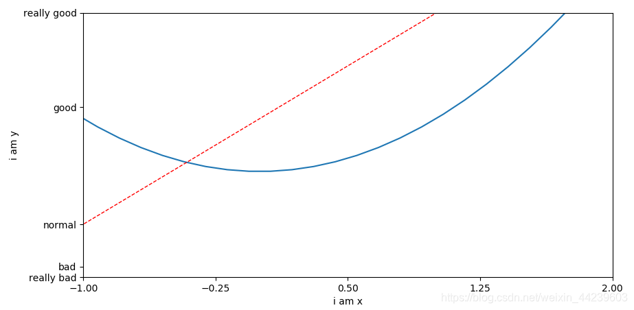
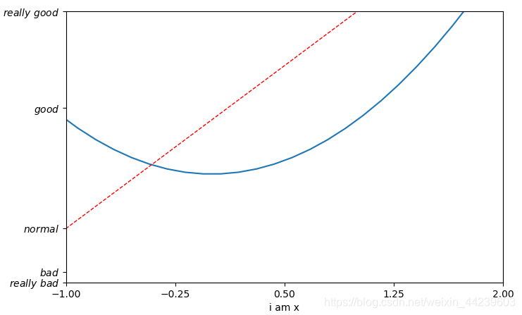
设置坐标值
plt.figure(num=4,figsize=(8,5))
plt.plot(x,y2)
plt.plot(x,y1,color=‘red’,linewidth = 1.0,linestyle = ‘–’)
plt.xlim((-1,2))##设置x轴范围
plt.ylim((-2,3))##设置y轴范围
plt.xlabel(‘i am x’)##设置x轴名称
plt.ylabel(‘i am y’)##设置y轴名称
new_ticks = np.linspace(-1,2,5) ##重新设置取值范围—轴
print(new_ticks)
plt.xticks(new_ticks)
##y轴将数值对应字母
plt.yticks([-2,-1.8,-1,1.22,3,],
[‘really bad’,‘bad’,‘normal’,‘good’,‘really good’])
plt.show()
plt.yticks([-2,-1.8,-1,1.22,3,],
[r’
r
e
a
l
l
y
b
a
d
really\ bad
really bad’,r’
b
a
d
bad
bad’,r’
n
o
r
m
a
l
normal
normal’,r’
g
o
o
d
good
good’,r’
r
e
a
l
l
y
g
o
o
d
really\ good
really good’])
plt.show()
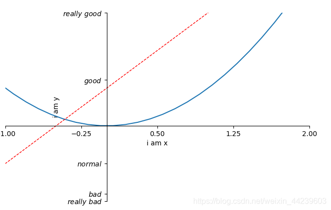
python中程序表示alpha表示α
##修改坐标值的位置
##gca = ‘get current axis’
ax = plt.gca()
##设置坐标轴的脊梁,坐标轴的四个框
ax.spines['right'].set_color('none')
ax.spines['top'].set_color('none')
ax.xaxis.set_ticks_position('bottom')
ax.yaxis.set_ticks_position('left')
##横坐标设置与纵坐标值交点为-1
ax.spines['bottom'].set_position(('data',0))##outward,axes:定位到百分比
ax.spines['left'].set_position(('data',0))
plt.show()
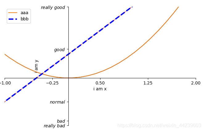
##设置图例,表示图线代表内容
##lable设置图线名称
l1,=plt.plot(x,y2,label = 'up')
##color:颜色; linewidth:图形线宽; linestyle:图线形式; 将两个方程放入一个图
l2,=plt.plot(x,y1,color='blue',linewidth = 3.0,linestyle = '--',label = 'down')
##打印图例
##handles:传入图线;labels:名称;loc:'best':找到合适地方放置图例
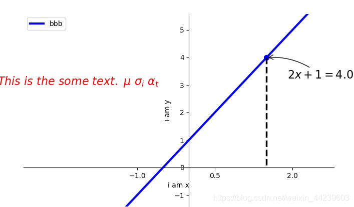
plt.legend(handles=[l1,l2],labels=['aaa','bbb'],loc='best')
plt.show()
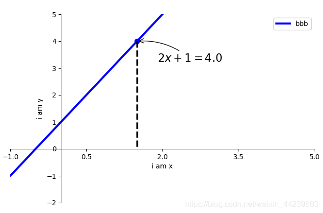
##设置注释文字
##r'$2x+1=%s$' % y0 : 注释文字
##xy=(x0,y0),xycoords='data' 基于(x0,y0)的点
##xytext = (+30, -30), textcoords = 'offset point',:将注释挪动位置
##arrowprops=dict(arrowstyle='->':设置箭头
##connectionstyle='arc3,rad=.2':设置弧度
plt.annotate(r'$2x+1=%s$' % y0,xy=(x0,y0),xycoords='data',
xytext=(+30,-30),textcoords='offset points',
fontsize = 16, arrowprops=dict(arrowstyle='->',
connectionstyle='arc3,rad=.2'))
#method 2
plt.text(-3.7,3,r'$This\ is\ the\ some\ text.\ \mu\ \sigma_i\ \alpha_t$',
fontdict={'size':16,'color':'r'})
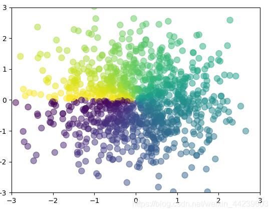
n = 1024
X = np.random.normal(0,1,n)
Y = np.random.normal(0,1,n)
print((X,Y))
T = np.arctan2(Y,X)##for color value
##设置散点图参数
plt.scatter(X,Y,s=75,c=T,alpha=0.5)
plt.xlim((-3,3))
plt.ylim((-3,3))
plt.show()
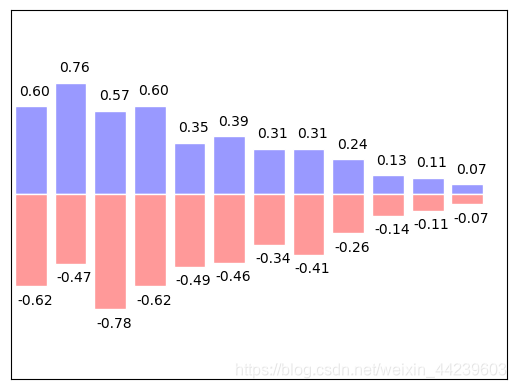
n = 12
##随机生成0到11的数值
X = np.arange(n)
##根据X生成Y,对于每个n都产生一个
Y1 = (1-X/float(n))*np.random.uniform(0.5,1.0,n)
Y2 = (1-X/float(n))*np.random.uniform(0.5,1.0,n)
##产生向上的数值,facecolor:主体颜色;edgecolor:表框颜色
plt.bar(X,+Y1,facecolor='#9999ff',edgecolor='white')
##产生向下的数值
plt.bar(X,-Y2,facecolor='#ff9999',edgecolor='white')
##柱状图上加文字
for x,y in zip(X,Y1):
##ha:horizontal alignment 对齐方式
plt.text(x + 0.1,y + 0.05,'%.2f'% y,ha='center',va='bottom')
for x,y in zip(X,Y2):
##ha:horizontal alignment 对齐方式
plt.text(x + 0.1,-y - 0.05,'-%.2f'% y,ha='center',va='top')
plt.xlim(-0.5,n)
plt.xticks(())
plt.ylim(-1.25,1.25)
plt.yticks(())
plt.show()
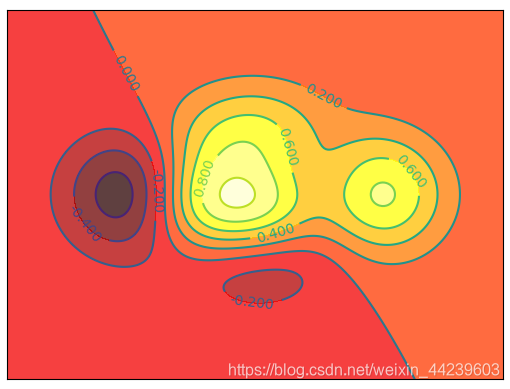
def f(x,y):
#the height function
return (1 - x / 2 + x**5 + y**3)*np.exp(-x**2-y**2)

n=256
x = np.linspace(-3,3,n)
y = np.linspace(-3,3,n)
##定义网格
X,Y = np.meshgrid(x,y)
##use plt.contourf to filling contours 等高线
##X,Y and value for (X,Y) point
##alpha:透明度 8:表示分成8端,10部分
plt.contourf(X,Y,f(X,Y),8,alpha=0.75,cmap=plt.cm.hot)
##use plt.contour to add contour lines 设置等高线的线
C = plt.contour(X,Y,f(X,Y),8,color='block',linewide=0.5)
##adding label 显示数值
plt.clabel(C,inline=True,fontsize=10)
plt.xticks(())
plt.yticks(())
plt.show()
a = np.array([0.313660827978,0.365348418405,0.423733120134,
0.455341841505,0.504435242423,0.555515514514,
0.626372257272,0.682624572724,0.731662627252]).reshape(3,3)
"""
for the value of"interpolation",check this:
http://matplotlib.org/examples/images_contours_and_fields/interpolation_methods.html
"""
plt.imshow(a,interpolation='nearest',cmap='bone',origin='lower')
plt.colorbar(shrink=0.9)
plt.xticks(())
plt.yticks(())
plt.show()
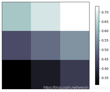
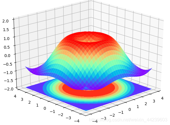
fig = plt.figure()
##添加3DAxes
ax = Axes3D(fig)
##X,Y value 设置面
X = np.arange(-4,4,0.25)
Y = np.arange(-4,4,0.25)
X,Y = np.meshgrid(X,Y)
##计算Z的值
R = np.sqrt(X ** 2 + Y ** 2)
Z = np.sin(R)

ax.plot_surface(X,Y,Z,rstride=1,cstride=1,cmap=plt.get_cmap('rainbow'))
ax.contourf(X,Y,Z,zdir='z',offset=-2,cmap='rainbow')
ax.set_zlim(-2,2)
plt.show()
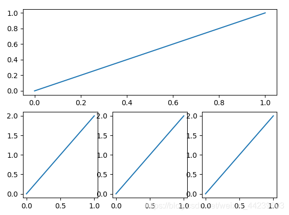
组合图
import matplotlib.pyplot as plt
plt.figure()
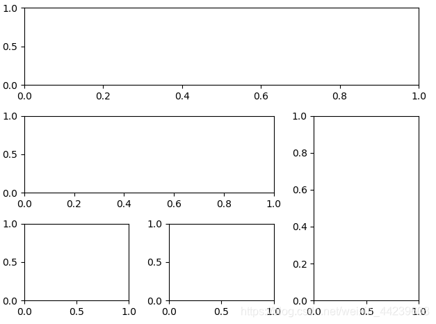
plt.subplot(2,1,1)
plt.plot([0,1],[0,1])
plt.subplot(2,3,4)
plt.plot([0,1],[0,2])
plt.subplot(2,3,5)
plt.plot([0,1],[0,2])
plt.subplot(2,3,6)
plt.plot([0,1],[0,2])
plt.show()
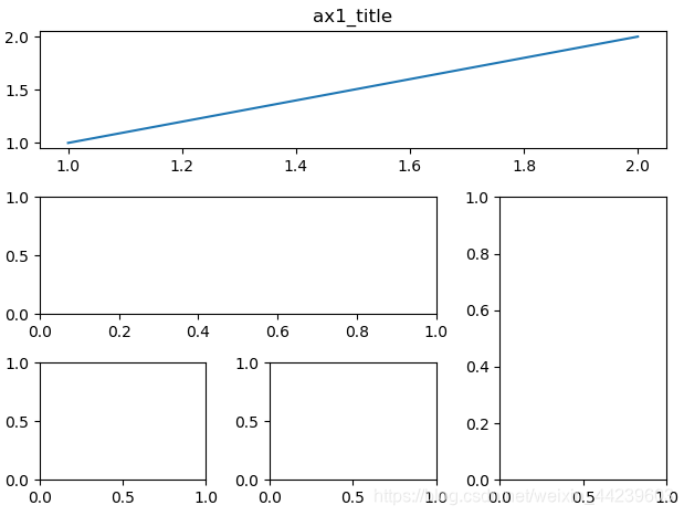
plt.figure()
ax1 = plt.subplot2grid((3,3),(0,0),colspan=3,rowspan=1)
ax1.plot([1,2],[1,2])
ax1.set_title('ax1_title')
##将表格分为9行9列,然后确定行列
ax2 = plt.subplot2grid((3,3),(1,0),colspan=2,rowspan=1)
ax3 = plt.subplot2grid((3,3),(1,2),rowspan=2)
ax4 = plt.subplot2grid((3,3),(2,0))
ax5 = plt.subplot2grid((3,3),(2,1))
plt.tight_layout()
plt.show()
plt.figure()
gs = gridspec.GridSpec(3,3)
ax1 = plt.subplot(gs[0,:])
ax2 = plt.subplot(gs[1,:2])
ax3 = plt.subplot(gs[1:,2])
ax4 = plt.subplot(gs[-1,0])
ax5 = plt.subplot(gs[-1,-2])
plt.tight_layout()
plt.show()
f,((ax11,ax12),(ax21,ax22)) = plt.subplots(2,2,sharex = True,sharey=True)
ax11.scatter([1,2],[1,2])
plt.tight_layout()
plt.show()
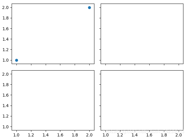
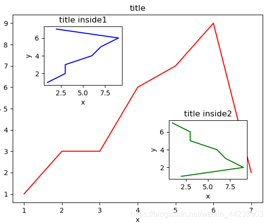
fig = plt.figure()
x = [1,2,3,4,5,6,7]
y = [1,3,3,6,7,9,2]

left,bottom,width,height = 0.1,0.1,0.8,0.8
ax1 = fig.add_axes([left,bottom,width,height])
ax1.plot(x,y,'r')
ax1.set_xlabel('x')
ax1.set_ylabel('y')
ax1.set_title('title')

left,bottom,width,height = 0.2,0.6,0.25,0.25
ax2 = fig.add_axes([left,bottom,width,height])
ax2.plot(y,x,'b')
ax2.set_xlabel('x')
ax2.set_ylabel('y')
ax2.set_title('title inside1')

plt.axes([0.6,0.2,0.25,0.25])
plt.plot(y[::-1],x,'g')
plt.xlabel('x')
plt.ylabel('y')
plt.title('title inside2')
plt.show()
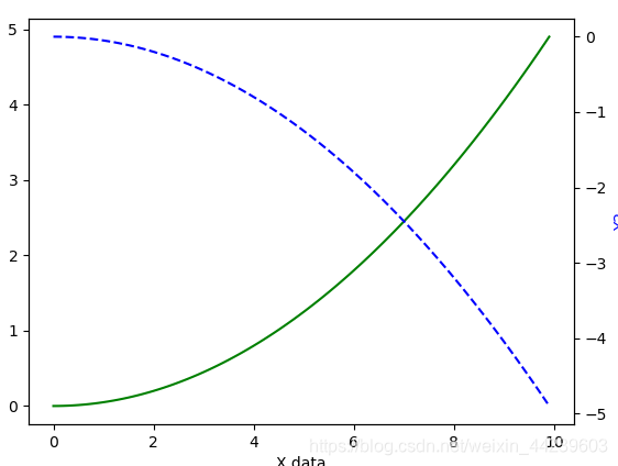
x = np.arange(0,10,0.1)
y1 = 0.05 * x ** 2
y2 = -1 * y1
fig,ax1=plt.subplots()
ax2 = ax1.twinx()
ax1.plot(x,y1,'g-')
ax2.plot(x,y2,'b--')
ax1.set_xlabel('X data')
ax1.set_ylabel('Y1',color = 'g')
ax2.set_ylabel('Y2',color = 'b')
plt.show()
fig,ax = plt.subplots()
x = np.arange(0,2*np.pi,0.01)
line,=ax.plot(x,np.sin(x))

def animate(i):
line.set_ydata(np.sin(x+i/100))
return line,
def init():
line.set_ydata(np.sin(x))
return line,

ani = animation.FuncAnimation(fig = fig,func=animate,frames=100,init_func=init,
interval=10,blit=True)

plt.show()


 被折叠的 条评论
为什么被折叠?
被折叠的 条评论
为什么被折叠?
 到【灌水乐园】发言


