测试代码:
<!DOCTYPE html>
<html lang="en">
<head>
    <meta charset="UTF-8">
    <meta name="viewport" content="width=device-width, initial-scale=1.0">
    <meta http-equiv="X-UA-Compatible" content="ie=edge">
    <title>Document</title>
    <style>
        body{
            background: black;
            perspective: 800px;
        }
        #container{
            width: 200px;
            height: 200px;
            margin:200px auto;
            /* border:1px dotted #fff; */
            position: relative;
            transform-style: preserve-3d;
            animation: run 2s linear infinite forwards;
        }
        @keyframes run{
            100%{
                transform: rotateY(360deg) ;
            }

        }
    #container div{
        width: 200px;
        height: 200px;
        background: rgba(255,255,255,0.5);
        border-radius: 10px;
        font-size: 50px;
        text-align: center;
        line-height: 200px;
        position: absolute;
        left:0px;
        top:0px;
    }
    .one{
        transform: rotateY(-90deg) translateZ(100px);
    }
    .two{
        transform: rotateY(90deg) translateZ(100px);
    }
    .three{
        transform: rotateX(90deg) translateZ(100px);
    }
    .four{
        transform: rotateX(-90deg) translateZ(100px);

    }
    .five{
        transform: rotateY(180deg) translateZ(100px);
    }
    .six{
        transform: translateZ(100px);
    }

    </style>
</head>
<body>
    <div id="container">
        <div class="one">1</div>
        <div class="two">2</div>
        <div class="three">3</div>
        <div class="four">4</div>
        <div class="five">5</div>
        <div class="six">6</div>

</body>
</html>
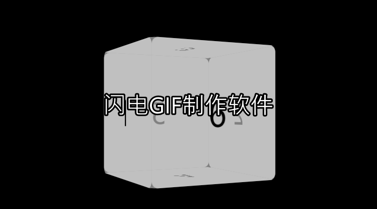


 本文介绍了一个使用HTML和CSS实现的3D立方体旋转动画,通过设置不同的透视角度和旋转变换,创建了一个六面体的3D效果,并使用关键帧动画使其持续旋转。


 扫一扫
扫一扫


 1074
1074

 被折叠的 条评论
为什么被折叠?
被折叠的 条评论
为什么被折叠?
 到【灌水乐园】发言


