


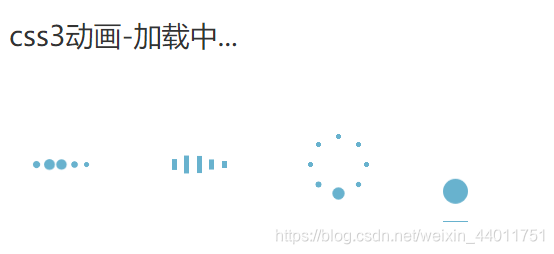
好看的四种加载动画,效果如图:
代码:
<!DOCTYPE html>
<html lang="en">


<head>
    <meta charset="UTF-8">
    <meta http-equiv="X-UA-Compatible" content="IE=edge">
    <meta name="viewport" content="width=device-width, initial-scale=1.0">
    <title>加载动画</title>
    <style>
        body {
            padding-top: 50px;
            display: flex;
            justify-content: space-around;
        }


        /* 第一种 */
        .demo1 {
            width: 4px;
            height: 4px;
            border-radius: 2px;
            background: #68b2ce;
            float: left;
            margin: 0 3px;
            animation: demo1 linear 1s infinite;
            -webkit-animation: demo1 linear 1s infinite;
        }


        .demo1:nth-child(1) {
            animation-delay: 0s;
        }


        .demo1:nth-child(2) {
            animation-delay: 0.15s;
        }


        .demo1:nth-child(3) {
            animation-delay: 0.3s;
        }


        .demo1:nth-child(4) {
            animation-delay: 0.45s;
        }


        .demo1:nth-child(5) {
            animation-delay: 0.6s;
        }


        @keyframes demo1 {


            0%,
            60%,
            100% {
                transform: scale(1);
            }


            30% {
                transform: scale(2.5);
            }
        }


        @-webkit-keyframes demo1 {


            0%,
            60%,
            100% {
                transform: scale(1);
            }


            30% {
                transform: scale(2.5);
            }
        }


        /* 第二种 */
        .demo2 {
            width: 4px;
            height: 6px;
            background: #68b2ce;
            float: left;
            margin: 0 3px;
            animation: demo2 linear 1s infinite;
            -webkit-animation: demo2 linear 1s infinite;
        }


        .demo2:nth-child(1) {
            animation-delay: 0s;
        }


        .demo2:nth-child(2) {
            animation-delay: 0.15s;
        }


        .demo2:nth-child(3) {
            animation-delay: 0.3s;
        }


        .demo2:nth-child(4) {
            animation-delay: 0.45s;
        }


        .demo2:nth-child(5) {
            animation-delay: 0.6s;
        }


        @keyframes demo2 {


            0%,
            60%,
            100% {
                transform: scale(1);
            }


            30% {
                transform: scaleY(3);
            }
        }


        @-webkit-keyframes demo2 {


            0%,
            60%,
            100% {
                transform: scale(1);
            }


            30% {
                transform: scaleY(3);
            }
        }


        /* 第三种 */
        #loading3 {
            position: relative;
            width: 50px;
            height: 50px;
        }


        .demo3 {
            width: 4px;
            height: 4px;
            border-radius: 2px;
            background: #68b2ce;
            position: absolute;
            animation: demo3 linear 0.8s infinite;
            -webkit-animation: demo3 linear 0.8s infinite;
        }


        .demo3:nth-child(1) {
            left: 24px;
            top: 2px;
            animation-delay: 0s;
        }


        .demo3:nth-child(2) {
            left: 40px;
            top: 8px;
            animation-delay: 0.1s;
        }


        .demo3:nth-child(3) {
            left: 47px;
            top: 24px;
            animation-delay: 0.1s;
        }


        .demo3:nth-child(4) {
            left: 40px;
            top: 40px;
            animation-delay: 0.2s;
        }


        .demo3:nth-child(5) {
            left: 24px;
            top: 47px;
            animation-delay: 0.4s;
        }


        .demo3:nth-child(6) {
            left: 8px;
            top: 40px;
            animation-delay: 0.5s;
        }


        .demo3:nth-child(7) {
            left: 2px;
            top: 24px;
            animation-delay: 0.6s;
        }


        .demo3:nth-child(8) {
            left: 8px;
            top: 8px;
            animation-delay: 0.7s;
        }


        @keyframes demo3 {


            0%,
            40%,
            100% {
                transform: scale(1);
            }


            20% {
                transform: scale(3);
            }
        }


        @-webkit-keyframes demo3 {


            0%,
            40%,
            100% {
                transform: scale(1);
            }


            20% {
                transform: scale(3);
            }
        }


        /* 第四种 */
        #loading4 {
            width: 20px;
            height: 100px;
            border-bottom: 1px solid #68b2ce;
        }


        .demo4 {
            width: 20px;
            height: 20px;
            border-radius: 10px;
            background: #68b2ce;
            animation: demo4 cubic-bezier(0.5, 0.01, 0.9, 1) 0.6s infinite alternate;
            -webkit-animation: demo4 cubic-bezier(0.5, 0.01, 0.9, 1) 0.6s infinite alternate;
        }


        @keyframes demo4 {
            0% {
                transform: translateY(0px);
                -webkit-transform: translateY(0px);
            }


            100% {
                transform: translateY(80px);
                -webkit-transform: translateY(80px);
            }
        }


        @-webkit-keyframes demo4 {
            0% {
                transform: translateY(0px);
                -webkit-transform: translateY(0px);
            }


            100% {
                transform: translateY(80px);
                -webkit-transform: translateY(80px);
            }
        }
    </style>
</head>


<body>
    <div id="loading1">
        <div class="demo1"></div>
        <div class="demo1"></div>
        <div class="demo1"></div>
        <div class="demo1"></div>
        <div class="demo1"></div>
    </div>
    <div id="loading2">
        <div class="demo2"></div>
        <div class="demo2"></div>
        <div class="demo2"></div>
        <div class="demo2"></div>
        <div class="demo2"></div>
    </div>
    <div id="loading3">
        <div class="demo3"></div>
        <div class="demo3"></div>
        <div class="demo3"></div>
        <div class="demo3"></div>
        <div class="demo3"></div>
        <div class="demo3"></div>
        <div class="demo3"></div>
        <div class="demo3"></div>
    </div>
    <div id="loading4">
        <div class="demo4"></div>
    </div>
</body>


</html>
希望文档能帮助到您,最后求个赞,谢谢~


 扫一扫
扫一扫


 被折叠的 条评论
为什么被折叠?
被折叠的 条评论
为什么被折叠?
 到【灌水乐园】发言


