


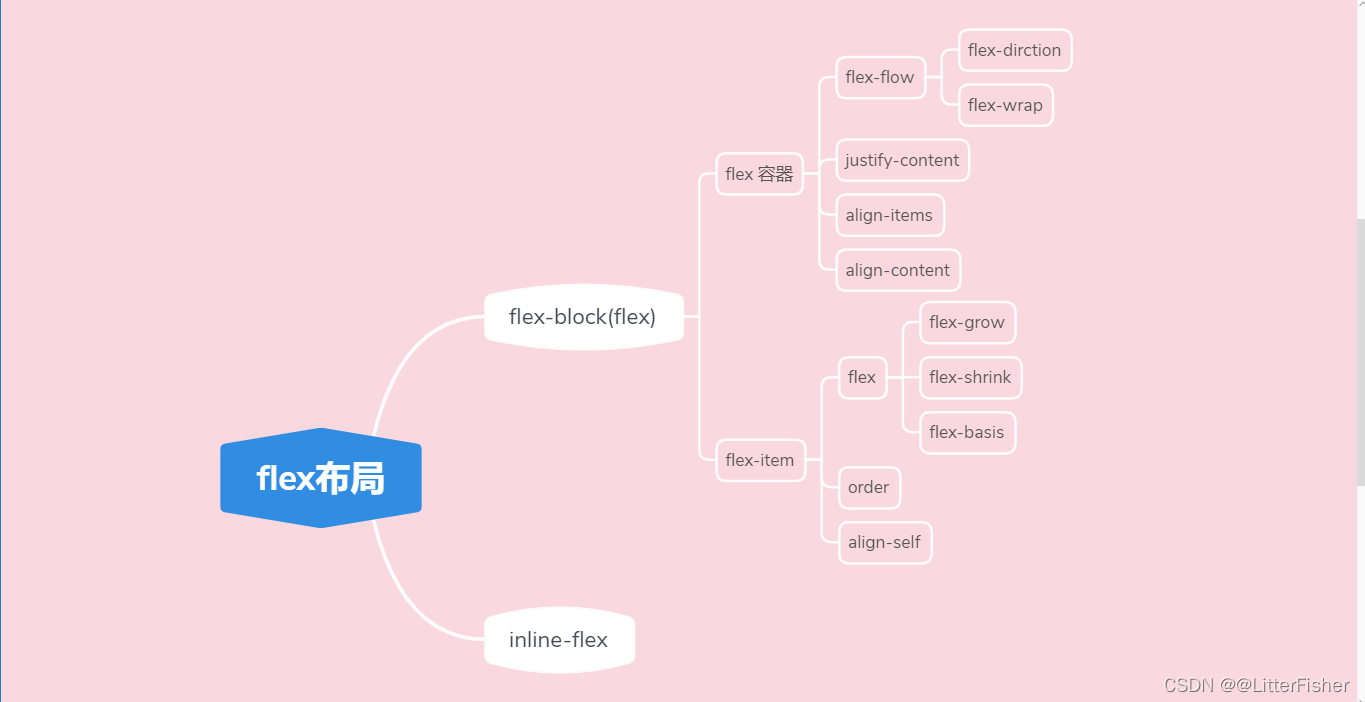
文章目录
前言
flex布局是我最常用最喜欢的布局,看了《css权威指南》记录一下用法
提示:以下是本篇文章正文内容,下面案例可供参考
一、flex要学什么?
一种简单而有效的布局方式,通过下面即可让元素成为弹性容器,子元素成为弹性。
div {
	display:flex;
	display:inline-flex;
	//新语法
	display:flex block;
	display:flex inline;
}
二、弹性容器(父)
1. flex-direction
决定主轴方向
flex-direction: row(默认) | row-reverse | column | column-reverse;
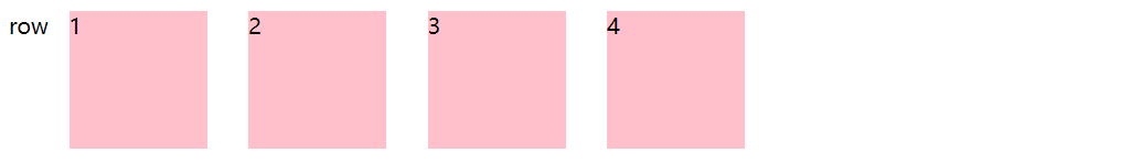
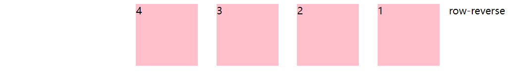
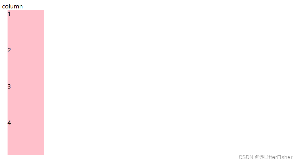
主轴方向确定后垂直主轴的就是垂轴(副轴)
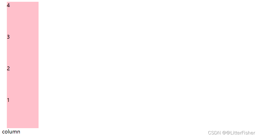
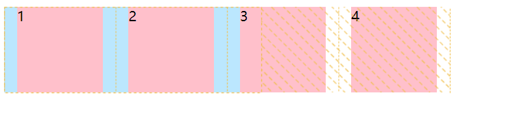
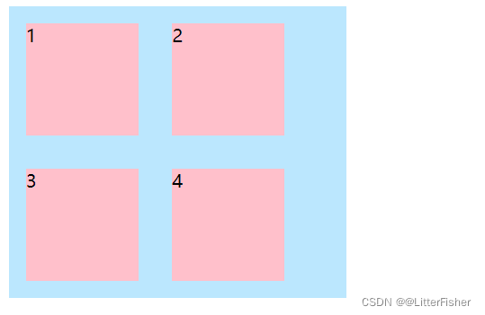
2. flex-wrap
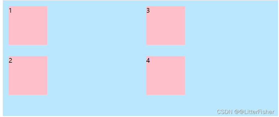
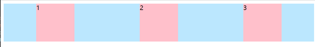
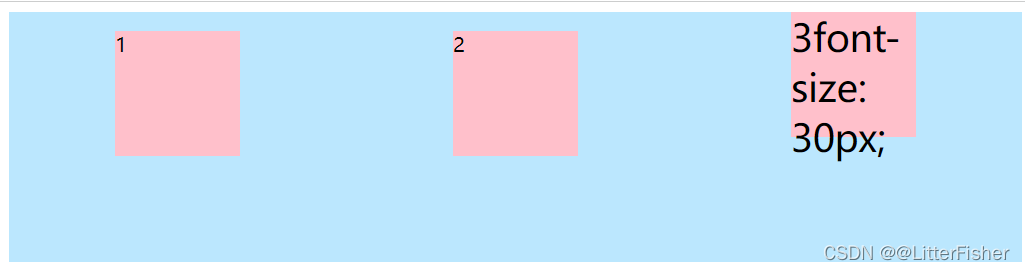
当弹性元素在主轴一行放不下的时候,默认不换行。
flex-wrap:nowrap|wrap|wrap-reverse
nowrap:
<head>
    <style>
        .container {
            display: flex;
            flex-direction: row;
            width: 300px;
            background-color: #bbe7fe;
        }
        .item {
            width: 100px;
            height: 100px;
            background-color: pink;
            margin: 0 15px;
            flex-shrink: 0;
        }
    </style>
</head>
<body>
    <div class="container">
        <div class="item">1</div>
        <div class="item">2</div>
        <div class="item">3</div>
        <div class="item">4</div>
    </div>
</body>
注意这里为了演示设定了flex-shrink: 0; 子元素缩小多少多余空间,防止子元素默认值干扰。
会超出父容器范围。
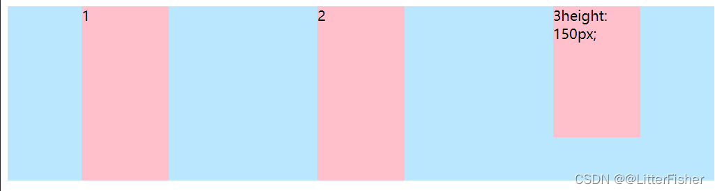
wrap:
wrap-reverse:
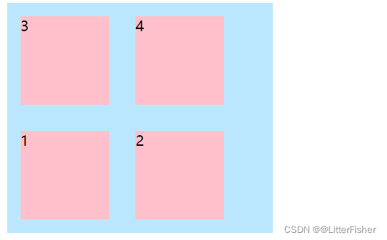
逆时针换行
上面为主轴为row的换行,下面是主轴是column的换行。
3. flex-flow
上面两者的简写
flex-flow: <flex-direction>|| <flex-wrap>;
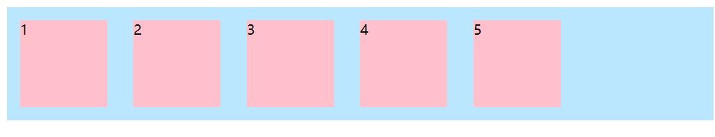
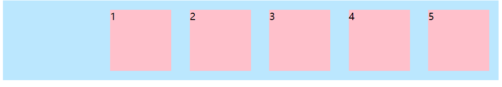
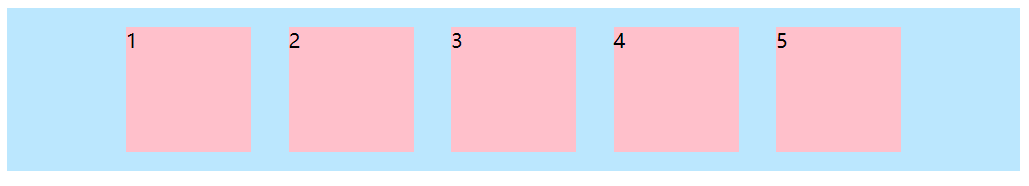
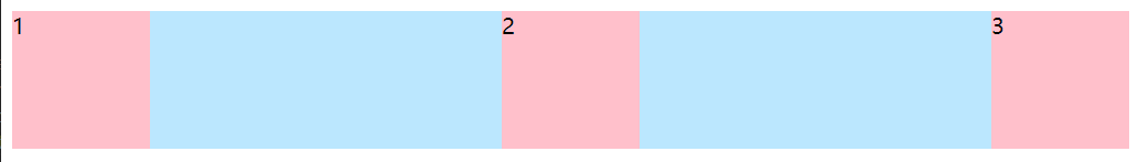
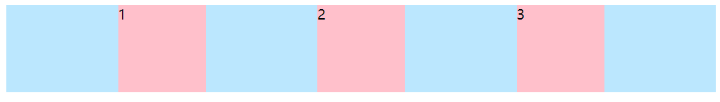
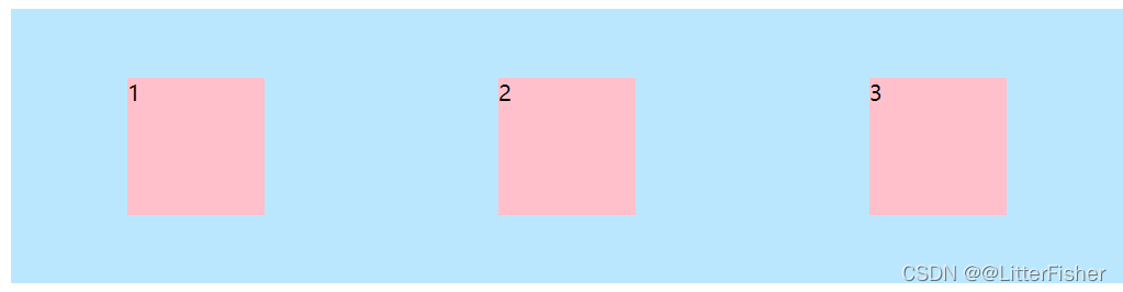
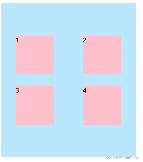
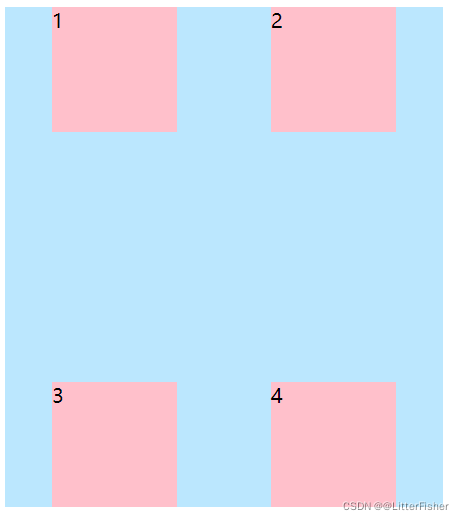
4. justify-content
确定子元素在主轴方向的对齐方式。
justify-content: flex-start(默认) | flex-end | center | space-around | space-between | space-evenly;
flex-start:
flex-end:
center:
space-around:
平分剩余空间,但是注意的是起边与第一个子项的距离是两个子项之间距离的一半,注意与space-evenly的区别。
space-between:
先贴两边,剩余元素平分剩余空间。
space-evenly:
剩余空间平分,但是第一个与起边的距离与两个子项之间的间距相等。
上面为主轴为row的情况,不考虑不够距离的情况。
5. align-items
确定子元素在垂轴方向的对齐方式,注意是一行(或一列),多行的由align-content决定。
align-items: flex-start | flex-end | center | baseline | stretch(默认);
baseline:以字体的基线对齐
stretch:
拉伸,当不设置子元素width height maxwidth这些优先级高的时候,子项会拉伸到垂直一样大小。
仅列出主轴是row的情况。
6. align-content
与justify-content一样,但是它是垂轴的对齐方式,属性与justify-content一致。
center:
space-between:
仅讨论主轴为row的情况。
三、弹性元素(子)
1. order
修改某个子项显示的优先级。
order:integer
默认0,可以为负数。
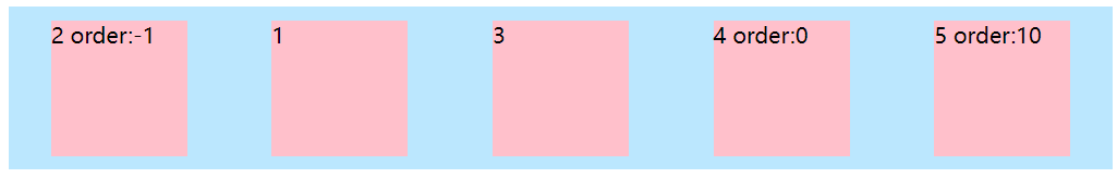
负数>0>正整数
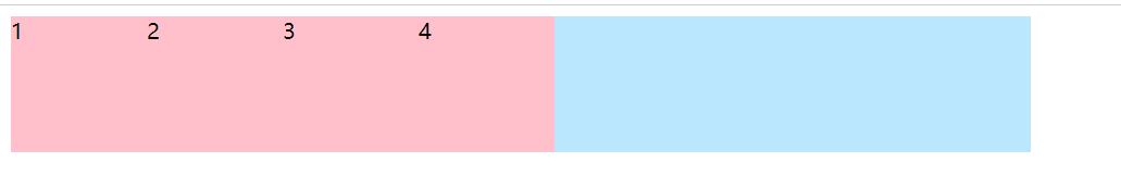
2. flex
一般建议合着写,不建议分开写。
flex-grow
弹性容器(父)有多余空间,多余空间按比例分配子项。
order:integer
默认0,负数无效。
<head>
    <style>
        .container {
            display: flex;
            width: 750px;
            background-color: #bbe7fe;
        }
        .item {
            width: 100px;
            height: 100px;
            background-color: pink;
        }
    </style>
</head>
<body>
    <div class="container">
        <div class="item">1</div>
        <div class="item">2</div>
        <div class="item">3</div>
        <div class="item">4</div>
    </div>
</body>
	<div class="container">
        <div class="item" style="flex-grow:1">1</div>
        <div class="item" style="flex-grow:1">2</div>
        <div class="item" style="flex-grow:1">3</div>
        <div class="item" style="flex-grow:2">4</div>
    </div>
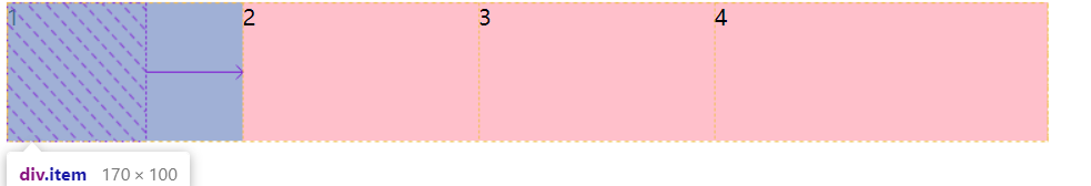
750 - 400 = 350
350/(1+1+1+2) = 70
注意:1.如果有外边距:要减去外边距,再平分空间。
flex-shrink
弹性容器(父)不够空间,多余空间按比例缩小。
order:integer
默认1,负数无效
父300px 子100px:
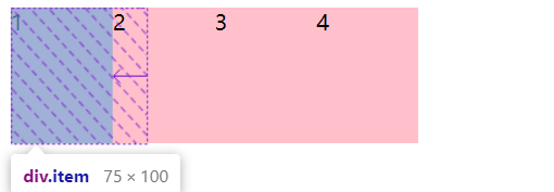
缺少100px:
本来我以为是100px/4 = 25px 然后 100px-25px = 25px ,实际上不是。
当子项宽度不一的时候:
<head>
    <style>
        .container {
            display: flex;
            width: 750px;
            background-color: #bbe7fe;
        }

        .item1 {
            width: 250px;
            height: 100px;
            background-color: pink;
            flex-shrink: 1;
        }

        .item2 {
            width: 500px;
            height: 100px;
            background-color: pink;
            flex-shrink: 1;
        }

        .item3 {
            width: 250px;
            height: 100px;
            background-color: pink;
            flex-shrink: 3;
        }
    </style>
</head>

<body>
    <div class="container">
        <div class="item1">1</div>
        <div class="item2">2</div>
        <div class="item3">3</div>

    </div>
</body>
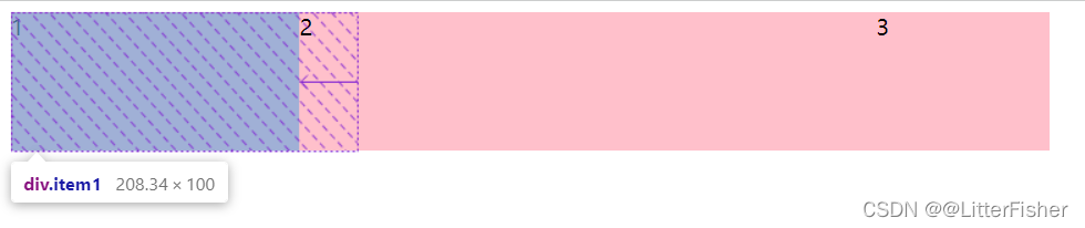
若是以上面的算:
缺少250px / 5 = 50px
那么第一个子项应该是250 - 50 = 200px 显然不是。
实际上是:
250/(250*1 + 500*1 + 250*3) = 16.67%

第一个子项:
250 * 1 * 16.67% = 41.67px
实际大小 = 250 - 41.67 = 208.34px
注意:有些内容是无法缩小的,比如固定大小图片,那么图片这一份不加入比例计算。
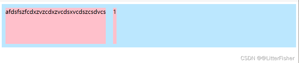
flex-basis
基准:指定了子项在容器主轴方向上的初始大小,优先级高于自身的宽度width。
flex-basis: 0 | <percentage> | auto(默认) | <length> |content(新属性)
content:
(新属性)关键字,弹性基准= 元素内容大小,即等于弹性元素中内容最大的长度。
 <div class="container">
        <div class="item">1</div>
        <div class="item" style="order:-1">afdsfszfcdxzvzcdxzvcdsxvcdszcsdvcs</div>
    </div>
        <style>
        .container {
            display: flex;
            background-color: #bbe7fe;
        }

        .item {
            width: 100px;
            height: 100px;
            background-color: pink;
            flex-basis: content;
            margin: 10px;
        }
    </style>
auto:
- 子项没设置width/height,元素本身的大小。
- 设置了width ,就是width。
- width = auto,回落到content。
flex简写的意义
flex: none | [ <'flex-grow'><'flex-shrink'>? || <'flex-basis'>]
默认:flex:0 1 auto
他有几个简写:
flex:initial=flex:0 1 auto,也就是说不够空间会缩小。flex:auto=flex:1 1 auto。flex:none=flex: 0 0 auto,禁止变形。flex:number=flex: number 0 0,任何大于0的数字都能增大包括0.1。
3. align-self
单个子项覆盖align-items属性值。
align-items: auto | flex-start | flex-end | center | baseline | stretch(默认);
总结
多练就行


 扫一扫
扫一扫


 131
131

 被折叠的 条评论
为什么被折叠?
被折叠的 条评论
为什么被折叠?
 到【灌水乐园】发言


