echarts方形柱状图

在这里插入图片描述

import * as echarts from 'echarts' // 注:该项目运用5.0版本以上 原先import echarts from 'echarts'不适用
function goverChartConfig() {
  const dom = 800
  const barWidth = dom / 20
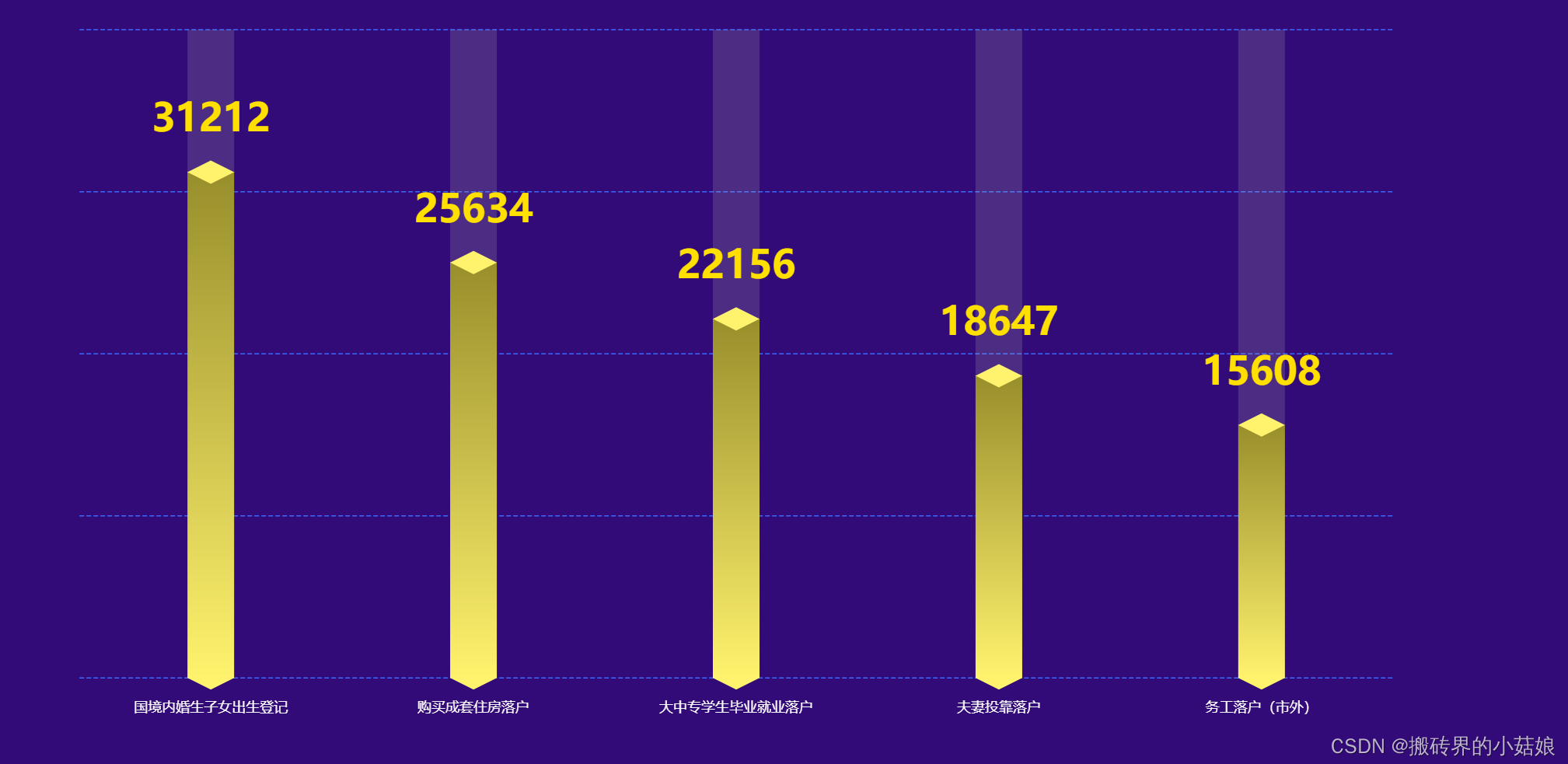
  const xAxisData = ['国境内婚生子女出生登记', '购买成套住房落户', '大中专学生毕业就业落户', '夫妻投靠落户', '务工落户(市外)']
  const yAxisData = [31212, 25634, 22156, 18647, 15608]
  const option = {
    // backgroundColor: '#010d3a',
    // 提示框
    // tooltip: {
    //   trigger: 'axis',
    //   formatter: '{b} : {c}',
    //   axisPointer: { // 坐标轴指示器,坐标轴触发有效
    //     type: 'shadow' // 默认为直线,可选为:'line' | 'shadow'
    //   }
    // },
    // 区域位置
    grid: {
      left: '10%',
      right: '10%',
      top: '10%',
      bottom: '10%'
    },
    // X轴
    xAxis: [{
      data: xAxisData,
      type: 'category',
      show: true,
      axisLine: {
        show: false,
        lineStyle: {
          color: '#ffffff'
          // shadowColor: 'rgba(255,255,255,1)'
          // shadowOffsetX: '20'
        }
        // symbol: ['none', 'arrow'],
        // symbolOffset: [0, 25]
      },
      splitLine: {
        show: false
      },
      axisTick: {
        show: false
      },
      axisLabel: {
        margin: 20
        // fontSize: 20
      }
    }],
    yAxis: {
      show: true,
      splitNumber: 4,
      axisLine: {
        show: false
      },
      splitLine: {
        show: true,
        lineStyle: {
          type: 'dashed',
          color: '#3B69FF'
        }
      },
      axisLabel: {
        show: false
      }
    },
    series: [
      { // 数据颜色
        //name: '日付费用户数',
        type: 'bar',
        barWidth: barWidth,
        showBackground: true,
        itemStyle: {
          normal: {
            color: new echarts.graphic.LinearGradient(
              0, 0, 0, 1,
              [
                { offset: 0, color: '#988F2C' },
                { offset: 1, color: '#FFF26D' }
              ]
            )
          }
        },
        label: {
          show: true,
          position: [barWidth / 2, -(barWidth + 20)],
          // position: 'top',
          color: '#FFE000 ',
          fontSize: 33,
          fontStyle: 'bold',
          align: 'center'
        },
        data: yAxisData
      },
      { // 底
        z: 2,
        type: 'pictorialBar',
        data: yAxisData,
        symbol: 'diamond',
        symbolOffset: [0, '50%'],
        symbolSize: [barWidth, barWidth * 0.5],
        itemStyle: {
          normal: {
            color: '#FFF26D'
          }
        }
      },
      { // 顶
        z: 3,
        type: 'pictorialBar',
        symbolPosition: 'end',
        data: yAxisData,
        symbol: 'diamond',
        symbolOffset: [0, '-50%'],
        symbolSize: [barWidth, barWidth * 0.5],
        itemStyle: {
          normal: {
            borderWidth: 0,
            color: '#FFF26D'
          }
        }
      }
    ]
  }
  return option
}
// 注 给高度宽度
<div id="goverEchart" class="efficientEchart"></div>
import * as echarts from 'echarts'
import { efficientChartConfig, trafficChartConfig, goverChartConfig } from '../config'
mounted() {
  this.paintGoverEchart()
      window.addEventListener('resize', () => {
        this.goverEchart.resize()
    })
},
methods: {
    paintGoverEchart() {
      this.goverEchart = echarts.init(document.getElementById('goverEchart'))
      this.goverEchart.setOption({}, true)
      const goverConfig = goverChartConfig()
      this.goverEchart.setOption(goverConfig, true)
    }
}
### ECharts 中配置和自定义柱状图 #### 初始化 ECharts 实例对象 要在页面中创建一个图表,首先需要初始化 ECharts 实例对象。这通常是在 DOM 文档加载完成后执行的操作。 ```javascript const myChart = echarts.init(document.querySelector('#main')); // 创建并返回一个新的 echarts 实例[^1] ``` #### 设置不同颜色的柱子 对于希望每根柱子具有不同颜色的情况,在 `series` 配置项中的 `itemStyle` 下指定特定的颜色数组即可实现这一效果。 ```javascript option = { series: [{ type: 'bar', data: [ {value: 30, itemStyle: {color: '#FF7F50'}}, {value: 40, itemStyle: {color: '#87CEFA'}}, {value: 50, itemStyle: {color: '#DA70D6'}}, {value: 60, itemStyle: {color: '#32CD32'}} ] }] }; myChart.setOption(option); ``` #### 自定义 Legend 图标样式 为了让 legend 显示并且其图标呈现为正方形而不是默认圆形,可以在 `legend` 和 `series` 的配置里调整相应属性: ```javascript option = { legend: { icon: 'rect', // 将图例标记设为矩形 data: ['类别A','类别B','类别C','类别D'] }, series: [...] }; ``` #### 使用图片填充柱体 如果打算用图像作为柱条背景,则可以通过如下方式引入外部资源到项目文件夹内,并将其应用至数据序列之中。 ```javascript let ImagePath = new Image(); ImagePath.src = 'path/to/your/image.png'; option = { series: [{ name: '', type: 'bar', barWidth : '50%', data:[ {value: Math.round(Math.random()*100), itemStyle:{normal:{color:{image: ImagePath}}}}, ... ], }] } ``` #### 定制化标签显示内容 当有特殊需求要改变每个柱子顶部所展现的文字时,可以利用 `label.formatter` 函数来自由控制输出格式。 ```javascript option = { series: [{ type: 'bar', label: { show: true, position: 'top', formatter: function (params) { return "自定义内容:" + params.value; } }, data:[...] }] }; ``` 以上就是针对如何在 ECharts 中配置和自定义柱状图的一些基本指导[^2][^3][^4]。
评论
添加红包

请填写红包祝福语或标题

红包个数最小为10个

红包金额最低5元

当前余额3.43前往充值 >
需支付:10.00
成就一亿技术人!
领取后你会自动成为博主和红包主的粉丝 规则
hope_wisdom
发出的红包
实付
使用余额支付
点击重新获取
扫码支付
钱包余额 0

抵扣说明:

1.余额是钱包充值的虚拟货币,按照1:1的比例进行支付金额的抵扣。
2.余额无法直接购买下载,可以购买VIP、付费专栏及课程。

余额充值