


最近学习跳槽面试,发现学习知识总是会遗忘的。不如总结记录下来,方便回忆。
flex布局定义
flex布局又叫弹性布局,伸缩布局,通过给父容器设置dispaly:flex属性,子元素实现弹性布局。父容器实现弹性布局后,子元素的一些属性也会消失,如子元素的float,clear,vertical-align属性
(学习前要了解,flex布局有主轴和副轴的概念,默认横向为主轴,纵向为副轴。)
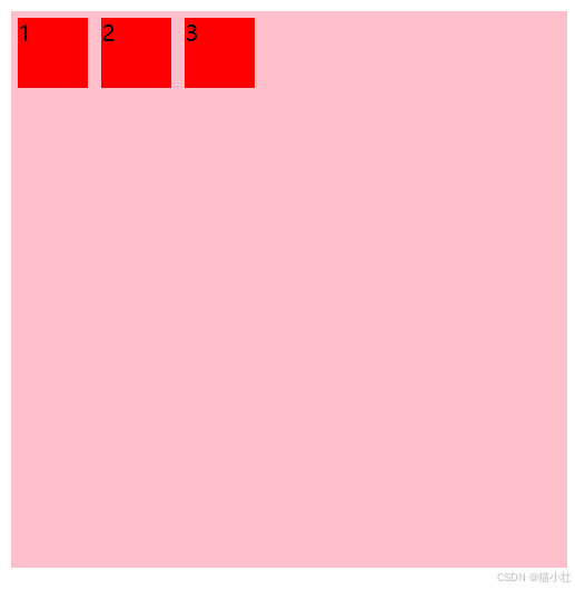
设置flex display:flex
设置父元素display:flex后,子元素沿主轴排列
<style>
    div {
        display: flex;
        background-color: pink;
        width: 400px;
        height: 400px;
    }
    div span {
        background-color: red;
        margin: 5px 5px;
        width:50px;
        height: 50px;
    }
</style>
<body>
    <div>
        <span>1</span>
        <span>2</span>
        <span>3</span>
    </div>
</body>
设置主轴方向 flex-direction
flex-direction:row(colum)
row:横向排列 row-reverse:横向反向排列(从右至左)
colum:纵向排列 colum-reverse:纵向排列(从下至上)设置主轴方向
<style>
div {
display: flex;
/* flex父元素属性设置 1.flex-direction 设置主轴方向 排列方式,默认为row横向排列 */
/* */
flex-direction: row;
/* flex-direction: row-reverse;
flex-direction: column;
flex-direction:colum-reverse; */
background-color: pink;
width: 400px;
height: 400px;
}
div span {
background-color: red;
margin: 5px 5px;
width:50px;
height: 50px;
}
</style>
<body>
<div>
<span>1</span>
<span>2</span>
<span>3</span>
</div>
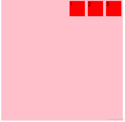
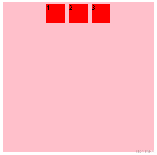
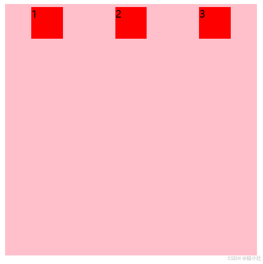
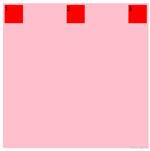
</body>设置主轴排列方式 justify-content
justify-content:flex-start|flex-end|center|space-around|space-between
当主轴是row时,代码效果如下
justify-content:flex-start
<style>
    div {
        display: flex;
        /* flex父元素属性设置 1.flex-direction 设置主轴方向 排列方式,默认为row横向排列 */
        /*  */
        flex-direction: row;
        /* flex-direction: row-reverse;
        flex-direction: column;
        flex-direction:colum-reverse; */
        justify-content: flex-start;
        /* justify-content: flex-end; */
        /* justify-content: center;
        justify-content: space-around;
        justify-content: space-between; */
        background-color: pink;
        width: 400px;
        height: 400px;
    }
    div span {
        background-color: red;
        margin: 5px 5px;
        width:50px;
        height: 50px;
    }
</style>
<body>
    <div>
        <span>1</span>
        <span>2</span>
        <span>3</span>
    </div>
</body>
效果如下
justify-content:flex-end
justify-content:center
justify-content:space-around
justify-content:space-between
两端对齐后居中
设置副轴排列方式 align-item
align-item(单行) align-content(副轴换行时对齐方式)
设置换行 flex-wrap
flex-wrap:no-wrap|wrap(默认不换行)
如下图,当子元素宽度总和超过父容器宽度时,子元素宽度会沿着父容器方向被压缩。不足100px
<!DOCTYPE html>
<html lang="en">
<head>
    <meta charset="UTF-8">
    <meta name="viewport" content="width=device-width, initial-scale=1.0">
    <title>Document</title>
</head>
<style>
    div {
        display: flex;
        /* flex父元素属性设置 1.flex-direction 设置主轴方向 排列方式,默认为row横向排列 */
        /*  */
        flex-direction: row;
        /* flex-direction: row-reverse;
        flex-direction: column;
        flex-direction:colum-reverse; */
        justify-content: flex-start;
        /* justify-content: flex-end; */
         /* justify-content: center; */
        /* justify-content: space-around; */
        /* justify-content: space-between;  */
        background-color: pink;
        width: 400px;
        height: 400px;
    }
    div span {
        background-color: red;
        margin: 5px 5px;
        height: 50px;
        width: 100px;
    }
</style>
<body>
    <div>
        <span>1</span>
        <span>2</span>
        <span>3</span>
        <span>4</span>
        <span>5</span>
        <span>6</span>
    </div>
</body>
</html>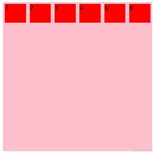
设置flex-wrap:wrap后效果
<!DOCTYPE html>
<html lang="en">
<head>
    <meta charset="UTF-8">
    <meta name="viewport" content="width=device-width, initial-scale=1.0">
    <title>Document</title>
</head>
<style>
    div {
        display: flex;
        /* flex父元素属性设置 1.flex-direction 设置主轴方向 排列方式,默认为row横向排列 */
        /*  */
        flex-direction: row;
        /* flex-direction: row-reverse;
        flex-direction: column;
        flex-direction:colum-reverse; */
        justify-content: flex-start;
        /* justify-content: flex-end; */
         /* justify-content: center; */
        /* justify-content: space-around; */
        /* justify-content: space-between;  */
        background-color: pink;
        width: 400px;
        height: 400px;
        flex-wrap:wrap
    }
    div span {
        background-color: red;
        margin: 5px 5px;
        height: 50px;
        width: 100px;
    }
</style>
<body>
    <div>
        <span>1</span>
        <span>2</span>
        <span>3</span>
        <span>4</span>
        <span>5</span>
        <span>6</span>
    </div>
</body>
</html>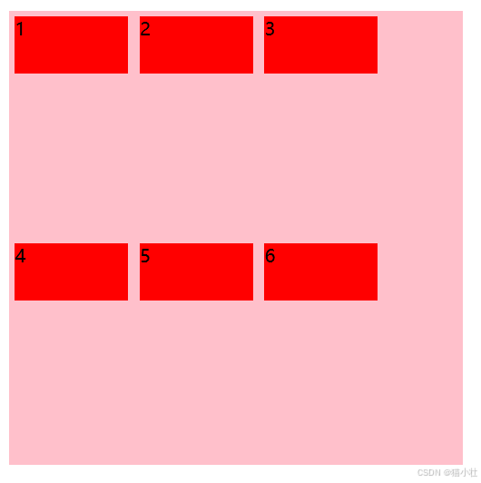
flex-flow属性
flex-flow是flex-direction属性和flex-warp的组合写法。如flex-flow:row warp;即可实现行排列和换行操作。
子元素属性
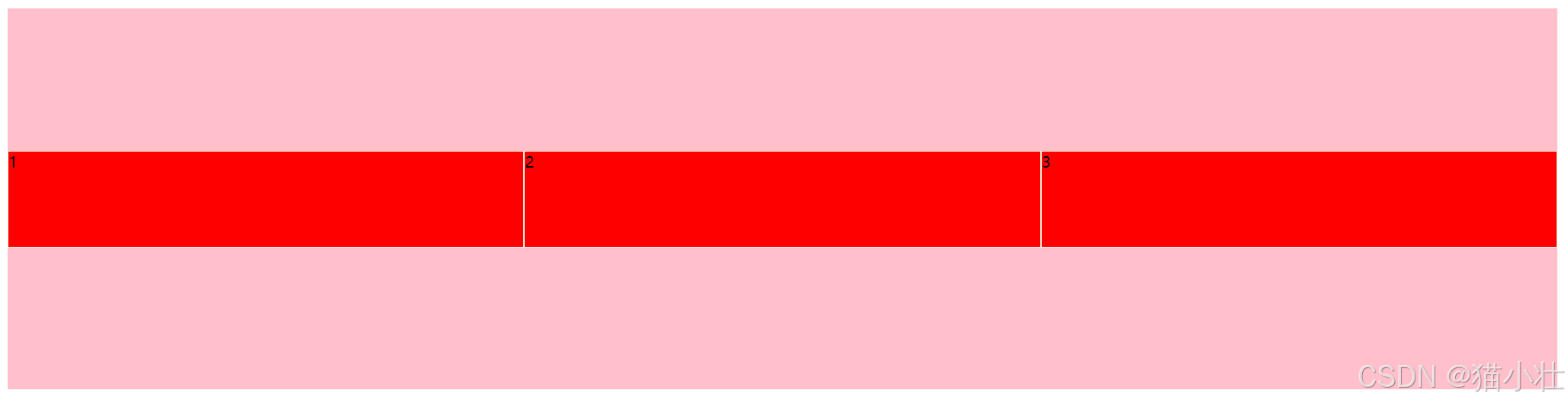
flex属性
设置子盒子占用父盒子剩余空间比例.
如下图,设置父盒子宽度为80%,设置1 3 子容器宽度固定,给子元素2设置flex:1属性后。即可分配父盒子剩余空间,且会因为屏幕大小变化而自适应。
<!-- 设置主轴上元素排列方式 -->
<!DOCTYPE html>
<html lang="en">
<head>
    <meta charset="UTF-8">
    <meta name="viewport" content="width=device-width, initial-scale=1.0">
    <title>Document</title>
</head>
<style>
    /* 元素跟着主轴走 */
    /* flex父元素属性设置 1.flex-direction 设置主轴方向 排列方式 */
    div {
        display: flex;
        /* 设置主轴方向,竖向排列,竖向相反排列 */
        flex-direction: row;
        /* flex-direction: column; */
        /* flex-direction: column-reverse;
        flex-direction: row;
        flex-direction: row-reverse; */
        /* justify-content: center; */
        /* justify-content: flex-end; */
        /* justify-content: left; */
        /* justify-content: space-around; */
        justify-content: space-between;
        align-items: center;
        align-content: space-between;
        /* align-items: stretch; */
        /* 是否自动换行 */
        flex-wrap: wrap;

        background-color: pink;
        width: 80%;
        height: 400px;
    }
    div span:nth-child(1) {
        background-color: red;
        /* flex: 1; */
        margin: 5px 5px;
        height: 50px;
        width: 50px;
    }
    div span:nth-child(2) {
        background-color: red;
        flex: 1;
    }
    div span:nth-child(3) {
        background-color: red;
        /* flex: 1; */
        margin: 5px 5px;
        height: 50px;
        width: 50px;
    }
</style>
<body>
    <div>
        <span>1</span>
        <span>2</span>
        <span>3</span>
    </div>
</body>
</html>
当不设置子元素宽度,设置flex:1时,即可实现子元素平均分配父元素空间操作。
<!-- 设置主轴上元素排列方式 -->
<!DOCTYPE html>
<html lang="en">
<head>
    <meta charset="UTF-8">
    <meta name="viewport" content="width=device-width, initial-scale=1.0">
    <title>Document</title>
</head>
<style>
    /* 元素跟着主轴走 */
    /* flex父元素属性设置 1.flex-direction 设置主轴方向 排列方式 */
    div {
        display: flex;
        flex-direction: row;
        align-items: center;
        flex-wrap: wrap;
        background-color: pink;
        width: 80%;
        height: 400px;
    }
    div span{
        background-color: red;
        flex: 1;
        height: 100px;
        border: 1px solid beige;
    }

</style>
<body>
    <div>
        <span>1</span>
        <span>2</span>
        <span>3</span>
    </div>
</body>
</html>
效果如下:
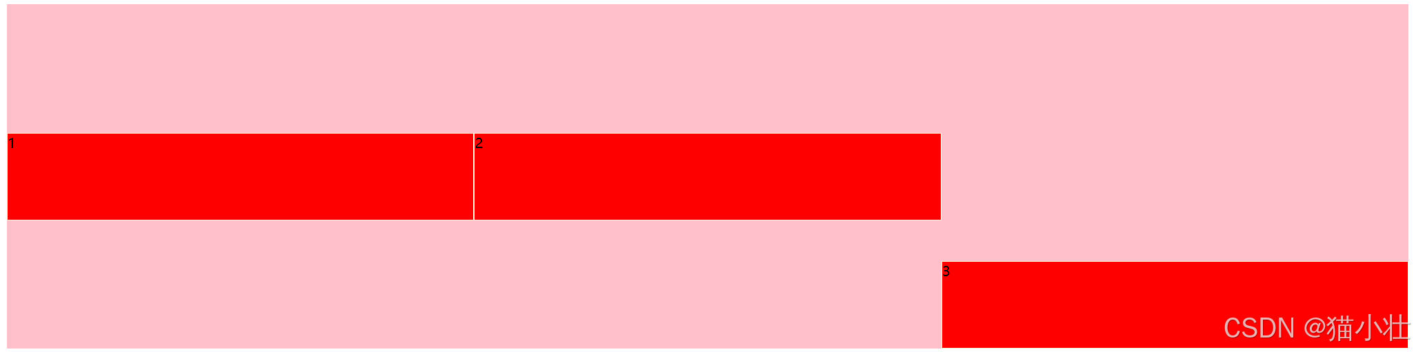
align-self属性
设置子元素本身侧轴排列方式
<!-- 设置主轴上元素排列方式 -->
<!DOCTYPE html>
<html lang="en">
<head>
    <meta charset="UTF-8">
    <meta name="viewport" content="width=device-width, initial-scale=1.0">
    <title>Document</title>
</head>
<style>
    /* 元素跟着主轴走 */
    /* flex父元素属性设置 1.flex-direction 设置主轴方向 排列方式 */
    div {
        display: flex;
        flex-direction: row;
        align-items: center;
        flex-wrap: wrap;
        background-color: pink;
        width: 80%;
        height: 400px;
    }
    div span{
        background-color: red;
        flex: 1;
        height: 100px;
        border: 1px solid beige;
    }
    div span:nth-child(3){
        align-self: flex-end;
    }

</style>
<body>
    <div>
        <span>1</span>
        <span>2</span>
        <span>3</span>
    </div>
</body>
</html>
效果如下:
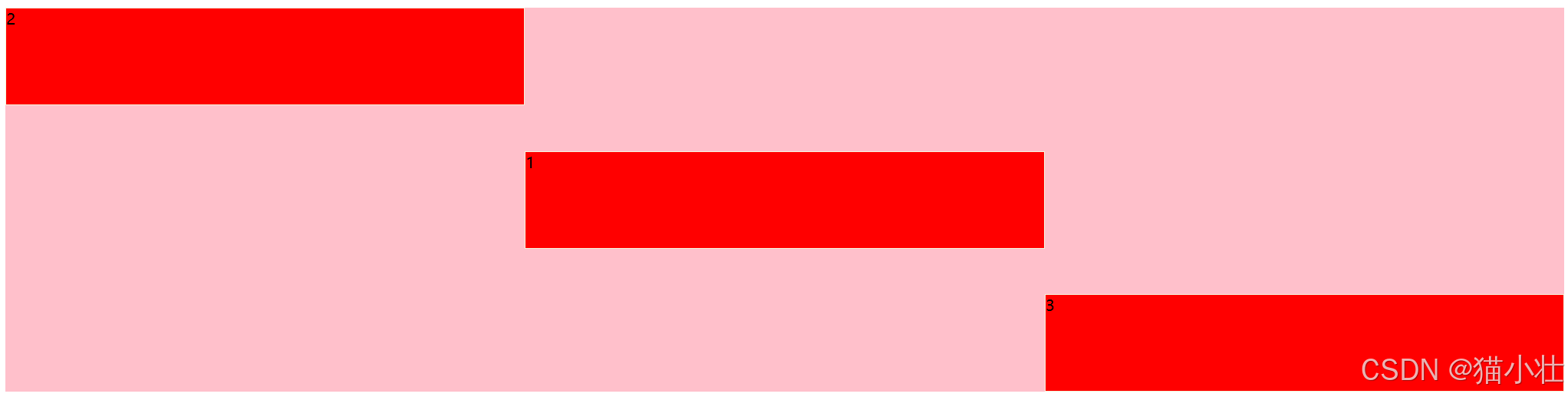
order属性
设置子元素顺序,数值越小,越靠前,默认为0;
<!-- 设置主轴上元素排列方式 -->
<!DOCTYPE html>
<html lang="en">
<head>
    <meta charset="UTF-8">
    <meta name="viewport" content="width=device-width, initial-scale=1.0">
    <title>Document</title>
</head>
<style>
    /* 元素跟着主轴走 */
    /* flex父元素属性设置 1.flex-direction 设置主轴方向 排列方式 */
    div {
        display: flex;
        flex-direction: row;
        align-items: center;
        flex-wrap: wrap;
        background-color: pink;
        width: 80%;
        height: 400px;
    }
    div span{
        background-color: red;
        flex: 1;
        height: 100px;
        border: 1px solid beige;
    }
    div span:nth-child(2){
        align-self: flex-start;
        order: -1;
    }
    div span:nth-child(3){
        align-self: flex-end;
    }

</style>
<body>
    <div>
        <span>1</span>
        <span>2</span>
        <span>3</span>
    </div>
</body>
</html>
效果如下:
总结
以上就是本次学习过程中常用的flex布局属性,后续会补充。
学习链接:【黑马!真的很详细!】CSS3-flex布局(flex布局的单个知识点忘记也可以复习)_哔哩哔哩_bilibili


 扫一扫
扫一扫


 230
230

 被折叠的 条评论
为什么被折叠?
被折叠的 条评论
为什么被折叠?
 到【灌水乐园】发言


