


Theme 主题设置
One Line Introduction
在项目常量包装层,theme负责样式(color,size,font)这些以数字表达的常量进行声明
怎么封装?
const colors = {
  accent: "#F3534A",
  primary: "#0AC4BA",
  secondary: "#2BDA8E",
  tertiary: "#FFE358",
  black: "#323643",
  white: "#FFFFFF",
  gray: "#9DA3B4",
  gray2: "#C5CCD6"
};

const sizes = {
  // global sizes
  base: 16,
  font: 14,
  radius: 6,
  padding: 25,

  // font sizes
  h1: 26,
  h2: 20,
  h3: 18,
  title: 18,
  header: 16,
  body: 14,
  caption: 12
};

const fonts = {
  h1: {
    fontSize: sizes.h1
  },
  h2: {
    fontSize: sizes.h2
  },
  h3: {
    fontSize: sizes.h3
  },
  header: {
    fontSize: sizes.header
  },
  title: {
    fontSize: sizes.title
  },
  body: {
    fontSize: sizes.body
  },
  caption: {
    fontSize: sizes.caption
  }
};
Block 样式预包装(用于优化RN的原生组件样式)
One Line Introduction
Block就是个组件块,用于装具体小组件的,没有size
Block提供可选的animated动画view样式选项的包装处理后的呈现(基于React Native的stylesheet view animated)。
怎么封装?
创建样式表
通过StyleSheet.create
- styleOption
- attributeName : attributeValue
//example
const styles:IProps = StyleSheet.create({white: { backgroundColor: theme.colors.white },});
接收prop样式选项
通过&&提供props中的style选项,查找后return之前的样式表,并支持样式rewrite
// "&&" if(options){datas}
    const blockStyles = [
      styles.block,
      flex && { flex },
      flex === false && { flex: 0 }, // reset / disable flex
      row && styles.row,
      column && styles.column,
      center && styles.center,
      middle && styles.middle,
      left && styles.left,
      right && styles.right,
      top && styles.top,
      bottom && styles.bottom,
      margin && { ...this.handleMargins() },
      padding && { ...this.handlePaddings() },
      card && styles.card,
      shadow && styles.shadow,
      space && { justifyContent: `space-${space}` },
      wrap && { flexWrap: "wrap" },
      color && styles[color], // predefined styles colors for backgroundColor
      color && !styles[color] && { backgroundColor: color }, // custom backgroundColor
      style // rewrite predefined styles
    ];
复杂的样式处理
padding/margin 要支持计算
所以通过调用handle函数处理props的padding/margin运算、参数并返回给style选项
- 提供两个参数类型处理
- 1个number:四个方向直接返回输入值
- 1个含有number的对象:按照CSS传入参数分类讨论
public handleMargins() {
    const { margin } = this.props;
    if (typeof margin === "number") {
      return {
        marginTop: margin,
        marginRight: margin,
        marginBottom: margin,
        marginLeft: margin
      };
    }

    if (typeof margin === "object") {
      const marginSize = Object.keys(margin).length;
      switch (marginSize) {
        case 1:
          return {
            marginTop: margin[0],
            marginRight: margin[0],
            marginBottom: margin[0],
            marginLeft: margin[0]
          };
        case 2:
          return {
            marginTop: margin[0],
            marginRight: margin[1],
            marginBottom: margin[0],
            marginLeft: margin[1]
          };
        case 3:
          return {
            marginTop: margin[0],
            marginRight: margin[1],
            marginBottom: margin[2],
            marginLeft: margin[1]
          };
        default:
          return {
            marginTop: margin[0],
            marginRight: margin[1],
            marginBottom: margin[2],
            marginLeft: margin[3]
          };
      }
    }
  }
const blockStyles = [
	margin && { ...this.handleMargins() },
	padding && { ...this.handlePaddings() },
]
Badge 图标盒子
One Line Introduction
Badge 里面会按封装的样式装一个图标, 基于 Block 增加特有属性进行封装
特有属性
图标盒子的特有属性
- height width borderRadius
- 支持 size 的 rewrite :通过 StyleSheet.flatten
// Flattens an array of style objects, into one aggregated style object
const badgeStyles = StyleSheet.flatten([
  styles.badge,
  size && {
    height: size,
    width: size,
    borderRadius: size
  },// rewrite predefined size
  style// rewrite predefine styles
]);
Button 按钮
One Line Introduction
独立的按钮样式的组件基于 TouchableOpacity (可按压组件)和 expo-linear-gradient 的 LinearGradient(渐变组件)
TouchableOpacity
LinearGradient 相关属性本项目几乎涵盖
怎么封装?
按钮样式特有属性如下
//index must be string or number so must use interface to rule it
const styles:IProps = StyleSheet.create({
  button: {
    borderRadius: theme.sizes.radius,
    height: theme.sizes.base * 3,
    justifyContent: "center",
    marginVertical: theme.sizes.padding / 3
  },
  shadow: {
    shadowColor: theme.colors.black,
    shadowOffset: { width: 0, height: 2 },
    shadowOpacity: 0.1,
    shadowRadius: 10
  },
  accent: { backgroundColor: theme.colors.accent },
  primary: { backgroundColor: theme.colors.primary },
  secondary: { backgroundColor: theme.colors.secondary },
  tertiary: { backgroundColor: theme.colors.tertiary },
  black: { backgroundColor: theme.colors.black },
  white: { backgroundColor: theme.colors.white },
  gray: { backgroundColor: theme.colors.gray },
  gray2: { backgroundColor: theme.colors.gray2 },
});
button 样式为必选
const buttonStyles = [
      styles.button,
      shadow && styles.shadow,
      color && styles[color],// predefined styles colors for backgroundColor
      color && !styles[color] && { backgroundColor: color }, // custom backgroundColor
      style
    ];
支持gradient渐变渲染
if (gradient) {
      return (
        <TouchableOpacity
          style={buttonStyles}
          activeOpacity={opacity}
          {...props}
        >
          <LinearGradient
            start={start}
            end={end}
            locations={locations}
            style={buttonStyles}
            colors={[startColor, endColor]}
          >
            {children}
          </LinearGradient>
        </TouchableOpacity>
      );
    }

    return (
      <TouchableOpacity
        style={buttonStyles}
        activeOpacity={opacity || 0.8}
        {...props}
      >
        {children}
      </TouchableOpacity>
    );
   }
Card 卡片块
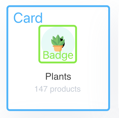
One Line Introduction
对 Block 进行进一步封装,具有 borderRadius padding marginBottom ,无size
特有属性
只有位置,无 height width
export const styles:IProps = StyleSheet.create({
  card: {
    borderRadius: theme.sizes.radius,
    padding: theme.sizes.base + 4,
    marginBottom: theme.sizes.base
  }
});
Divider 隔板块
One Line Introduction

隔板实现方式:无高度但有border Bottom Width
export const styles:IProps = StyleSheet.create({
  divider: {
    height: 0,
    margin: theme.sizes.base * 2,
    borderBottomColor: theme.colors.gray2,
    borderBottomWidth: StyleSheet.hairlineWidth
  }
});
用block包装即可
Input 输入框块
One Line Introduction
提供输入Label、TextInput、自定义RightLabel、无RightLabel有Right就渲染Right
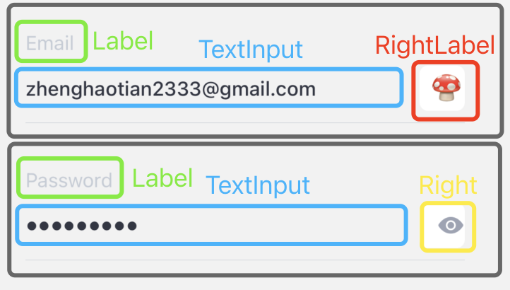
- 判断Text Input的type
const inputType = email
      ? "email-address"
      : number
      ? "numeric"
      : phone
      ? "phone-pad"
      : "default";
- right toggle(rightLabel就直接
rightLabel ? rightLabel : null)
renderToggle() {
    const { secure, rightLabel } = this.props;
    const { toggleSecure } = this.state;

    if (!secure) return null;

    return (
      <Button
        style={styles.toggle}
        onPress={() => this.setState({ toggleSecure: !toggleSecure })}
      >
        {rightLabel ? (
          rightLabel
        ) : (
          <Icon.Ionicons
            color={theme.colors.gray}
            size={theme.sizes.font * 1.35}
            name={!toggleSecure ? "md-eye" : "md-eye-off"}
          />
        )}
      </Button>
    );
  }
特有属性
const styles = StyleSheet.create({
  input: {
    borderWidth: StyleSheet.hairlineWidth,
    borderColor: theme.colors.black,
    borderRadius: theme.sizes.radius,
    fontSize: theme.sizes.font,
    fontWeight: "500",
    color: theme.colors.black,
    height: theme.sizes.base * 3
  },
  toggle: {
    position: "absolute",
    alignItems: "flex-end",
    width: theme.sizes.base * 2,
    height: theme.sizes.base * 2,
    top: theme.sizes.base,
    right: 0
  }
});
Switch 开关组件
One Line Introduction
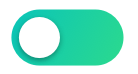
对 RN 的 Switch 重新包装,设置了默认开和关背景颜色
- 这是一个纯展示的组件,React.PureComponent。
- pureComponent进行的是浅比较,也就是说如果是引用数据类型的数据,只会比较不是同一个地址,而不会比较这个地址里面的数据是否一致。当组件更新时,如果组件的props或者state都没有改变,render函数就不会触发。省去虚拟DOM的生成和对比过程,达到提升性能的目的。具体原因是因为react自动帮我们做了一层浅比较
- 在我们的开关中,这样主要提升性能。
Text 文字
同样的方式:
- StyleSheet.create创建样式表
- 接收props的选项
- 查找props的选项
- 返回
<Text style={textStyles} {...props}> {children} </Text>


 扫一扫
扫一扫


 被折叠的 条评论
为什么被折叠?
被折叠的 条评论
为什么被折叠?
 到【灌水乐园】发言


