


目录标题
1.散点图绘图思路
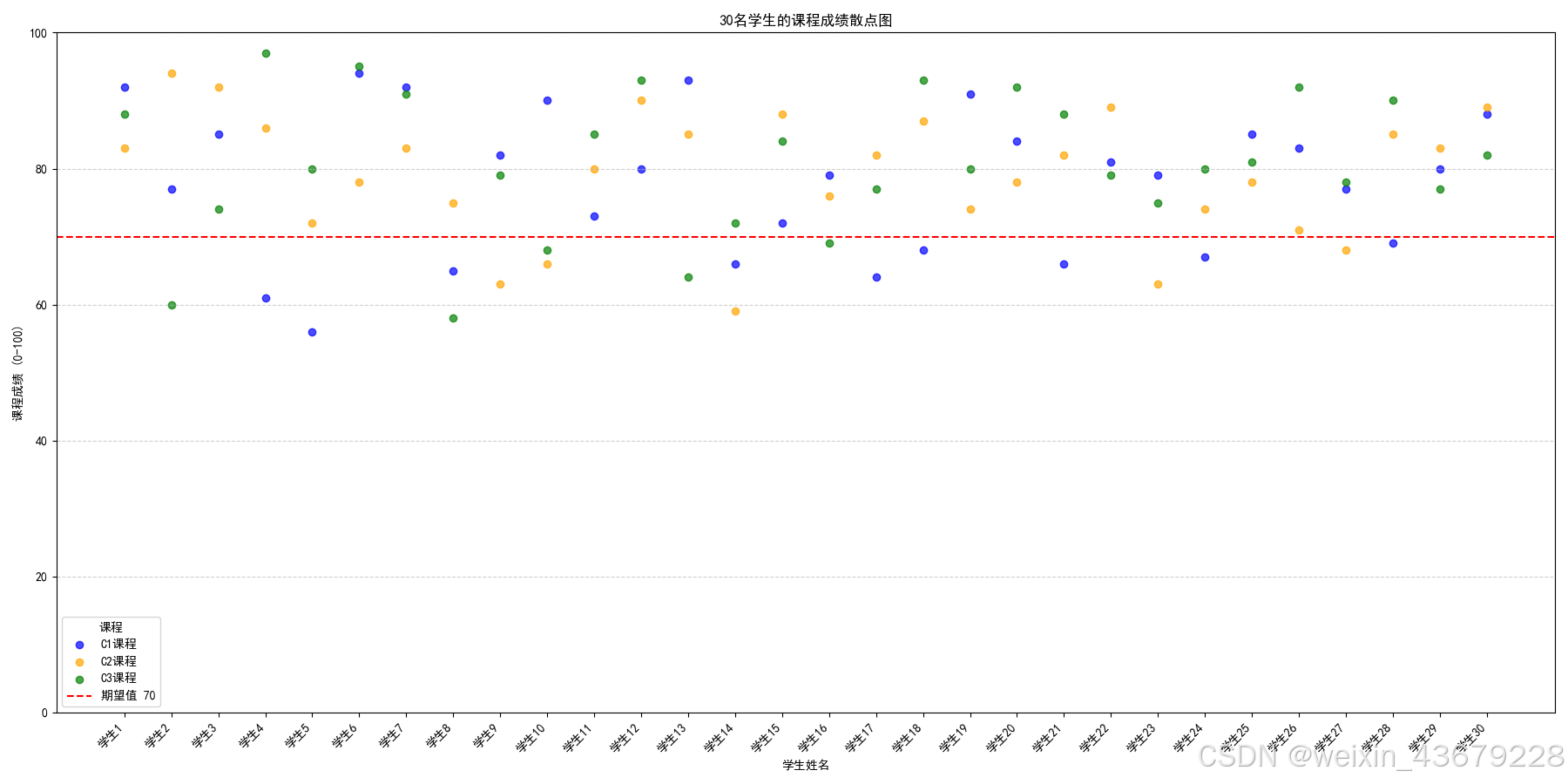
- 通过散点图可视化展示不同学生在三门课程中的成绩。以下是绘制散点图的主要步骤:
1.1 数据准备
- 数据包括30个学生的姓名和三门课程的成绩(C1、C2、C3)。
| 姓名 | C1课程成绩 | C2课程成绩 | C3课程成绩 |
|---|---|---|---|
| 学生1 | 92 | 83 | 88 |
| 学生2 | 77 | 94 | 60 |
| 学生3 | 85 | 92 | 74 |
| 学生4 | 61 | 86 | 97 |
| 学生5 | 56 | 72 | 80 |
| 学生6 | 94 | 78 | 95 |
| 学生7 | 92 | 83 | 91 |
| 学生8 | 65 | 75 | 58 |
| 学生9 | 82 | 63 | 79 |
| 学生10 | 90 | 66 | 68 |
| 学生11 | 73 | 80 | 85 |
| 学生12 | 80 | 90 | 93 |
| 学生13 | 93 | 85 | 64 |
| 学生14 | 66 | 59 | 72 |
| 学生15 | 72 | 88 | 84 |
| 学生16 | 79 | 76 | 69 |
| 学生17 | 64 | 82 | 77 |
| 学生18 | 68 | 87 | 93 |
| 学生19 | 91 | 74 | 80 |
| 学生20 | 84 | 78 | 92 |
| 学生21 | 66 | 82 | 88 |
| 学生22 | 81 | 89 | 79 |
| 学生23 | 79 | 63 | 75 |
| 学生24 | 67 | 74 | 80 |
| 学生25 | 85 | 78 | 81 |
| 学生26 | 83 | 71 | 92 |
| 学生27 | 77 | 68 | 78 |
| 学生28 | 69 | 85 | 90 |
| 学生29 | 80 | 83 | 77 |
| 学生30 | 88 | 89 | 82 |
1.2 数据处理
- 需要根据数据的特征(学生姓名、三门课程成绩)设定横轴和纵轴。
- 横轴使用学生的姓名,纵轴表示每个学生的三门课程的成绩。
1.3 绘制单点图
- 使用Python中的matplotlib库的scatter()函数来绘制散点图,将三门课程成绩分别用不同颜色的点表示。
- 为了使图表更具可读性,可以添加网格线、期望值线(例如期望值70分)等辅助元素。
1.4 图表美化与调整
- 设置图表的标题、坐标轴标签、图例和显示样式,以提高图表的可视化效果。
- 将图表保存为高分辨率的图片,方便后续使用。
2.实现代码
2.1 运行的Python环境
本代码使用了以下环境和库:
- Python版本:3.x(建议使用Python 3.7或更高版本,本人运行环境是Python 3.9)
- 依赖库:
- matplotlib:用于绘制图表,安装命令:
pip install matplotlib - pandas:用于处理数据,安装命令:
pip install pandas
- matplotlib:用于绘制图表,安装命令:
2.2 代码与解析
实现代码:
import matplotlib.pyplot as plt
import pandas as pd
from matplotlib import rcParams

# 设置中文字体
rcParams['font.sans-serif'] = ['SimHei']  # 使用 SimHei 字体支持中文
rcParams['axes.unicode_minus'] = False    # 解决负号显示问题

# 30名学生的姓名和成绩(C1、C2、C3课程)
data = {
    "姓名": [
        "学生1", "学生2", "学生3", "学生4", "学生5", "学生6", "学生7", "学生8", "学生9", "学生10",
        "学生11", "学生12", "学生13", "学生14", "学生15", "学生16", "学生17", "学生18", "学生19", "学生20",
        "学生21", "学生22", "学生23", "学生24", "学生25", "学生26", "学生27", "学生28", "学生29", "学生30"
    ],
    "C1课程成绩": [
        92, 77, 85, 61, 56, 94, 92, 65, 82, 90,
        73, 80, 93, 66, 72, 79, 64, 68, 91, 84,
        66, 81, 79, 67, 85, 83, 77, 69, 80, 88
    ],
    "C2课程成绩": [
        83, 94, 92, 86, 72, 78, 83, 75, 63, 66,
        80, 90, 85, 59, 88, 76, 82, 87, 74, 78,
        82, 89, 63, 74, 78, 71, 68, 85, 83, 89
    ],
    "C3课程成绩": [
        88, 60, 74, 97, 80, 95, 91, 58, 79, 68,
        85, 93, 64, 72, 84, 69, 77, 93, 80, 92,
        88, 79, 75, 80, 81, 92, 78, 90, 77, 82
    ]
}

# 将数据转换为DataFrame
df = pd.DataFrame(data)

# 绘制散点图
plt.figure(figsize=(18, 9))

# 绘制三列散点
x_positions = range(len(df["姓名"]))  # 横轴位置为索引
plt.scatter(x_positions, df["C1课程成绩"], label="C1课程", color='blue', alpha=0.7)  # C1课程成绩的散点图
plt.scatter(x_positions, df["C2课程成绩"], label="C2课程", color='orange', alpha=0.7)  # C2课程成绩的散点图
plt.scatter(x_positions, df["C3课程成绩"], label="C3课程", color='green', alpha=0.7)  # C3课程成绩的散点图

# 添加期望值线
plt.axhline(y=70, color='red', linestyle='--', linewidth=1.5, label="期望值 70")

# 设置网格线
plt.grid(axis='y', linestyle='--', alpha=0.6)

# 设置横轴和纵轴
plt.xticks(x_positions, df["姓名"], rotation=45, ha='right')  # 横轴改为学生姓名
plt.ylim(0, 100)  # 纵轴设置为0到100的范围
plt.xlabel("学生姓名")
plt.ylabel("课程成绩 (0-100)")
plt.title("30名学生的课程成绩散点图")
plt.legend(loc='best', title="课程")
plt.tight_layout()

# 保存图像,设置分辨率为300像素
output_path = "学生成绩散点图.png"
plt.savefig(output_path, dpi=300)
plt.show()

print(f"图表已保存为:{output_path}")
运行结果:
2.2.1 设置字体的参数
常见字体:
- 中文字体
'SimHei':黑体(常用于中文显示)。
'SimSun':宋体(常用于中文显示)。
'Microsoft YaHei':微软雅黑(常用于中文显示)。
'STKaiti':楷体(适合用于正式文件的中文字体)。
'FangSong':仿宋(在某些文档中用于中文显示)。 - 英文字体
'serif':衬线字体,例如 Times New Roman。
'sans-serif':无衬线字体,例如 Arial、Helvetica。
'monospace':等宽字体,例如 Courier。
'cursive':手写体字体。
'fantasy':幻想体字体。
使用方法:
- 根据需求在 family 中设置字体,例如:
- family=‘Arial’:使用 Arial 字体。
- family=‘SimHei’:使用黑体字体(中文)。
- family=‘serif’:使用衬线字体(常用于英文字体)。
2.2.2 设置字号的参数
以下面代码为例:
# 设置轴标签和标题的字体及字号
# fontsize=18:设置标题字体大小为18。 fontweight='bold':设置标题字体加粗。 family='SimHei':设置字体为黑体。
plt.xlabel("学生姓名", fontsize=14, fontweight='bold', family='SimHei')  # 设置x轴标签字体、字号、加粗
plt.ylabel("课程成绩 (0-100)", fontsize=14, fontweight='bold', family='SimHei')  # 设置y轴标签字体、字号、加粗
plt.title("30名学生的课程成绩散点图", fontsize=18, fontweight='bold', family='SimHei')  # 设置标题字体、字号、加粗

# 设置图例
# fontsize=12:设置图例文本的字体大小为12。title_fontsize=14:设置图例标题的字体大小为14。
plt.legend(loc='upper left', title="课程", fontsize=12, title_fontsize=14)
其中:
fontsize=14:设置字体大小为14。
fontweight='bold':设置字体为加粗。
family='SimHei':设置字体为黑体(支持中文显示)。
2.2.3 图例安置位置
legend 的 loc 参数用于指定图例的位置。matplotlib 支持多种图例位置设置,既可以用字符串关键字,也可以用数字代码表示位置。
| loc值 | 图例位置 |
|---|---|
| best | 自动选择最合适的位置(避免遮挡数据点) |
| upper right | 右上角 |
| upper left | 左上角 |
| lower left | 左下角 |
| lower right | 右下角 |
| right | 整个图的右侧 |
| center | 整个图的中心 |
| …… |
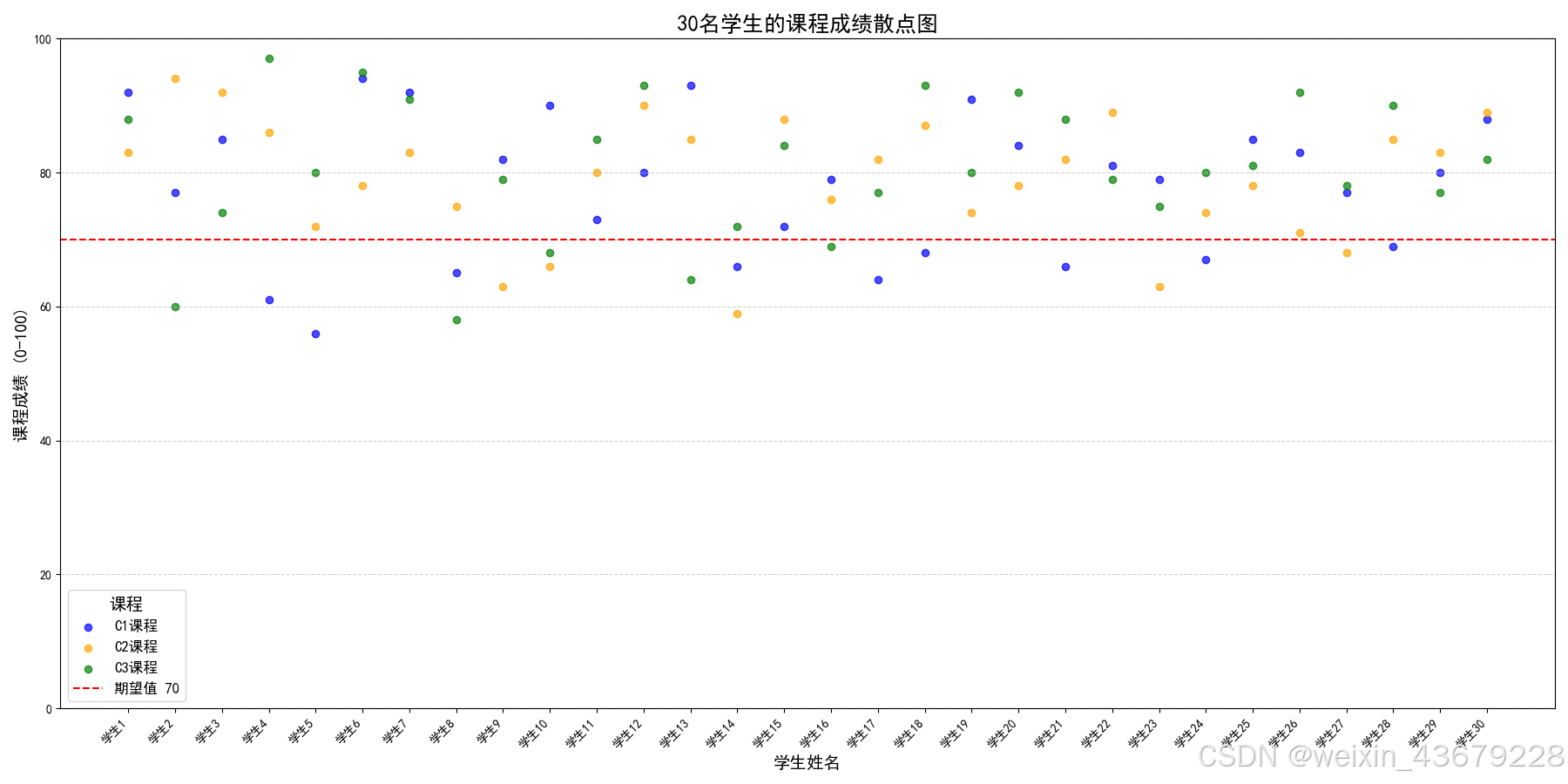
2.3 调整后的代码与结果图
import matplotlib.pyplot as plt
import pandas as pd
from matplotlib import rcParams

# 设置中文字体
rcParams['font.sans-serif'] = ['SimHei']  # 使用 SimHei 字体支持中文
rcParams['axes.unicode_minus'] = False    # 解决负号显示问题

# 30名学生的姓名和成绩(C1、C2、C3课程)
data = {
    "姓名": [
        "学生1", "学生2", "学生3", "学生4", "学生5", "学生6", "学生7", "学生8", "学生9", "学生10",
        "学生11", "学生12", "学生13", "学生14", "学生15", "学生16", "学生17", "学生18", "学生19", "学生20",
        "学生21", "学生22", "学生23", "学生24", "学生25", "学生26", "学生27", "学生28", "学生29", "学生30"
    ],
    "C1课程成绩": [
        92, 77, 85, 61, 56, 94, 92, 65, 82, 90,
        73, 80, 93, 66, 72, 79, 64, 68, 91, 84,
        66, 81, 79, 67, 85, 83, 77, 69, 80, 88
    ],
    "C2课程成绩": [
        83, 94, 92, 86, 72, 78, 83, 75, 63, 66,
        80, 90, 85, 59, 88, 76, 82, 87, 74, 78,
        82, 89, 63, 74, 78, 71, 68, 85, 83, 89
    ],
    "C3课程成绩": [
        88, 60, 74, 97, 80, 95, 91, 58, 79, 68,
        85, 93, 64, 72, 84, 69, 77, 93, 80, 92,
        88, 79, 75, 80, 81, 92, 78, 90, 77, 82
    ]
}

# 将数据转换为DataFrame
df = pd.DataFrame(data)

# 绘制散点图
plt.figure(figsize=(18, 9))

# 绘制三列散点
x_positions = range(len(df["姓名"]))  # 横轴位置为索引
plt.scatter(x_positions, df["C1课程成绩"], label="C1课程", color='blue', alpha=0.7)  # C1课程成绩的散点图
plt.scatter(x_positions, df["C2课程成绩"], label="C2课程", color='orange', alpha=0.7)  # C2课程成绩的散点图
plt.scatter(x_positions, df["C3课程成绩"], label="C3课程", color='green', alpha=0.7)  # C3课程成绩的散点图

# 添加期望值线
plt.axhline(y=70, color='red', linestyle='--', linewidth=1.5, label="期望值 70")

# 设置网格线
plt.grid(axis='y', linestyle='--', alpha=0.6)

# 设置横轴和纵轴
plt.xticks(x_positions, df["姓名"], rotation=45, ha='right')  # 横轴改为学生姓名
plt.ylim(0, 100)  # 纵轴设置为0到100的范围

# 设置轴标签和标题的字体及字号
# fontsize=18:设置标题字体大小为18。 fontweight='bold':设置标题字体加粗。 family='SimHei':设置字体为黑体。
plt.xlabel("学生姓名", fontsize=14, fontweight='bold', family='SimHei')  # 设置x轴标签字体、字号、加粗
plt.ylabel("课程成绩 (0-100)", fontsize=14, fontweight='bold', family='SimHei')  # 设置y轴标签字体、字号、加粗
plt.title("30名学生的课程成绩散点图", fontsize=18, fontweight='bold', family='SimHei')  # 设置标题字体、字号、加粗

# 设置图例
# fontsize=12:设置图例文本的字体大小为12。title_fontsize=14:设置图例标题的字体大小为14。
plt.legend(loc='best', title="课程", fontsize=12, title_fontsize=14)

# 保存图像,设置分辨率为300像素
output_path = "学生成绩散点图1.png"
plt.savefig(output_path, dpi=300)
plt.show()

print(f"图表已保存为:{output_path}")


 被折叠的 条评论
为什么被折叠?
被折叠的 条评论
为什么被折叠?
 到【灌水乐园】发言


