


python画图
关联图 correlation
典型的关联图有:折线图、散点图、相关矩阵
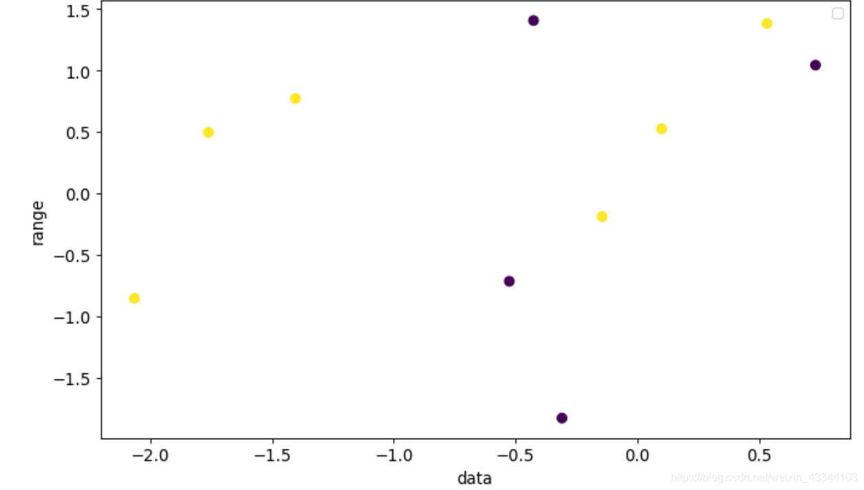
1.散点图 scatter
#定义数据
x1 = np.random.randn(10,2)
x2 = np.array([0,1,0,1,1,1,0,1,0,1])
#确定画布
plt.figure(figsize=(10,6),#图像尺寸
		dpi = 80,       #图像分辨率
		facecolor = 'w',#图像背景颜色
		edgecolor = 'k')#图像边框颜色
#绘图
plt.scatter(x1[:,0],x1[:,1],
			s=50,
			c=x2)#对于多个颜色需要使用循环
			 #图例label = 'Positive'
#对已有图像进行装饰
#plt.gca().set(xlim=(),ylim=())#控制横纵坐标范围
plt.xticks(fontsize=12)#坐标轴上的标尺的字的大小
plt.yticks(fontsize=12)
plt.xlabel('数据',fontsize=12)#坐标轴的标题和字体大小
plt.xlabel('范围',fontsize=12)
#装饰图形(显示图例)
plt.legend()
#图形显示
plt.show()
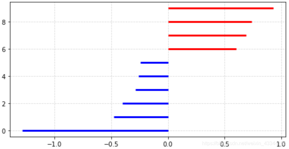
偏差图 deviation
典型的偏差图有:发散型条形图、面积图…
plt.hlines() #水平条形图
plt.vlines() #竖直条形图
x = np.random.randn(10)
x.sort() #按顺序排列
x = x-x.mean()  #基于均值分为两部分
plt.figure(figsize =(8,4))

colors=[]
for i in x:  #x是大于0和小于0两部分
    if i>0:
        colors.append('red')
    else:
        colors.append('blue')

plt.hlines(y=range(10),
		xmin=0,xmax=x,
		linewidth=3,
		color=colors)
plt.grid(linestyle='--',alpha=0.5) # 配置网格线
#plt.legend()  #显示图例,标签
plt.show()
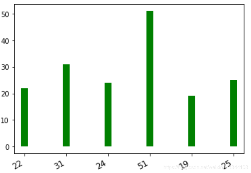
排序图 Ranking
典型的排序图有:柱状图、坡度图、哑铃图
X=[1,2,3,4,5,6]
y=[22,31,24,51,19,25]
plt.vlines(x=X,ymin=0,ymax=y,
			linewidth=10,
			colors='g',
			linestyles='solid') #调节线型
plt.xticks(X,y,
	rotation=30,  #坐标旋转角度
	horizontalalignment='right',  #坐标位置
	fontsize=12)
patches.rectangle 绘制长方形
fig,ax = plt.subplots(figsize= 最低0.47元/天 解锁文章


 971
971

 被折叠的 条评论
为什么被折叠?
被折叠的 条评论
为什么被折叠?
 到【灌水乐园】发言


