


内层的地址和时间这一行,设置了justify-content: space-between;但并不生效,原因是要在上一层.center 设置 flex:1;( 重点)
经常忘记,特在此记录一下,以下是代码
<view class="index-card" @click="showDetail(item)">
					<view class="card-top">
						<u-avatar size="50" :src="this.$utils.baseUrl+'/file/download/'+item.avatar"></u-avatar>
						<view class="center">
							<view><u--text size="30rpx" :lines="2" :text="item.name"></u--text></view>
							<view class="card-bottom">
								<view class="location">
									<uni-icons type="location" size="15"></uni-icons>
									<view class="address">{{item.city}} · {{item.address}}</view>
								</view>
								<view class="time">
									{{item.createTime}}
								</view>
							</view>
						</view>
					</view>
					<view class="uni-list--border-bottom"></view>
				</view>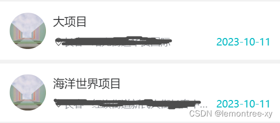
.index-card {
		padding: 15px 15px;
		background-color: #ffffff;
		margin-top: 5px;

		.card-top {
			color: $uni-color-title;
			display: flex;
			flex-direction: row;
			align-items: center;

			.center {
				font-size: $font-lg;
				margin-left: 10px;
				flex:1;

				.card-bottom {
					color: $font-color-light;
					font-size: 26rpx;
					margin-top: 10px;
					display: flex;
					flex-direction: row;
					align-items: center;
					justify-content: space-between;
					width: 100%;

					.location {
						display: flex;
						flex-direction: row;
						align-items: center;
						.address {
							width: 400rpx;
							overflow: hidden;
							white-space: nowrap;
							text-overflow: ellipsis;
						}
					}
					.time {
						color: $color-primary;
					}
				}
			}
		}


	}


 扫一扫
扫一扫


 1527
1527

 被折叠的 条评论
为什么被折叠?
被折叠的 条评论
为什么被折叠?
 到【灌水乐园】发言


