


 本文总结了使用CSS绘制小程序卡劵的思路,包括利用径向渐变实现圆形镂空,线性渐变结合伪类创建锯齿效果,以及如何添加虚线和阴影以增加立体感。同时,探讨了制作竖向卡劵的方法,以及简化版的双矩形卡劵技巧。
总结了一下CSS绘制卡劵的一些思路技巧
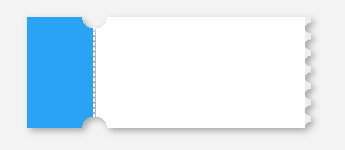
radial-gradient()径向渐变函数,用于实现卡劵的圆形镂空
CSS语法:background: radial-gradient(shape size at position, start-color, ..., last-color);
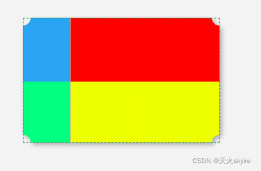
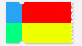
先做一个长方形,四角圆形镂空。为了方便理解圆形镂空的定位,我用颜色做了一个分区
/* 圆形镂空 */
.G8 {

  width: 250px;
  height: 100px;
  position: relative;
  background:
    radial-gradient(circle at left top, transparent 10px,  #28A4F2 0) top left / 60px 51% no-repeat,
    radial-gradient(circle at left bottom, transparent 10px,  #01ff80 0) bottom left /60px 51% no-repeat,
    radial-gradient(circle at right top, transparent 10px, #ff0000 0) top right /190px 51% no-repeat,
    radial-gradient(circle at right bottom, transparent 10px, #eeff00 0) bottom right /190px 51% no-repeat;
}
其中radial-gradient(circle at left top, transparent 10px, #28A4F2 0) top left / 60px 51% no-repeat的含义是:
left top左上角, transparent 10px,圆形大小,
top left / 60px 51%左上角定位,60和51对应宽和高
no-repeat背景图像将仅显示一次
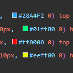
四行代码对应四个颜色的位置
把蓝绿分区的left与红黄分区的bottom对调
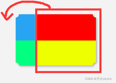
即可得到卡劵的样式
/* 圆形镂空 */
.G8 {

  width
最低0.47元/天 解锁文章


 扫一扫
扫一扫


 被折叠的 条评论
为什么被折叠?
被折叠的 条评论
为什么被折叠?
 到【灌水乐园】发言


