


 本文介绍使用Flex布局及绝对定位实现响应式三栏布局的方法,并通过媒体查询确保不同屏幕尺寸下的良好显示效果。
在上一篇文章写了两栏等高、双飞翼和圣杯三栏布局。今天来继续完善三栏布局方式以及对flex布局继续完善。
三栏布局依然是下面这样。
flex
<section class='body'>
	<artical class='content'>content</artical>
	<aside class='left'>left</aside>
	<aside class='right'>right</aside>
</section>
.body {display: flex;}
.left,.right {/*左右两列定宽200px*/flex:0 0 200px;height: 200px;background-color: pink;}
.left{order:-1}
.content {flex:1;height: 200px;background-color: yellow;}
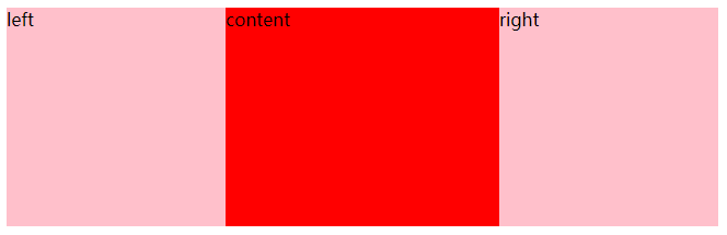
绝对定位
<section class='body'>
	<aside class='content'>content</aside>
	<aside class='left'>left</aside>
	<aside class='right'>right</aside>
</section>
.body{position:relative;min-width:500px}
.content,.left,.right{height:200px;top:0}
.left,.right{background:pink;position:absolute;width:200px}
.left{left:0}
.right{right:0}
.content{margin:0 200px 0 200px;background:red}
上面用flex弹性盒子和position:absolute绝对定位完成了三栏布局,下面将对flex组成的三栏布局进行扩充,成下面这样
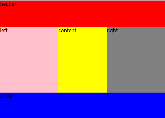
以下是相关代码
<header>header</header>
	<section class='body'>
		<article class='content'>content</article>
		<aside class='left'>left</aside>
		<aside class='right'>right</aside>
	</section>
<footer>footer</footer>
body{min-height:100vh;display:flex;flex-direction: column;}
header,footer{flex:1}
header{background:red}
footer{background:blue}
.body{flex:3;display:flex}
.content,.left,.right{}
.left,.right{flex:0 0 12rem}
.left{background:pink;order:-1}
.right{background:gray}
.content{background:yellow;flex:1}
下面继续来完善,当窗口缩小到768px以下时,呈现出:
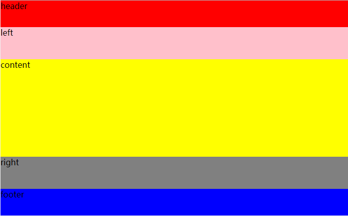
只需要加上媒体查询,就可以实现上图
@media (max-width:768px){
 		.body{flex-direction:column;flex:8}
 		.left,.right{flex:1}
 		.content{flex:4}
        }


 扫一扫
扫一扫


 1570
1570

 被折叠的 条评论
为什么被折叠?
被折叠的 条评论
为什么被折叠?
 到【灌水乐园】发言


