


<!DOCTYPE html>
<html lang="zh-CN">
<head>
<meta charset="UTF-8">
<meta name="viewport" content="width=device-width, initial-scale=1.0">
<title>脉冲光环动画</title>
<style>
* {
margin: 0;
padding: 0;
box-sizing: border-box;
}
body {
font-family: 'Segoe UI', Tahoma, Geneva, Verdana, sans-serif;
background: linear-gradient(135deg, #1a1a2e 0%, #16213e 100%);
color: #fff;
min-height: 100vh;
display: flex;
flex-direction: column;
align-items: center;
justify-content: center;
padding: 20px;
overflow: hidden;
}
.container {
text-align: center;
max-width: 800px;
width: 100%;
padding: 30px;
}
h1 {
margin-bottom: 40px;
font-size: 2.8rem;
color: #fff;
text-shadow: 0 0 15px rgba(233, 29, 182, 0.7);
letter-spacing: 2px;
}
.description {
margin-bottom: 50px;
font-size: 1.2rem;
line-height: 1.6;
color: #a3a3c3;
max-width: 600px;
margin-left: auto;
margin-right: auto;
}
.pulse-demo-area {
position: relative;
display: flex;
align-items: center;
justify-content: center;
width: 300px;
height: 300px;
margin: 0 auto 50px;
}
.pulse-ring {
position: absolute;
border: 4px solid rgba(233, 29, 182, 0.3);
border-radius: 50%;
animation: pulse 2s ease-out infinite;
}
.pulse-1 {
width: 120px;
height: 120px;
animation-delay: 0s;
}
.pulse-2 {
width: 140px;
height: 140px;
animation-delay: 0.7s;
}
.pulse-3 {
width: 160px;
height: 160px;
animation-delay: 1.4s;
}
.pulse-center {
width: 100px;
height: 100px;
background: linear-gradient(135deg, #e91db6 0%, #f06292 50%, #e91db6 100%);
border-radius: 50%;
display: flex;
align-items: center;
justify-content: center;
color: white;
font-weight: bold;
font-size: 1.8rem;
z-index: 10;
box-shadow:
0 8px 32px rgba(233, 29, 182, 0.4),
0 0 0 4px rgba(233, 29, 182, 0.1),
inset 0 4px 12px rgba(255, 255, 255, 0.3);
cursor: pointer;
transition: all 0.3s ease;
}
.pulse-center:hover {
transform: scale(1.05);
box-shadow:
0 12px 40px rgba(233, 29, 182, 0.6),
0 0 0 6px rgba(233, 29, 182, 0.15),
inset 0 6px 16px rgba(255, 255, 255, 0.4);
}
@keyframes pulse {
0% {
transform: scale(0.8);
opacity: 1;
}
100% {
transform: scale(1.5);
opacity: 0;
}
}
.code-container {
background: rgba(0, 0, 0, 0.3);
border-radius: 12px;
padding: 25px;
margin-top: 30px;
overflow-x: auto;
font-family: 'Consolas', 'Monaco', monospace;
font-size: 16px;
border: 1px solid rgba(233, 29, 182, 0.2);
}
pre {
color: #f8f8f8;
line-height: 1.5;
white-space: pre-wrap;
}
.comment {
color: #6a9955;
}
.selector {
color: #d7ba7d;
}
.property {
color: #9cdcfe;
}
.value {
color: #ce9178;
}
.usage {
margin-top: 40px;
padding: 20px;
background: rgba(233, 29, 182, 0.1);
border-radius: 12px;
border-left: 4px solid #e91db6;
}
.usage h2 {
margin-bottom: 15px;
color: #f06292;
}
.usage p {
line-height: 1.6;
color: #c5c5d6;
}
.footer {
margin-top: 50px;
text-align: center;
color: rgba(255, 255, 255, 0.6);
font-size: 14px;
}
/* 响应式设计 */
@media (max-width: 600px) {
h1 {
font-size: 2.2rem;
}
.description {
font-size: 1rem;
}
.pulse-demo-area {
width: 250px;
height: 250px;
}
.pulse-center {
width: 80px;
height: 80px;
font-size: 1.5rem;
}
}
</style>
</head>
<body>
<div class="container">
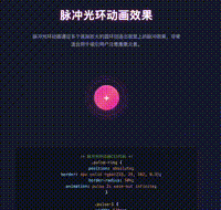
<h1>脉冲光环动画效果</h1>
<p class="description">
脉冲光环动画通过多个逐渐放大的圆环创造出视觉上的脉冲效果,非常适合用于吸引用户注意重要元素。
</p>
<div class="pulse-demo-area">
<div class="pulse-ring pulse-1"></div>
<div class="pulse-ring pulse-2"></div>
<div class="pulse-ring pulse-3"></div>
<div class="pulse-center">+</div>
</div>
<div class="code-container">
<pre><code><span class="comment">/* 脉冲光环动画CSS代码 */</span>
<span class="selector">.pulse-ring</span> {
<span class="property">position</span>: <span class="value">absolute</span>;
<span class="property">border</span>: <span class="value">4px solid rgba(233, 29, 182, 0.3)</span>;
<span class="property">border-radius</span>: <span class="value">50%</span>;
<span class="property">animation</span>: <span class="value">pulse 2s ease-out infinite</span>;
}
<span class="selector">.pulse-1</span> {
<span class="property">width</span>: <span class="value">120px</span>;
<span class="property">height</span>: <span class="value">120px</span>;
<span class="property">animation-delay</span>: <span class="value">0s</span>;
}
<span class="selector">.pulse-2</span> {
<span class="property">width</span>: <span class="value">140px</span>;
<span class="property">height</span>: <span class="value">140px</span>;
<span class="property">animation-delay</span>: <span class="value">0.7s</span>;
}
<span class="selector">.pulse-3</span> {
<span class="property">width</span>: <span class="value">160px</span>;
<span class="property">height</span>: <span class="value">160px</span>;
<span class="property">animation-delay</span>: <span class="value">1.4s</span>;
}
<span class="selector">@keyframes pulse</span> {
<span class="value">0%</span> {
<span class="property">transform</span>: <span class="value">scale(0.8)</span>;
<span class="property">opacity</span>: <span class="value">1</span>;
}
<span class="value">100%</span> {
<span class="property">transform</span>: <span class="value">scale(1.5)</span>;
<span class="property">opacity</span>: <span class="value">0</span>;
}
}</code></pre>
</div>
<div class="usage">
<h2>使用场景</h2>
<p>脉冲光环动画非常适合用于:</p>
<p>• 吸引用户点击重要按钮</p>
<p>• 提示用户进行某些操作</p>
<p>• 应用中的特效和过渡效果</p>
<p>• 游戏界面中的特殊元素提示</p>
</div>
</div>
<div class="footer">
<p>脉冲光环动画 - 专为吸引用户注意力而设计</p>
</div>
</body>
</html>


 扫一扫
扫一扫


 2758
2758

 被折叠的 条评论
为什么被折叠?
被折叠的 条评论
为什么被折叠?
 到【灌水乐园】发言


