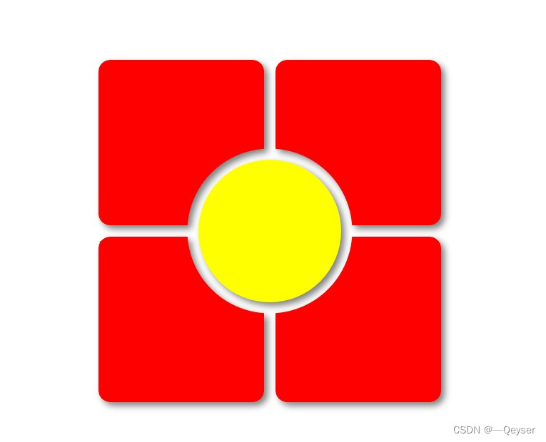
效果
<!DOCTYPE html>
<html lang="en">

<head>
  <meta charset="UTF-8">
  <title>17sucai - A Pen by Mark Boots</title>
  <!-- <link rel="stylesheet" href="./style.css"> -->

</head>

<style>
  .cards {

    --gap: 1rem;
    --border-radius: 1rem;
    width: 30rem;
    aspect-ratio: 1/1;
    display: grid;
    grid-template-rows: 1fr 1fr;
    grid-template-columns: 1fr 1fr;
    gap: var(--gap);
    filter: drop-shadow(5px 5px 5px hsl(0 0% 0% / .5));
    position: relative;


    >.card {

      position: relative;

      &:nth-of-type(1) {
        --x: 0;
        --y: 0
      }

      &:nth-of-type(2) {
        --x: 1;
        --y: 0
      }

      &:nth-of-type(3) {
        --x: 0;
        --y: 1
      }

      &:nth-of-type(4) {
        --x: 1;
        --y: 1
      }

      &::before {
        color: black !important;
        content: "";
        position: absolute;
        inset: 0;
        border-radius: var(--border-radius);
        /* background-image: var(--bg-image); */
        background-color: red;
        --bg-size: calc(200% + var(--gap));
        background-size: var(--bg-size) var(--bg-size);
        background-position: calc(100% * var(--x)) calc(100% * var(--y));
        --mask-pos:
          /* think i can shorten this? */
          calc(100% - (100% * var(--x)) + (var(--gap) / 2) * ((var(--x) * -2) + 1)) calc(100% - (100% * var(--y)) + (var(--gap) / 2) * ((var(--y) * -2) + 1));
        --mask-image: radial-gradient(100% 100% at var(--mask-pos), transparent calc(50% - 1px), black 50%);
        -webkit-mask-image: var(--mask-image);
        mask-image: var(--mask-image);
      }
    }

    >.center {
      position: absolute;
      width: calc(50% - var(--gap) * 2.5);
      aspect-ratio: 1/1;
      /* background-image: var(--bg-image); */
      background-color: yellow;
      --bg-size: calc((100% + var(--gap) * 2.5) * 2);
      background-size: var(--bg-size) var(--bg-size);
      background-position: center;
      inset: 0;
      border-radius: 50%;
      margin: auto;

    }
  }

  html,
  body {
    height: 100%
  }

  body {
    margin: 0;
    display: grid;
    place-items: center
  }
</style>

<body>
  <!-- partial:index.partial.html -->
  <div class="cards">
    <div class="card"></div>
    <div class="card"></div>
    <div class="card">1</div>
    <div class="card"></div>
    <div class="center"></div>
  </div>
  <!-- partial -->

</body>

</html>


 扫一扫
扫一扫


 1767
1767

 被折叠的 条评论
为什么被折叠?
被折叠的 条评论
为什么被折叠?
 到【灌水乐园】发言


