


Themes
New in version 0.6.
Note
This section provides information about using pre-existing HTML themes. If
you wish to create your own theme, refer to
HTML theme development.
Sphinx supports changing the appearance of its HTML output via themes. A
theme is a collection of HTML templates, stylesheet(s) and other static files.
Additionally, it has a configuration file which specifies from which theme to
inherit, which highlighting style to use, and what options exist for customizing
the theme’s look and feel.
Themes are meant to be project-unaware, so they can be used for different
projects without change.
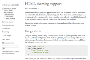
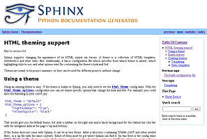
Using a theme
Using a theme provided with Sphinx is easy. Since these
do not need to be installed, you only need to set the html_theme
config value. For example, to enable the classic theme, add the following
to conf.py:
html_theme = "classic"
You can also set theme-specific options using the html_theme_options
config value. These options are generally used to change the look and feel of
the theme. For example, to place the sidebar on the right side and a black
background for the relation bar (the bar with the navigation links at the
page’s top and bottom), add the following conf.py:
html_theme_options = {
"rightsidebar": "true",
"relbarbgcolor": "black"
}
If the theme does not come with Sphinx, it can be in two static forms or as a
Python package. For the static forms, either a directory (containing
theme.conf and other needed files), or a zip file with the same
contents is supported. The directory or zipfile must be put where Sphinx can
find it; for this there is the config value html_theme_path. This
can be a list of directories, relative to the directory containing
conf.py, that can contain theme directories or zip files. For example,
if you have a theme in the file blue.zip, you can put it right in the
directory containing conf.py and use this configuration:
html_theme = "blue"
html_theme_path = ["."]
The third form is a Python package. If a theme you want to use is distributed
as a Python package, you can use it after installing
# installing theme package
$ pip install sphinxjp.themes.dotted
Once installed, this can be used in the same manner as a directory or
zipfile-based theme:
html_theme = "dotted"
For more information on the design of themes, including information about
writing your own themes, refer to HTML theme development.
Builtin themes
Theme overview
alabaster
classic
sphinxdoc
scrolls
agogo
traditional
nature
haiku
pyramid
bizstyle
Sphinx comes with a selection of themes to choose from.
These themes are:
basicThis is a basically unstyled layout used as the base for the
other themes, and usable as the base for custom themes as well. The HTML
contains all important elements like sidebar and relation bar. There are
these options (which are inherited by the other themes):
nosidebar (true or false): Don’t include the sidebar. Defaults to
False.
sidebarwidth (int or str): Width of the sidebar in pixels.
This can be an int, which is interpreted as pixels or a valid CSS
dimension string such as ‘70em’ or ‘50%’. Defaults to 230 pixels.
body_min_width (int or str): Minimal width of the document body.
This can be an int, which is interpreted as pixels or a valid CSS
dimension string such as ‘70em’ or ‘50%’. Use 0 if you don’t want
a width limit. Defaults may depend on the theme (often 450px).
body_max_width (int or str): Maximal width of the document body.
This can be an int, which is interpreted as pixels or a valid CSS
dimension string such as ‘70em’ or ‘50%’. Use ‘none’ if you don’t
want a width limit. Defaults may depend on the theme (often 800px).
navigation_with_keys (true or false): Allow navigating to the
previous/next page using the keyboard’s left and right arrows. Defaults to
False.
globaltoc_collapse (true or false): Only expand subsections
of the current document in globaltoc.html
(see html_sidebars).
Defaults to True.
New in version 3.1.
globaltoc_includehidden (true or false): Show even those
subsections in globaltoc.html (see html_sidebars)
which have been included with the :hidden: flag of the
toctree directive.
Defaults to False.
New in version 3.1.
globaltoc_maxdepth (int): The maximum depth of the toctree in
globaltoc.html (see html_sidebars). Set it to -1 to allow
unlimited depth. Defaults to the max depth selected in the toctree directive.
New in version 3.2.
alabasterAlabaster theme is a modified “Kr” Sphinx theme from @kennethreitz
(especially as used in his Requests project), which was itself originally
based on @mitsuhiko’s theme used for Flask & related projects. Refer to its
installation page for information on how to configure
html_sidebars for its use.
classicThis is the classic theme, which looks like the Python 2
documentation. It can be customized via
these options:
rightsidebar (true or false): Put the sidebar on the right side.
Defaults to False.
stickysidebar (true or false): Make the sidebar “fixed” so that it
doesn’t scroll out of view for long body content. This may not work well
with all browsers. Defaults to False.
collapsiblesidebar (true or false): Add an experimental JavaScript
snippet that makes the sidebar collapsible via a button on its side.
Defaults to False.
externalrefs (true or false): Display external links differently from
internal links. Defaults to False.
There are also various color and font options that can change the color scheme
without having to write a custom stylesheet:
footerbgcolor (CSS color): Background color for the footer line.
footertextcolor (CSS color): Text color for the footer line.
sidebarbgcolor (CSS color): Background color for the sidebar.
sidebarbtncolor (CSS color): Background color for the sidebar collapse
button (used when collapsiblesidebar is True).
sidebartextcolor (CSS color): Text color for the sidebar.
sidebarlinkcolor (CSS color): Link color for the sidebar.
relbarbgcolor (CSS color): Background color for the relation bar.
relbartextcolor (CSS color): Text color for the relation bar.
relbarlinkcolor (CSS color): Link color for the relation bar.
bgcolor (CSS color): Body background color.
textcolor (CSS color): Body text color.
linkcolor (CSS color): Body link color.
visitedlinkcolor (CSS color): Body color for visited links.
headbgcolor (CSS color): Background color for headings.
headtextcolor (CSS color): Text color for headings.
headlinkcolor (CSS color): Link color for headings.
codebgcolor (CSS color): Background color for code blocks.
codetextcolor (CSS color): Default text color for code blocks, if not
set differently by the highlighting style.
bodyfont (CSS font-family): Font for normal text.
headfont (CSS font-family): Font for headings.
sphinxdocThe theme originally used by this documentation. It features
a sidebar on the right side. There are currently no options beyond
nosidebar and sidebarwidth.
scrollsA more lightweight theme, based on the Jinja documentation. The following color options are available:
headerbordercolor
subheadlinecolor
linkcolor
visitedlinkcolor
admonitioncolor
agogoA theme created by Andi Albrecht. The following options are supported:
bodyfont (CSS font family): Font for normal text.
headerfont (CSS font family): Font for headings.
pagewidth (CSS length): Width of the page content, default 70em.
documentwidth (CSS length): Width of the document (without sidebar),
default 50em.
sidebarwidth (CSS length): Width of the sidebar, default 20em.
rightsidebar (true or false): Put the sidebar on the right side.
Defaults to True.
bgcolor (CSS color): Background color.
headerbg (CSS value for “background”): background for the header area,
default a grayish gradient.
footerbg (CSS value for “background”): background for the footer area,
default a light gray gradient.
linkcolor (CSS color): Body link color.
headercolor1, headercolor2 (CSS color): colors for
and
headings.
headerlinkcolor (CSS color): Color for the backreference link in
headings.
textalign (CSS text-align value): Text alignment for the body, default
is justify.
natureA greenish theme. There are currently no options beyond
nosidebar and sidebarwidth.
pyramidA theme from the Pyramid web framework project, designed by Blaise Laflamme.
There are currently no options beyond nosidebar and sidebarwidth.
haikuA theme without sidebar inspired by the Haiku OS user guide. The following
options are supported:
full_logo (true or false, default False): If this is true, the
header will only show the html_logo. Use this for large logos.
If this is false, the logo (if present) will be shown floating right, and
the documentation title will be put in the header.
textcolor, headingcolor, linkcolor, visitedlinkcolor,
hoverlinkcolor (CSS colors): Colors for various body elements.
traditionalA theme resembling the old Python documentation. There are
currently no options beyond nosidebar and sidebarwidth.
epubA theme for the epub builder. This theme tries to save visual
space which is a sparse resource on ebook readers. The following options
are supported:
relbar1 (true or false, default True): If this is true, the
relbar1 block is inserted in the epub output, otherwise it is omitted.
footer (true or false, default True): If this is true, the
footer block is inserted in the epub output, otherwise it is omitted.
bizstyleA simple bluish theme. The following options are supported
beyond nosidebar and sidebarwidth:
rightsidebar (true or false): Put the sidebar on the right side.
Defaults to False.
New in version 1.3:‘alabaster’, ‘sphinx_rtd_theme’ and ‘bizstyle’ theme.
Changed in version 1.3:The ‘default’ theme has been renamed to ‘classic’. ‘default’ is still
available, however it will emit a notice that it is an alias for the new
‘alabaster’ theme.
Third Party Themes
There are many third-party themes available for Sphinx. Some of these are for
general use, while others are specific to an individual project.
sphinx-themes.org is a gallery that showcases various themes for Sphinx,
with demo documentation rendered under each theme. Themes can also be found
on PyPI (using the classifier Framework :: Sphinx :: Theme), GitHub
and GitLab.


 扫一扫
扫一扫


 1万+
1万+

 被折叠的 条评论
为什么被折叠?
被折叠的 条评论
为什么被折叠?
 到【灌水乐园】发言


