


算法学习、4对1辅导、论文辅导、核心期刊
项目的代码和数据下载可以通过公众号滴滴我
项目思路
- 确定分析方向,公子比较想知道同样的商品是不是自营店铺普片比较贵(以消费者搜索的角度)
- 从京东平台上输入搜索关键字,定向爬取该关键字商品的信息(共100页)
- 数据分析验证第1小点
数据说明
数据一共5985条数据,字段共5个分别是:price、name、url、comment、shopname。
部分表数据如下:
数据来源:https://www.heywhale.com/home
分析数据
import pandas as pd
import numpy as np
import matplotlib.pyplot as plt
import seaborn as sns
%matplotlib inline
# sns.set(palette="summer",font='Microsoft YaHei',font_scale=1.2)
from warnings import filterwarnings
filterwarnings('ignore')
df = pd.read_csv('csvjd.csv',encoding='gbk')
print('数据形状:{}'.format(df.shape))
数据形状:(5984, 5)
print('重复值:{}条'.format(df.duplicated().sum()))
重复值:77条
# 空值统计
df.isnull().sum()
# 删除重复值
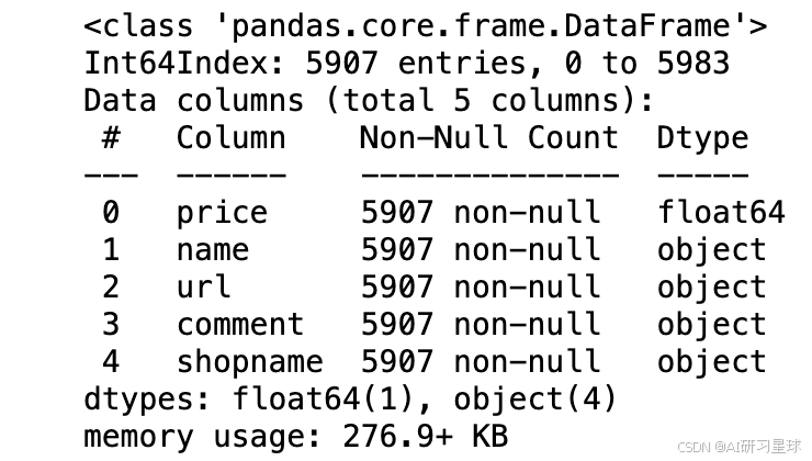
df.drop_duplicates(inplace=True)
df.info()
df.head()
# 处理comment列数据
def comment_p(x):
    x = x.replace(r'+','')
    if '万' in x:
        x = x.replace(r'万','')
        x=float(x)*10000
        return x
    else:
        return x
df['new_comment'] = df['comment'].apply(lambda x:comment_p(x)).astype('int')
def new_group(frame):
    new_group=[]
    for i in range(len(frame)):
        if frame.iloc[i,4].find('自营')>=0:
            new_group.append('京东自营')
        elif frame.iloc[i,4].find('旗舰店')>=0:
            new_group.append('旗舰店')
        elif frame.iloc[i,4].find('专营店')>=0:
            new_group.append('专营店')
        else:
            new_group.append('其它')
    frame['newgroup']=new_group
new_group(df)
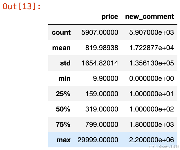
df.describe()
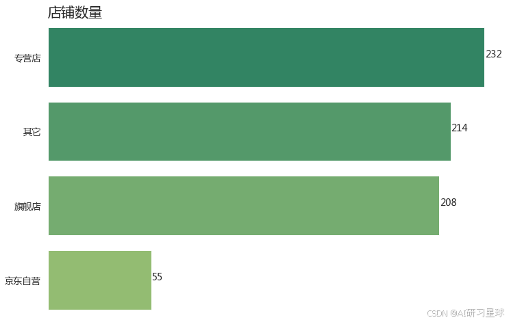
1、统计不同类型的店铺数量
# 统计这100页中共有多少家店铺
print('该100页商品信息中共有:{} 家店铺'.format(df['shopname'].nunique()))
该100页商品信息中共有:709 家店铺
s_group = df.groupby('newgroup').shopname.nunique().reset_index(name='counts')
s_group.sort_values(by='counts',ascending=False,inplace=True)

plt.figure(figsize=(12,8))
sns.barplot(x='counts',y='newgroup',data=s_group)
con = list(s_group['counts'])
con=sorted(con,reverse=True)
for x,y in enumerate(con):
    plt.text(y+0.1,x,'%s' %y,size=14)
plt.xlabel('')
plt.ylabel('')
plt.xticks([])
plt.grid(False)
plt.box(False)
plt.title('店铺数量',loc='left',fontsize=20)
plt.show()
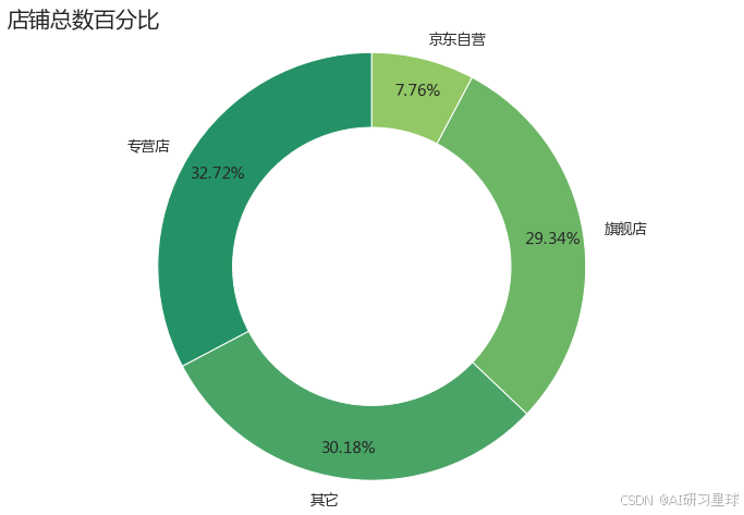
2、绘制店铺类型的百分比
plt.figure(figsize=(12,8))
size = s_group['counts']
labels = s_group['newgroup']
plt.pie(size,labels=labels,wedgeprops={'width':0.35,'edgecolor':'w'},
        autopct='%.2f%%',pctdistance=0.85,startangle = 90)
plt.axis('equal')
plt.title('店铺总数百分比',loc='left',fontsize=20)
plt.show()
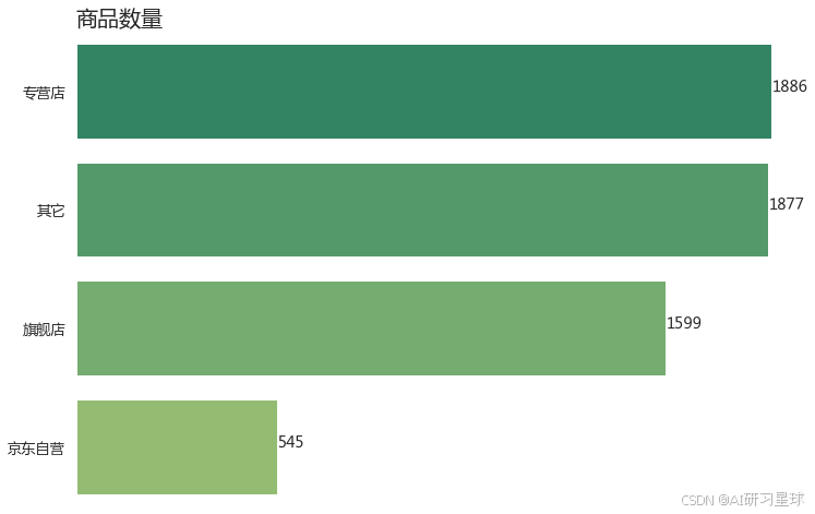
plt.figure(figsize=(12,8))
sns.countplot(y=df['newgroup'],order = df['newgroup'].value_counts().index,data=df)

con = list(df['newgroup'].value_counts().values)
con=sorted(con,reverse=True)
for x,y in enumerate(con):
    plt.text(y+0.1,x,'%s' %y,size=14)
plt.xlabel('')
plt.ylabel('')
plt.xticks([])
plt.grid(False)
plt.box(False)
plt.title('商品数量',loc='left',fontsize=20)
plt.show()
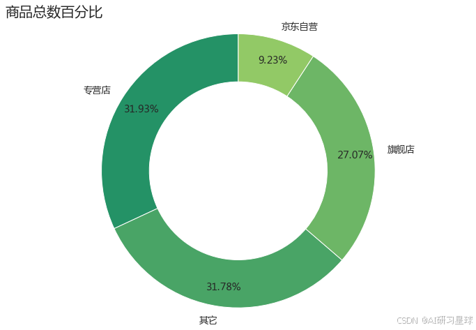
plt.figure(figsize=(12,8))
size = df['newgroup'].value_counts().values
labels = df['newgroup'].value_counts().index
plt.pie(size,labels=labels,wedgeprops={'width':0.35,'edgecolor':'w'},
        autopct='%.2f%%',pctdistance=0.85,startangle = 90)
plt.axis('equal')
plt.title('商品总数百分比',loc='left',fontsize=20)
plt.show()
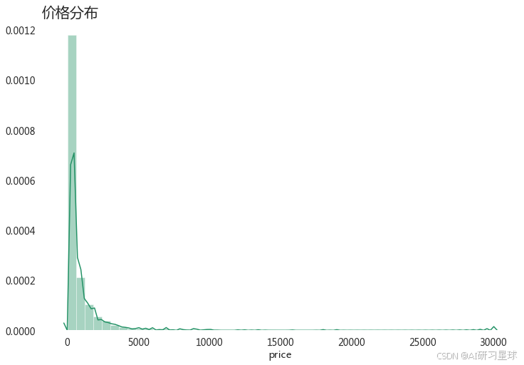
3、查看整体价格分布
# 整体价格分布
plt.figure(figsize=(12,8))
sns.distplot(df['price'])
plt.title('价格分布',loc='left',fontsize=20)
plt.box(False)
plt.show()
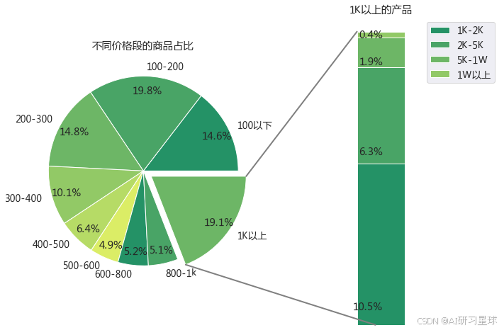
4、查看该商品主要集中在哪个价格段
result = df
result['price_cut'] = pd.cut(x=result['price'],bins=[0,100,200,300,400,500,600,800,1000,30000],
                             labels=['100以下','100-200','200-300','300-400','400-500','500-600','600-800','800-1k','1K以上'])
result2 = df[df['price']>=1000]
result2['price_cut'] = pd.cut(x=result['price'],bins=[1000,2000,5000,10000,30000],
                             labels=['1K-2K','2K-5K','5K-1W','1W以上'])
result3 = pd.DataFrame((result2['price_cut'].value_counts()/result.shape[0]).round(3))
from matplotlib.patches import ConnectionPatch
import numpy as np

# make figure and assign axis objects
fig = plt.figure(figsize=(12, 8))
ax1 = fig.add_subplot(121)
ax2 = fig.add_subplot(122)
fig.subplots_adjust(wspace=0)

# pie chart parameters
ratios = result.groupby('price_cut').name.count().values
labels = result.groupby('price_cut').name.count().index
explode = [0, 0,0,0,0,0,0,0,0.1]
# rotate so that first wedge is split by the x-axis
angle = -180 * ratios[8]
ax1.pie(ratios, autopct='%1.1f%%', startangle=angle,
        labels=labels, explode=explode,pctdistance=0.85)
ax1.set_title('不同价格段的商品占比')

# bar chart parameters

xpos = 0
bottom = 0
ratios = result3.values
width = .2


for j in range(len(ratios)):
    height = ratios[j]
    ax2.bar(xpos, height, width, bottom=bottom)
    ypos = bottom + ax2.patches[j].get_height() / 10
    bottom += height
    ax2.text(xpos, ypos, '%1.1f%%' % (ax2.patches[j].get_height() * 100),
             ha='right')

ax2.set_title('1K以上的产品')
ax2.legend((result3.index))
ax2.axis('off')
ax2.set_xlim(- 2.5 * width, 2.5 * width)

# use ConnectionPatch to draw lines between the two plots
# get the wedge data
theta1, theta2 = ax1.patches[8].theta1, ax1.patches[8].theta2
center, r = ax1.patches[8].center, ax1.patches[8].r
bar_height = sum([item.get_height() for item in ax2.patches])

# draw top connecting line
x = r * np.cos(np.pi / 180 * theta2) + center[0]
y = r * np.sin(np.pi / 180 * theta2) + center[1]
con = ConnectionPatch(xyA=(-width / 2, bar_height), coordsA=ax2.transData,
                      xyB=(x, y), coordsB=ax1.transData)
con.set_color([0.5, 0.5, 0.5])
con.set_linewidth(2)
ax2.add_artist(con)

# draw bottom connecting line
x = r * np.cos(np.pi / 180 * theta1) + center[0]
y = r * np.sin(np.pi / 180 * theta1) + center[1]
con = ConnectionPatch(xyA=(-width / 9, 0), coordsA=ax2.transData,
                      xyB=(x, y), coordsB=ax1.transData)
con.set_color([0.5, 0.5, 0.5])
ax2.add_artist(con)
con.set_linewidth(2)

plt.show()
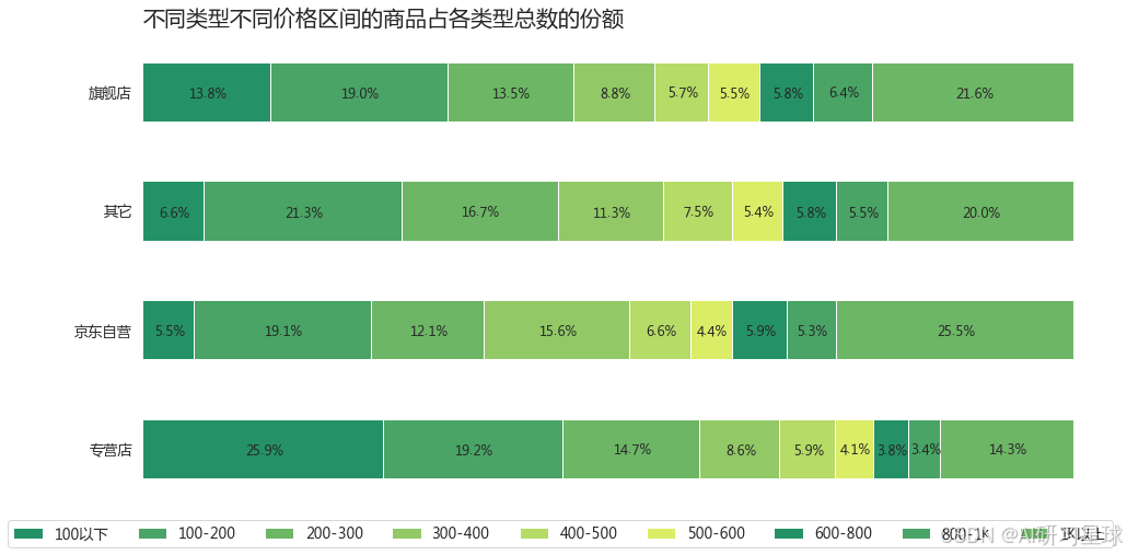
result4 = result.groupby(['newgroup','price_cut']).name.count().reset_index(name='counts')
result4 = pd.DataFrame(result4)
result4.columns = ['newgroup','price_cut','counts']
percent=pd.pivot_table(result4,index=['newgroup'],columns=['price_cut'])
percent.columns = ['100以下','100-200','200-300','300-400','400-500','500-600','600-800','800-1k','1K以上']
# percent=percent.reset_index()
p_percent=percent.div(percent.sum(axis=1), axis=0)*100
p_percent=p_percent.reset_index()
p_percent.plot(x = 'newgroup', kind='barh',stacked = True,mark_right = True,figsize=(16,8))
df_rel=p_percent[p_percent.columns[1:]]

for n in df_rel:
    for i, (cs, ab, pc) in enumerate(zip(p_percent.iloc[:, 1:].cumsum(1)[n], p_percent[n], df_rel[n])):
        plt.text(cs - ab/2, i, str(np.round(pc, 1)) + '%', va='center', ha='center',size=12)

plt.title('不同类型不同价格区间的商品占各类型总数的份额',loc='left',fontsize=20)
plt.legend(bbox_to_anchor=(1, -0.01),ncol=10,facecolor='None')
plt.xlabel('')
plt.ylabel('')
plt.xticks([])
plt.grid(False)
plt.box(False)
plt.show()
5、累计成交量
这里的累计成交量是:因为京东上的商品只要交易成功不管是否评价,系统都会记录评价人数,因此忽略时效的问题,可当作累计成交来看,只看大概的别纠结哈
result7 = result.groupby('price_cut').new_comment.sum().reset_index(name='total_comment')
plt.figure(figsize=(12,8))
size = result7['total_comment']
labels = result7['price_cut']
plt.pie(size,labels=labels,
        autopct='%.2f%%',pctdistance=0.8,explode=[0,0,0,0,0.5,0.5,0.5,0.5,0.5])
plt.title('不同价格区间累计成交量',loc='left',fontsize=16)
plt.axis('equal')
plt.show()
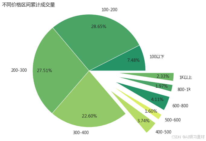
超 86%的人选择400元以下的商品
plt.figure(figsize=(12,8))
sns.barplot(x=(result.groupby('newgroup').new_comment.sum().sort_values(ascending=False).values/10000).round(2),
            y=result.groupby('newgroup').new_comment.sum().sort_values(ascending=False).index,
           data=result,palette='summer')
con = list((result.groupby('newgroup').new_comment.sum().sort_values(ascending=False).values/10000).round(2))
# con=sorted(con,reverse=True)
for x,y in enumerate(con):
    plt.text(y+0.1,x,'%s (万人)' %y,size=12)
plt.grid(False)
plt.box(False)
plt.xticks([])
plt.ylabel('')
plt.title('不同类型的店铺累计成交量排名',loc='left',fontsize=20)
plt.show()

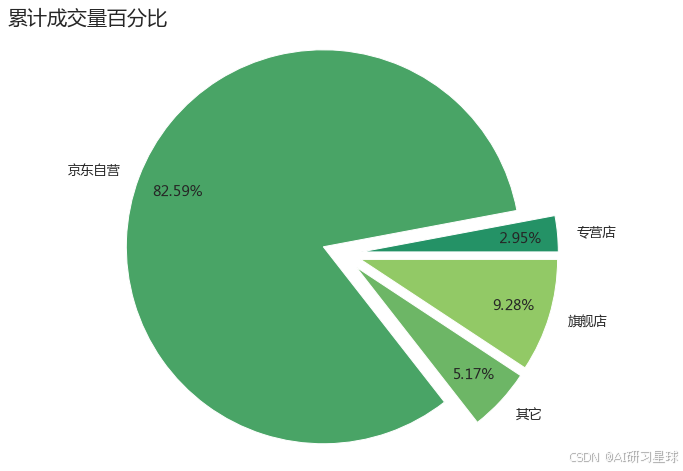
plt.figure(figsize=(12,8))
size = result.groupby('newgroup').new_comment.sum()
labels = size.index
plt.pie(size.values,labels=labels,autopct='%.2f%%',pctdistance=0.8,explode=[0.1,0.1,0.1,0.1])
plt.axis('equal')
plt.title('累计成交量百分比',loc='left',fontsize=20)
plt.show()
result5 = result.groupby(['newgroup','price_cut']).new_comment.sum().reset_index(name='total_comment')
plt.figure(figsize=(20,4))
n = 0
for x in ['京东自营','旗舰店','专营店','其它']:
    df = result5[result5['newgroup']==x]
    n+=1
    plt.subplot(1,4,n)
    sns.barplot(x='price_cut',y=df['total_comment']/10000,data=df,palette='summer')
    plt.title(x)
    plt.xlabel('')
    plt.ylabel('累计成交 ( 万单 )')
    plt.xticks(rotation=45)
    plt.grid(False)
    plt.box(False)
plt.show()
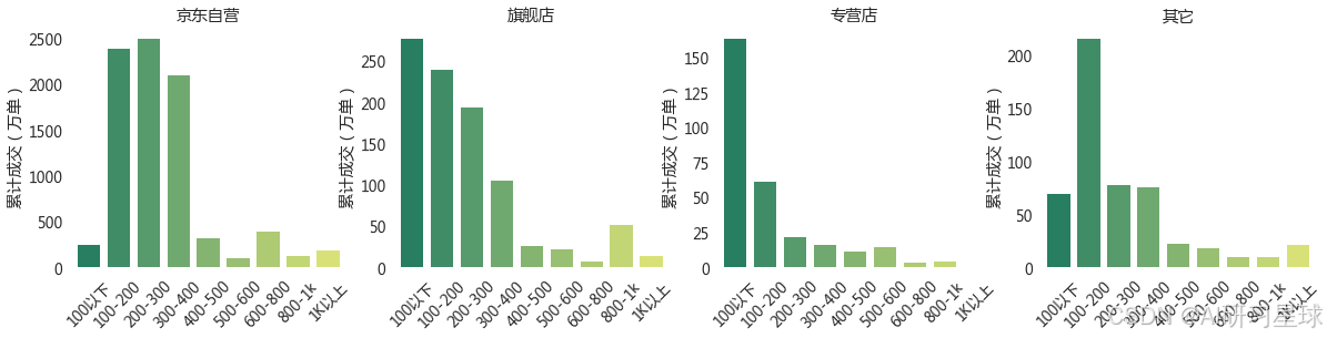
总结
- 自营类店铺以不到 10%的商品数量赢得了超过 80% 的成交量
- 超过 90%的非自营类店铺需要竞争被剩下的不到 20%的资源,
- 更可怕的是超 30 % 的专营店类店铺只能瓜分剩下不到 3% 的成交量
算法学习、4对1辅导、论文辅导、核心期刊
项目的代码和数据下载可以通过公众号滴滴我


 被折叠的 条评论
为什么被折叠?
被折叠的 条评论
为什么被折叠?
 到【灌水乐园】发言


