


 本文介绍如何使用纯CSS实现一个美观且功能完善的自定义单选框,包括边线、圆点绘制、选中、Hover及Focus状态,以及添加动效。
今天跟大家一起,使用纯样式来实现一个支持快捷键切换的、漂酿的单选框。
主要会用到 ::before 和 ::after 伪元素、CSS 属性选择器、相邻兄弟选择器、CSS3 transform 等,示例样式会使用 SCSS ,因为它更直观、更易于阅读。
DOM 结构
你有多久没出去浪了?
反正我是很久没去看世界啦 。。。?
我们先把结构整出来,创建一个单选按钮组:
<h2>你想去哪里浪?</h2>
<div class="input-radio">
  <!-- 选中状态添加 checked 属性 -->
  <input id="city1" type="radio" name="where" checked />
  <label for="city1">我想要带你去浪漫的土耳其</label>
</div>
<div class="input-radio">
  <input id="city2" type="radio" name="where" />
  <label for="city2">然后一起去东京和巴黎</label>
</div>
<div class="input-radio">
  <input id="city3" type="radio" name="where" />
  <label for="city3">其实我特别喜欢迈阿密</label>
</div>
<div class="input-radio">
  <input id="city4" type="radio" name="where" />
  <label for="city4">和有黑人的洛杉矶</label>
</div>
这个结构很巧妙。
<input> 最终是不显示的,因为我们就是要模拟它。<input> 与 <label> 绑定来触发鼠标状态的改变。
本方案理论上 IE9 以上浏览器都可以。此篇目的不在讨论兼容性,页面验证效果仅在 Chrome 浏览器下进行。
不加样式时,页面是这样子:
emmm~,看上去有点挤,控制一下间距:
.input-radio {

  // 上下间距
  margin: 1em 0;

}
看上去好多了!
下面进入正题。
单选框的边线区域
- <label> 标签紧跟在单选框的后面,并且只有它自己,刚好使用 + 选择器;
- <label> 标签用于显示文字,并作为伪元素的载体;
- 为 <label> 标签添加伪元素用于模拟单选框;
- 先创建 ::before 伪元素来模拟单选框的边线区域,为了便于查看其位置先设置为背景色;
- 单选框宽高一致,设置边线区域 border-radius: 50% 使其变成圆形;
- 相对于 <label> 调整边线区域位置,绝对定位到合适位置,盖住原生的单选框;
- 将原生 <input> 透明,也可以 display: none 掉。这里采用透明,因为位置更好控制。
样式如下:
.input-radio {

  // 上下间距
  margin: 1em 0;

  // 单选框
  input[type="radio"] {

    // 将原生单选框透明
    opacity: 0;

    // 紧接在单选框后面的标签,用于显示文字并作为伪元素的载体
    + label {
      position: relative;
      cursor: pointer;

      // 下面使用伪元素模拟单选框

      // 圆形外边线
      &::before {
        content: '';
        position: absolute;
        left: -24px;
        border-radius: 50%;
        width: 18px;
        height: 18px;
        background-color: black;
      }

    }

  }

}
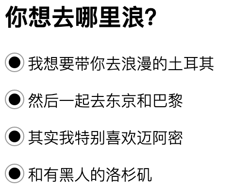
这个时候,页面长这样:
是不是已经有比较大的变化了?嘿嘿,Go on~ ?
单选框的圆点
- 修改边线区域 background-color 为 border;
- 原生单选框是不是显示出来了?对了,这就是为什么要把它透明 / 隐藏的原因。
- 创建 ::after 伪元素来模拟单选框的实心圆点,用于选中状态的显示;
- 圆点大小需要考虑距离边线的位置,我们设置为 3px;
- 同上,相对于 <label> 调整圆点位置,绝对定位到水平垂直居中位置。
样式如下:
.input-radio {

  // 上下间距
  margin: 1em 0;

  // 单选框
  input[type="radio"] {

    // 将原生单选框透明
    opacity: 0;

    // 紧接在单选框后面的标签,用于显示文字并作为伪元素的载体
    + label {
      position: relative;
      cursor: pointer;

      // 下面使用伪元素模拟单选框

      // 圆形外边线
      &::before {
        content: '';
        position: absolute;
        left: -24px;
        border-radius: 50%;
        width: 18px;
        height: 18px;
        border: 1px solid #999;
      }

      // 实心圆,用于选中状态的显示
      &::after {
        content: '';
        position: absolute;
        left: -20px;
        top: 4px;
        border-radius: 50%;
        width: 12px;
        height: 12px;
        background-color: black;
      }

    }

  }

}
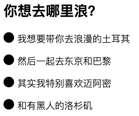
雏形完成:
可是,所有选项都是选中的状态。
No! 这只是个假象,我们接下来才开始实现选中状态。
绘制选中状态
- 上面所有选项都选中(只是假象),是因为圆点设置了 background-color,那就去掉吧;
- 为单选框添加 checked 属性,checked 即原生单选框的选择状态;
- 修改在 checked (选中状态)下圆点背景色、边线颜色,本例设置为蓝色。
样式如下:
.input-radio {

  // 上下间距
  margin: 1em 0;

  // 单选框
  input[type="radio"] {

    // 将原生单选框透明
    opacity: 0;

    // 紧接在单选框后面的标签,用于显示文字并作为伪元素的载体
    + label {
      position: relative;
      cursor: pointer;

      // 下面使用伪元素模拟单选框

      // 圆形外边线
      &::before {
        content: '';
        position: absolute;
        left: -24px;
        border-radius: 50%;
        width: 18px;
        height: 18px;
        border: 1px solid #999;
      }

      // 实心圆,用于选中状态的显示
      &::after {
        content: '';
        position: absolute;
        left: -20px;
        top: 4px;
        border-radius: 50%;
        width: 12px;
        height: 12px;
      }

    }

    // 单选框的选中状态,为其添加 checked 属性
    &:checked {
      + label {
        &::before {
          border-color: blue;
        }
        &::after {
          background-color: blue;
        }
      }
    }

  }

}
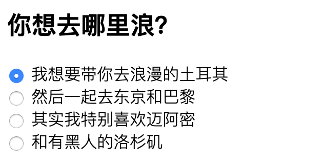
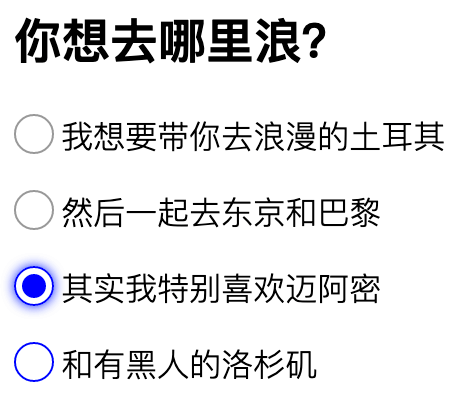
基本搞定,点击切换和状态改变都没有问题:
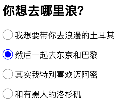
但是!如果你是一个完美主义者,显然,这还不够完美!
那么,我们继续。
Hover 及 Focus 状态
- 通过修改不同状态下边线颜色及添加效果来增加用户感知;
- hover 状态,修改边线颜色为蓝色,提示用户鼠标位置的变化;
- focus 状态,追加单选框阴影效果,美观的同时,与备选项区分更加明显。
样式如下:
.input-radio {

  // 上下间距
  margin: 1em 0;

  // 单选框
  input[type="radio"] {

    // 将原生单选框透明
    opacity: 0;

    // 紧接在单选框后面的标签,用于显示文字并作为伪元素的载体
    + label {
      position: relative;
      cursor: pointer;

      // 下面使用伪元素模拟单选框

      // 圆形外边线
      &::before {
        content: '';
        position: absolute;
        left: -24px;
        border-radius: 50%;
        width: 18px;
        height: 18px;
        border: 1px solid #999;
      }

      // 实心圆,用于选中状态的显示
      &::after {
        content: '';
        position: absolute;
        left: -20px;
        top: 4px;
        border-radius: 50%;
        width: 12px;
        height: 12px;
      }

    }

    // 单选框的选中状态,为其添加 checked 属性
    &:checked {
      + label {
        &::before {
          border-color: blue;
        }
        &::after {
          background-color: blue;
        }
      }
    }

    // hover 状态
    &:hover {
      + label::before {
        border-color: blue;
      }
    }

    // focus 状态
    &:focus {
      + label::before {
        box-shadow: 0 0 6px blue;
      }
    }

  }

}
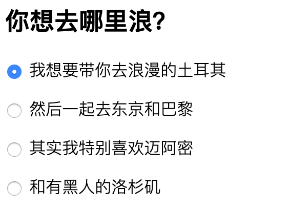
已经很不错了呢!效果如下:
切换稍微有一点生硬,再加个动效吧。
添加动效
- 为实心圆添加缩放动效;
- 实心圆默认不显示,scale(0),为单选框添加 checked 属性(选中状态)时,过渡到 scale(1),时间设置为 0.3 秒。
完整的样式如下:
.input-radio {

  // 上下间距
  margin: 1em 0;

  // 单选框
  input[type="radio"] {

    // 将原生单选框透明
    opacity: 0;

    // 紧接在单选框后面的标签,用于显示文字并作为伪元素的载体
    + label {
      position: relative;
      cursor: pointer;

      // 下面使用伪元素模拟单选框

      // 圆形外边线
      &::before {
        content: '';
        position: absolute;
        left: -24px;
        border-radius: 50%;
        width: 18px;
        height: 18px;
        border: 1px solid #999;
      }

      // 实心圆,用于选中状态的显示
      &::after {
        content: '';
        position: absolute;
        left: -20px;
        top: 4px;
        border-radius: 50%;
        width: 12px;
        height: 12px;
        // 缩放动效,不显示
        transform: scale(0);
      }
    }

    // 单选框的选中状态,为其添加 checked 属性
    &:checked {
      + label {
        &::before {
          border-color: blue;
        }
        &::after {
          background-color: blue;
          // 缩放动效,放大到正常大小
          transform: scale(1);
          transition: all .3s;
        }
      }
    }

    // hover 状态
    &:hover {
      + label::before {
        border-color: blue;
      }
    }

    // focus 状态
    &:focus {
      + label::before {
        box-shadow: 0 0 6px blue;
      }
    }

  }

}
大功告成!
点点看,是不是不灵动了很多呢?
动效就不配图了。你自己实现一遍,亲自体验会更棒!
对了,这个方案单选框获取焦点后,支持键盘上下快捷键切换哦! Perfect! ?


 扫一扫
扫一扫


 1万+
1万+

 被折叠的 条评论
为什么被折叠?
被折叠的 条评论
为什么被折叠?
 到【灌水乐园】发言


