


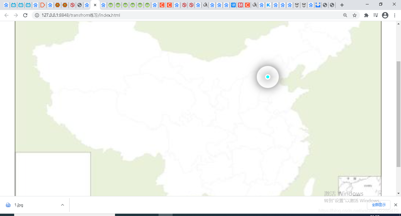
页面中闪动的点
代码如下图所示
<!DOCTYPE html>
<html>
	<head>
		<meta charset="utf-8" />
		<title></title>
		<style type="text/css">
	    .map {
			position: relative;
			margin: 0 auto;
			width: 500px;
			height:356px;
			background: url(img/1.jpg);
		}
		.city {
			position: absolute;
			left: 343px;
			top: 146px;
			color: #fff;
		}
		.dot {
			width: 4px;
			height: 4px;
			background-color: #00FFFF;
			border-radius: 50%;
		}
		.pulse1,.pulse2,.pulse3 {
		   position: absolute;
		   top: 50%;
		   left: 50%;
		   transform: translate(-50%,-50%);
		   width: 6px;
		   height: 6px;
		   box-shadow: 0px 0px 12px #666;
		   border-radius: 50%;
		   animation: pluse 1.2s linear infinite;
		}
		div .pulse2 {
			animation-delay: 0.4s;
		}
		div .pulse3 {
			animation-delay: 0.4s;
		}
		@keyframes pluse{
			50% {
				width: 40px;
				height: 40px;
				opacity: 1;
			}
			70% {
				width: 70px;
				height: 70px;
				opacity: 0;
			}
		}
		</style>
	</head>
	<body>
		<div class="map">
			<div class="city">
				<div class="dot"></div>
				<div class="pulse1"></div>
				<div class="pulse2"></div>
				<div class="pulse3"></div>
			</div>
		</div>
	</body>
</html>


 扫一扫
扫一扫


 被折叠的 条评论
为什么被折叠?
被折叠的 条评论
为什么被折叠?
 到【灌水乐园】发言


