


目录
8.1.1、TransformOperationsTransition示例
引言
Avalonia是一个强大的框架,使开发人员能够使用.NET创建跨平台应用程序。它使用自己的渲染引擎绘制UI控件,确保在Windows、macOS、Linux、Android、iOS和WebAssembly等不同平台上具有一致的外观和行为。这意味着开发人员可以共享他们的UI代码,并在不同的目标平台上保持统一的外观和感觉。一个跨平台的UI框架,与跨平台.Net结合,为不同平台分发软件。
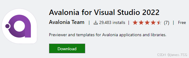
1、VS中的Avalonia安装配置
调出终端输入一下命令安装模板:
dotnet new install Avalonia.Templates安装完成之后输入: dotnet new list
看到安装的模板类型大致如下:
Template Name Short Name Language Tags
-------------------------------------------- -------------------------- ---------- ---------------------------------------------------------
Avalonia App avalonia.app [C#],F# Desktop/Xaml/Avalonia/Windows/Linux/macOS
Avalonia MVVM App avalonia.mvvm [C#],F# Desktop/Xaml/Avalonia/Windows/Linux/macOS
Avalonia Cross Platform Application avalonia.xplat [C#],F# Desktop/Xaml/Avalonia/Web/Mobile
Avalonia Resource Dictionary avalonia.resource Desktop/Xaml/Avalonia/Windows/Linux/macOS
Avalonia Styles avalonia.styles Desktop/Xaml/Avalonia/Windows/Linux/macOS
Avalonia TemplatedControl avalonia.templatedcontrol [C#],F# Desktop/Xaml/Avalonia/Windows/Linux/macOS
Avalonia UserControl avalonia.usercontrol [C#],F# Desktop/Xaml/Avalonia/Windows/Linux/macOS
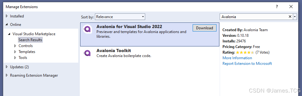
Avalonia Window avalonia.window [C#],F# Desktop/Xaml/Avalonia/Windows/Linux/macOS在VS2022中调试Avalonia程序我们还需要安装一个扩展:
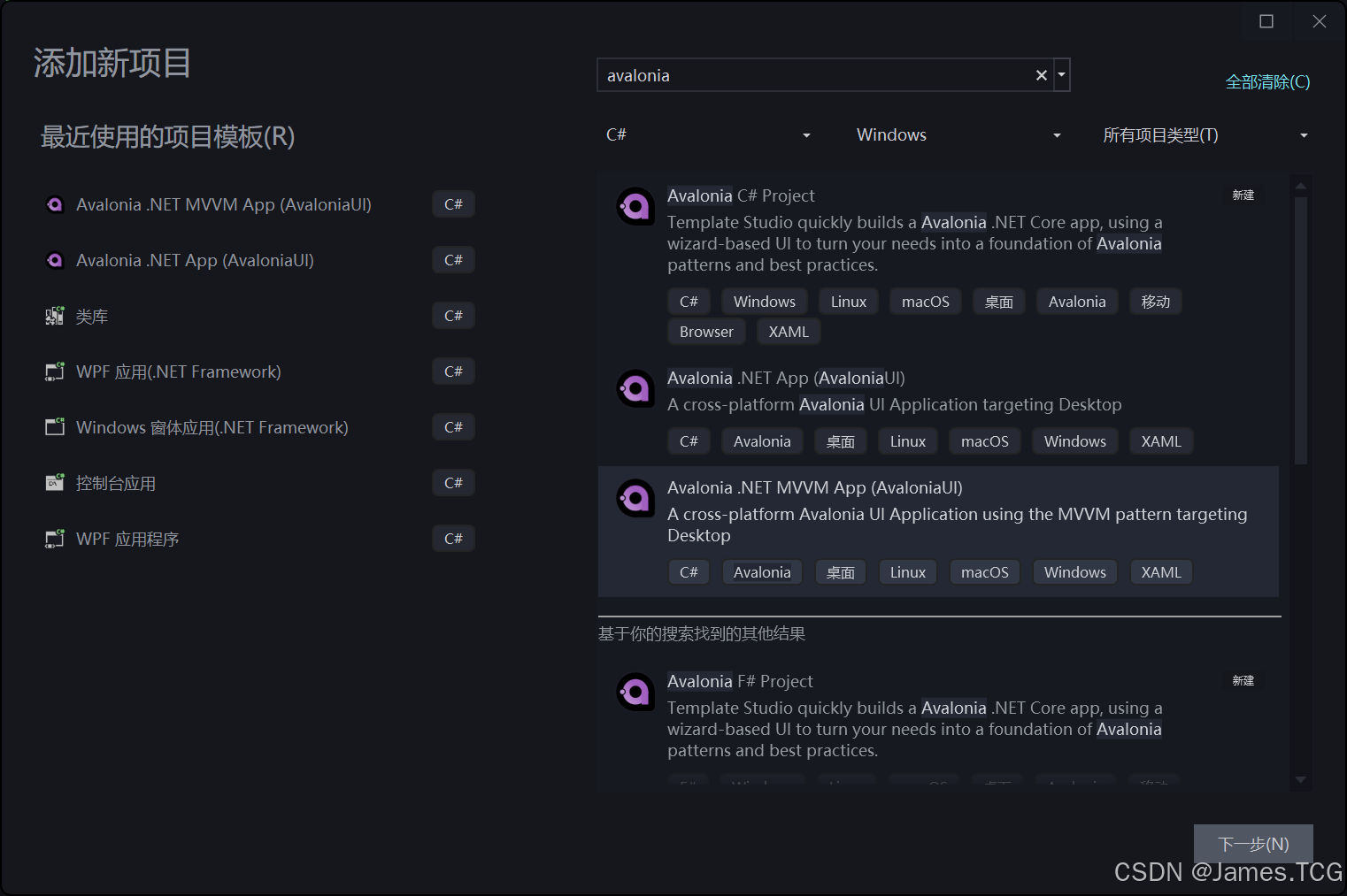
2、创建MVVM项目
创建MVVM项目会自动添加MVVM框架,这里我选择社区工具包:CommunityToolkit.Mvvm
axaml文件中添加控件,以及自动属性的赋值与WPF差不多但更好用。比如Grid控件,分行分列时xaml要写好几行代码,而axaml只需要两行:
 <Grid
     Margin="5"
     ColumnDefinitions="120, 100"
     RowDefinitions="Auto, Auto, Auto"
     ShowGridLines="True"/>
3、样式选择器
| 样式选择器 | 描述 |
|---|---|
Button | 选择所有 Button(类)控件。 |
Button.red | 选择所有带有 red 样式类的 Button 控件。 |
Button.red.large | 选择所有同时带有 red 和 large 样式类的 Button 控件。 |
Button:focus | 选择所有带有 :focus 伪类激活的 Button 控件。 |
Button.red:focus | 选择所有同时带有 red 样式类和 :focus 伪类激活的 Button 控件。 |
Button#myButton | 选择 Name(属性)为 "myButton" 的 Button 控件。 |
StackPanel Button.xl | 选择所有带有 xl 样式类的 Button(类)控件,同时它们是 StackPanel(类)控件的后代,可以位于任何级别。 |
StackPanel > Button.xl | 选择所有带有 xl 样式类的 Button(类)控件,同时它们是 StackPanel(类)控件的直接后代。 |
Button /template/ ContentPresenter | 选择所有在 Button(类)控件的模板内的 ContentPresenter(类)控件。 |
3.1、Selector
与WPF最大的不同就是样式,WPF中的样式的使用是在控件的Style中进行资源绑定来将样式赋给该控件,而Avalonia中可以在定义样式时,通过样式选择器Selector直接指定到对应的控件,并通过classes进行区分应用不同的样式(CSS样式)。
<Style Selector="TargetControlClass.styleClassName"><UserControl>
<UserControl.Styles>
<!-- 让带有 h1 样式类的 TextBlock 具有 24 点的字体大小 -->
<Style Selector="TextBlock.h1">
<Setter Property="FontSize" Value="24"/>
</Style>
</UserControl.Styles>
<TextBlock Classes="h1">Header</TextBlock>
<UserControl>如果Selector中只赋值了控件类型,而没有“.”向下细分,则该样式会应用到所有内部的同类型控件上。
精确限定,用于要求同时具有多个Class名称:
<UserControl>
    <UserControl.Styles>
        <!-- 让带有 h1 和 h2 样式类的 TextBlock 具有 24 点的字体大小 -->
        <Style Selector="TextBlock.h1.h2">
            <Setter Property="FontSize" Value="24"/>
        </Style>
    </UserControl.Styles>
    <TextBlock Classes="h1 h2">生效</TextBlock>
    <TextBlock Classes="h1">不生效</TextBlock>
    <TextBlock Classes="h2">不生效</TextBlock>
<UserControl>
3.2、嵌套样式 ^
样式可以嵌套在其他样式中。要嵌套样式,只需将子样式作为父 <Style> 元素的子元素包含,并在子选择器的开头加上嵌套选择器 ^ (可以理解为外部样式的缩写)
<Style Selector="TextBlock.h1">
    <Setter Property="FontSize" Value="24"/>
    <Setter Property="FontWeight" Value="Bold"/>

    <Style Selector="^:pointerover">
        <Setter Property="Foreground" Value="Red"/>
    </Style>
</Style>
:pointerover 为鼠标悬停时设定样式
等价于:
<Style Selector="TextBlock.h1">
    <Setter Property="FontSize" Value="24"/>
    <Setter Property="FontWeight" Value="Bold"/>
</Style>
<Style Selector="TextBlock.h1:pointerover">
    <Setter Property="FontSize" Value="24"/>
    <Setter Property="FontWeight" Value="Bold"/>
    <Setter Property="Foreground" Value="Red"/>
</Style>
3.3、多样式
你可以为 Avalonia UI 控件分配一个或多个样式类,并使用它们来指导样式选择。样式类通过在控件元素中使用 Classes 属性进行分配。如果你想分配多个类,则使用空格分隔它们。
<Button Classes="h1 blue"/>代码中可以这样添加:
control.Classes.Add("blue");
control.Classes.Remove("red");如果你想样式应用于多个不同控件,可以用逗号分隔:ControlType1,ControlType2
<Style Selector="TextBlock, Button">3.4、伪类选择器 :
Avalonia中的伪类,类似于CSS中的伪类,是由Control(控件)暴露出的关键字,用于方便地指示控件的特定状态,以便于样式选择器使用。这些状态被用于条件性地样式化控件。例如,一个Button(按钮)在被按下时可以有不同的外观,一个 TextBox 在被禁用时也是如此。
<StackPanel>
  <StackPanel.Styles>
    <Style Selector="Button:pressed">
        <Setter Property="Foreground" Value="Red"/>
    </Style>
  </StackPanel.Styles>
  <Button>I will have red text when pressed.</Button>
</StackPanel>
一个控件可以同时激活多个伪类,此时您可以用选择器同时目标多个伪类。
<Style Selector="Button:focus">
<Style Selector="Button.large:focus">
<Style Selector="Button.red:focus:pointerover">
:disabled | 控件失能,无法交互时 |
:pointerover | 鼠标悬停 |
:focus | 获得焦点时 |
:focus-within | 获得焦点或子元素获得焦点时 |
:focus-visible | 获得焦点并可见时 |
自定义伪类:[PseudoClasses(":left", ":right", ":middle")]
[PseudoClasses(":left", ":right", ":middle")]
public class AreaButton : Button
{
    protected override void OnPointerMoved(PointerEventArgs e)
    {
        base.OnPointerMoved(e);
        var pos = e.GetPosition(this);

        if (pos.X < Bounds.Width * 0.25)
            SetAreaPseudoclasses(true, false, false);
        else if (pos.X > Bounds.Width * 0.75)
            SetAreaPseudoclasses(false, true, false);
        else
            SetAreaPseudoclasses(false, false, true);
    }

    protected override void OnPointerExited(PointerEventArgs e)
    {
        base.OnPointerExited(e);
        SetAreaPseudoclasses(false, false, false);
    }

    private void SetAreaPseudoclasses(bool left, bool right, bool middle)
    {
        PseudoClasses.Set(":left", left);
        PseudoClasses.Set(":right", right);
        PseudoClasses.Set(":middle", middle);
    }
}
如果控件不是Avalonia自带的,需要带上程序集名(xmlns名称) ,通过竖线 | 分开
<Window.Styles>
    <Style Selector="local|AreaButton">
        <Setter Property="Content" Value="Testing Area" />
        <Setter Property="MinWidth" Value="200" />

        <Style Selector="^:left">
            <Setter Property="Content" Value="Left" />
        </Style>
        <Style Selector="^:right">
            <Setter Property="Content" Value="Right" />
        </Style>
        <Style Selector="^:middle">
            <Setter Property="Content" Value="Middle" />
        </Style>
    </Style>
</Window.Styles>

<local:AreaButton />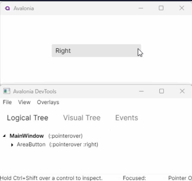
3.5、模板选择器
通过 /template/ 我们可以找到非我们自己定义的控件的内部元素,并更改其样式。这比WPF中要简单许多。
<StackPanel>
  <StackPanel.Styles>
    <Style Selector="Button:pressed /template/ ContentPresenter">
        <Setter Property="TextBlock.Foreground" Value="Red"/>
    </Style>
  </StackPanel.Styles>
  <Button>I will have red text when pressed.</Button>
</StackPanel>
3.5、条件样式
A: 如果你需要使用绑定VM条件添加或删除类,则可以使用以下特殊语法:
<UserControl>
    <UserControl.Styles>
        <Style Selector="Button">
            <Setter Property="Foreground" Value="Blue"/>
        </Style>
        <Style Selector="Button.accent">
            <Setter Property="Foreground" Value="Red"/>
        </Style>
    </UserControl.Styles>
    <Button Classes.accent="{Binding IsSpecial}" />
<UserControl>
如果我们想要取反,直接加!即可 !IsSpecial
B: 按名称 #ControlName
<Style Selector="#myButton">
<Style Selector="Button#myButton">
C: 派生类 : is(ControlBase)
<Style Selector=":is(Button)">
<Style Selector=":is(local|Button)">
派生自Control,且Classes = "margin2"
<Style Selector=":is(Control).margin2">
<Style Selector=":is(local|Control.margin2)">
D: 直接子集 >
<Style Selector="StackPanel > Button"><StackPanel>
<Button>直接子集会应用样式</Button>
<DockPanel Width="300" Height="300">
<Button DockPanel.Dock="Top">间接不会应用样式</Button>
<TextBlock>Some text</TextBlock>
</DockPanel
</StackPanel>E: 任意后代子集
<Style Selector="StackPanel Button">F: 按属性值 ControlType[Property=Value]
<Style Selector="Button[IsDefault=true]">

<StackPanel Orientation="Horizontal">
   <Button IsDefault="True">Save</Button>
   <Button>Cancel</Button>
</StackPanel>
G: Not语句 ControlType :not(Condition)
<Style Selector="TextBlock:not(.h1)">H: 子元素位置 ControlType:nth-child(An+B)
从前往后,第B个开始,步长为A,子元素位置与An+B结果相等时应用样式,计算结果小于1时不起作用,n=0,1,2,3...
<Style Selector="TextBlock:nth-child(2n+3)">与此相反,从末尾开始往前计算的也有:ControlType:nth-last-child(An+B)
<Style Selector="TextBlock:nth-last-child(2n+3)">或则直接指定位置:
<Style Selector="TextBlock:nth-child(3)">奇偶数:odd / even
<Style Selector="TextBlock:nth-child(odd)">
<Style Selector="TextBlock:nth-child(even)">
在线测试: :nth Tester
4、引用样式文件
对于已有样式 Styles/AppStyles.axaml
<Styles xmlns="https://github.com/avaloniaui"
        xmlns:x="http://schemas.microsoft.com/winfx/2006/xaml">
    <Style Selector="TextBlock.h1">
        <Setter Property="FontSize" Value="24"/>
        <Setter Property="FontWeight" Value="Bold"/>
    </Style>
</Styles>
A: 同项目在Window中引用
<Window ... >
    <Window.Styles>
        <StyleInclude Source="/Styles/AppStyles.axaml" />
    </Window.Styles>

    <StackPanel>
       <TextBlock Classes="h1">Heading 1</TextBlock>
       <TextBlock>This is not a heading and will not be changed.</TextBlock>
    </StackPanel>
</Window>
B: 同项目在App.axmal中引用
<Application... >
    <Application.Styles>
        <FluentTheme Mode="Light"/>
        <StyleInclude Source="/AppStyles.axaml"/>
    </Application.Styles>
</Application>
C: 引用其他程序集的样式 avares://
<Application... >
    <Application.Styles>
        <FluentTheme Mode="Light"/>
        <StyleInclude Source="avares://MyApp.Shared/Styles/CommonAppStyles.axaml"/>
    </Application.Styles>
</Application>
5、主题资源
通过主题字典可以添加多个资源字典,设置不同的键值:Light/Dark。
<Application xmlns="https://github.com/avaloniaui"
             xmlns:x="http://schemas.microsoft.com/winfx/2006/xaml"
             x:Class="AvaloniaApplication.App"
             RequestedThemeVariant="Dark">
  <Application.Styles>
    <FluentTheme />
  </Application.Styles>
</Application>
插入主题变量域为后续控件应用资源。
<ThemeVariantScope RequestedThemeVariant="Light"><Window xmlns="https://github.com/avaloniaui"
xmlns:x='http://schemas.microsoft.com/winfx/2006/xaml'
x:Class="Sandbox.MainWindow"
RequestedThemeVariant="Dark"
Background="Gray">
<Window.Resources>
<ResourceDictionary>
<ResourceDictionary.ThemeDictionaries>
<ResourceDictionary x:Key='Light'>
<SolidColorBrush x:Key='BackgroundBrush'>SpringGreen</SolidColorBrush>
<SolidColorBrush x:Key='ForegroundBrush'>Black</SolidColorBrush>
</ResourceDictionary>
<ResourceDictionary x:Key='Dark'>
<SolidColorBrush x:Key='BackgroundBrush'>DodgerBlue</SolidColorBrush>
<SolidColorBrush x:Key='ForegroundBrush'>White</SolidColorBrush>
</ResourceDictionary>
</ResourceDictionary.ThemeDictionaries>
</ResourceDictionary>
</Window.Resources>
<Window.Styles>
<Style Selector="Button">
<Setter Property="Background" Value="{DynamicResource BackgroundBrush}" />
<Setter Property="Foreground" Value="{DynamicResource ForegroundBrush}" />
</Style>
</Window.Styles>
<StackPanel Spacing="5" Margin="5">
<Button Content="Dark button"
Background="{DynamicResource BackgroundBrush}"
Foreground="{DynamicResource ForegroundBrush}" />
<ThemeVariantScope RequestedThemeVariant="Light">
<Button Content="Light button"
Background="{DynamicResource BackgroundBrush}"
Foreground="{DynamicResource ForegroundBrush}" />
</ThemeVariantScope>
</StackPanel>
</Window>
6、绑定
6.1、绑定到控件
通过关键字:#TargetControlName.TargetProperty
<TextBox Name="other">

<!-- 绑定到命名为 other 控件的 Text 属性 -->
<TextBlock Text="{Binding #other.Text}"/>
6.2、绑定到父级
通过关键字:$parent.TargetProperty
<Border Tag="Hello World!">
  <TextBlock Text="{Binding $parent.Tag}"/>
</Border>任意级父级:$parent[Grade].TargetProperty
<Border Tag="Hello World!">
  <Border>
    <TextBlock Text="{Binding $parent[1].Tag}"/>
  </Border>
</Border>指定父级类型:$parent[ParentControlType].TargetProperty
<Border Tag="Hello World!">
  <Decorator>
    <TextBlock Text="{Binding $parent[Border].Tag}"/>
  </Decorator>
</Border>指定父级类型和级别:$parent[ParentControlType;Grade].TargetProperty
<Border Tag="Hello World!">
  <Border>
    <Decorator>
    <TextBlock Text="{Binding $parent[Border;1].Tag}"/>
    </Decorator>
  </Border>
</Border>第三方控件:$parent[AssemblyName:ParentControlType].TargetProperty
<local:MyControl Tag="Hello World!">
  <Decorator>
    <TextBlock Text="{Binding $parent[local:MyControl].Tag}"/>
  </Decorator>
</local:MyControl>
6.3、绑定到方法
Avalonia UI 数据绑定提供了一种使用命名约定来实现“能否执行?”的功能的简单方法。
如果你需要根据命令参数的值或视图模型属性的值来决定是否执行,那么你可以编写一个第二个布尔方法来检查操作方法是否可以执行。
为了使其工作,Avalonia UI 使用了布尔方法与操作方法相同的根名称,但加上了前缀 Can 的命名约定。
namespace AvaloniaGuides.ViewModels
{
    public class MainWindowViewModel
    {
        public void PerformAction(object msg)
        {
            Debug.WriteLine($"The action was called. {msg}");
        }

        public bool CanPerformAction(object msg)
        {
            if (msg!=null) return !string.IsNullOrWhiteSpace( msg.ToString() );
            return false;
        }
    }
}
绑定
<StackPanel Margin="20">
  <TextBox Margin="0 5" x:Name="message"
           Watermark="Add a message to enable the button"/>
  <Button Command="{Binding PerformAction}"
          CommandParameter="{Binding #message.Text}">
    Run the example
  </Button>
</StackPanel>
6.3、绑定到任务结果
如果您需要进行一些繁重的工作来加载属性的内容,您可以绑定到 async Task<TResult> 的结果。假设您有以下的视图模型,它在一个长时间运行的过程中生成一些文本:
public Task<string> MyAsyncText => GetTextAsync();

private async Task<string> GetTextAsync()
{
  await Task.Delay(1000); // 仅为演示目的而进行延迟
  return "Hello from async operation";
}
<TextBlock Text="{Binding MyAsyncText^, FallbackValue='Wait a second'}" />对于需要延迟返回的任务结果需要加绑定后缀:^
7、动画
7.1、样式中的关键帧动画
IterationCount 可设置为指定次数或无限循环
<Window xmlns="https://github.com/avaloniaui">
    <Window.Styles>
	<Style Selector="Rectangle.red">
		<Setter Property="Fill" Value="Red"/>
		<Style.Animations>
			<Animation Duration="0:0:3" IterationCount="INFINITE">
				<KeyFrame Cue="0%">
					<Setter Property="Opacity" Value="0.0"/>
					<Setter Property="RotateTransform.Angle" Value="0.0"/>
				</KeyFrame>
				<KeyFrame Cue="100%">
					<Setter Property="Opacity" Value="1.0"/>
					<Setter Property="RotateTransform.Angle" Value="90.0"/>
				</KeyFrame>
			</Animation>
		</Style.Animations>
	</Style>
    </Window.Styles>
    <Rectangle Classes="red" Width="100" Height="100"/>
</Window>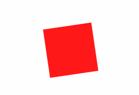
PlaybackDirection 可指定动画方向:
PlaybackDirection="AlternateReverse| 值 | 描述 |
|---|---|
Normal | (默认)正向播放动画。 |
Reverse | 反向播放动画。 |
Alternate | 先正向播放动画,然后反向播放。 |
AlternateReverse | 先反向播放动画,然后正向播放。 |
7.2、填充模式
| 值 | 描述 |
|---|---|
None | 动画运行后,值不会保留,也不会在动画延迟时应用第一个值。 |
Forward | 最后的插值值将持续保留到目标属性。 |
Backward | 在动画延迟时,第一个插值值将显示。 |
Both | 将同时应用 Forward 和 Backward 行为。 |
 <Window.Styles>
     <Style Selector="Rectangle.red">
         <Setter Property="Fill" Value="Red" />
         <Style.Animations>
             <Animation
                 PlaybackDirection="Normal"
		         FillMode="Both"
                 Duration="0:0:3">
                 <KeyFrame Cue="0%">
                     <Setter Property="Opacity" Value="0.0" />
                     <Setter Property="RotateTransform.Angle" Value="0.0" />
			<Setter Property="Width" Value="100"/>
                 </KeyFrame>
                 <KeyFrame Cue="100%">
                     <Setter Property="Opacity" Value="1.0" />
                     <Setter Property="RotateTransform.Angle" Value="90.0" />
			<Setter Property="Width" Value="200"/>
                 </KeyFrame>
             </Animation>
         </Style.Animations>
     </Style>
 </Window.Styles>
7.3、缓动函数
Easing="BounceEaseIn"
8、过渡效果Transition
8.1、基本过渡动画
Avalonia中的过渡效果也受到CSS动画的很大启发。它们监听目标属性的值的任何变化,并根据其参数对变化进行动画处理。可以通过Transitions属性在任何Control上定义过渡效果:

在控件中定义Transition :
<Window.Styles>
	<Style Selector="Rectangle.red">
		<Setter Property="Height" Value="100"/>
		<Setter Property="Width" Value="100"/>
		<Setter Property="Fill" Value="Red"/>
		<Setter Property="Opacity" Value="0.5"/>
	</Style>
	<Style Selector="Rectangle.red:pointerover">
		<Setter Property="Opacity" Value="1"/>
	</Style>
</Window.Styles>

<Rectangle Classes="red">
	<Rectangle.Transitions>
		<Transitions>
			<DoubleTransition Property="Opacity" Duration="0:0:0.2"/>
		</Transitions>
	</Rectangle.Transitions>
</Rectangle>
在样式中定义Transition :
<Window xmlns="https://github.com/avaloniaui">
    <Window.Styles>
        <Style Selector="Rectangle.red">
            <Setter Property="Height" Value="100"/>
            <Setter Property="Width" Value="100"/>
            <Setter Property="Fill" Value="Red"/>
            <Setter Property="Opacity" Value="0.5"/>
            <Setter Property="Transitions">
                <Transitions>
                    <DoubleTransition Property="Opacity" Duration="0:0:0.2"/>
                </Transitions>
            </Setter>
        </Style>
        <Style Selector="Rectangle.red:pointerover">
            <Setter Property="Opacity" Value="1"/>
        </Style>
    </Window.Styles>

    <Rectangle Classes="red"/>

</Window>
每个过渡效果都有 Property、Delay、Duration 和可选的 Easing 属性。
Property 表示过渡效果的目标属性,用于监听和动画处理值。
Delay 表示过渡效果应用于目标之前的等待时间。
Duration 表示过渡效果播放的时间长度。
缓动函数与 关键帧动画 中描述的相同。
以下是可用的过渡效果类型。必须根据要动画处理的属性类型选择正确的类型。
BoxShadowsTransition:用于BoxShadows目标属性BrushTransition:用于IBrush目标属性ColorTransition:用于Color目标属性CornerRadiusTransition:用于CornerRadius目标属性DoubleTransitions:用于double目标属性FloatTransitions:用于float目标属性IntegerTransitions:用于int目标属性PointTransition:用于Point目标属性SizeTransition:用于Size目标属性ThicknessTransition:用于Thickness目标属性TransformOperationsTransition:用于ITransform目标属性VectorTransition:用于Vector目标属性
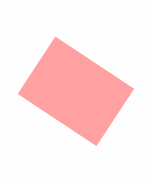
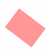
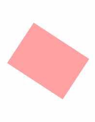
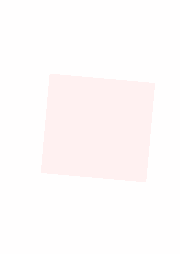
8.1.1、TransformOperationsTransition示例
在指针悬停在其上方时旋转45度
<Border Width="100" Height="100" Background="Red">
    <Border.Styles>
        <Style Selector="Border">
            <Setter Property="RenderTransform" Value="rotate(0)"/>
        </Style>
        <Style Selector="Border:pointerover">
            <Setter Property="RenderTransform" Value="rotate(45deg)"/>
        </Style>
    </Border.Styles>
    <Border.Transitions>
        <Transitions>
            <TransformOperationsTransition Property="RenderTransform" Duration="0:0:1"/>
        </Transitions>
    </Border.Transitions>
</Border>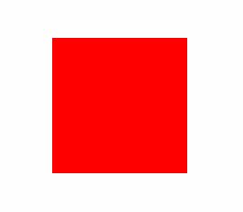
可用的过渡效果如下:
| 过渡效果 | 示例 | 可接受的单位 |
|---|---|---|
translate | translate(10px), translate(0px, 10px) | px |
translateX | translateX(10px) | px |
translateY | translateY(10px) | px |
scale | scale(10), scale(0, 10) | |
scaleX | scaleX(10) | |
scaleY | scaleY(10) | |
skew | skew(90deg), skew(0, 90deg) | deg, grad, rad, turn |
skewX | skewX(90deg) | deg, grad, rad, turn |
skewY | skewY(90deg) | deg, grad, rad, turn |
rotate | rotate(90deg) | deg, grad, rad, turn |
matrix | matrix(1,2,3,4,5,6) |
8.2、页面过渡动画
TransitioningContentControl 可以使用页面过渡来对内部控件上的内容更改进行动画处理。
Content | 要在控件中显示的内容。 |
TransitioningContentControl. ContentTemplate | 用于显示内容的数据模板。 |
TransitioningContentControl. PageTransition | 用于对内容更改进行动画处理的页面过渡效果。应用的主题将提供默认页面过渡。要禁用转换,请将此属性设置为 null。 |
页面过渡动画:
CrossFade(默认): 跨淡入淡出页面过渡通过动画方式改变不透明度,从而使当前页面淡出,新页面淡入。
PageSlide:页面滑动过渡将旧页面移出视图,并将新页面视图移入,持续一定的时间。您可以使用orientation属性指定滑动方向(默认为水平)。
您可以组合两种或更多内置的页面过渡效果,以创建新的效果。
<CompositePageTransition>
    <CrossFade Duration="0:00:00.500" />
    <PageSlide Duration="0:00:00.500" Orientation="Horizontal" />
    <PageSlide Duration="0:00:00.500" Orientation="Vertical" />
</CompositePageTransition>
8.2.1、示例1

在此示例中,视图模型包含一组不同的图像,以幻灯片形式显示它们。每当 bound 属性发生更改时,以下 XAML 将使用默认页面过渡来更改图像(在数据模板中):SelectedImage
<TransitioningContentControl Content="{Binding SelectedImage}" >
    <TransitioningContentControl.ContentTemplate>
        <DataTemplate DataType="Bitmap">
            <Image Source="{Binding}" />
        </DataTemplate>
    </TransitioningContentControl.ContentTemplate>
</TransitioningContentControl>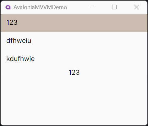
使用默认页面过渡动画
<StackPanel>
	 <ListBox Name="nameBox" ItemsSource="{Binding Names}"/>
<TransitioningContentControl Content="{Binding #nameBox.SelectedItem}">
    <TransitioningContentControl.ContentTemplate>
        <DataTemplate>
            <TextBlock Text="{Binding}" HorizontalAlignment="Center" VerticalAlignment="Center"/>
        </DataTemplate>
    </TransitioningContentControl.ContentTemplate>
</TransitioningContentControl>
</StackPanel>
8.2.2、示例2 :PageSlide

<TransitioningContentControl Content="{Binding SelectedImage}" >
    <TransitioningContentControl.PageTransition>
        <PageSlide Orientation="Horizontal" Duration="0:00:00.500" />
    </TransitioningContentControl.PageTransition>
    <TransitioningContentControl.ContentTemplate>
        <DataTemplate DataType="Bitmap">
            <Image Source="{Binding}"  />
        </DataTemplate>
    </TransitioningContentControl.ContentTemplate>
</TransitioningContentControl>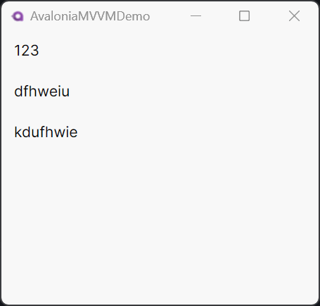
 <StackPanel>
     <ListBox Name="nameBox" ItemsSource="{Binding Names}" />
     <TransitioningContentControl Content="{Binding #nameBox.SelectedItem}">
         <TransitioningContentControl.PageTransition>
             <PageSlide Orientation="Horizontal" Duration="0:00:00.500" />
         </TransitioningContentControl.PageTransition>
         <TransitioningContentControl.ContentTemplate>
             <DataTemplate>
                 <TextBlock
                     HorizontalAlignment="Center"
                     VerticalAlignment="Center"
                     Text="{Binding}" />
             </DataTemplate>
         </TransitioningContentControl.ContentTemplate>
     </TransitioningContentControl>
 </StackPanel>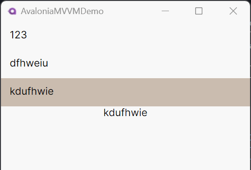
<StackPanel>
    <ListBox Name="nameBox" ItemsSource="{Binding Names}" />
    <TransitioningContentControl Content="{Binding #nameBox.SelectedItem}">
        <TransitioningContentControl.PageTransition>
            <CompositePageTransition>
                <CrossFade Duration="0:00:00.500" />
                <PageSlide Orientation="Horizontal" Duration="0:00:00.500" />
                <PageSlide Orientation="Vertical" Duration="0:00:00.500" />
            </CompositePageTransition>
        </TransitioningContentControl.PageTransition>
        <TransitioningContentControl.ContentTemplate>
            <DataTemplate>
                <TextBlock
                    HorizontalAlignment="Center"
                    VerticalAlignment="Center"
                    Text="{Binding}" />
            </DataTemplate>
        </TransitioningContentControl.ContentTemplate>
    </TransitioningContentControl>
</StackPanel>


 扫一扫
扫一扫


 969
969

 被折叠的 条评论
为什么被折叠?
被折叠的 条评论
为什么被折叠?
 到【灌水乐园】发言


