


前端常问的面试题,题目:假设高度一定,请写出三栏布局,左右宽度300px,中间自适应。
看到这里我希望你能停下来思考几分钟,
好了,那么你想出了几种答案呢?
下面提供这道题的五种解决方案:
首先要写好整个页面的布局(初始化等)
    <style>
        html * {
            padding: 0;
            margin: 0;
        }

        .layout {
            margin-top: 20px;
        }

        .layout article div {
            min-height: 100px;
        }
    </style>
-------------------------------------------------------------实现方法-----------------------------------------------------------
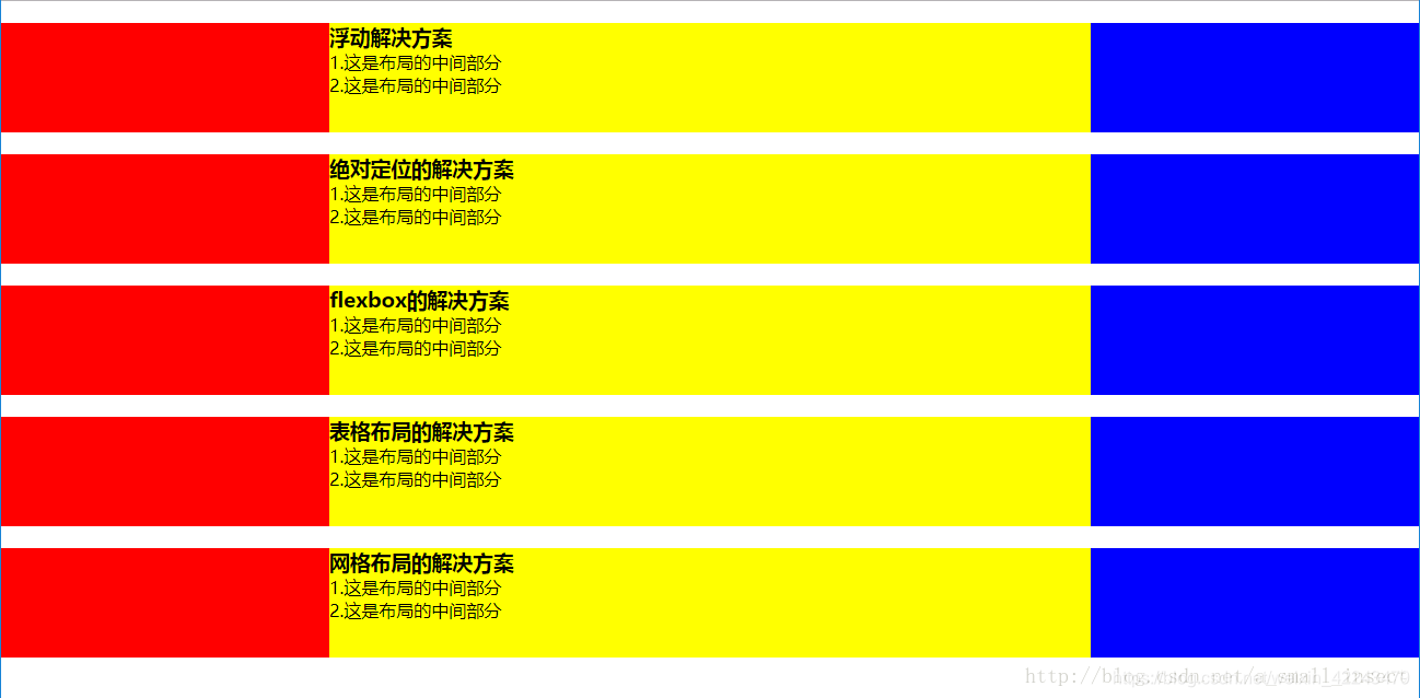
1.浮动的解决方案
(运用float,左右浮动,中间采用margin-left 和 margin-right 时,一定要注意三个div的顺序,center必须放在最后)
分析:
- 运用float,左右浮动,中间采用margin-left 和 margin-right 方法。按照HTML在页面展示的顺序,先有left占据了200px,然后是center,center未设置宽度,但其父div是100%,所以,center占据剩余的全部空间(由于设置了margin-right,所以有右边有空白,实际上还是center盒子所占的空间),最后渲染right,由于left和center所在的行空间没有多余的空间了,所以right被挤下来了。
- left——right——center或者right——left——center为啥可以达到预期效果?和渲染顺序有关,先渲染left,由于left左边浮动,所以,left乖乖的处于左边;再渲染right,right又浮动,所以,right乖乖的处于右边;最后渲染center,由于left、right设置了浮动(脱离正常文档流),又因为center设置了左右margin(刚好空出的位置放left和right),所以center可以和left、right愉快和谐的处于一行(实际上left、right不在正常的文档流中,刚好处于center的左右margin)
<!-- 浮动布局解决方案 -->
    <section class="layout float">
        <style>
            .layout.float .left {
                float: left;
                width: 300px;
                background: red;
            }

            .layout.float .right {
                float: right;
                width: 300px;
                background: blue;
            }

            .layout.float .center {
                background: yellow;
            }
        </style>
        <article class="left-center-right">
            <div class="left"></div>
            <div class="right"></div>
            <div class="center">
                <h1>浮动解决方案</h1>
                <p>1.这是布局的中间部分</p>
                <p>2.这是布局的中间部分</p>
            </div>
        </article>
    </section>
2.绝对定位的解决方案
<!-- 绝对定位的解决方案 -->
    <section class="layout absolute">
        <style>
            .layout.absolute .left-center-right>div {
                position: absolute;
            }

            .layout.absolute .left {
                left: 0;
                width: 300px;
                background: red;
            }

            .layout.absolute .center {
                left: 300px;
                right: 300px;
                background: yellow;
            }

            .layout.absolute .right {
                right: 0;
                width: 300px;
                background: blue;
            }
        </style>
        <article class="left-center-right">
            <div class="left"></div>
            <div class="center">
                <h1>绝对定位的解决方案</h1>
                <p>1.这是布局的中间部分</p>
                <p>2.这是布局的中间部分</p>
            </div>
            <div class="right"></div>
        </article>
    </section>
3.flexbox的解决方案
<!-- flexbox解决方案 -->
    <section class="layout flexbox">
        <style>
            .layout.flexbox {
                margin-top: 140px;
            }

            .layout.flexbox .left-center-right {
                display: flex;
            }

            .layout.flexbox .left {
                width: 300px;
                background: red;
            }

            .layout.flexbox .center {
                flex: 1;
                background: yellow;
            }

            .layout.flexbox .right {
                width: 300px;
                background: blue;
            }
        </style>
        <article class="left-center-right">
            <div class="left"></div>
            <div class="center">
                <h1>flexbox的解决方案</h1>
                <p>1.这是布局的中间部分</p>
                <p>2.这是布局的中间部分</p>
            </div>
            <div class="right"></div>
        </article>
    </section>
4.表格布局的解决方案
<!-- 表格布局的解决方案 -->
    <section class="layout table">
        <style>
            .layout.table .left-center-right {
                width: 100%;
                display: table;
                height: 100px;
            }

            .layout.table .left-center-right>div {
                display: table-cell;
            }

            .layout.table .left {
                width: 300px;
                background: red;
            }

            .layout.table .center {
                background: yellow;
            }

            .layout.table .right {
                width: 300px;
                background: blue;
            }
        </style>
        <article class="left-center-right">
            <div class="left"></div>
            <div class="center">
                <h1>表格布局的解决方案</h1>
                <p>1.这是布局的中间部分</p>
                <p>2.这是布局的中间部分</p>
            </div>
            <div class="right"></div>
        </article>
    </section>
5.网格布局的解决方案
<!-- 网格布局的解决方案     -->
    <section class="layout grid">
        <style>
            .layout.grid .left-center-right {
                display: grid;
                width: 100%;
                grid-template-rows: 100px;
                grid-template-columns: 300px auto 300px;
            }

            .layout.grid .left {
                background: red;
            }

            .layout.grid .center {
                background: yellow;
            }

            .layout.grid .right {
                background: blue;
            }
        </style>
        <article class="left-center-right">
            <div class="left"></div>
            <div class="center">
                <h1>网格布局的解决方案</h1>
                <p>1.这是布局的中间部分</p>
                <p>2.这是布局的中间部分</p>
            </div>
            <div class="right"></div>
        </article>
    </section>
其他的方法还有:使用负margin——双飞翼布局;使用负margin——圣杯布局
运行结果


 扫一扫
扫一扫


 2万+
2万+

 被折叠的 条评论
为什么被折叠?
被折叠的 条评论
为什么被折叠?
 到【灌水乐园】发言


