


文章目录
项目地址
- 教程作者:
- 教程地址:
https://www.CSND.com/watch?v=I2NNxr3WPDo
- 代码仓库地址:
- 作者的:https://github.com/ed-roh/gym-typescript/tree/master
- 我的:https://github.com/CXTV/gym01/tree/master/gym-typescript
- 所用到的框架和插件:
一、项目初始化
1. 配置环境
1.使用vite配置react环境,并且创建项目名为gym-typsript
npm create vite@latest
- cd到项目里
- 安装所需要的包
npm i framer-motion react-anchor-link-smooth-scroll@1.0.12 @heroicons/react
- 安装dev环境的依赖,不会安装到正式发布环境
npm i -D @types/react-anchor-link-smooth-scroll@1.0.2 @types/node
2. 将配置好的初始化环境push到git
1.github主页里创建一个空的项目
2. 本地文件夹里
#1.本地文件初始
git init
#2.添加本地文件
git add .
#3. 提交更改
git commit -m "first commit"
#4. 将本地的master设置为默认分支
git branch -M master
#5. 添加到远程仓库的
git remote add origin https://github.com/CXTV/gym01.git
#6.将Master分支与远程分支合并
git push --set-upstream origin master
3.修改引入包的方式为@
- 在
vite.config.ts里添加
import { defineConfig } from "vite";
import react from "@vitejs/plugin-react";
import path from "path";

// https://vite.dev/config/
export default defineConfig({
  plugins: [react()],
  resolve: {
    alias: {
      "@": path.resolve(__dirname, "src"),
    },
  },
});
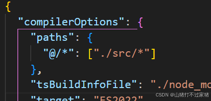
- 修改
tsconfig.node.json
4.安装tailwind css@3
- 安装vite 5.1
npm create vite@5.1.0
- 进入到创建的项目,并且执行
npm install -D tailwindcss@3 postcss autoprefixer
npx tailwindcss init -p
- 修改
tailwind.config.js
/** @type {import('tailwindcss').Config} */
export default {
  content: [
    "./index.html",
    "./src/**/*.{js,ts,jsx,tsx}",
  ],
  theme: {
    extend: {},
  },
  plugins: [],
}
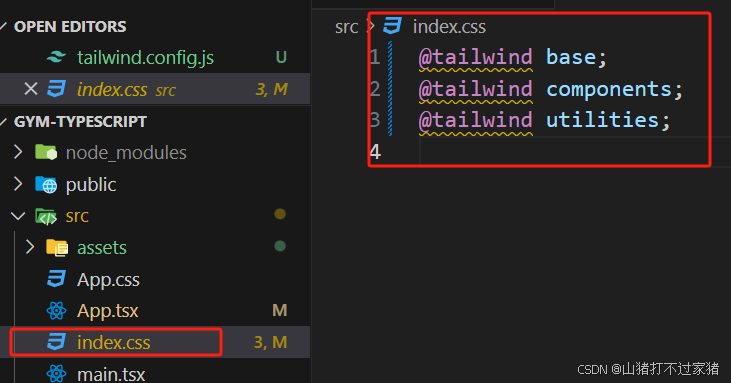
- 修改
index.css
@tailwind base;
@tailwind components;
@tailwind utilities;
- 测试
function App() {
return (
<>
<div className="grid gap-4 grid-cols-[repeat(auto-fill,minmax(300px,1fr))]">
<div className="bg-blue-200 p-4">Item 1</div>
<div className="bg-blue-300 p-4">Item 2</div>
<div className="bg-blue-400 p-4">Item 3</div>
<div className="bg-blue-500 p-4">Item 4</div>
</div>
</>
);
}

export default App;
- 按环境
npm install -D tailwindcss@3
npx tailwindcss init
- 安装成功后会出现
tailwind.config.js,根据主题配置
/** @type {import('tailwindcss').Config} */
module.exports = {
  content: ["./index.html", "./src/**/*.{js,ts,jsx,tsx}"],
  theme: {
    extend: {
      colors: {
        "gray-20": "#F8F4EB",
        "gray-50": "#EFE6E6",
        "gray-100": "#DFCCCC",
        "gray-500": "#5E0000",
        "primary-100": "#FFE1E0",
        "primary-300": "#FFA6A3",
        "primary-500": "#FF6B66",
        "secondary-400": "#FFCD5B",
        "secondary-500": "#FFC132",
      },
      backgroundImage: (theme) => ({
        "gradient-yellowred":
          "linear-gradient(90deg, #FF616A 0%, #FFC837 100%)",
        "mobile-home": "url('./assets/HomePageGraphic.png')",
      }),
      fontFamily: {
        dmsans: ["DM Sans", "sans-serif"],
        montserrat: ["Montserrat", "sans-serif"],
      },
      content: {
        evolvetext: "url('./assets/EvolveText.png')",
        abstractwaves: "url('./assets/AbstractWaves.png')",
        sparkles: "url('./assets/Sparkles.png')",
        circles: "url('./assets/Circles.png')",
      },
    },
    screens: {
      xs: "480px",
      sm: "768px",
      md: "1060px",
    },
  },
  plugins: [],
};
- 在
index.css里添加依赖
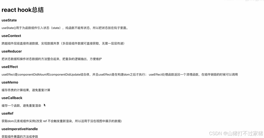
5. hook的总结
6. Tailwind Css
1. Media Queries
- Tailwind is mobile-first,sm以下是黑色,Moblie——sm是green——md是blue
<div className="bg-black sm:bg-green-800 md:bg-blue-800"></div>
二、仿youtube
- 安装所需要的包
npm i class-variance-authority taiwind-merge
2.1 封装自己的button组件
- 需求:网站上的button样式,普通的,hover是黑色的hover是浅色的,hover变成圆形的
1. 自定义tailwind theme
import colors from "tailwindcss/colors"

/** @type {import('tailwindcss').Config} */
export default {
  content: ["./index.html", "./src/**/*.{js,ts,jsx,tsx}"],
  theme: {
    extend: {
      colors: {
        secondary: {
          DEFAULT: colors.neutral[200],
          hover: colors.neutral[300],
          border: colors.neutral[400],
          text: colors.neutral[500],
          dark: colors.neutral[800],
          ["dark-hover"]: colors.neutral[900],
        },
      },
    },
  },
  plugins: [],
}
2. 封装button组件
- 自己封装button组件,保留原有的tailwind样式,也可以传递自定义的参数和样式
import { VariantProps, cva } from "class-variance-authority";
import { ComponentProps } from "react";
import { twMerge } from "tailwind-merge";

export const buttonStyles = cva(["transition-colors"], {
  variants: {
    //按钮的不同风格,如 default、ghost、dark
    variant: {
      default: ["bg-secondary", "hover:bg-secondary-hover"],
      ghost: ["hover:bg-gray-100"],
      dark: [
        "bg-secondary-dark",
        "hover:bg-secondary-dark-hover",
        "text-secondary",
      ],
    },
    //按钮的不同尺寸,如 default(方形)、icon(圆形)
    size: {
      default: [" rounded", "p-2"],
      icon: [
        "rounded-full",
        "w-10",
        "h-10",
        "flex",
        "items-center",
        "justify-center",
        "p-2.5",
      ],
    },
  },
  defaultVariants: {
    variant: "default",
    size: "default",
  },
});

//继承buttonStyles和react原生button组件
type ButtonProps = VariantProps<typeof buttonStyles> & ComponentProps<"button">;

//创建可传递的参数,并且不覆盖tailwindcss的原生样式
export function Button({ variant, size, className, ...props }: ButtonProps) {
  return (
    <button
      {...props}
      className={twMerge(buttonStyles({ variant, size }), className)}
    />
  );
}
- 使用封装的button
 <Button variant="ghost" size="icon" className="bg-red-500">
   <Menu />
 </Button>
2.2 设计重点
1. 导航栏
-
md以上显示

-
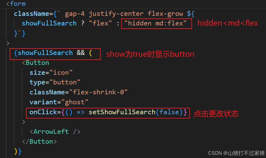
md以下显示:点击搜索出现搜索框和后退
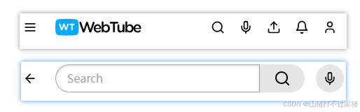
- 由于这3个的显示是一体的的,所以给一个state用来控制
//前用于使用,后用于设置
 const [showFullSearch, setShowFullSearch] = useState(false);
- 中间搜索栏显示处理:在小于md的hidden 大于md 显示flex
2. 点选变色
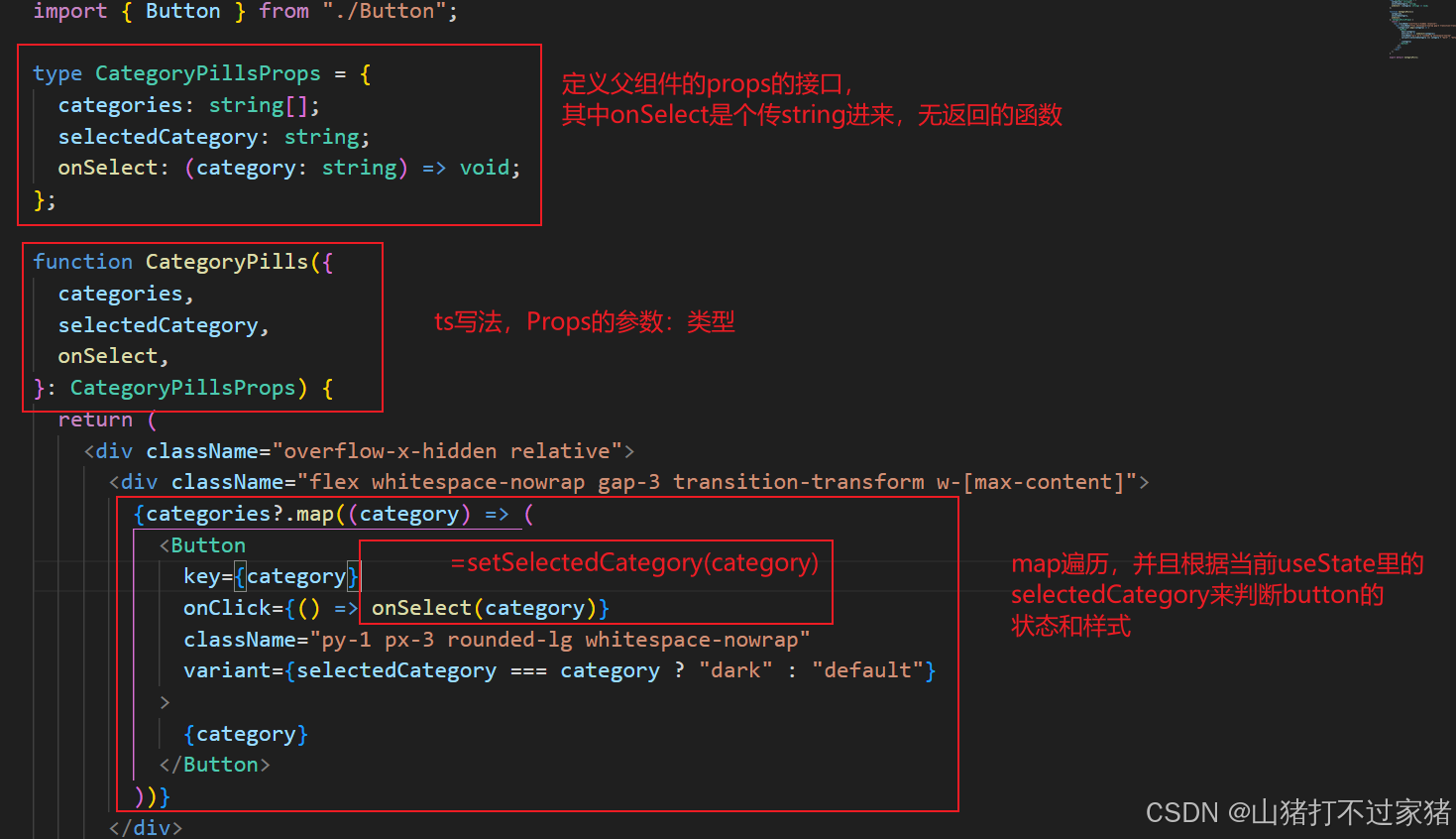
- 父组件APP里传递categories,selectedCategory以及onClick方法
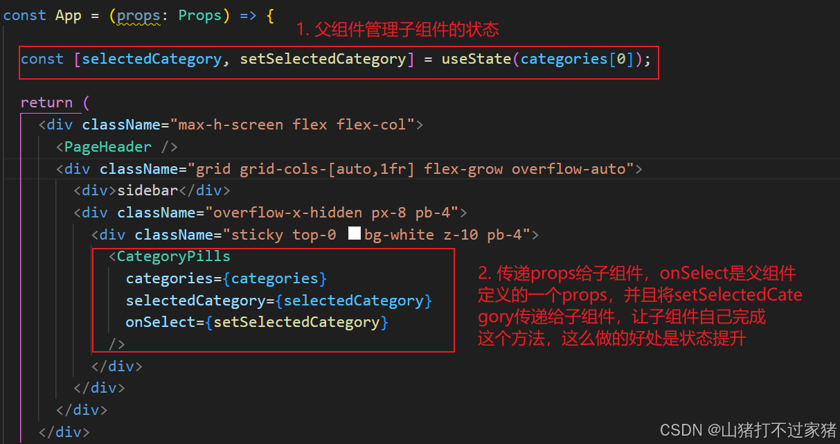
- 子组件里接收父组件的props,并且定义onSelect方法,根据父组件useState的selected的值,来控制button的状态
3. 左右箭头移动 导航
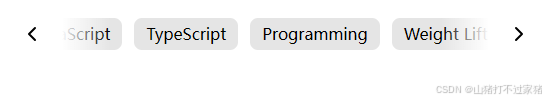
import { ChevronLeft, ChevronRight } from "lucide-react";
import { Button } from "./Button";
import { useEffect, useRef, useState } from "react";

type CategoryPillsProps = {
  categories: string[];
  selectedCategory: string;
  onSelect: (category: string) => void;
};

const TRANSLATE_AMOUNT = 200;

function CategoryPills({
  categories,
  selectedCategory,
  onSelect,
}: CategoryPillsProps) {
  const [translate, setTranslate] = useState(0);
  const [isLeftArrowVisible, setIsLeftArrowVisible] = useState(false);
  const [isRightArrowVisible, setIsRightArrowVisible] = useState(false);
  const containerRef = useRef<HTMLDivElement>(null);

  useEffect(() => {
    if (containerRef.current == null) return;

    const observer = new ResizeObserver((entries) => {
      const container = entries[0]?.target;
      if (container == null) return;

      setIsLeftArrowVisible(translate > 0);
      setIsRightArrowVisible(
        translate + container.clientWidth < container.scrollWidth
      );
    });

    observer.observe(containerRef.current);

    return () => {
      observer.disconnect();
    };
  }, [categories, translate]);

  return (
    <div ref={containerRef} className="overflow-x-hidden relative">
      <div
        className="flex whitespace-nowrap gap-3 transition-transform w-[max-content]"
        style={{ transform: `translateX(-${translate}px)` }}
      >
        {categories?.map((category) => (
          <Button
            key={category}
            onClick={() => onSelect(category)}
            className="py-1 px-3 rounded-lg whitespace-nowrap"
            variant={selectedCategory === category ? "dark" : "default"}
          >
            {category}
          </Button>
        ))}
      </div>
      {isLeftArrowVisible && (
        <div
          className="absolute left-0 top-1/2 -translate-y-1/2
      bg-gradient-to-r from-white from-50% to-transparent w-24 h-full"
        >
          <Button
            variant="ghost"
            size="icon"
            className="h-full aspect-square w-auto p-1.5"
            onClick={() => {
              setTranslate((translate) => {
                const newTranslate = translate - TRANSLATE_AMOUNT;
                if (newTranslate <= 0) return 0;
                return newTranslate;
              });
            }}
          >
            <ChevronLeft />
          </Button>
        </div>
      )}
      {isRightArrowVisible && (
        <div
          className="absolute right-0 top-1/2 -translate-y-1/2
      bg-gradient-to-l from-white from-50% to-transparent w-24 h-full flex justify-end"
        >
          <Button
            variant="ghost"
            size="icon"
            className="h-full aspect-square w-auto p-1.5"
            onClick={() => {
              setTranslate((translate) => {
                if (containerRef.current == null) {
                  return translate;
                }
                const newTranslate = translate + TRANSLATE_AMOUNT;
                const edge = containerRef.current.scrollWidth;
                const width = containerRef.current.clientWidth;
                if (newTranslate + width >= edge) {
                  return edge - width;
                }
                return newTranslate;
              });
            }}
          >
            <ChevronRight />
          </Button>
        </div>
      )}
    </div>
  );
}

export default CategoryPills;


 扫一扫
扫一扫


 被折叠的 条评论
为什么被折叠?
被折叠的 条评论
为什么被折叠?
 到【灌水乐园】发言


