


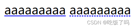
通过background渐变来模拟下划线
可以改变颜色和样式
可以通过色标得百分比位置来微调虚线的实虚比例,还可以通过background-size来改变虚线的疏密
 <style>
     /* 实线下划线 */
     .line {
         background: linear-gradient(blue, blue) no-repeat;
         background-size: 100% 1px;
         background-position: 0 1.15em;
         text-shadow: .05em 0 white, -.05em 0 white;
     }

     /* 虚线下划线 */
     .line1 {
         background: linear-gradient(90deg, blue 66%, transparent 0) repeat-x;
         background-size: 0.2em 1px;
         background-position: 0 1.15em;
     }
 </style>

 <main>
     <a class="line">aaaaaaaaa</a>
     <a class="line1">aaaaaaaaa</a>
 </main>
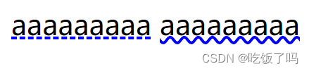
目前css的一些新属性支持下划线样式的修改
<style>
     .line2 {
         text-decoration: underline;
         text-decoration-color: blue;
         text-decoration-style: dashed;
     }
     .line3 {
         text-decoration: underline;
         text-decoration-color: blue;
         text-decoration-style: dashed;
     }
 </style>
 <main>
     <a class="line2">aaaaaaaaa</a>
     <a class="line3">aaaaaaaaa</a>
 </main>


 扫一扫
扫一扫


 6157
6157

 被折叠的 条评论
为什么被折叠?
被折叠的 条评论
为什么被折叠?
 到【灌水乐园】发言


