


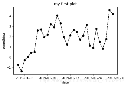
绘制折线图并保存
调用方式及参数意义见帖子:https://blog.youkuaiyun.com/claroja/article/details/70792880
以下为创建数据+绘图+保存的简单例子
import matplotlib.pyplot as plt
import numpy as np
import pandas as pd
#创建时间序列
a=pd.date_range('1/1/2019',periods=30)
#创建纵轴
b=np.random.randn(30)
b1=b.cumsum()

#在空白图纸中插入一张图
fig=plt.figure()
ax=fig.add_subplot(1,1,1)
#绘图
ax.plot(a,b1,'ko--')
#设置标题和x/y标签
ax.set_title('my first plot')
ax.set_xlabel('date')
ax.set_ylabel('something')

#保存
plt.savefig('D:/example.png')
输出为:
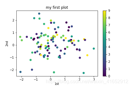
绘制散点图并保存
import matplotlib.pyplot as plt
import numpy as np
import pandas as pd

#创建数据
a=np.random.randn(200)
a.resize([100,2]) #此处不能用a.reshape,因为reshape不会改变原数组
c=np.random.randint(0,10,100)

#绘图
plt.scatter(a[:,0],a[:,1],c=c)  #设置为不同颜色散点图
plt.colorbar()  #在图的右边添加子彩条
plt.title('my first plot')  #设置标题
plt.xlabel('1st')           #设置x标签
plt.ylabel('2nd')          #设置y标签

plt.savefig('C:/Users/18842/Desktop/python/scatter.png') #保存图片
输出为:
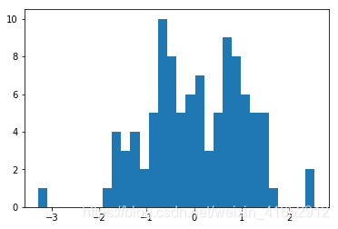
绘制直方图
调用方式为plt.hist(arr, bins=10, normed=0, facecolor=‘black’, edgecolor=‘black’,alpha=1,histtype=‘bar’)
hist的参数非常多,但常用的就这六个,只有第一个是必须的,后面四个可选
arr: 需要计算直方图的一维数组
bins: 直方图的柱数,可选项,默认为10
normed: 是否将得到的直方图向量归一化。默认为0
facecolor: 直方图颜色
edgecolor: 直方图边框颜色
alpha: 透明度
histtype: 直方图类型,‘bar’, ‘barstacked’, ‘step’, ‘stepfilled’
import matplotlib.pyplot as plt
import numpy as np
arr=np.random.randn(100)
plt.hist(arr,bins=30)
输出为:


 726
726

 被折叠的 条评论
为什么被折叠?
被折叠的 条评论
为什么被折叠?
 到【灌水乐园】发言


