


前端样式
使用了iview的布局组件
控制左菜单栏的前端主父组件代码
<template>
<div id="Home">
<Layout :style="{minHeight: '100vh'}" >
<Sider collapsible :collapsed-width="78" v-model="isCollapsed">
<Menu
v-model="option"
active-name="detail"
theme="dark"
width="auto"
:class="menuitemClasses"
@on-select="changeOption($event)">
<MenuItem v-for="(item,index) in menuList" :key="index" :name="item.name">
<Icon :type="item.icon"></Icon>
<span >{{item.detail}}</span>
</MenuItem>
</Menu>
</Sider>
<Layout>
<Card>
{{option}}
<cluster-info v-if="option=='detail'"></cluster-info>
<topic-apply v-if="option=='topicApply'"></topic-apply>
<change-white-list-apply v-if="option=='whitelist'"></change-white-list-apply>
</Card>
</Layout>
</Layout>
</div>
</template>
<script>
import ClusterInfo from '../components/cluster/ClusterInfo'
import TopicApply from '../components/cluster/TopicApply'
import ChangeWhiteListApply from '../components/cluster/ChangeWhiteListApply'
export default {
name:'Home',
data () {
return {
isCollapsed: false,
menuList: [
{
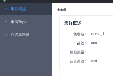
name: "detail",
detail: "集群概述",
icon: "ios-archive-outline"
},
{
name: "topicApply",
detail: "申请Topic",
icon: "ios-archive-outline"
},
{
name:"whitelist",
detail: "白名单新增",
icon: "ios-create-outline"
},
],
option:"detail",
};
},
mounted(){
},
created(){
// this.$nextTick(()=>{
// console.log('refs:')
// console.log(this.$refs.menu)
// })
},
computed: {
menuitemClasses: function () {
return [
'menu-item',
this.isCollapsed ? 'collapsed-menu' : ''
]
}
},
components:{
ClusterInfo,
ChangeWhiteListApply,
TopicApply
},
methods:{
changeOption(e){
this.option=e
// console.log('=====')
// console.log(this.option)
// console.log(e)
}
}
}
</script>
1. 通过import 导入组件
组件即为自定义的vue页面
2. 在vue实例中通过components注册组件
3. 组件名是驼峰命名的,直接在template标签内使用组件,如
组件名为:ClusterInfo
则使用方式为:<cluster_info></cluster_info>
4. Menu组件绑定数据option,通过option可以判断当前点击的是那个Menu,然后再使用对应的组件将页面渲染


 扫一扫
扫一扫


 被折叠的 条评论
为什么被折叠?
被折叠的 条评论
为什么被折叠?
 到【灌水乐园】发言


