


1、价格的直方图,以颜色划分,以cut填充颜色
library(ggplot2)
data("diamonds")
ggplot(aes(x=log(price),fill=cut),data=diamonds)+
  facet_wrap(~color)+
  geom_histogram()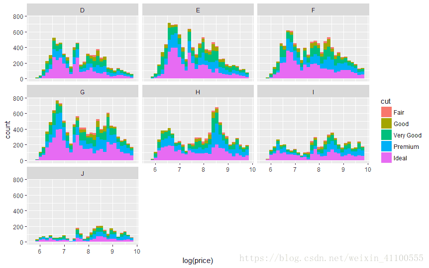
- 注意color和fill的区别,color是边框,fill是填充色
> ggplot(aes(x=price,color=cut),data=diamonds)+
+     facet_wrap(~color)+
+     geom_histogram()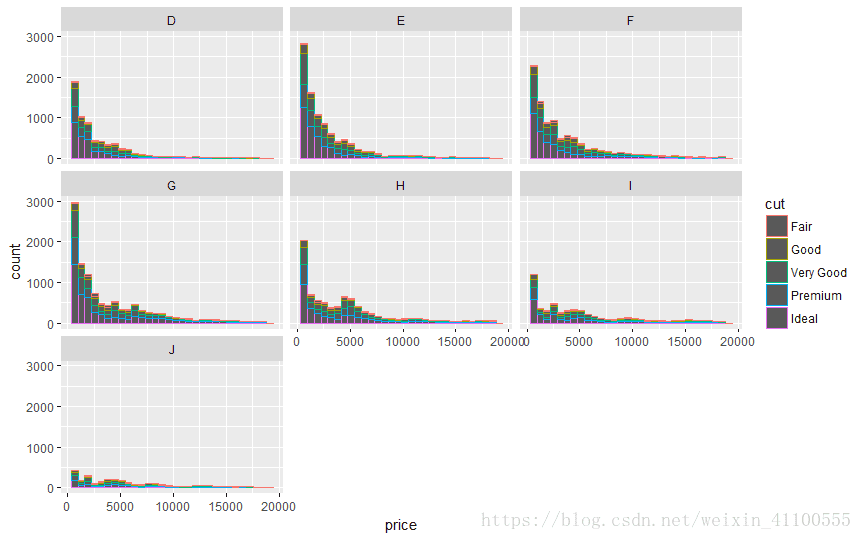
2、table和price的散点图,以cut添加颜色
ggplot(aes(x=table,y=price,color=cut),data=diamonds)+
  geom_point()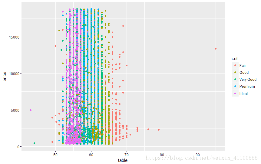


 6545
6545

 被折叠的 条评论
为什么被折叠?
被折叠的 条评论
为什么被折叠?
 到【灌水乐园】发言


