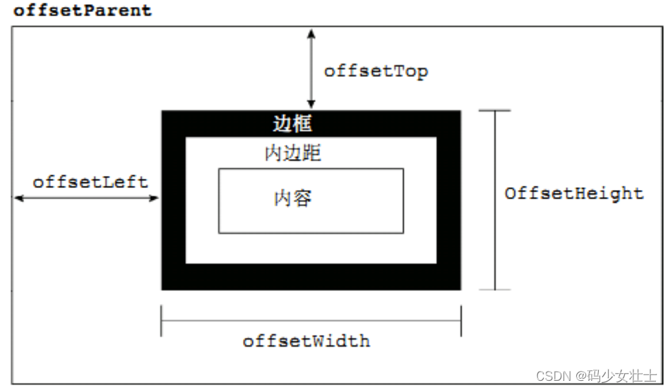
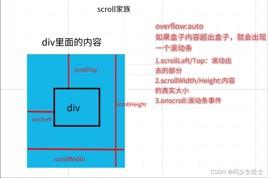
01-三大家族(offset、scroll、client)
![[外链图片转存失败,源站可能有防盗链机制,建议将图片保存下来直接上传(img-zw9ihXLj-1640414831672)(day05.assets/1554473815720-1637084942857.png)]](https://i-blog.csdnimg.cn/blog_migrate/502a6a37c4eb485743034d8be0f4bae3.png)
1.1-三大家族
<!DOCTYPE html>
<html>
<head lang="en">
<meta charset="UTF-8" />
<title>标题</title>
<style>
* {
margin: 0;
padding: 0;
}
div {
width: 150px;
height: 150px;
background-color: pink;
overflow: auto;
padding: 10px;
border: 10px solid red;
margin: 100px;
}
</style>
</head>
<body>
<div class="box">
我有很多很多的内容哦 我有很多很多的内容哦 我有很多很多的内容哦
我有很多很多的内容哦 我有很多很多的内容哦 我有很多很多的内容哦
我有很多很多的内容哦 我有很多很多的内容哦 我有很多很多的内容哦
我有很多很多的内容哦 我有很多很多的内容哦 我有很多很多的内容哦
我有很多很多的内容哦 我有很多很多的内容哦
</div>
<script>
let box = document.querySelector('.box')
console.log(box.offsetWidth, box.offsetHeight)
console.log(box.offsetLeft, box.offsetTop)
console.log(box.scrollWidth, box.scrollHeight)
console.log(box.scrollLeft, box.scrollTop)
console.log(box.clientWidth, box.clientHeight)
console.log(box.clientLeft, box.clientTop)
</script>
</body>
</html>
1.2-获取网页滚动距离
<!DOCTYPE html>
<html>
<head lang="en">
<meta charset="UTF-8">
<title>标题</title>
<style>
body{
width: 3000px;
height: 3000px;
}
</style>
</head>
<body>
<script>
window.onscroll = function(){
console.log( document.documentElement.scrollLeft,document.documentElement.scrollTop );
};
</script>
</body>
</html>
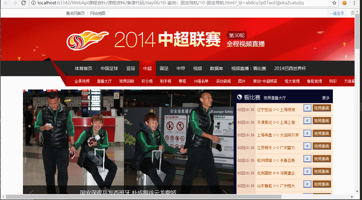
1.3-scroll案例:固定导航
- 需求分析:当页面的顶部区域滚动出去之后,页面的导航栏不再滚动,而是固定在顶部
- 思路分析:监听页面的滚动,当滚动距离超出顶部区域高度时,设置导航栏为fixed固定定位
<!DOCTYPE html>
<html>
<head lang="en">
<meta charset="UTF-8">
<title></title>
<style>
* {
margin: 0;
padding: 0
}
img {
vertical-align: top;
}
.main {
margin: 0 auto;
width: 1000px;
margin-top: 10px;
}
.fixed {
position: fixed;
top: 0;
left: 0;
}
</style>
</head>
<body>
<div class="top" id="topPart">
<img id="pic" src="images/top.png" alt=""/>
</div>
<div class="nav" id="navBar">
<img src="images/nav.png" alt=""/>
</div>
<div class="main" id="mainPart">
<img src="images/main.png" alt=""/>
</div>
<script>
let topPart = document.querySelector('#topPart');
let navBar = document.querySelector('#navBar');
let mainPart = document.querySelector('#mainPart');
window.onscroll = function(){
let y = document.documentElement.scrollTop;
if( y >= topPart.offsetHeight ){
navBar.style.position = 'fixed';
navBar.style.top = 0;
mainPart.style.marginTop = 10 + navBar.offsetHeight + 'px';
}else{
navBar.style.position = 'static';
mainPart.style.marginTop = '10px';
};
};
</script>
</body>
</html>
1.4-client案例:响应式布局
<!DOCTYPE html>
<html lang="en">
<head>
<meta charset="UTF-8">
<meta name="viewport" content="width=device-width, initial-scale=1.0">
<meta http-equiv="X-UA-Compatible" content="ie=edge">
<title>Document</title>
</head>
<body>
<script>
window.onresize = function(){
let w = document.documentElement.clientWidth;
let h = document.documentElement.clientHeight;
console.log(w,h);
if( w >= 1200 ){
document.body.style.backgroundColor = 'red'


 本文详细介绍了网页布局中的offset、scroll和client家族,以及如何获取元素的宽高和位置。接着讨论了如何获取网页的滚动距离,并展示了如何实现固定导航栏和响应式布局。最后,通过电梯导航和手风琴效果的案例,深入探讨了网页交互的实现技巧,包括页面滚动跟随和元素展开收缩的动态效果。
 最低0.47元/天 解锁文章


 扫一扫
扫一扫


 316
316

 被折叠的 条评论
为什么被折叠?
被折叠的 条评论
为什么被折叠?
 到【灌水乐园】发言


