


 本文探讨了在前端开发中实现三栏布局的五种方法:浮动布局、绝对定位、flexBox、表格布局和网格布局。重点推荐使用flexBox和表格布局,因在子元素内容增加时能保持整体布局稳定,同时提到了对旧版浏览器的兼容解决方案。
随着显示器及电子设备的发展,如何适应设备尺寸并且不破坏原有的前端设计样式成了最大的考虑,现在记录并复习前端分栏技术的应用
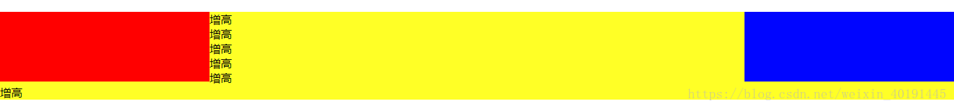
假设高度100px,实现三栏布局,左右固定,中间部分适应
实现效果图如下

公共样式
	<style>
	*{
	  margin: 0;
	  padding: 0;
	}
	.Box{
	  margin-top: 20px;
	}
	.Box>div{
	  min-height: 100px;
	}
	</style>
Method One ( 浮动布局 )
    <section>
    <style>
      .float.left{
        float: left;
        width: 300px;
        background-color: red;
      }
      .float.right{
        float: right;
        width: 300px;
        background-color: blue;
      }
      .float.center{
        background-color: yellow;
      }
    </style>
    <article class="Box">
      <div class="float left"></div>
      <div class="float right"></div>
      <div class="float center"></div>
    </article>
  </section>
注意要点:自适应的元素必须放在浮动元素之后,否则自适应元素会将浮动元素压到下方。
Method Two ( 绝对定位 )
    <section>
    <style>
      .position{
        position: relative;
      }
      .position.left{
        width: 300px;
        position: absolute;
        left: 0;
        background-color: red;
      }
      .position.center{
        position: absolute;
        left: 300px;
        right: 300px;
        background-color: yellow;
      }
      .position.right{
        width: 300px;
        position: absolute;
        right: 0;
        background-color: blue;
      }
    </style>
    <article class="Box position">
      <div class="position left"></div>
      <div class="position center"></div>
      <div class="position right"></div>
    </article>
  </section>
Method Three ( flexBox )
	<section>
    <style>
      .flex{
        display: flex;
        margin-top: 70px;
      }
      .flex.left{
        width: 300px;
        background-color: red;
      }
      .flex.right{
        width: 300px;
        background-color: blue;
      }
      .flex.center{
        flex: 1;
        background-color: yellow;
      }
    </style>
    <article class="Box flex">
      <div class="flex left"></div>
      <div class="flex center"></div>
      <div class="flex right"></div>
    </article>
  </section>
Method Four ( 表格布局 )
	<section>
    <style>
      .Box.table{
        display: table;
        width: 100%;
        height: 100px;
      }
      .table>div{
        display: table-cell;
      }
      .table.left{
        width: 300px;
        background-color: red;
      }
      .table.right{
        width: 300px;
        background-color: blue;
      }
      .table.center{
        background-color: yellow;
      }
    </style>
    <article class="Box table">
      <div class="table left"></div>
      <div class="table center"></div>
      <div class="table right"></div>
    </article>
  </section>
Method Five( 网格布局 )
	<section>
    <style>
      .Box.grid{
        display: grid;
        width: 100%;
        grid-template-rows: 100px;
        grid-template-columns: 300px auto 300px;
      }
      .grid.left{
        background-color: red;
      }
      .grid.center{
        background-color: yellow;
      }
      .grid.right{
        background-color: blue;
      }
    </style>
    <article class="Box grid">
      <div class="grid left"></div>
      <div class="grid center"></div>
      <div class="grid right"></div>
    </article>
  </section>
横向布局使用情况总结
综上5种横向分栏布局方法,首推 方式3和4 ,当我们使用其他3种方法时,如果子元素盒子内容增加导致盒子高度增加,那么将会出现该盒子元素高度溢出,其他盒子不变的情况,影响整体布局
拓展的说,三栏横向布局的实例可以回退到二栏,或者延申到四栏、N栏,益于保证页面样式最小限度的破坏,提高用户体验。
EG:flex布局在IE8及以下并不支持,如果项目要求兼任的话,可以使用表格布局进行替换。


 扫一扫
扫一扫


 被折叠的 条评论
为什么被折叠?
被折叠的 条评论
为什么被折叠?
 到【灌水乐园】发言


