


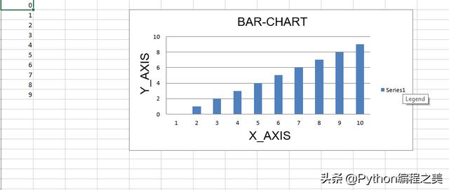
代码1:绘制条形图
要在Excel工作表上绘制条形图,请使用openpyxl.chart子模块中的BarChart类。
代码演示:
# import openpyxl module import openpyxl # import BarChart class from openpyxl.chart sub_module from openpyxl.chart import BarChart,Reference # Call a Workbook() function of openpyxl # to create a new blank Workbook object wb = openpyxl.Workbook() # Get workbook active sheet # from the active attribute. sheet = wb.active # write o to 9 in 1st column of the active sheet for i in range(10): sheet.append([i]) # create data for plotting values = Reference(sheet, min_col = 1, min_row = 1, max_col = 1, max_row = 10) # Create object of BarChart class chart = BarChart() # adding data to the Bar chart object chart.add_data(values) # set the title of the chart chart.title = " BAR-CHART "# set the title of the x-axis chart.x_axis.title = " X_AXIS "# set the title of the y-axis chart.y_axis.title = " Y_AXIS "# add chart to the sheet # the top-left corner of a chart # is anchored to cell E2 . sheet.add_chart(chart, "E2") # save the file wb.save("barChart.xlsx") 输出:
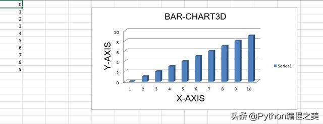
代码2:绘制3D条形图
要在Excel工作表上绘制3D条形图,请使用openpyxl.chart子模块中的BarChart3D类。
代码演示:
# import openpyxl module import openpyxl # import BarChart3D class from openpyxl.chart sub_module from openpyxl.chart import BarChart3D,Reference # write o to 9 in 1st column of the active sheet for i in range(10): sheet.append([i]) values = Reference(sheet, min_col = 1, min_row = 1, max_col = 1, max_row = 10) # Create object of BarChart3D class chart = BarChart3D() chart.add_data(values) # set the title of the chart chart.title = " BAR-CHART3D "# set the title of the x-axis chart.x_axis.title = " X AXIS "# set the title of the y-axis chart.y_axis.title = " Y AXIS "# add chart to the sheet # the top-left corner of a chart # is anchored to cell E2. sheet.add_chart(chart, "E2") # save the file wb.save("BarChart3D.xlsx") 输出:
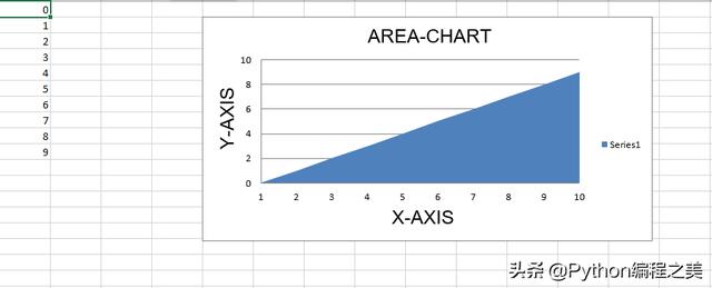
代码3:绘制面积图
要在Excel工作表上绘制面积图,请使用openpyxl.chart子模块中的AreaChart类。
代码演示:
import openpyxl # import AreaChart class from openpyxl.chart sub_module from openpyxl.chart import AreaChart,Reference wb = openpyxl.Workbook() sheet = wb.active # write o to 9 in 1st column of the active sheet for i in range(10): sheet.append([i]) values = Reference(sheet, min_col = 1, min_row = 1, max_col = 1, max_row = 10) # create object of AreaChart class chart = AreaChart() chart.add_data(values) # set the title of the chart chart.title = " AREA-CHART "# set the title of the x-axis chart.x_axis.title = " X-AXIS "# set the title of the y-axis chart.y_axis.title = " Y-AXIS "# add chart to the sheet # the top-left corner of a chart # is anchored to cell E2 . sheet.add_chart(chart, "E2") # save the file wb.save("AreaChart.xlsx") 输出:
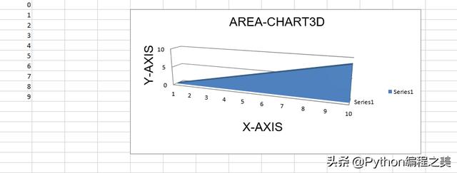
代码4:绘制3D区域图
要在Excel工作表上绘制3D面积图,请使用openpyxl.chart子模块中的AreaChart3D类。
代码演示:
import openpyxl # import AreaChart3D class from openpyxl.chart sub_module from openpyxl.chart import AreaChart3D,Reference wb = openpyxl.Workbook() sheet = wb.active # write o to 9 in 1st column of the active sheet for i in range(10): sheet.append([i]) values = Reference(sheet, min_col = 1, min_row = 1, max_col = 1, max_row = 10) # Create object of AreaChart3D class chart = AreaChart3D() chart.add_data(values) # set the title of the chart chart.title = " AREA-CHART3D "# set the title of the x-axis chart.x_axis.title = " X-AXIS "# set the title of the y-axis chart.y_axis.title = " Y-AXIS "# add chart to the sheet # the top-left corner of a chart # is anchored to cell E2 . sheet.add_chart(chart, "E2") # save the file wb.save("AreaChart3D.xlsx") 输出:
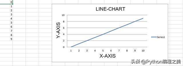
代码5:绘制折线图。
要在Excel工作表上绘制折线图,请使用openpyxl.chart子模块中的LineChart类。
代码演示:
# import openpyxl module import openpyxl # import LineChart class from openpyxl.chart sub_module from openpyxl.chart import LineChart,Reference wb = openpyxl.Workbook() sheet = wb.active # write o to 9 in 1st column of the active sheet for i in range(10): sheet.append([i]) values = Reference(sheet, min_col = 1, min_row = 1, max_col = 1, max_row = 10) # Create object of LineChart class chart = LineChart() chart.add_data(values) # set the title of the chart chart.title = " LINE-CHART "# set the title of the x-axis chart.x_axis.title = " X-AXIS "# set the title of the y-axis chart.y_axis.title = " Y-AXIS "# add chart to the sheet # the top-left corner of a chart # is anchored to cell E2 . sheet.add_chart(chart, "E2") # save the file wb.save("LineChart.xlsx") 输出:
代码6:绘制3D折线图。
为了在Excel工作表上绘制3D折线图,我们必须使用openpyxl.chart子模块中的LineChart3D类。
代码演示:
import openpyxl # import LineChart3D class from openpyxl.chart sub_module from openpyxl.chart import LineChart3D,Reference wb = openpyxl.Workbook() sheet = wb.active # write o to 9 in 1st column of the active sheet for i in range(10): sheet.append([i]) values = Reference(sheet, min_col = 1, min_row = 1, max_col = 1, max_row = 10) # Create object of LineChart3D class chart = LineChart3D() chart.add_data(values) # set the title of the chart chart.title = " LINE-CHART3D "# set the title of the x-axis chart.x_axis.title = " X-AXIS "# set the title of the y-axis chart.y_axis.title = " Y-AXIS "# add chart to the sheet # the top-left corner of a chart # is anchored to cell E2 . sheet.add_chart(chart, "E2") # save the file wb.save("LineChart3D.xlsx") 输出:


 689
689

 被折叠的 条评论
为什么被折叠?
被折叠的 条评论
为什么被折叠?
 到【灌水乐园】发言


