


 本文分享了如何使用HTML和CSS创建一个具有波动动画效果的美味虾尾展示页面,通过关键帧动画和定位技巧,实现了视觉上的动态美感。
看的一个专栏前端每日实战 的文章,大家可以去看看。
下面是看了大神写的之后,自己写了一遍;
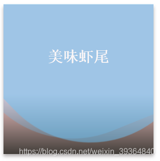
先上效果图:
html代码:
<div class="content">
        <p>美味虾尾</p>
        <span class="wave"></span>
        <span class="wave"></span>
        <span class="wave"></span>
    </div>
css代码:
.content {
        width: 300px;
        height: 300px;
        box-shadow: 0px 5px 10px 0px rgb(177, 174, 174);
        background-color: rgb(243, 225, 202);
        background-image: linear-gradient(rgb(250, 203, 203) 60%,
            rgba(22, 21, 21, 0.8));
        overflow: hidden;
        position: relative;
    }

    .content p {
        color: rgb(252, 247, 247);
        font-size: 30px;
        text-align: center;
        line-height: 150px;
        position: relative;
        z-index: 99999;
        font-weight: bold;
        font-family: serif;
    }

    .wave {
        position: absolute;
        width: 550px;
        height: 550px;
        top: -300px;
        left: -100px;
        background-color: rgba(111, 194, 243, 0.3);
        border-radius: 38%;
        animation: drift 5s linear infinite;
    }

    .wave:nth-of-type(1) {
        animation-duration: 5s;
    }

    .wave:nth-of-type(2) {
        animation-duration: 7s;
    }

    .wave:nth-of-type(3) {
        animation-duration: 10s;
    }

    @keyframes drift {
        from {
            transform: rotate(360deg);
        }
    }


 扫一扫
扫一扫


 6984
6984

 被折叠的 条评论
为什么被折叠?
被折叠的 条评论
为什么被折叠?
 到【灌水乐园】发言


