


利用连接散点图探索全球的饮用水情况
import matplotlib.pyplot as plt
import numpy as np
import pandas as pd

from scipy.stats import rankdata
数据探索
以下数据如果有需要的同学可关注公众号HsuHeinrich,回复【数据可视化】自动获取~
# 导入数据
data_raw = pd.read_csv("https://raw.githubusercontent.com/rfordatascience/tidytuesday/master/data/2021/2021-05-04/water.csv")

# 数据预处理
data = (
    data_raw
    .dropna(subset=["install_year", "country_name"]) # 剔除空数据
    .assign(
        install_decade = (data_raw["install_year"] // 10) * 10, # 将年份转为年代,即每10年的年初
    )
    .query("1970 <= install_decade <= 2020") # 筛选1970~2020年的数据
)

# 计算新安装量
data["nb_install"] = data.groupby(["country_name", "install_decade"])["country_name"].transform("size")

# 长宽数据转化-保留1970~2020的数据
data_pivoted = pd.pivot_table(
    data, index="country_name", values="nb_install", columns="install_decade"
).dropna().reset_index()

data = pd.melt(data_pivoted, id_vars = "country_name", value_name="nb_install", var_name="decade")

# 处理数据,生成rank(表示每decade新安装量的降序排名)
data["country_name"] = data["country_name"].str.upper()
data["rank"] = data.groupby("decade")["nb_install"].transform(lambda x: rankdata(-x))
data = data.sort_values(["country_name", "decade"])

data.head()
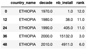
country_name:名称
decade:年代
nb_install:安装量
rank:排名
绘制连接散点图-突出显示指定国家
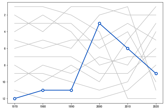
- 绘制第一个国家,理解本图的组成部分
COUNTRIES = data["country_name"].unique()
COUNTRY = COUNTRIES[0]
# 初始化布局
fig, ax = plt.subplots(figsize=(9, 6))

# 反转y轴
ax.invert_yaxis()

# 循环遍历国家
for country in COUNTRIES:
    d = data[data["country_name"] == country]
    x = d["decade"].values
    y = d["rank"].values

    # 突出显示指定国家
    if country == COUNTRY:
        ax.plot(x, y, color="#0b53c1", lw=2.4, zorder=10)
        ax.scatter(x, y, fc="w", ec="#0b53c1", s=60, lw=2.4, zorder=12)
    # 其余国家不突出显示
    else:
        ax.plot(x, y, color="#BFBFBF", lw=1.5)
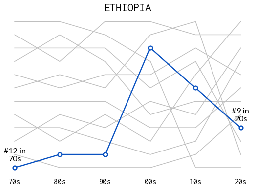
- 添加适当的注释信息
def add_label(x, y, fontsize, ax):
    '''
    x:decade取值;y:rank取值
    在对应的点附近添加年代和排名信息
    '''
    PAD = 0.4
    ax.annotate(
        f"#{int(y)} in\n{str(int(x))[2:]}s",
        xy=(x, y - PAD),
        ha="center",
        va="bottom",
        fontsize=fontsize,
        fontname="Lato",
        zorder=12
    )
# 初始化布局
fig, ax = plt.subplots(figsize=(9, 6))
ax.invert_yaxis()

for country in COUNTRIES:
    d = data[data["country_name"] == country]
    x = d["decade"].values
    y = d["rank"].values

    if country == COUNTRY:
        ax.plot(x, y, color="#0b53c1", lw=2.4, zorder=10)
        ax.scatter(x, y, fc="w", ec="#0b53c1", s=60, lw=2.4, zorder=12)

        # 添加文本信息(首尾点上)
        add_label(x[0], y[0], 16, ax)
        add_label(x[-1], y[-1], 16,ax)
    else:
        ax.plot(x, y, color="#BFBFBF", lw=1.5)

# 删除y刻度
ax.set_yticks([])

# x刻度
ax.set_xticks([1970, 1980, 1990, 2000, 2010, 2020])

# x刻度标签
ax.set_xticklabels(
    ["70s", "80s", "90s", "00s", "10s", "20s"],
    fontsize=16,
    fontfamily="Inconsolata"
)
# 删除底部刻度线
ax.tick_params(bottom=False)

# 删除边框
ax.set_frame_on(False)

# 添加标题
ax.set_title(COUNTRY, fontfamily="Inconsolata", fontsize=24, fontweight=500);
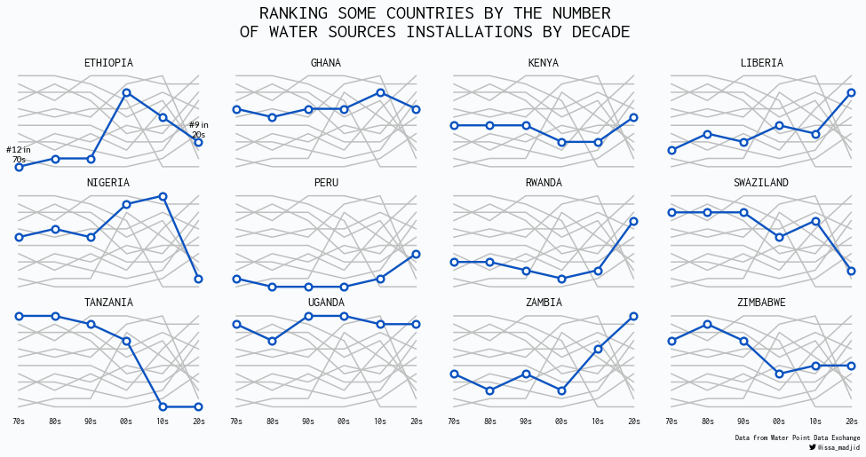
- 在以上的基础上,绘制多图(多个国家的排名)
def plot_country(country, data, annotate, ax):
    '''
    将上述单个国家的绘制过程写入函数,annotate为控制变量(是否添加文本注释)
    '''

    for country_inner in COUNTRIES:
        d = data[data["country_name"] == country_inner]
        x = d["decade"].values
        y = d["rank"].values

        if country_inner == country:
            ax.plot(x, y, color="#0b53c1", lw=2.4, zorder=10)
            ax.scatter(x, y, fc="w", ec="#0b53c1", s=60, lw=2.4, zorder=12)
            if annotate:
                add_label(x[0], y[0], 10, ax)
                add_label(x[-1], y[-1], 10, ax)
        else:
            ax.plot(x, y, color="#BFBFBF", lw=1.5)

    ax.set_yticks([])
    ax.set_xticks([1970, 1980, 1990, 2000, 2010, 2020])
    ax.set_xticklabels(
        ["70s", "80s", "90s", "00s", "10s", "20s"],
        fontsize=10,
        fontfamily="Inconsolata"
    )
    ax.tick_params(bottom=False)
    ax.set_frame_on(False)

    ax.set_title(country, fontfamily="Inconsolata", fontsize=14, fontweight=500)

    return ax
# 初始化布局
fig, axes = plt.subplots(3, 4, sharex=True, sharey=True, figsize=(14, 7.5))

for idx, (ax, country) in enumerate(zip(axes.ravel(), COUNTRIES)):
    # 仅第一个国家添加文本注释
    annotate = idx == 0
    plot_country(country, data, annotate, ax)

# 反转y轴
ax.invert_yaxis()

# 调整布局
fig.subplots_adjust(wspace=0.1, left=0.025, right=0.975, bottom=0.11, top=0.82)

# 标题
fig.text(
    x=0.5,
    y=0.92,
    s="RANKING SOME COUNTRIES BY THE NUMBER\nOF WATER SOURCES INSTALLATIONS BY DECADE",
    ha="center",
    va="center",
    ma="center",
    fontsize=22,
    fontweight="bold",
    fontname="Inconsolata"
)

# 著作信息-数据来源
fig.text(
    x=0.975,
    y=0.05,
    s="Data from Water Point Data Exchange",
    ha="right",
    ma="right",
    fontsize=8
)

# 著作信息-作者
fig.text(
    x=0.975,
    y=0.03,
    s="@issa_madjid",
    ha="right",
    ma="right",
    fontsize=8,
    fontweight="bold",
)

# 推特徽标
twitter_symbol = "\uf099"

fig.text(
    x=0.925,
    y=0.03,
    s=twitter_symbol,
    ha="right",
    ma="right",
    fontsize=8,
    fontweight="bold",
    fontfamily="Font Awesome 5 Brands"
)

# 背景色
fig.set_facecolor("#f9fbfc")
参考:Multi panel highlighted lineplots with Matplotlib
共勉~


 被折叠的 条评论
为什么被折叠?
被折叠的 条评论
为什么被折叠?
 到【灌水乐园】发言


