


 本文整理了CSS中使div元素右对齐的技巧,包括使用margin: auto等方法,帮助读者掌握CSS布局对齐。
今天在复习之前学到的CSS内容时,在菜鸟教程上看到了很全的对齐方式,于是简单的整理一下。
CSS水平&垂直对齐
(1)元素居中对齐——margin: auto;
HTML部分代码:
class="father"> <div class="son">div> </div>
CSS部分代码:
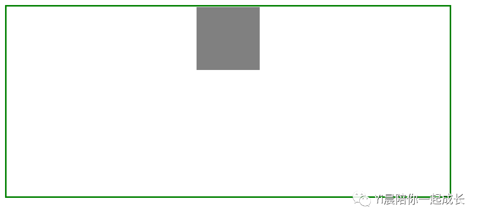
<style> .father { width: 700px; height: 300px; border: 3px solid green; } .son { width: 100px; height: 100px; background-color: gray; margin: auto; }style>界面展示如下:
说两句:该方法是水平居中方法,如果没有设置 width 属性(或者设置 100%),居中对齐将不起作用。
补充:同样的,该方法也可以让图片居中展示
HTML部分代码:
class="father"> <img src="001.jpg" alt=""> </div>CSS部分代码:
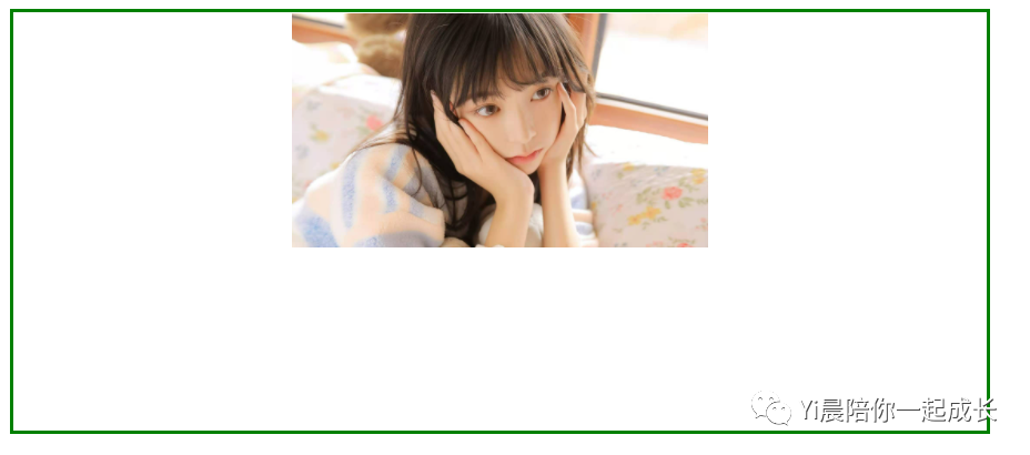
<style> .father { width: 700px; height: 300px; border: 3px solid green; } img { display: block; width: 300px; margin: auto; }style>界面展示:
说两句:使用该方法使图片居中对齐时,不要忘了 display: block;
(2)文本水平居中对齐——text-align: center;
HTML部分代码:
class="father"> <p>我是居中的p> </div>CSS部分代码:
<style> .father { width: 700px; height: 300px; border: 3px solid green; } .father p { text-align: center; }style>界面展示如下:

说两句:该方法是只针对文本居中对齐的。
(3)左右对齐——使用定位方式
使用position: absolute;可以使元素左右对齐或居中对齐,此处以居中对齐为例。
HTML部分代码:
class="father"> <img src="001.jpg" alt=""> </div>CSS部分代码:
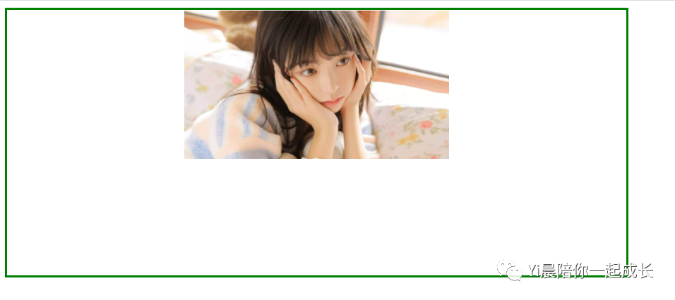
<style> .father { position: relative; width: 700px; height: 300px; border: 3px solid green; } img { position: absolute; left: 50%; display: block; width: 300px; margin-left: -150px; }style>界面展示:
说两句:使用定位的方式,会使使用该方法的元素“漂浮”起来,因此千万不要忘了给父盒子设置定位。
(4)左右对齐——使用 float 方式
该方法在对齐方面 的应用,主要是用于左右对齐,以右对齐为例。
HTML部分代码:
class="father"> <img src="001.jpg" alt=""> </div>CSS部分代码:
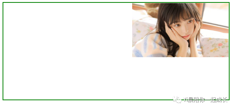
<style> .father { width: 700px; height: 300px; border: 3px solid green; } img { display: block; width: 300px; float: right; }style>界面展示:
说两句:如果子元素的高度大于父元素,且子元素设置了浮动,那么子元素将溢出,这时候你可以使用 "clearfix(清除浮动)" 来解决该问题。
例如把上述代码的CSS部分改为
<style> .father { width: 700px; height: 300px; border: 3px solid green; } img { display: block; width: 1000px; float: right; }style>此时界面为:

给父盒子加上overflow: auto; 来解决子元素溢出的问题。
<style> .father { width: 700px; height: 300px; border: 3px solid green; overflow: auto; } img { display: block; width: 1000px; float: right; }style>此时界面展示为:


 扫一扫
扫一扫


 被折叠的 条评论
为什么被折叠?
被折叠的 条评论
为什么被折叠?
 到【灌水乐园】发言


