


 本文详细介绍使用Matplotlib和NumPy库进行绘图的方法,包括普通绘图、自定义函数绘图、子图绘制以及点图和线图的创建。通过实例展示了如何设置坐标轴、标签、刻度和图例,适合初学者和需要提升绘图技能的读者。
一、普通绘图
 1 import matplotlib.pyplot as plt
 2 import numpy as np
 3
 4 # 绘制普通图像
 5 x = np.linspace(-1, 1, 50)
 6 y1 = 2 * x + 1
 7 y2 = x**2
 8
 9 plt.figure()
10 # 在绘制时设置lable, 逗号是必须的
11 l1, = plt.plot(x, y1, label = 'line')
12 l2, = plt.plot(x, y2, label = 'parabola', color = 'red', linewidth = 1.0, linestyle = '--')
13
14 # 设置坐标轴的取值范围
15 plt.xlim((-1, 1))
16 plt.ylim((0, 2))
17
18 # 设置坐标轴的lable
19 plt.xlabel('X axis')
20 plt.ylabel('Y axis')
21
22 # 设置x坐标轴刻度, 原来为0.25, 修改后为0.5
23 plt.xticks(np.linspace(-1, 1, 5))
24 # 设置y坐标轴刻度及标签, $$是设置字体
25 plt.yticks([0, 0.5], ['$minimum$', 'normal'])
26
27 # 设置legend
28 plt.legend(handles = [l1, l2,], labels = ['a', 'b'], loc = 'best')
29 plt.show()
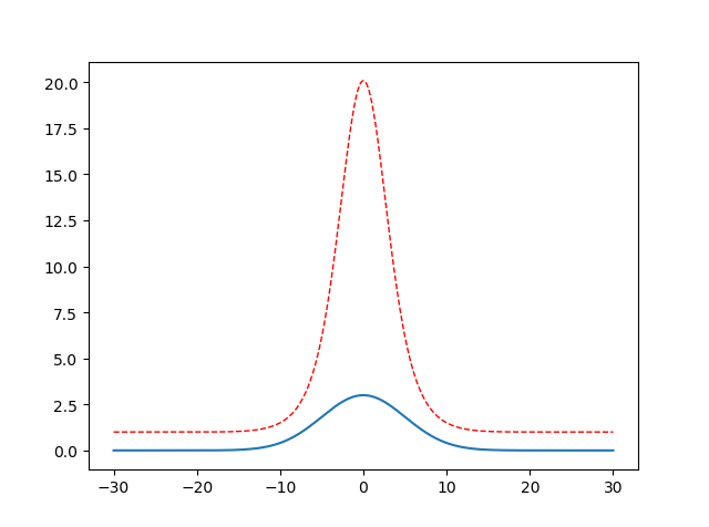
二、自定义单峰函数
 1 import math
 2 import numpy as np
 3 import matplotlib.pyplot as plt
 4
 5 x = np.linspace(-30, 30, 500)
 6 y = []
 7 y2 = []
 8 a = 3
 9 b = 0
10 c = 25
11 for i in x :
12     # 类似高斯函数,a 代表峰值, b对称轴位置,c方差
13     temp = a * math.exp(-(i-b)**2 / (2 * c))
14     y.append(temp)
15     #对上一个单峰函数值进行放大处理,红色虚线部分
16     y2.append(math.exp(temp))
17
18 plt.figure()
19 l1= plt.plot(x, y, label = 'line')
20 l2, = plt.plot(x, y2, label = 'parabola', color = 'red', linewidth = 1.0, linestyle = '--')
21 plt.show()
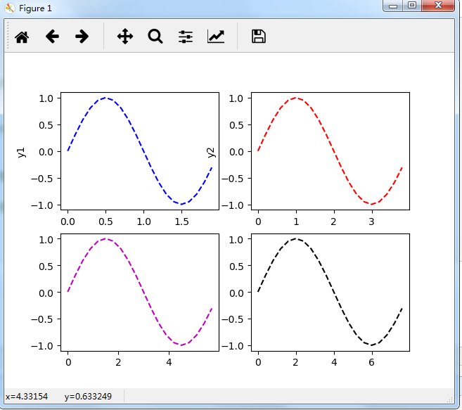
三、画subplot子图(2 x 2 为例)
 1     import matplotlib.pyplot as plt
 2     t=np.arange(0.0,2.0,0.1)
 3     s=np.sin(t*np.pi)
 4     plt.subplot(2,2,1) #要生成两行两列,这是第一个图plt.subplot('行','列','编号')
 5     plt.plot(t,s,'b--')
 6     plt.ylabel('y1')
 7     plt.subplot(2,2,2) #两行两列,这是第二个图
 8     plt.plot(2*t,s,'r--')
 9     plt.ylabel('y2')
10     plt.subplot(2,2,3)#两行两列,这是第三个图
11     plt.plot(3*t,s,'m--')
12     plt.subplot(2,2,4)#两行两列,这是第四个图
13     plt.plot(4*t,s,'k--')
14     plt.show()
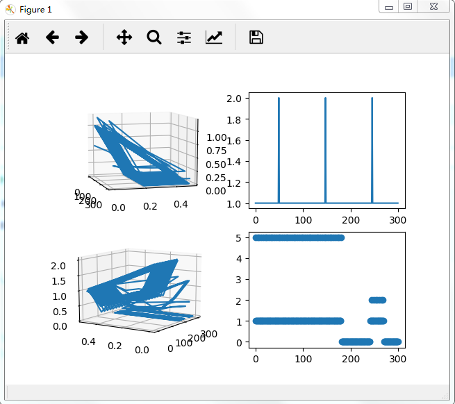
点图和线图
fig = plt.figure()
ax = fig.add_subplot(221, projection='3d')
ax.plot(array_normal[:,0],array_normal[:,1],array_normal[:,2])
plt.subplot(2,2,2)
plt.plot(np.arange(0,sample_len,1), signal_normal)

normal_pow = array_normal[:,2]

ax3 = fig.add_subplot(223, projection='3d')
ax3.plot(array_anomaly[:,0],array_anomaly[:,1],array_anomaly[:,2])

anomaly_pow = array_anomaly[:,2]
plt.subplot(2,2,4)
plt.scatter(np.arange(0,sample_len,1), signal_anomaly)
plt.show()
【Reference】
[1] https://www.jianshu.com/p/de223a79217a
[2] https://www.cnblogs.com/xingshansi/p/6777945.html


 1536
1536

 被折叠的 条评论
为什么被折叠?
被折叠的 条评论
为什么被折叠?
 到【灌水乐园】发言


