


 本文介绍了如何使用html和js实现一个仿苹果风格的悬浮按钮,该按钮可上下拖拽,点击后能展开相关菜单。通过CSS设置样式,JavaScript处理拖拽和点击事件,实现了平滑的过渡效果。
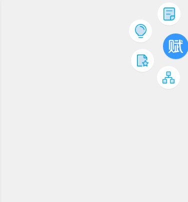
今天写了一个仿苹果的悬浮按钮,由于只在右侧展开,所以只能上下拖拽,展开效果入下
1.html
2.css
@charset "gb2312";
.info-nr {position:fixed;
top:70px;
right:3px;
z-index:900;
tap-highlight-color: rgba(0, 0, 0, 0);
}
#toMenu{display:block;
width:45px!important;
height:45px!important;
border-radius:45px;
position: absolute;
bottom:0;
right:0;
z-index:9999;
color:#fff;
background:url(../img/navimg/png2.png) 50% 50% #3498fe;
background-repeat: no-repeat;
background-size:auto 62%;
box-shadow:0 0 0 3px #3498fe, 0 2px 5px 0 #3498fe;
}
.info-nr-phone{height:45px;width:45px;}
#info-nr-phone{position:relative;}
.info-nr-phone>div {
width:40px;
height:40px;
border-radius:40px;
box-shadow:0 0 0 3px #FFFFFF, 0 2px 5px 0 rgba(0, 0, 0, 0.25);
position:absolute;
bottom:2px;
right:2px;
z-index:900;
-moz-transition: transform 200ms;
-webkit-transition: -webkit-transform 200ms;
-ms-transition: transform 200ms;
}
.info-nr-phone>.to_01 {-webkit-transform: translate(-14px, -120px) rotate(720deg);
-moz-transform: translate(-14px, -120px) rotate(720deg);
-ms-transform: translate(-14px, -120px) rotate(720deg);
-o-transform: translate(-14px, -120px) rotate(720deg);
transform: translate(-14px, -65px) rotate(720deg);
background:url(../img/navimg/55.png) 50% 50% no-repeat #fff;
background-size:auto 66%;}
.info-nr-phone>.to_02 {-webkit-transform: translate(-78px, -108px) rotate(720deg);
-moz-transform: translate(-78px, -108px) rotate(720deg);
-ms-transform: translate(-78px, -108px) rotate(720deg);
-o-transform: translate(-78px, -108px) rotate(720deg);
transform: translate(-71px, -31px) rotate(720deg);
background:url(../img/navimg/4.png) 50% 50% no-repeat #fff;
background-size:auto 70%;}
.info-nr-phone>.to_03 {-webkit-transform: translate(-85px, -80px) rotate(720deg);
-moz-transform: translate(-85px, -80px) rotate(720deg);
-ms-transform: translate(-85px, -80px) rotate(720deg);
-o-transform: translate(-85px, -80px) rotate(720deg);
transform: translate(-67px, 28px) rotate(720deg);
background:url(../img/navimg/3.png) 50% 50% no-repeat #fff;
background-size:auto 60%;
}
.info-nr-phone> .to_04{-webkit-transform: translate(-79px, -36px) rotate(720deg);
-moz-transform: translate(-79px, -36px) rotate(720deg);
-ms-transform: translate(-79px, -36px) rotate(720deg);
-o-transform: translate(-79px, -36px) rotate(720deg);
transform: translate(-15px, 62px) rotate(720deg);
background:url(../img/navimg/2.png) 50% 50% no-repeat #fff;
background-size:auto 60%;
}
3.js
// JavaScript Document
window.addEventListener("DOMContentLoaded", function () {
$("#toMenu").click(function(){
$(".info-nr-phone").toggleClass("info-nr-phone2");
$(".menu_01").toggleClass("to_01");
$(".menu_02").toggleClass("to_02");
$(".menu_03").toggleClass("to_03");
$(".menu_04").toggleClass("to_04");
});
}, false);
// 拖拽
var screenHeight = document.documentElement.clientHeight;
var fdiv = document.getElementById("info-nr");
fdiv.addEventListener('touchstart', false);
fdiv.addEventListener('touchmove', function(event) {
// 如果这个元素的位置内只有一个手指的话
if (event.targetTouches.length == 1) {
event.preventDefault();// 阻止浏览器默认事件,重要
var touch = event.targetTouches[0];
if((touch.pageY)<=70){//超过顶部
fdiv.style.top="70px";
}else if(touch.pageY>(screenHeight-parseInt(fdiv.clientHeight))){//超过底部
fdiv.style.top=(screenHeight-parseInt(fdiv.clientHeight))-70+"px";
}else{
fdiv.style.top = (touch.pageY-parseInt(fdiv.clientHeight)/2) + "px";
}
}
}, false);
fdiv.addEventListener('touchend', false);


 扫一扫
扫一扫


 1万+
1万+

 被折叠的 条评论
为什么被折叠?
被折叠的 条评论
为什么被折叠?
 到【灌水乐园】发言


