


 介绍一款基于jQuery的动画导航菜单,初始为中央按钮,点击展开左侧菜单,再次点击收回,附带平滑过渡效果。
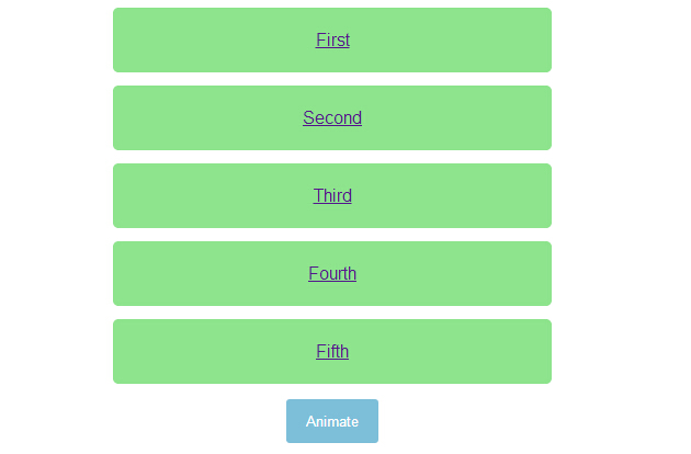
今天给大家分享一款基jquery超炫的动画导航菜单。这款导航菜单,初始时页面中间一个按钮,单击按钮,菜单从左侧飞入页中。再次单击按钮,导航飞入左侧消息。动画效果很非常炫。一起看下效果图:
实现的代码。
html代码:
 <ul>
        <li><a href="http://***">First</a></li>
        <li><a href="http://***">Second</a></li>
        <li><a href="http://***">Third</a></li>
        <li><a href="http://***">Fourth</a></li>
        <li><a href="http://***">Fifth</a></li>
    </ul>
    <button>
        Animate</button>
    <script src='jquery.js'></script>
    <script>        $('button').on('click', function () {
            $('ul').toggleClass('animate');
        }); //@ sourceURL=pen.js
    </script>
css代码:
 body
        {
            text-align: center;
        }

        ul
        {
            width: 400px;
            padding: 0;
            margin: 0 auto;
        }
        ul.animate li
        {
            transform: translate(0);
        }
        ul.animate li:nth-of-type(1)
        {
            transition-delay: 0.05s;
        }
        ul.animate li:nth-of-type(2)
        {
            transition-delay: 0.1s;
        }
        ul.animate li:nth-of-type(3)
        {
            transition-delay: 0.15s;
        }
        ul.animate li:nth-of-type(4)
        {
            transition-delay: 0.2s;
        }
        ul.animate li:nth-of-type(5)
        {
            transition-delay: 0.25s;
        }

        li
        {
            list-style: none;
            display: block;
            padding: 20px;
            margin: 12px 0;
            border-radius: 5px;
            font-family: Helvetica, sans-serif;
            color: #fff;
            background: #8DE48D;
            transform: translate(-500%);
            transition: transform 0.75s cubic-bezier(0.175, 0.885, 0.32, 1.08);
        }
        li:nth-of-type(5)
        {
            transition-delay: 0.15s;
        }
        li:nth-of-type(4)
        {
            transition-delay: 0.3s;
        }
        li:nth-of-type(3)
        {
            transition-delay: 0.45s;
        }
        li:nth-of-type(2)
        {
            transition-delay: 0.6s;
        }
        li:nth-of-type(1)
        {
            transition-delay: 0.75s;
        }

        button
        {
            padding: 12px 18px;
            border: none;
            border-radius: 3px;
            color: #fff;
            background: #7DBED8;
        }
        button:focus
        {
            outline: none;
        }
注:本文爱编程原创文章,转载请注明原文地址:http://***/Article/9693


 扫一扫
扫一扫


 664
664

 被折叠的 条评论
为什么被折叠?
被折叠的 条评论
为什么被折叠?
 到【灌水乐园】发言


