


 本文深入解析TiUI的布局系统,包括单位设置、坐标网格、布局模式等关键特性,并提供了丰富的示例代码帮助开发者理解如何在跨平台环境中进行精确的UI定位。

-
单位
-
在tiapp.xml里设置默认单位
-
-
关于坐标网格
-
位置及元素的尺寸
-
布局模式
-
关于设置Auto的属性
-
ScrollView 的Auto属性
-
-
动手实践
-
延伸阅读
内容
Ti当前的布局系统是一个跨平台的布局系统。它的一些特性和细节在Ti SDK 2.0里面已经给出,具体参考 "Composite UI Layout Specification." 它除了说明了一些各种不同的属性及行为外,文档还说明了一些并不推荐的特性和设置,而这些将会在未来版本的TI SDK中给出说明。
在本节参考指南中,我们将学习以下影响你所开发的APP的一些因素。
-
单位
-
坐标网格布局
-
位置和视图层次结构
-
布局的模式
-
zIndex & default stacking order
单位
UI元素的布局及位置都靠一些加了(显示或者隐形的)单位的数值来说明,如width:10px;如果你不指定其单位,那么将会使用系统默认的单位。你也 在tiapp.xml中可以设置APP的默认尺寸单位。
首先,我们先可以了解一些单位。
-
dip : 一个独立的像素。Density-independent pixels. A measurement which is translated natively to a corresponding pixel measure using a scale factor based on a platform-specific "default" density, and the device's physical density.
-
System unit :依赖于平台的默认单位,例如,android的默认单位像素,IOS的是dip。
被支持的单位有:
-
固定尺寸
-
px : 像素
-
mm :毫米
-
cm : 厘米
-
in : 英寸
-
dp/dip : DIP,Density-independent pixels (we sometimes call these "points")
-
Android : 实际像素 pixels = dip * (screen density) / 160
-
iOS : actual pixels = dip * (screen density) / 163 (effectively 1dip=1px on standard, 1dip=2px on retina)
-
Mobile Web: actual pixels = dip * (screen density) / 96 (effectively 1dip=1px because most browsers scale pages to 96dpi to make them consistent with desktops).
-
-
-
相对尺寸
-
% : 相对于父容器的百分比.
-
对于x轴的值是相对于父容器的的宽度
-
对于y轴的值是相对于父容器的的高度
-
-
应用示例:
var view = Ti.UI.createView({/* 不要像这样混的使用单位 */ top: '10mm', left: '5px', width: '30%', height: 50 /*使用系统默认的单位 */ });在 tiapp.xml 设置默认的单位
在文件里面增加一项:
<property name="ti.ui.defaultunit" type="string">value</property>value的值可以是px, mm, cm, in, dp, dip, 或者system.
坐标网格
Ti使用的是坐标网格布局方式。 网格的位置是基于系统或者说平台的单位的。 这就意味着,在IOS中,元素是定位于一个与密度无关的网格中,而在android中,元素是定位于一个与密度有关的网格中。这产生的结果是:在IOS中,元素的定位不取决于屏幕的密度,而在android中,如果你使用绝对定位,这将会在不同的设备中产生不同的影响。
-
iPhone (最原始的) 是基于 320 x 480 dip 网格。
-
iPad (最原始的)是基于 1024 x 768 dip 网格。
-
android设备的尺寸则大小不一,可以参考以下模拟器:
-
HVGA emulator is 320 x 480 px
-
WVGA800 emulator is 480 x 800 px
-
WVGA854 emulator is 480 x 854 px
-
请记住在android中你可以使用dp 或者dip作为单位,去实现跟IOS一样的效果。
定位与元素的尺寸
在Ti中,元素都使用相对于父容器来进行定位的,比如说window 或者view。 根据你使用的定位属性,参考点可能是父容器的top/left 或者是 bottom/right 。
如以下属性:
-
top and left properties
-
bottom and right properties
-
center property
Size属性,表示一个view渲染后的尺寸,这样只有当其和其父容器被完全渲染(绘制完后)完后才会有效。这就意味着size属性是一个只读的属性,包含width和height;
你可以通过设置width和heigth来确定一个元素的尺寸。如果你不设置长度和宽度,但是设置了top和bottom,那么该元素将会根据其父容器的top和bottom边界来计算其自己的height。同样的,对于width 可以设置left和right属性。
在下面的小列子中,红色的View被定位在相对于windows的top 20和left 20 ,黄色的View被定位于bottom 100,right 100 这些都是相对于父容器windows的。
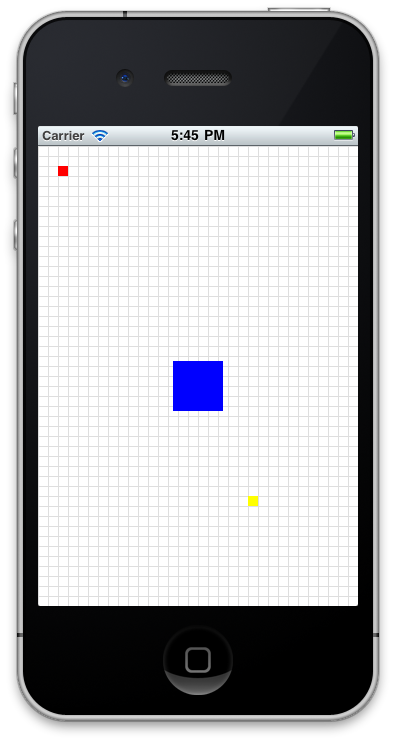
var win = Ti.UI.createWindow({ backgroundColor:'#fff' }); var redview = Ti.UI.createView({ top:20, left:20, width:10, height:10, backgroundColor:"red" }); win.add(redview); var yellowview = Ti.UI.createView({ bottom:100, right:100, width:10, height:10, backgroundColor:"yellow" }); win.add(yellowview); var blueview = Ti.UI.createView({ center: {x: 160, y: 240}, width:50, height:50, backgroundColor:"blue" }); win.add(blueview); var greenview = Ti.UI.createView({ top:-20, width:10, height:10, backgroundColor:"green" }); win.add(greenview); win.open();
布局模式
Ti 的windows 及其他的视图组件,可以使用layout的三个属性值来设定其布局方式。
-
absolute - 绝对定位
-
vertical - 垂直定位.
-
horizontal -水平定位.
通常,各个组件之间都是组合来使用的。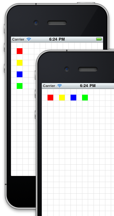
var win = Ti.UI.createWindow({ backgroundColor:'#fff' }); // 使用网格绘制module,参见 https://gist.github.com/1187384 // 每隔20 point 绘制一个网格线 var grid = require('gridlines'); grid.drawgrid(20,win); // 绘制一个View 并设置其属性。 var view = Ti.UI.createView({ backgroundColor:'transparent', top:0, left:0, width:'100%', height:'100%', layout:'vertical'//使用垂直布局 }); // 绘制带有颜色的方块的方法。 function makeView(color) { return Ti.UI.createView({ top:20, left:20, width:20, height:20, backgroundColor:color }); } view.add(makeView('red')); view.add(makeView('yellow')); view.add(makeView('blue')); view.add(makeView('green')); win.add(view); win.open();"auto" 行为
Ti 中的视图组件支持设置 auto来计算其尺寸,但是,auto 不建议在Ti 2.0 中使用。在过去,auto 应用于height和width ,这些用于支持“根据视图组件的内容来设定其大小”。 而这种模糊的描述是与跨平台的目标不一致的。
而auto可以被两个指定的属性代替:size 属性和 fill 属性。 Ti.UI.SIZE 能够约束视图组件的大小使其根据内容适配。 The Ti.UI.FILL 能够根据父容器的尺寸去扩大其自己的大小。需要注意的是:FILL属性,没有考虑其兄弟视图组件。这就意味着如果一个父容器有两个孩子View,一个设置的固定的尺寸,一个设置的是FILL,那么第二个视图会将第一个视图覆盖,然后撑满父容器。
下面是一些含有SIZE 和 FILL的UI组件:
| SIZE views | FILL views | Mixed behavior |
| Button | Window | Toolbar: FILL for width, SIZE for height |
| Label | View | TableViewRow: FILL for width, SIZE for height |
| ImageView | TabGroup | Slider: FILL for width, SIZE for height |
| ProgressBar | TableView |
|
| Switch | WebView |
|
| TextArea | ScrollView |
|
| TextField | ScrollableView |
|
| Picker |
|
|
| SearchBar |
|
|
| ButtonBar |
|
|
| TableViewSection |
|
|
ScrollView "auto"
在ScrollView中, contentWidth 和 contentHeight 也可以设置为"auto", 如果使用auto的话,建议这样使用:
-
When all children views have FILL behavior, the content area of the scroll view will be clipped to the physical size of the scroll view
-
Otherwise, the content area will grow according to the bottom offset of the bottom-most View and the right offset of right-most View. In some cases the bottom-most and right-most View may be the same View.
zIndex & default stacking(Z-index属性和默认叠加)
你可以在一个View之上再定义个View.。如果你添加一个视图View在如容器上面,默认的它将会覆盖所有你之前添加的视图View(我们假设边界一样)。你可以通过设置他们的顺序(不是经常好用)或者设置Zindex属性来控制他们叠加的顺序。 就像HTML一样,zIndex属性接受零以上的整数,值越大离最上层越近。
延伸阅读(实例)
-
Finished code(完整的代码)
-
Titanium UI 组件规范
-
解释Titanium UI 布局及定位的实例


 扫一扫
扫一扫


 3869
3869

 被折叠的 条评论
为什么被折叠?
被折叠的 条评论
为什么被折叠?
 到【灌水乐园】发言


