


 本文分享了作者使用ECharts绘制各种图表的经验,包括普通折线图、热力图、双Y轴图、饼图和柱状图联动等。通过具体实例介绍了如何设置图表样式、触发事件及实现数据联动。

最近在学echarts,自己试着做了一些,很多地方还搞不太懂,写记录一下,慢慢来吧
先看效果
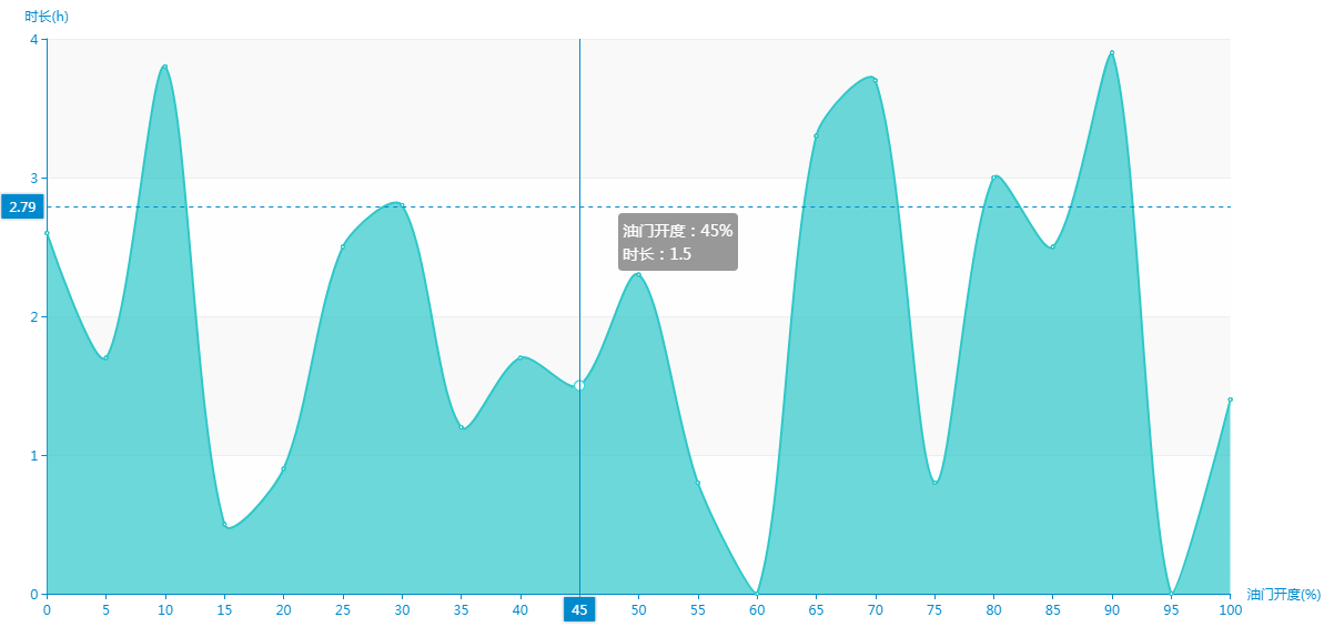
这是普通的折线图
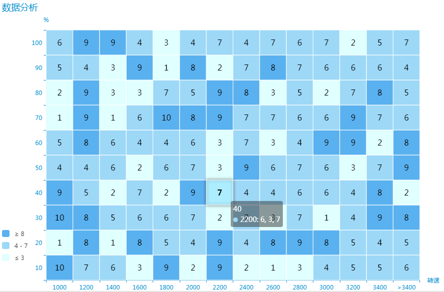
这是热力图
这是双Y轴图
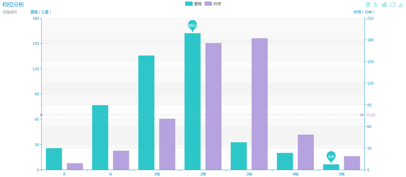
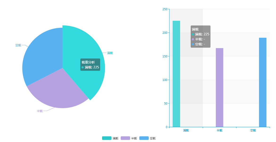
这是饼图和柱图联动
好了,不多说,上代码
<body>
    <div id="accelerator">
        <div id="ac" style="width: 100%; height: 620px;"></div>
        <!-- ac 表示 AcceleratorChart -->
    </div>
    <div id="economicDriving" class="clearfix">
        <div id="edc1" style="width: 70%; height: 620px;"></div>
        <div id="edc2" style="width: 30%; height: 620px;"></div>
        <!-- edc表示 EconomicDrivingChart -->
    </div>
    <div id="addSpeed">
        <div id="asc" style="width: 100%; height: 620px;"></div>
        <!-- asc 表示 addSpeedChart -->
    </div>
    <div id="stall">
        <div id="sc" style="width: 100%; height: 620px;"></div>
        <!-- sc 表示 stallChart -->
    </div>
    <div id="weight" class="clearfix">
        <div id="wc1" style="width: 60%; height: 620px;"></div>
        <div id="wc2" style="width: 40%; height: 620px;"></div>
        <!-- wc 表示 weightChart -->
    </div>
</body>
这里需要注意一个问题,有的时候大家为起什么名字的id发愁,但是千万不要把元素的id与js的函数名一样,因为浏览器会把id默认提升为变量(比如谷歌)
<script>
initAcceleratorChart();
initEconomicDrivingChart();
initAddSpeedChart();
stallChart();
weightChart();
function initAcceleratorChart (){
var chart = echarts.init(document.getElementById('ac'),'macarons');
var data = randomXData();
var option = {
tooltip: {
trigger: 'axis',
formatter: function (param){
var s = '油门开度:'+param[0].name+'%';
s += '<br/>';
s += '时长:';
s += param[0].value;
return s;
},
textStyle: {
align: 'left'
},
axisPointer: {
type: 'cross'
}
},
xAxis: [
{
type: 'category',
boundaryGap: false, // 两端空白
name: '油门开度(%)',
data: [0, 5, 10, 15, 20, 25, 30, 35, 40, 45, 50, 55, 60, 65, 70, 75, 80, 85, 90, 95, 100]
}
],
yAxis: [
{
type: 'value',
name: '时长(h)'
}
],
series: [
{
name: '时长',
type: 'line',
smooth: true,
itemStyle: {
normal: {
areaStyle: {
type: 'default'
}
}
},
data: data
}
]
}
chart.setOption(option);
chart.on('click', function (param){
console.log(param)
})
}
function initEconomicDrivingChart(){
var xData = [1000, 1200, 1400, 1600, 1800, 2000, 2200, 2400, 2600, 2800, 3000, 3200, 3400, '>3400'];
var yData = [10, 20, 30, 40, 50, 60, 70, 80, 90, 100];
// 随机数a b
function random (a, b){
return Math.round(Math.random()*Math.abs(b-a)+Math.min(a,b));
}
// seriesData 格式: [{name:'',type:'heatmap',data:[[x,y,z],[],[],...},{...}]
// data 是个二位数组 x 对应x坐标 y对应y坐标 z对应映射值 yData的长度等于seriseData的长度
var seriesData = [];
// 模拟数据
for(var i = 0; i < yData.length; i++){
var data = [];
for(var j = 0; j < xData.length; j ++){
data.push([i,j]);
}
seriesData.push(data);
}
for(var m = 0; m < seriesData.length; m ++){
seriesData[m] = seriesData[m].map(function(item){
return [item[1], item[0], random(1, 10)];
})
seriesData[m] = {
name: yData[m],
type: 'heatmap',
data: seriesData[m]
}
}
var option = {
title: {
text: '数据分析'
},
tooltip : {
trigger: 'item'
/*axisPointer: {
type: 'cross'
}*/
},
legend: {
show: true,
z: 999,
left: 'center',
top: 'top',
orient: 'horizontal'
},
xAxis: {
name: '转速',
type: 'category',
data: xData
},
yAxis: {
name: '%',
type: 'category',
data: yData
},
visualMap: {
show: true,
type: 'piecewise', // 分段型
min: 1,
max: 10,
pieces: [ // 数据分段 对应颜色
{gte: 8},
{gte: 4, lte: 7},
{lte: 3}
],
calculable: true,
orient: 'vertical',
left: 'left',
bottom: '15%'
},
series: seriesData,
label: { // 颜色块里的文本样式
normal: {
show: true,
color: '#000',
fontSize: 16
},
emphasis: {
fontWeight: 'bolder'
}
},
itemStyle: { // 颜色块的样式
normal: {
borderWidth: 1,
borderColor: '#fff'
},
emphasis: {
shadowBlur: 10,
shadowColor: 'rgba(0,0,0,0.5)'
}
}
};
var chart1 = echarts.init(document.getElementById('edc1'), 'macarons');
chart1.setOption(option);
var v1 = 0;
var v2 = 0;
var v3 = 0;
seriesData.forEach(function(item){
var data = item.data;
data.forEach(function(i){
var v = parseInt(i[2]);
if(v <= 3){ // 次经济
v1 += v;
}else if (v > 3 && v < 8){ // 经济
v2 += v;
}else{ // 非经济
v3 += v;
}
})
})
var option2 = {
tooltip: {
trigger: 'item',
formatter: '{b}:{c}({d}%)'
},
legend: {
orient: 'horizontal',
left: 'center',
bottom: 40,
data: ['非经济行驶', '经济行驶', '次经济行驶']
},
series: [
{
type: 'pie',
radius: '50%',
center: ['50%', '50%'],
data: [
{value: v3, name: '非经济行驶'},
{value: v2, name: '经济行驶'},
{value: v1, name: '次经济行驶'}
],
itemStyle: {
normal: {
label: {
show: false
}
}
}
}
]
}
var chart2 = echarts.init(document.getElementById('edc2'), 'macarons');
chart2.setOption(option2);
}
function initAddSpeedChart(){
var option = {
title: {
text: '车辆加速度分析'
},
tooltip: {
},
xAxis: [{
type: 'category',
name: 'xxx',
data: [-3, -2, -1, 0, 1, 2, 3]
}],
yAxis: [{
type: 'value',
name: '转速'
}],
visualMap: {
show: true,
type: 'piecewise', // 分段型
pieces: [ // 数据分段 对应颜色
{gte: 2000}, // 正常
{gt: 1000, lt: 2000}, // 过激
{lte: 1000} // 异常
],
calculable: true,
orient: 'vertical',
left: 'left',
bottom: '15%'
},
series: [{
name: '加速分析',
type: 'bar',
data: [800, 1300, 4000, 6500, 5100, 1500, 790]
}]
}
var chart = echarts.init(document.getElementById('asc'), 'macarons');
chart.setOption(option)
}
function stallChart(){
var option = {
title : {
text: '档位分析',
subtext: '纯属虚构'
},
tooltip : {
trigger: 'item'
},
legend: {
data:['里程', '时间']
},
toolbox: {
show : true,
feature : {
mark : {show: true},
dataView : {show: true, readOnly: false},
magicType : {show: true, type: ['line', 'bar']},
restore : {show: true},
saveAsImage : {show: true}
}
},
calculable : true,
xAxis : [
{
type : 'category',
data : ['R','N','1档','2档','3档','4档','5档']
}
],
yAxis : [
{
type : 'value',
name: '里程(公里)'
},
{
type: 'value',
name: '时间(分钟)'
}
],
series : [
{
name:'里程',
type:'bar',
yAxisIndex:0,
data:[25.6, 76.7, 135.6, 162.2, 32.6, 20.0, 6.4],
markPoint : {
data : [
{type : 'max', name: '最大值'},
{type : 'min', name: '最小值'}
]
}
},
{
name:'时间',
type:'bar',
yAxisIndex: 1,
data:[9.0, 26.4, 70.7, 175.6, 182.2, 48.7, 18.8],
markPoint : {
data : [
{name : '年最高', value : 182.2, xAxis: 7, yAxis: 183, symbolSize:18},
{name : '年最低', value : 2.3, xAxis: 11, yAxis: 3}
]
},
markLine : {
data : [
{type : 'average', name : '平均值'}
]
}
}
]
};
var chart = echarts.init(document.getElementById('sc'), 'macarons');
chart.setOption(option);
}
function weightChart(){
var option1 = {
title: {
text: '载重分析'
},
tooltip: {
trigger: 'item'
},
legend: { // 修改大小位置
orient: 'horizontal',
x: 'right',
y: 'bottom',
itemWidth: 40,
itemHeight: 15,
data: ['满载', '半载', '空载']
},
calculable: true,
series: [
{
name: '载重分析',
type: 'pie',
radius: '55%',
center: ['50%', '50%'],
data: [
{value: 225, name: '满载'},
{value: 167, name: '半载'},
{value: 189, name: '空载'}
]
}
]
};
var option2 = {
tooltip: {
trigger: 'axis',
axisPointer: {
type: 'shadow'
}
},
legend: {
show: false,
orient: 'vertical',
x: 'right',
data: ['满载', '半载', '空载']
},
calculable: true,
xAxis: [
{
type: 'category',
show: true,
data: ['满载', '半载', '空载']
}
],
yAxis: [
{
type: 'value',
splitArea: {show: true}
}
],
series: [
{
name: '满载',
type: 'bar',
data: [225, null, null] // itemStyle
},
{
name: '半载',
type: 'bar',
data: [null, 167, null]
},
{
name: '空载',
type: 'bar',
data: [null, null, 189]
}
]
}
var chart1 = echarts.init(document.getElementById('wc1'), 'macarons');
var chart2 = echarts.init(document.getElementById('wc2'), 'macarons');
chart1.setOption(option1);
chart2.setOption(option2);
echarts.connect([chart1, chart2]);
}
function randomXData (){
var range = 4;
//var n = (Math.Random(range*rand)).toFixed(1);
var n = 0;
var arr = [];
for(var i = 0; i < 21; i ++){
n = (range*Math.random()).toFixed(1);
arr.push(n);
}
return arr;
}
</script>还有就是因为业务需要,最后的联动图,有些数据设置为0了,导致柱图略细
这个demo应用了自己的主题,大家颜色可能会和我的不一样
tooltip我没有去设置,提示信息不太友好,可以用formatter设置一下
最后一组两图关联时,注意series.data 里数据的name一定要一致


 515
515

 被折叠的 条评论
为什么被折叠?
被折叠的 条评论
为什么被折叠?
 到【灌水乐园】发言


