|
Use the following guidelines to create professional VI and subpalette icons to distribute in a product or to share with other developers.
When you create icons, consider using a unifying theme, using color and contrast, designing for localization, choosing consistent glyphs, using standard text and icon sizes, and designing icons for subpalettes.
Unifying Themes
You can use a common element or combination of elements to unify a group of icons, such as a banner, a glyph, a background or border color, or text as shown in the following examples.
    
An important issue to consider if you want to use a common element in an icon set is how much of the icon space you want the element to use. In the previous examples, the VXI icon has less room for glyphs than the NI-DMM icon does.
If you use a banner for an icon set, consider using glyphs instead of text because well-designed glyphs can be easier to distinguish from each other than text. Using glyphs instead of text also removes the need to redesign icons if a product name changes.
Color and Contrast
Choose a light background color and outline glyphs in black to ensure enough contrast between the two elements. You should always create a black and white icon for printing purposes because users might not have access to a color printer.
Localization
Use text in icons only if the text itself is not localized. For example, "DAQ" is a term that is the same in German texts as it is in English texts. Do not use puns in icon glyphs because puns can be difficult to understand for users who speak a different language or for whom English is a second language. For example, do not represent a data logging VI with a picture of a tree branch or a lumberjack.
Glyph Choice
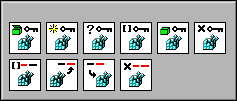
Choose glyphs that clearly represent the functionality of the icon. Using glyphs consistently across icons can reduce user confusion. For example, all the Windows Registry Access VIs in LabVIEW use the "registry" glyph so the user knows they all belong to the same group, as shown in the following graphic.
Text
If you must use text in an icon, use short, clear words. Unclear text can be just as confusing as a poorly designed glyph, especially for users who speak a different language or for whom English is a second language. The best font to use for LabVIEW icons is 8-point Small Fonts in all caps.
Size
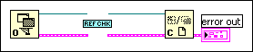
Try to keep all icons a standard size (32x32 pixels). VIs with smaller icons can be awkward to select and wire and might look strange when wired. For example, if you have a thin rectangular icon with a standard connector pane, the wires might seem to disappear into whitespace, as shown in the following graphic.
Subpalette Icons
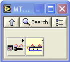
Subpalette icons should always be transparent so that the arrow on the top right corner remains visible. A white background in the Icon Editor translates to a transparent background in the icon on the palette. LabVIEW replaces all contiguous whitespace from the edges of the icon with the system background color. For example, the icon on the left in the following graphic uses a white background in the Icon Editor and thus displays the arrow on the palette. The icon on the right in the following graphic does not display the arrow on the palette because the background in the Icon Editor is not white.
| 


 该博客转载自https://www.cnblogs.com/Qia_sky/archive/2005/11/27/285725.html ,但未提供具体关于图标指南的详细内容。
 5262
5262

 被折叠的 条评论
为什么被折叠?
被折叠的 条评论
为什么被折叠?
 到【灌水乐园】发言


 扫一扫
扫一扫


