


 本文介绍了TextField组件在交互设计中的重要性,详细讲解了其属性和用法,包括hint属性用于提示信息,max_text_lines属性控制最大显示行数,text_input_type属性设定文本输入类型,input_enter_key_type属性设置输入键类型,并探讨了如何通过自定义样式提升UI美观度,以及利用setEditorActionListener实现交互操作。
TextField组件是交互类组件之一,是程序用于和用户进行交互的重要组件之一。TextField组件允许用户在组件中编写和修改内容,与Text组件不同之处在于Text组件的内容是不可编辑的。而TextField类是继承自Text类的,因此Text类中的属性和方法在TextField实例中也是可以使用的。TextField组件是重要的交互类组件,我们常见的场景有聊天界面的文字录入框;登录界面的账号、密码输入框;内容类录入页面的标题框等等。那么我们来看看如何在UI界面上加上TextField组件。在MingComponent项目中新建TextFieldComponentExampleAbility元程序,然后修改text_field_component_example_layout.xml中的代码。如下所示:
<?xml version="1.0" encoding="utf-8"?><DirectionalLayout xmlns:ohos="http://schemas.huawei.com/res/ohos" ohos:height="match_parent" ohos:width="match_parent" ohos:orientation="vertical"> <TextField ohos:height="match_content" ohos:width="match_parent" ohos:hint="请输入..." ohos:text_size="50" ohos:padding="20"/>DirectionalLayout>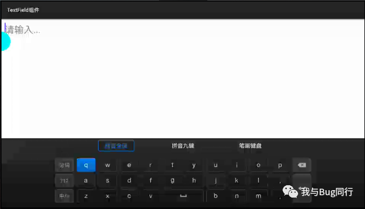
在TextField组件中有hint属性,这个属性是用于提示该组件的用途。比如我们在登录界面会在用户账号输入框中提示“请输入账号...”,这样能够使用户直观的了解该出填写那些数据。如果我们不设置hint属性,这对于用户不是很友好,同时也会给开发人员带来不便。我们也可以使用hint_color属性来重新更改提示信息的显示颜色。
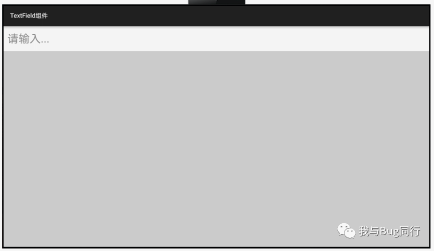
很多时候我们使用TextField组件与用户交互,用户输入信息,而这个信息有可能会超出TextField组件的宽度,如果我们设置其height为match_content时,内容会自动换行。如果我们将其height设置为固定的值时,当内容换行时,只会显示当前的内容行,我们需要使用鼠标或者手指上下滑动才能看到被遮住的内容。
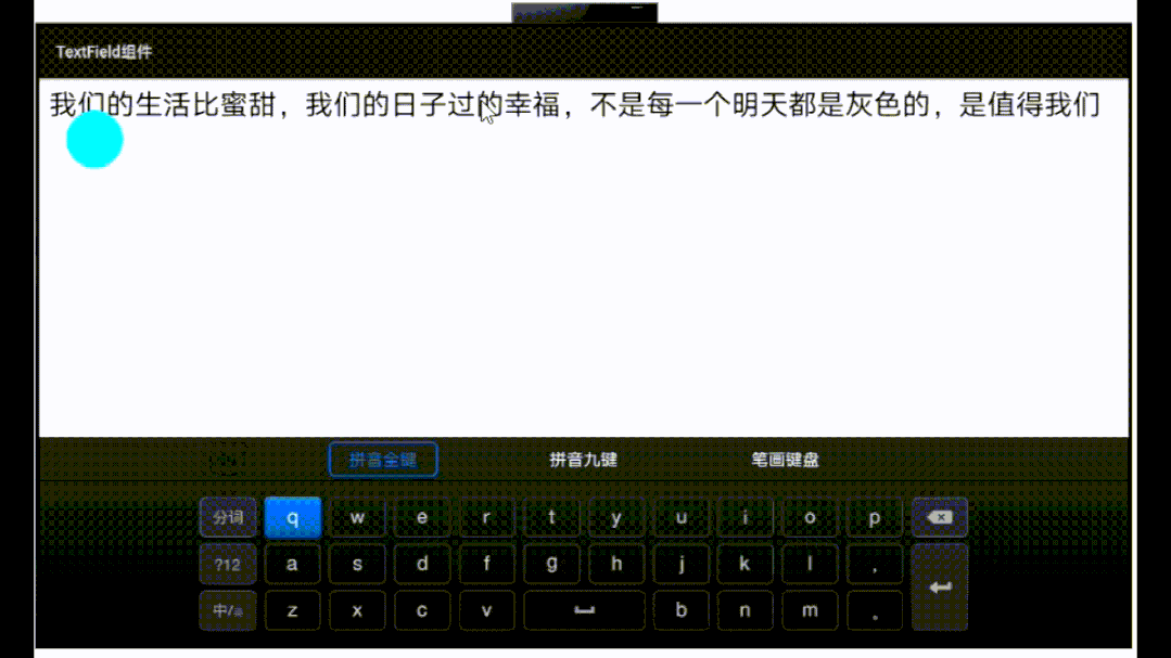
固定高度后,需要上下滑动才能查看
对于这种情况,我们可以使用max_text_lines属性来指定内容需要显示多少行,我们来修改text_field_component_example_layout.xml中的代码,如下所示:
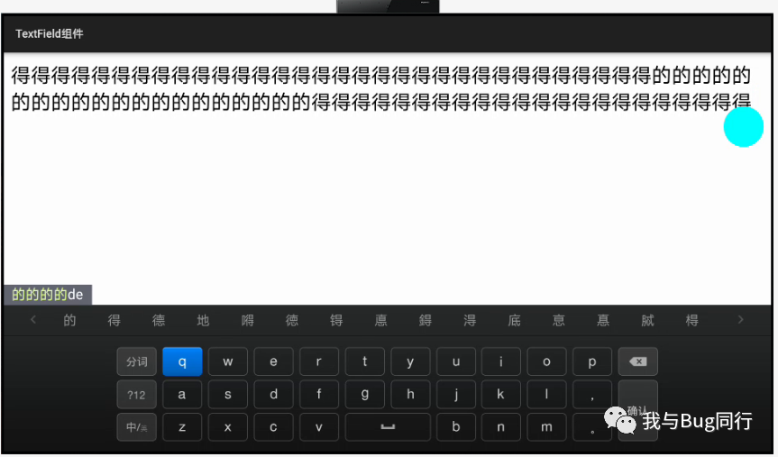
<?xml version="1.0" encoding="utf-8"?><DirectionalLayoutxmlns:ohos="http://schemas.huawei.com/res/ohos"ohos:height="match_parent"ohos:width="match_parent"ohos:orientation="vertical"><TextField ohos:height="50vp" ohos:width="match_parent" ohos:hint="请输入..." ohos:text_size="50" ohos:padding="20" ohos:max_text_lines="2"/>DirectionalLayout>这里通过ohos:max_text_lines指定TextField组件最大行数为两行,两行内容填充完后,若还有内容的话将会直接拽在第二行的内容后,被隐藏。因此如果我们需要设置它的最大行数,同时也要考虑字数的限制。如下图我们输入两行内容后,再输入内容的话,将不会再显示,而是直接在光标处隐藏,如果你删除前面的内容,后面的内容将会出现。
一般我们使用文本输入框时,会有多种类型选择,比如输入的字符只能是英文字符,或者输入的字符只能是数字,又或者输入字符时以*号代替显示,在TextField组件中以text_input_type属性来设置文本的文本输入类型。值有:PATTERN_NUMBER 文本内容只包含数字,PATTERN_PASSWORD 输入文本内容以密码形式显示,PATTERN_TEXT 公用的文本模式。我们以password为例,代码如下。
<?xml version="1.0" encoding="utf-8"?><DirectionalLayoutxmlns:ohos="http://schemas.huawei.com/res/ohos"ohos:height="match_parent"ohos:width="match_parent"ohos:orientation="vertical"><TextField ohos:height="match_content" ohos:width="match_parent" ohos:hint="请输入..." ohos:text_size="50" ohos:padding="20" ohos:text_input_type="pattern_password"/>DirectionalLayout>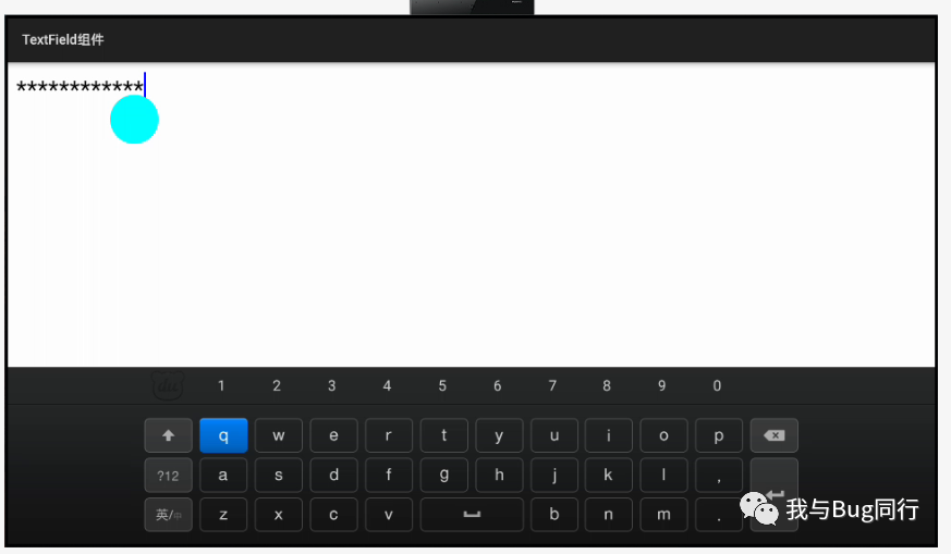
我们在登录界面上输入用户账号、密码后我们会点击登录按钮进行登录,如果我们仅仅是以简单的文本输入做交互,我们可以使用输入法选项来代替按钮的交互。TextField组件提供了input_enter_key_type属性来设置文本的输入选项,值有:ENTER_KEY_TYPE_GO 指示执行"go"动作的输入键类型,ENTER_KEY_TYPE_SEARCH 指示执行"search"动作的输入键类型,NTER_KEY_TYPE_SEND 指示执行"send"动作的输入键类型。我们以search为例,代码如下:
<?xml version="1.0" encoding="utf-8"?><DirectionalLayoutxmlns:ohos="http://schemas.huawei.com/res/ohos"ohos:height="match_parent"ohos:width="match_parent"ohos:orientation="vertical"><TextField ohos:height="match_content" ohos:width="match_parent" ohos:hint="请输入..." ohos:text_size="50" ohos:padding="20" ohos:text_input_type="pattern_password" ohos:input_enter_key_type="enter_key_type_search"/>DirectionalLayout>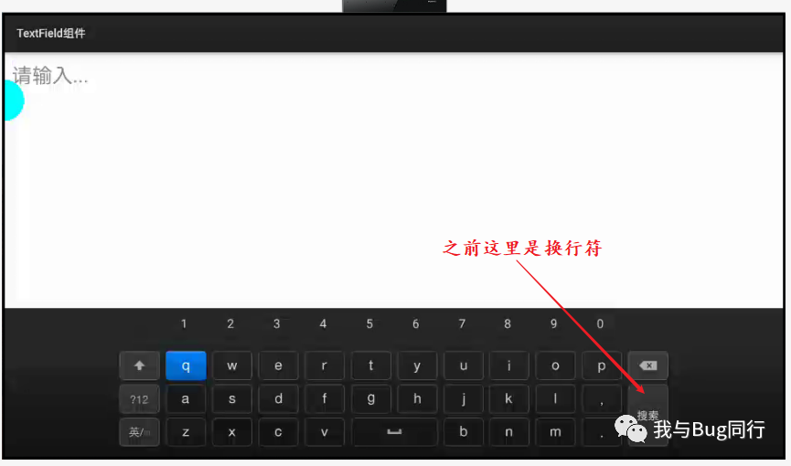
通过上面的代码我们基本熟悉了TextField组件的使用,对于默认样式的TextField组件我们看起来很别扭,我们不知道它的界限在哪儿,这种UI界面对于用户来说不友好,对于这种问题我们怎么去解决呢?
我们可以给整个布局一个与TextField组件不相同的背景色;
我们指定布局的背景色为“#CCCCCC”,TextField组件的背景色为“#F5F5F5”,这样我们就能很好的区分TextField组件的界限。
我们可以自定义TextField组件的显示样式。
我们可以通过设置TextField组件的背景色,边框,圆角来自定义TextField组件的显示样式,以达到UI界面的美观。我们在graphic文件夹下新建background_text_field_component_example_layout.xml文件,在代码中配置属性,代码如下所示:
<?xml version="1.0" encoding="UTF-8" ?><shape xmlns:ohos="http://schemas.huawei.com/res/ohos" ohos:shape="rectangle"> <solid ohos:color="#F5F5F5"/> <corners ohos:radius="20"/> <stroke ohos:width="2" ohos:color="#00BCD4"/>shape>在text_field_component_example_layout.xml中引入自定义样式,如下所示:
ohos:height="match_content" ohos:width="match_parent" ohos:hint="请输入..." ohos:text_size="50" ohos:margin="20" ohos:padding="20" ohos:background_element="$graphic:background_text_field_component_example_layout"/>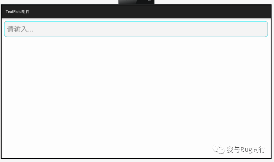
在TextField组件中为其提供了一个独有的方法setEditorActionListener(Text.EditorActionListener listener)用于为视图中的编辑器操作注册一个监听器。我们可以通过这个方法实现和按钮同等交互的操作。
<?xml version="1.0" encoding="utf-8"?><DirectionalLayout xmlns:ohos="http://schemas.huawei.com/res/ohos" ohos:height="match_parent" ohos:width="match_parent" ohos:orientation="vertical"><TextField ohos:id="$+id:text_field_component" ohos:height="match_content" ohos:width="match_parent" ohos:hint="请输入..." ohos:text_size="50" ohos:margin="20" ohos:padding="20" ohos:input_enter_key_type="enter_key_type_search" ohos:background_element="$graphic:background_text_field_component_example_layout"/> <Text ohos:id="$+id:text_field_editor_action" ohos:height="match_content" ohos:width="match_content" ohos:text="视图将响应并处理编辑器操作"/>DirectionalLayout> @Override public void onStart(Intent intent) { super.onStart(intent); super.setUIContent(ResourceTable.Layout_text_field_component_example_layout); Text text = (Text) findComponentById(ResourceTable.Id_text_field_editor_action); TextField textField = (TextField) findComponentById(ResourceTable.Id_text_field_component); textField.setEditorActionListener(new Text.EditorActionListener() { @Override public boolean onTextEditorAction(int i) { if (i == 2) { text.setText("视图将响应并处理编辑器操作为:切换"); return true; } else if (i == 3) { text.setText("视图将响应并处理编辑器操作为:搜索"); return true; } else if (i == 4) { text.setText("视图将响应并处理编辑器操作为:发送"); return true; } return false; } }); }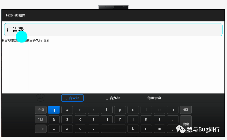
TextField组件的常用属性和方法这里就介绍这么多,我们小结一下 本节的内容。
提示信息hint属性和提示信息颜色hint_color属性
最大显示行数max_text_lines属性
文本输入类型text_input_type属性
输入键类型input_enter_key_type属性
自定义TextField样式
编辑器操作监听器


 扫一扫
扫一扫


 被折叠的 条评论
为什么被折叠?
被折叠的 条评论
为什么被折叠?
 到【灌水乐园】发言


