


Seaborn-Powerful Matplotlib Extension
seaborn实现直方图和密度图
import numpy as np
import pandas as pd
import matplotlib.pyplot as plt
import seaborn as sns
%matplotlib inline
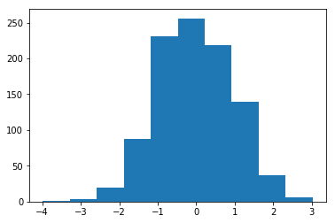
s1=pd.Series(np.random.randn(1000))
plt.hist(s1)#直方图结果:
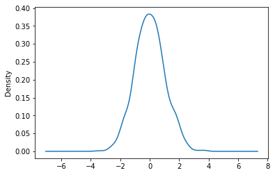
s1.plot(kind='kde')#密度图
结果:
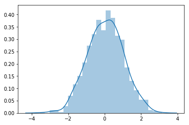
sns.distplot(s1,hist=True,kde=True)#可直接简写为sns.distplot(s1),因为默认情况下hist=True,kde=True
结果:
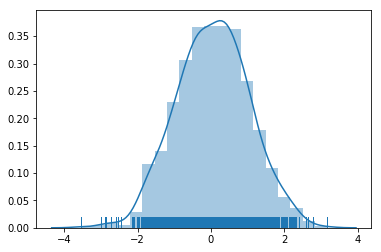
sns.distplot(s1,bins=20,rug=True)#bins=20指的是分为20等份,rug用于显示数据的密集度 在jupyter notebook中可以通过shift+Tab查看函数功能
结果:
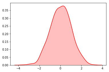
sns.kdeplot(s1,shade=True,color='r')#密度图,shade会将曲线下边颜色进行填充,默认为蓝色,可修改颜色
结果:
sns.rugplot(s1,height=1)#密集度图
结果:

seaborn实现柱状图和热力图
import numpy as np
import pandas as pd
import matplotlib.pyplot as plt
import seaborn as sns
%matplotlib inline
df=sns.load_dataset('flights')#通过在线的repository(存储库)下载数据,sns的内置方法
print(df.head())
df.shape
结果:


   year     month  passengers
0  1949   January         112
1  1949  February         118
2  1949     March         132
3  1949     April         129
4  1949       May         121
(144, 3)
df=df.pivot(index='month',columns='year',values='passengers')#生成透视表,阅读数据更加方便
print(df)
结果:
year       1949  1950  1951  1952  1953  1954  1955  1956  1957  1958  1959  \
month
January     112   115   145   171   196   204   242   284   315   340   360
February    118   126   150   180   196   188   233   277   301   318   342
March       132   141   178   193   236   235   267   317   356   362   406
April       129   135   163   181   235   227   269   313   348   348   396
May         121   125   172   183   229   234   270   318   355   363   420
June        135   149   178   218   243   264   315   374   422   435   472
July        148   170   199   230   264   302   364   413   465   491   548
August      148   170   199   242   272   293   347   405   467   505   559
September   136   158   184   209   237   259   312   355   404   404   463
October     119   133   162   191   211   229   274   306   347   359   407
November    104   114   146   172   180   203   237   271   305   310   362
December    118   140   166   194   201   229   278   306   336   337   405

year       1960
month
January     417
February    391
March       419
April       461
May         472
June        535
July        622
August      606
September   508
October     461
November    390
December    432
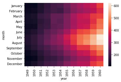
sns.heatmap(df)#热力图
结果:
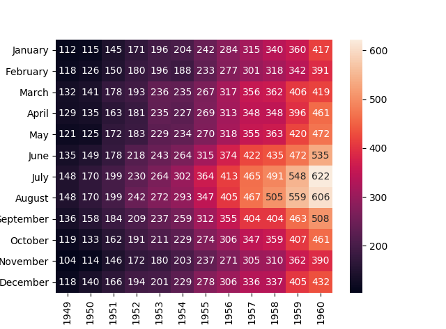
sns.heatmap(df,annot=True,fmt='d')#annot显示是否有字,fmt=‘d’表示显示整数数字
结果:
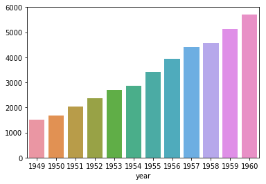
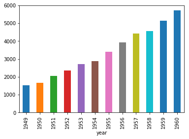
s=df.sum()
print(s)
print(s.index)
print(s.values)
结果:
year
1949    1520
1950    1676
1951    2042
1952    2364
1953    2700
1954    2867
1955    3408
1956    3939
1957    4421
1958    4572
1959    5140
1960    5714
dtype: int64
Int64Index([1949, 1950, 1951, 1952, 1953, 1954, 1955, 1956, 1957, 1958, 1959,
            1960],
           dtype='int64', name='year')
[1520 1676 2042 2364 2700 2867 3408 3939 4421 4572 5140 5714]
sns.barplot(x=s.index,y=s.values)
结果:
print(type(s))
s.plot(kind='bar')#复习matplotlib画出柱状图
结果:
seaborn设置图形显示效果
import numpy as np
import pandas as pd
import matplotlib.pyplot as plt
import seaborn as sns
%matplotlib inline
x=np.linspace(0,14,100)#等差数列,在0,14之间等分为100份
y1=np.sin(x)
y2=np.sin(x+2)*1.25
def sinplot():
    plt.plot(x,y1)
    plt.plot(x,y2)
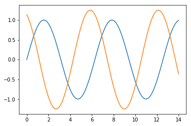
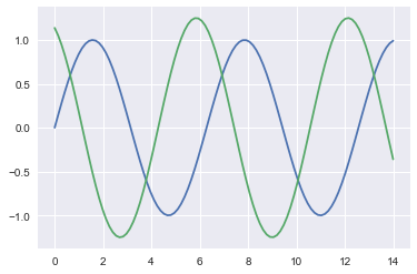
sinplot()
结果:
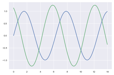
import seaborn as sns
sinplot()#seaborn为其定义了5种风格,下图为默认风格
style=['darkgrid','dark','white','whitegrid','ticks']
结果:
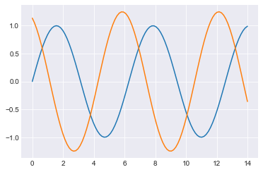
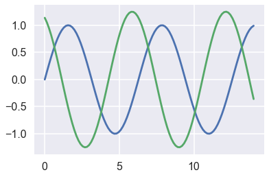
sns.set_style(style[3])
sinplot()
sns.axes_style()#显示出主题的参数设置,可更改,见下条程序
结果:
{'axes.axisbelow': True,
 'axes.edgecolor': '.8',
 'axes.facecolor': 'white',
 'axes.grid': True,
 'axes.labelcolor': '.15',
 'axes.linewidth': 1.0,
 'figure.facecolor': 'white',
 'font.family': ['sans-serif'],
 'font.sans-serif': ['Arial',
  'DejaVu Sans',
  'Liberation Sans',
  'Bitstream Vera Sans',
  'sans-serif'],
 'grid.color': '.8',
 'grid.linestyle': '-',
 'image.cmap': 'rocket',
 'legend.frameon': False,
 'legend.numpoints': 1,
 'legend.scatterpoints': 1,
 'lines.solid_capstyle': 'round',
 'text.color': '.15',
 'xtick.color': '.15',
 'xtick.direction': 'out',
 'xtick.major.size': 0.0,
 'xtick.minor.size': 0.0,
 'ytick.color': '.15',
 'ytick.direction': 'out',
 'ytick.major.size': 0.0,
 'ytick.minor.size': 0.0}
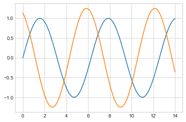
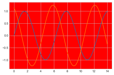
sns.set_style(style[3],{'axes.facecolor':'red'})
sinplot()
结果:
{'axes.axisbelow': True,
 'axes.edgecolor': '.8',
 'axes.facecolor': 'red',
 'axes.grid': True,
 'axes.labelcolor': '.15',
 'axes.linewidth': 1.0,
 'figure.facecolor': 'white',
 'font.family': ['sans-serif'],
 'font.sans-serif': ['Arial',
  'DejaVu Sans',
  'Liberation Sans',
  'Bitstream Vera Sans',
  'sans-serif'],
 'grid.color': '.8',
 'grid.linestyle': '-',
 'image.cmap': 'rocket',
 'legend.frameon': False,
 'legend.numpoints': 1,
 'legend.scatterpoints': 1,
 'lines.solid_capstyle': 'round',
 'text.color': '.15',
 'xtick.color': '.15',
 'xtick.direction': 'out',
 'xtick.major.size': 0.0,
 'xtick.minor.size': 0.0,
 'ytick.color': '.15',
 'ytick.direction': 'out',
 'ytick.major.size': 0.0,
 'ytick.minor.size': 0.0}
sinplot()#原本的设置已经改变 ,要想恢复到以前的形式,需要清空当前风格设置
结果:

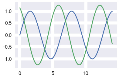
sns.set()#清空当前风格设置
sinplot()#回到默认设置
结果:

context=['paper','notebook','talk','poster']#曲线属性
sns.set_context(context[0])
sinplot()
结果:
sns.set_context(context[3])#与第0个相比会变粗,变大
sinplot()
sns.plotting_context()#显示出属性的设置
结果:
{'axes.labelsize': 17.6,
 'axes.titlesize': 19.200000000000003,
 'font.size': 19.200000000000003,
 'grid.linewidth': 1.6,
 'legend.fontsize': 16.0,
 'lines.linewidth': 2.8000000000000003,
 'lines.markeredgewidth': 0.0,
 'lines.markersize': 11.200000000000001,
 'patch.linewidth': 0.48,
 'xtick.labelsize': 16.0,
 'xtick.major.pad': 11.200000000000001,
 'xtick.major.width': 1.6,
 'xtick.minor.width': 0.8,
 'ytick.labelsize': 16.0,
 'ytick.major.pad': 11.200000000000001,
 'ytick.major.width': 1.6,
 'ytick.minor.width': 0.8}
sns.set_context(context[3],rc={'grid.linewidth': 10})#sns.set_context(context=None, font_scale=1, rc=None)
sinplot()
结果:

sinplot()#原本的设置已经改变 ,要想恢复到以前的形式,需要清空当前风格设置
结果:
sns.set()#清空当前风格设置
sinplot()#回到默认设置
结果:
seaborn强大的调色功能
import numpy as np
import pandas as pd
import matplotlib.pyplot as plt
import seaborn as sns
%matplotlib inline
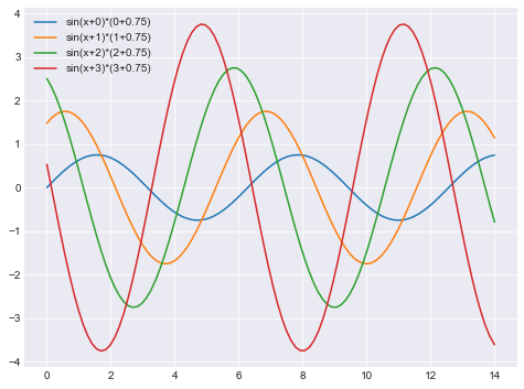
def sinplot():
x=np.linspace(0,14,100)
plt.figure(figsize=(8,6))#调整图像大小
for i in range(4):
plt.plot(x,np.sin(x+i)*(i+0.75),label='sin(x+%s)*(%s+0.75)'%(i,i))
plt.legend()
sinplot()
结果:

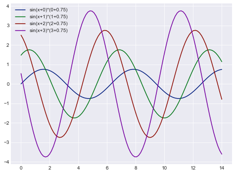
import seaborn as sns
sinplot()
结果:
sns.color_palette()#当前系统所使用的调色板 每组中有三个值,分别为RGB
结果:
[(0.12156862745098039, 0.4666666666666667, 0.7058823529411765),
 (1.0, 0.4980392156862745, 0.054901960784313725),
 (0.17254901960784313, 0.6274509803921569, 0.17254901960784313),
 (0.8392156862745098, 0.15294117647058825, 0.1568627450980392),
 (0.5803921568627451, 0.403921568627451, 0.7411764705882353),
 (0.5490196078431373, 0.33725490196078434, 0.29411764705882354),
 (0.8901960784313725, 0.4666666666666667, 0.7607843137254902),
 (0.4980392156862745, 0.4980392156862745, 0.4980392156862745),
 (0.7372549019607844, 0.7411764705882353, 0.13333333333333333),
 (0.09019607843137255, 0.7450980392156863, 0.8117647058823529)]
sns.palplot(sns.color_palette())#画出色板的颜色
结果:

pal_style=['deep','muted','pastel','bright','dark','colorblind']#6种主题分类色板
sns.palplot(sns.color_palette('deep'))
结果:

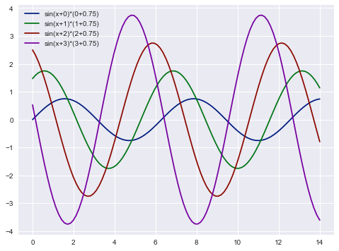
sns.set_palette(sns.color_palette('dark'))#设置为dark色板
sinplot()
结果:
sns.set()#恢复到以前默认的色板
sinplot()
结果:

with sns.color_palette('dark'):#设置临时色板
    sinplot()
结果:
sinplot()#上述为临时色板
结果:

pall=sns.color_palette([(0.5,0.1,0.7),(0.3,0.1,0.9)])#生成自己的色板
sns.palplot(pall)
结果:

sns.palplot(sns.color_palette('hls',8))#生成8种颜色的色板,随便指定数目
结果:


 592
592

 被折叠的 条评论
为什么被折叠?
被折叠的 条评论
为什么被折叠?
 到【灌水乐园】发言


