


 本文介绍了一个使用CSS3实现的动画示例,通过定义关键帧来改变元素的颜色和位置,实现循环渐变的效果,并展示了不同浏览器前缀的兼容写法。
CSS3动画遵循@kwyframes规则,规定了动画的名称、时长。
1、示例代码
<!DOCTYPE html>
<html lang="en">
<head>
<meta charset="UTF-8">
<title>CSS3动画示例</title>
<style>
*{margin: 0;padding: 0}
section{width:100px;height: 100px;
background-color: coral;
position: relative;
animation: anim 3s infinite alternate;
-webkit-animation:anim 3s infinite alternate;
-moz-animation: anim 3s infinite alternate;
-o-animation: anim 3s infinite alternate;
margin: 50px auto; }
@keyframes anim {
0%{background-color: red;left: 0;top: 0;}
25%{background-color: green;left: 100px;top: 0;}
50%{background-color: blue;left: 100px;top: 100px;}
75%{background-color: yellow;left: 0;top: 100px;}
100%{background-color: purple;left: 0;top: 0;}
}
@-webkit-keyframes anim {
0%{background-color: red;left: 0;top: 0;}
25%{background-color: green;left: 100px;top: 0;}
50%{background-color: blue;left: 100px;top: 100px;}
75%{background-color: yellow;left: 0;top: 100px;}
100%{background-color: purple;left: 0;top: 0;}
}
@-moz-keyframes anim {
0%{background-color: red;left: 0;top: 0;}
25%{background-color: green;left: 100px;top: 0;}
50%{background-color: blue;left: 100px;top: 100px;}
75%{background-color: yellow;left: 0;top: 100px;}
100%{background-color: purple;left: 0;top: 0;}
}
@-o-keyframes anim {
0%{background-color: red;left: 0;top: 0;}
25%{background-color: green;left: 100px;top: 0;}
50%{background-color: blue;left: 100px;top: 100px;}
75%{background-color: yellow;left: 0;top: 100px;}
100%{background-color: purple;left: 0;top: 0;}
}
</style>
</head>
<body>
<section></section>
</body>
</html>
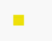
2.示例动画效果


 扫一扫
扫一扫


 被折叠的 条评论
为什么被折叠?
被折叠的 条评论
为什么被折叠?
 到【灌水乐园】发言


