


 本文介绍使用LaTeX及其宏包pdfplot进行论文图表绘制的方法。通过实例展示了如何利用csv文件输入数据并绘制复杂的对比图表,相较于Excel等工具,LaTeX绘图更为美观简洁。
latex 绘图功能比预计地还要强大,甚至可以画地图,画圣诞树。外导给了一个网站链接,上面有各种 latex 画图的例子:
http://www.texample.net/tikz/examples/feature/remember-picture/
用 latex 画图 还是挺麻烦的,它用一堆代码表示图形,并不像 excel 和 visio 那么形象。但是,对于写论文来说,它画图比较美观简洁。常用的画图宏包为 pdfplot,它的 manual 详细介绍了它的用法,下载地址:
http://www.bakoma-tex.com/doc/latex/pgfplots/pgfplots.pdf
manual 非常详细,非常全。下面是我画的图:我将一些数据放进 csv 文件里,然后从这个文件中提取横坐标,纵坐标画图。把数据放进 csv 文件用到了 filecontents 宏包。
\usepackage{pgfplots}
\usepackage{filecontents}
\begin{filecontents*}{mydata.csv}
a, sQS-std-in, sS-std-in, RS-std-in, RQ-std-in, sQS-rm-in, sS-rm-in, RS-rm-in, RQ-rm-in,sQS-std-out, sS-std-out, RS-std-out, RQ-std-out, sQS-rm-out, sS-rm-out, RS-rm-out, RQ-rm-out
100, 0.93, 1.19, 1.66, 2.40, 3.24, 2.60, 6.22, 11.65, 1.64, 1.29, 1.45, 1.34, 3.24, 2.99, 5.48, 11.21
500, 0.70, 0.87, 1.21, 1.49, 3.94, 2.77, 6.26, 11.74, 1.40, 1.06, 1.17, 1.15, 3.39, 2.80, 5.41, 11.14
1000, 0.56, 0.64, 1.21, 1.44, 3.92, 2.70, 6.20, 11.59, 0.65, 0.75, 1.19, 1.35, 2.53, 2.65, 5.36, 10.97
1500,0.55, 0.65, 1.32, 1.52, 4.09, 2.84, 6.24, 11.78, 0.52, 0.72, 1.31, 1.35, 2.35, 2.63, 5.37, 11.21
\end{filecontents*}
\begin{figure}[!ht]
\centering
\subfigure[Mean STD for different number of scenarios.]{
\begin{tikzpicture}
\pgfplotsset{every axis legend/.append style={
at={(0.5,1.03)},
anchor=south},every axis y label/.append style={at={(0.07,0.5)}}}
\begin{axis}[title=(a) Mean STD for ,xlabel=Num of scenarios,
ylabel=Mean STD,xtick =data,legend columns=4,legend style={font=\tiny},font=\footnotesize,width=8cm]
\addplot table [x=a, y=sQS-std-in,, col sep=comma] {mydata.csv};
\addplot table [x=a, y=sS-std-in, col sep=comma] {mydata.csv};
\addplot table [x=a, y=RS-std-in, col sep=comma] {mydata.csv};
\addplot table [x=a, y=RQ-std-in, col sep=comma] {mydata.csv};
\addplot table [x=a, y=sQS-std-out, col sep=comma] {mydata.csv};
\addplot table [x=a, y=sS-std-out, col sep=comma] {mydata.csv};
\addplot table [x=a, y=RS-std-out, col sep=comma] {mydata.csv};
\addplot table [x=a, y=RQ-std-out, col sep=comma] {mydata.csv};
\legend{s$\overline{Q}$S-in, sS-in, RS-in, RQ-in, s$\overline{Q}$S-out, sS-out, RS-out, RQ-out}
\end{axis}
\end{tikzpicture}}
~~~~
\subfigure[Mean RMSE for different number of scenarios.]{
\begin{tikzpicture}
\pgfplotsset{every axis legend/.append style={
at={(0.5,1.03)},
anchor=south},
every axis y label/.append style={at={(0.07,0.5)}}}
\begin{axis}[xlabel=Num of scenarios,
ylabel=Mean RMSE,xtick =data,legend columns=4,legend style={font=\tiny},font=\footnotesize,width=8cm]
\addplot table [x=a, y=sQS-rm-in,, col sep=comma] {mydata.csv};
\addplot table [x=a, y=sS-rm-in, col sep=comma] {mydata.csv};
\addplot table [x=a, y=RS-rm-in, col sep=comma] {mydata.csv};
\addplot table [x=a, y=RQ-rm-in, col sep=comma] {mydata.csv};
\addplot table [x=a, y=sQS-rm-out, col sep=comma] {mydata.csv};
\addplot table [x=a, y=sS-rm-out, col sep=comma] {mydata.csv};
\addplot table [x=a, y=RS-rm-out, col sep=comma] {mydata.csv};
\addplot table [x=a, y=RQ-rm-out, col sep=comma] {mydata.csv};
\legend{s$\overline{Q}$S-in, sS-in, RS-in, RQ-in, s$\overline{Q}$S-out, sS-out, RS-out, RQ-out}
\end{axis}
\end{tikzpicture}}
\caption{Stability test results for different number of scenarios.}\label{fig:InsampleOutsample}
\end{figure}我用 tikzpicture 画了两个图,显示效果:
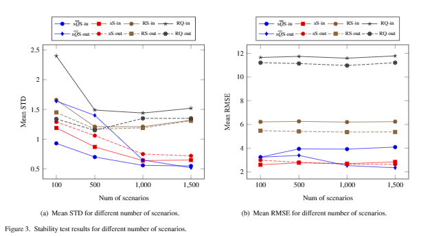
确实比 excel 画的图好看。


 1万+
1万+

 被折叠的 条评论
为什么被折叠?
被折叠的 条评论
为什么被折叠?
 到【灌水乐园】发言


