


 本文深入探讨CSS transition属性,包括transition-property、transition-duration、transition-timing-function和transition-delay。通过实例解析过渡的触发方式,如伪类:hover、:focus等,以及transitionend事件。了解这些,能帮助你创建更流畅的网页交互体验。
1、前言
transition从网页效果上来看是一种平滑过渡的动画,本质上是在一定的时间内将属性的状态从初始值过渡到结束值。如果不添加transition过渡,在网页中点击鼠标、获得焦点等操作将导致css的值在瞬间完成,看起来比较生硬,而添加了过渡效果,可以实现平滑的过渡,增加用户体验。
在使用的使用需要加浏览器前缀:
-webkit-transition
-moz-transition
-o-transition
过渡transition是一个复合属性,包括:
transition: || || ||
transition-property:过渡属性(默认值为all)
transition-duration:过渡持续时间(默认值为0s)
transition-timing-function:过渡函数(默认值为ease函数)
transition-delay过渡延迟时间(默认值为0s)
2、transition属性介绍
2.1 过渡属性transition-property
transition-property: none | all | [,]*
默认值:all
*表示0次或多次,也就是说transition-property后面可以跟多个属性,属性之间以逗号分隔。如果有多个属性过渡,可以使用all代替所有的属性名,表示所有的属性都将获得过渡效果。这里需要指出并不是所有的属性都能过渡,只有能够数字量化的CSS属性才能过渡,比如颜色系列(color、background-color、border-color)、数字系列(width、height、line-height)、01系列(opacity、visibility)。W3C上列出了所有的过渡属性列表
2.2 过渡持续时间transition-duration
transition-duration:[,]*
默认值:0s,表示立刻变化。
整个过渡状态完成需要的时间。单位可以指定秒,也可以指定毫秒。
有了transition-property和transition-duration的介绍,我们来看一个简单的例子:该实例使用的hover的时候,背景颜色由#69c编程red,并且过渡时间为3s。
transition过渡效果#block{
width: 400px;
height: 400px;
background-color: #69c;
margin: 0 auto;
-webkit-transition: background-color 3s;
}
#block:hover{
background-color: red;
}
网页的过渡效果如下所示:

2.3 过渡延迟时间transition-delay
transition-delay:[,]*
默认值:0s,表示不延迟
延迟过渡开始的时间。可以为正数,也可以为负数。如果为正数秒,则表示正数秒后才开始过渡。负数的情况可以参考这篇文章。
下面的例子中,将过渡时间设置为1s,过渡延迟时间设置的3s,可以看到当鼠标挪上去与离开过了3秒后背景颜色才开始过渡,并且过渡的时间为1s。
transition过渡效果#block{
width: 200px;
height: 200px;
background-color: #69c;
margin: 0 auto;
-webkit-transition: background-color 1s 3s;
}
#block:hover{
background-color: red;
}

当hover时过渡完成时,默认会恢复到最初的状态。 这里有一个小技巧,如果不想恢复到最初的状态,可以将transition-delay的值设定为很大,示例中将该值设置为999999s,大概为12天,对于用户浏览器窗口来讲,已经是足够长,这个时间范围内不会恢复到最初的状态,因此可以认为这种过渡是不可逆的,即是永久的。
Title.forever{
width: 100px;
height: 100px;
margin: 0 auto;
background-color: deeppink;
transition: all 1s linear 999999s;
}
.forever:hover{
transform: scale(2);
transition: all 1s ease-in-out;
}

从上面的示例可以得到最终的效果,当鼠标hover结束的时候,图片仍然保持在放大后的尺寸。具体原因是:回到原尺寸的过渡延迟时间设置的很大,用户的浏览器窗口不可能一直保持不关,现实的情况等于永久性过渡。
2.4 过渡时间函数transition-timing-function
transition-timing-function:[,]*
默认值:ease
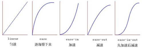
可选值:ease/linear/ease-in/ease-out/ease-in-out
ease 缓慢开始,缓慢结束(默认)
ease-in 缓慢开始
ease-out 缓慢结束
ease-in-out 缓慢开始,缓慢结束(和ease稍有区别,差别并不大)
linear 匀速
以上四个参数的变化曲线可以用下图表示:
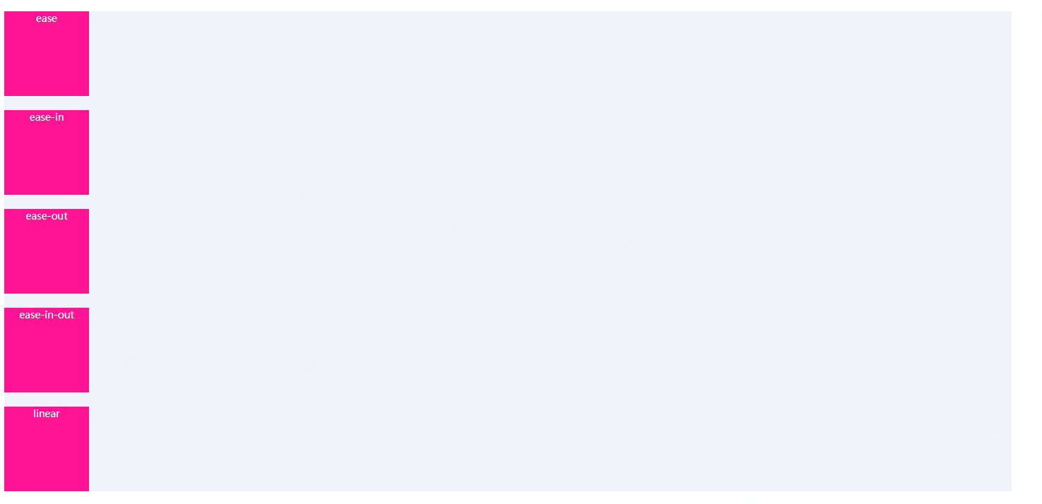
实际的效果如下图所示,动画依次对应ease、ease-in、ease-out、ease-in-out以及linear的动画效果:
cubic-bezier 贝塞尔曲线。(x1,y1,x2,y2)四个值对应于曲线上的P1和P2点,并且必须在[0,1]区域内,否则无效。

steps 支持两个参数,第一个是分割的数量,第二个参数可选关键字start、end(默认)。例如,steps(4, start)等价于step-start(4)、steps(4,end)等价于step-end(4)
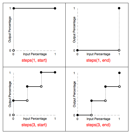
关于cubic-bezier和steps两个过渡时间函数,后面写相关的文章详细讨论。
3、 过渡触发的方式
一般地,过渡transition的触发方式有三种,分别是伪类触发、媒体查询触发@media和Javascript事件触发。其中,常见的伪类触发有:hover、:focus、:active、:checked等。
1.hover:鼠标悬停触发。在文章的上面有例子讲解。
2.active:用户点击元素并按住鼠标时触发
.active-demo{
display: block;
width: 100px;
height: 100px;
margin-top: 10px;
border-radius: 5px;
padding: 10px;
text-align: center;
background-color: deeppink;
transition: all 3s ease;
}
.active-demo:active{
background-color: blue;
width: 500px;
}
网页中的效果如下所示:

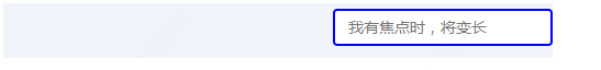
3.focus(获得焦点时触发)
input{
outline: none;
}
.wrapper{
position: relative;
width: 500px;
height: 50px;
padding: 5px;
background-color: #f0f3f9;
}
.input-demo{
position: absolute;
right: 0;
width: 200px;
height: 34px;
padding: 6px 12px;
font-size: 14px;
line-height: 1.4;
color: #555;
background-color: #fff;
border-image: none;
border: 2px solid blue;
border-radius: 4px;
transition: width 3s linear;
}
.input-demo:focus{
width: 400px;
border-image: none;
border: 2px solid gold;
}
我们对input进行绝对定位,并改变focus时它的宽度,就可以模拟出segmentfault顶部搜索框的效果。效果如下:
4.checked:
复选框
.checkbox{
transition: all 3s ease;
}
.label{
color: #1b1b1b;
transition: all 3s ease;
}
.checkbox:checked + .label{
color: deeppink;
font-size: 20px;
font-weight: 700;
}
在这个例子中通过checked的时候,改变label标签字体的大小和颜色。效果如下:

5.点击事件,例如添加删除等操作
.box{
color: #fff;
text-align: center;
margin-top: 10px;
width: 100px;
height: 100px;
border-radius: 5px;
background-color: deeppink;
transition: all 3s ease;
}
.box.clicked{
width: 200px;
height: 200px;
background-color: blue;
}
$(".box").click(function () {
$(this).toggleClass('clicked');
})
这个例子中,当点击鼠标的时候,改变容器的背景颜色和大小。效果图如下:

6.改变浏览器窗口大小触发@media
.media {
margin-top: 10px;
width: 200px;
height: 200px;
border-radius: 5px;
background: deeppink;
color: white;
text-align: center;
transition: all 1s ease;
}
@media only screen and (max-width : 960px) {
.media {
width: 100px;
height: 100px;
}
}
这个例子中通过改变浏览器窗口的大小,来实现media容器的宽度和高度的渐变。

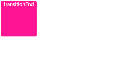
4、过渡transition结束事件
由于过渡涉及到一个过渡时间,在过渡完成的时候会触发transitionend事件,。兼容Chrome、Firefox、Safari、IE10+。具体用法如下:
element.addEventListener('transitionend', callback, false);
html
css
.end{
width: 120px;
height: 120px;
background-color: deeppink;
color: #fff;
text-align: center;
border-radius: 5px;
transition: all 3s ease;
}
.end:hover{
width: 200px;
height: 200px;
background-color: blue;
}
javacript
document.getElementById('end').addEventListener("transitionend", function (e) {
e = e || event;
document.getElementById('end').innerHTML = 'propertyName:' + e.propertyName
+ '; elapsedTime:' + e.elapsedTime + '; pseudoElement:' + e.pseudoElement;
});
效果如下:
但是transitionend事件比较坑,通过e.propertyName获取到的过渡属性不完整,比如文中示例,过渡的属性有width、height以及background-color,但是通过e.propertyName获得过渡属性只有height。
5、写在最后
关于transition过渡属性就介绍到这里,还有很多细节问题没有介绍到,大家可以再看看W3C上的介绍。相信到这里,你可以写一个用户友好的过渡效果了。
感谢您的阅读!在这样的一个浮躁的年代里,能够认真看到这里已经是对作者最大的肯定。欢迎大家关注我的微信公众号。
圣诞节了,祝福您和您的家人一切都好!


 扫一扫
扫一扫


 4351
4351

 被折叠的 条评论
为什么被折叠?
被折叠的 条评论
为什么被折叠?
 到【灌水乐园】发言


