


 博客探讨了CSS3中的圆角、阴影和透明度在IE8上的兼容问题,提供了包括使用背景图片、PIE.HTC文件等解决方案,同时建议使用渐变图片或不兼容IE8的策略。

 点击上方蓝字关注我们
设计有“三大妖术”分别是:圆角、阴影、透明度,恰恰他们在IE上存在兼容问题,让前兼容起来感到头,所以不兼容IE我们还是好朋友!

属性:opacity 兼容性:IE8以上

代码如下
//html
<div class="box">
    <div class="b">我是下面的盒子div>
    <div class="a">我是上面的盒子div>
div>

//css
.box{
    position: relative;
}
.b,.a{
    width: 300px;
    height: 150px;
    color:#fff;
    background-color:#000;
    text-align: center;
    line-height: 150px;
}
.a{
    position: absolute;
    top: 20px;
    left: 20px;
    opacity: 0.8;
    background-color: blue;
}
解决方案一:背景图片(不推荐)
原因:使用图片会发生请求,并且如果有交互,使用图片就比较生硬,并且后期维护比较麻烦,所以能用代码实现的,为啥要用图片(???) 解决方案二:兼容性代码 IE8支持filter:alpha(opacity); 查找资料发现filter:alpha(opacity)支持ie6~9,但是亲测发现IE9不太行以下是兼容性写法
.opacity{
  filter:alpha(opacity=50);       /* IE */
  -moz-opacity:0.5;             /* 老版Mozilla */
  -khtml-opacity:0.5;          /* 老版Safari */
  opacity: 0.5;              /* 支持opacity的浏览器*/
}
rgba颜色模式IE8同样不支持
解决方案
  .rgba{
  //一般的高级浏览器都支持
   background: rgba(255,255,255,0.1);
  //IE8下
  filter:progid:DXImageTransform.Microsoft.gradient(startColorstr=#19ffffff,endColorstr=#19ffffff);
  }
#19ffffff数值说明
19是rgba透明度0.1的IEfilter值。从0.1到0.9每个数字对应一个IEfilter值。对应关系如下截图所示。
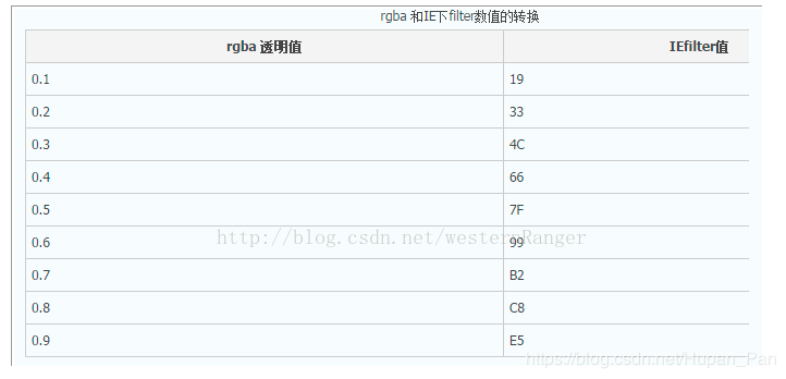
IEfilter值
但是呢这个表似乎有点难记,又是B又是C的
我们可以换一种表达方式
//html
<div class="box">
  <div class="bg">div>
  <div class="context">div>
div>

//css
.box{
  position: relative;
  width:100px;
  height:100px;
}
.bg{
position: relative;
  width:100px;
  height:100px;
  background-color: #fff;
  filter:alpha(opacity=60);
  -moz-opacity:0.5;
  -khtml-opacity:0.5;
  opacity: 0.6;
}
.context{
  position: relative;
  z-index:1
}
这种要定宽高,不能自适应,具体选择看业务需求吧
2圆角
属性:border-radius
兼容性:IE8依旧不兼容
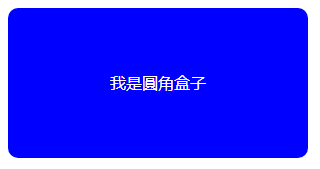
代码如下
//html
<div class="box">
    <div class="b">我是圆角盒子div>
div>

//css
.box{
    position: relative;
}
.b{
    width: 300px;
    height: 150px;
    color:#fff;
    background-color:blue;
    text-align: center;
    line-height: 150px;
    border-radius: 10px;
}
阴影
属性:box-shadow
兼容性:IE8依旧不兼容
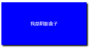
代码如下
//html
<div class="box">
    <div class="b">我是圆角盒子div>
div>

//css
.box{
    position: relative;
}
.b{
    width: 300px;
    height: 150px;
    color:#fff;
    background-color:blue;
    text-align: center;
    line-height: 150px;
    box-shadow:4px 4px 5px #000;
}
渐变
属性:linear-gradient
兼容性:IE10兼容
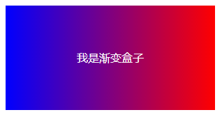
代码如下
//html
<div class="box">
    <div class="b">我是圆角盒子div>
div>

//css
.box{
    position: relative;
}
.b{
    width: 300px;
    height: 150px;
    color:#fff;
    background-color:blue;
    text-align: center;
    line-height: 150px;
    background-image:linear-gradient(to right,blue,red)
}
以上均未处理兼容
圆角和阴影可以使用图片解决但是依旧存在后期修改麻烦的问题
解决方案
使用第三方文件PIE.HTC
下载地址:http://css3pie.com/
使用方法
.boxShadow {
    width: 100px;
    height: 100px;
    margin: 100px;
    background-color: #000;
    box-shadow: 3px 3px 5px #000;
    /*关键属性设置 需要把路径设置好*/
    behavior: url(PIE.htc);
}
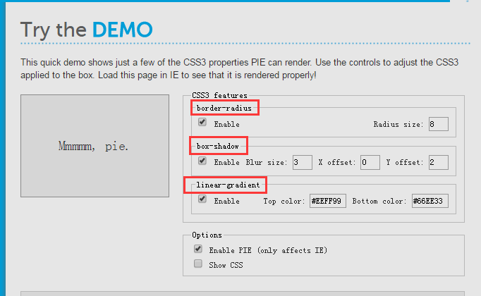
PIE可以处理CSS3的一些属性,如:
渐变也可以使用上面的方法
还可以使用图片的方式,渐变背景一般不需要太多的改动
.bg{
  width:100%;
  height:100%;
  backround:url('./img.jpg') repeat-x top
}
以上是部分IE兼容的解决方案
当然最好的解决方案就是不兼容(手动滑稽)
建议使用以下代码


 扫一扫
扫一扫


 3962
3962

 被折叠的 条评论
为什么被折叠?
被折叠的 条评论
为什么被折叠?
 到【灌水乐园】发言


