


 本文档是关于InfluxDB的教程,详细介绍了如何使用该数据库进行数据分析。内容源自一篇面向数据科学家的文章,适合对大数据分析感兴趣的读者。
influxdb 教程
目录 (Table of Contents)
介绍 (Introduction)
Wikipedia defines the Internet of Things (IoT) as “a system of interrelated computing devices, mechanical and digital machines provided with unique identifiers and the ability to transfer data over a network without requiring human-to-human or human-to-computer interaction.” To give an example, imagine a home security system and a smartwatch that both automatically send data to your phone.
Wikipedia将物联网(IoT)定义为“相互关联的计算设备,机械和数字机器的系统,该系统具有唯一的标识符,并且能够通过网络传输数据,而无需人与人或人与计算机的交互。 ” 举个例子,假设一个家庭安全系统和一个智能手表都可以自动将数据发送到您的手机。
While the IoT removes the need for human-to-computer interaction over the process of transferring data itself, human-to-computer interaction is still a necessary portion of analyzing IoT data. In order to interact with their IoT data, humans need a database where they can safely store it and a visualization platform where they can efficiently analyze, visualize, and ultimately draw insights from it.
虽然物联网消除了在传输数据本身的过程中进行人机交互的需求,但人机交互仍然是分析物联网数据的必要部分。 为了与物联网数据进行交互,人们需要一个可以安全存储它的数据库和一个可以有效分析,可视化并最终从中获取见识的可视化平台。
This is where InfluxDB and Knowi come in. InfluxDB is an open-source database that was purpose-built by the team at InfluxData for storing time-series IoT data, and Knowi is an analytics and visualization platform that offers broad native integration to InfluxDB. Knowi’s broad native integration sets it aside from many other analytics platforms which struggle with the unstructured nature of InfluxDB’s data, and ensures that you’ll have no issues using Knowi to query IoT data from InfluxDB in real time. In this tutorial, you’re going to learn how to use Knowi to analyze and visualize data from InfluxDB.
这就是InfluxDB和Knowi的用武之地。InfluxDB是一个开放源代码数据库,由InfluxData团队专门构建,用于存储时序IoT数据,而Knowi是一个分析和可视化平台,为InfluxDB提供了广泛的本地集成。 Knowi广泛的本机集成使它摆脱了许多其他分析平台的困扰,这些平台都与InfluxDB数据的非结构化性质抗争,并确保您使用Knowi实时查询InfluxDB的IoT数据不会有任何问题。 在本教程中,您将学习如何使用Knowi来分析和可视化InfluxDB中的数据。
连接到InfluxDB (Connecting to InfluxDB)
Once you’ve logged into your Knowi account, the first step is to connect to an InfluxDB datasource. In order to do this, follow these steps:
登录到Knowi帐户后 ,第一步就是连接到InfluxDB数据源。 为此,请按照下列步骤操作:
1)Maneuver over to the panel on the left side of your screen and select “Data sources.”
1)移至屏幕左侧的面板,然后选择“数据源”。
2) Find and select “InfluxDB” from “NoSQL Datasources.”
2)从“ NoSQL数据源”中找到并选择“ InfluxDB”。
3) Your datasource, host, and database name are automatically filled out here; all you need to do is save your datasource.
3)您的数据源,主机和数据库名称将在此处自动填写; 您需要做的就是保存数据源。
Congratulations on connecting to InfluxDB!
祝贺您连接到InfluxDB!
查询数据 (Querying Your Data)
When you saved your datasource, you should’ve received an alert that said “Datasource added. Configure Queries.” In order to set up your first query, follow these steps:
保存数据源后,您应该会收到一条警告,提示“已添加数据源。 配置查询。” 为了设置您的第一个查询,请按照下列步骤操作:
1) Click “Queries.”
1)点击“查询”。
2) Before you do anything else, name your report “InfluxDB Query” in “Report Name*” and then look directly above your report name. You should see a new alert at the top of your screen that reads “Tables retrieved. Use the Query generator section to discover and build reports/queries.” What this means is that Knowi automatically indexed every table that is stored within the InfluxDB database that you connected to, and you can now select tables from this index.
2)在执行其他操作之前,请在“报告名称*”中将报告命名为“ InfluxDB Query”,然后在报告名称的正上方查找。 您应该在屏幕顶部看到一个新的警报,显示为“检索到的表。 使用查询生成器部分来发现和构建报告/查询。” 这意味着Knowi会自动为您连接到的InfluxDB数据库中存储的每个表建立索引,现在您可以从该索引中选择表。
3) Scroll down to “Tables,” click on the down arrow, and select “h2o_temperature.” This will lead Knowi to automatically create an InfluxDB Query that calls all columns from the first 1,000 rows of this water temperature table in your InfluxDB database. This limit of 1,000 is just a default limitation, but Knowi can handle larger loads without any issue, so go ahead and delete the portion of your InfluxDB which says “limit 1000.” This water temperature table contains water temperature measurements conducted every six minutes at two separate locations and recorded in degrees Fahrenheit.
3)向下滚动到“表格”,单击向下箭头,然后选择“ h2o_temperature”。 这将导致Knowi自动创建一个InfluxDB查询,该查询将调用InfluxDB数据库中此水温表的前1,000行中的所有列。 此限制1,000是默认限制,但是Knowi可以处理更大的负载而没有任何问题,因此请继续删除InfluxDB中表示“限制1000”的部分。 该水温表包含在两个不同位置每六分钟进行的水温测量值,并以华氏度记录。
4) Move to the bottom left corner of your screen and click “Join.” This will set up a second query builder where you will generate a second query that you will eventually join with your first. In this second query builder, we’re going to repeat a very similar process to the first query. Use the down arrow under “Tables,” select “h2o_quality,” and delete “limit 1000” from the InfluxDB query that Knowi automatically generated. Just like the water temperature table, this water quality table also contains measurements that are conducted every six minutes.
4)移动到屏幕的左下角,然后单击“加入”。 这将设置第二个查询生成器,您将在其中生成第二个查询,最终将它们与第一个查询合并。 在第二个查询构建器中,我们将重复与第一个查询非常类似的过程。 使用“表”下的向下箭头,选择“ h2o_quality”,然后从Knowi自动生成的InfluxDB查询中删除“限制1000”。 就像水温表一样,该水质表还包含每六分钟进行一次的测量。
Before we get into step 5, I think it’s good to explain why you need to take this step. Water quality is measured by a metric that is called water quality index and shortened to just “index” in our water quality table. Unlike water temperature, which remains fairly consistent, water quality index is extremely volatile and can range from anywhere between the minimum measurement of 0 and the maximum measurement of 100 within the course of an hour. To give you an idea of how volatile this is, here is what it would look like if we visualized water temperature and water quality index over the course of one day:
在进入步骤5之前,我认为最好解释一下为什么需要执行此步骤。 水质通过一种称为水质指数的度量标准进行衡量,在我们的水质表中简称为“指数”。 与保持相当稳定的水温不同,水质指数非常不稳定,在一小时的过程中,其范围介于最小测量值0和最大测量值100之间。 为了让您了解其挥发性,以下是我们可视化一天的过程中水温和水质指数的样子:
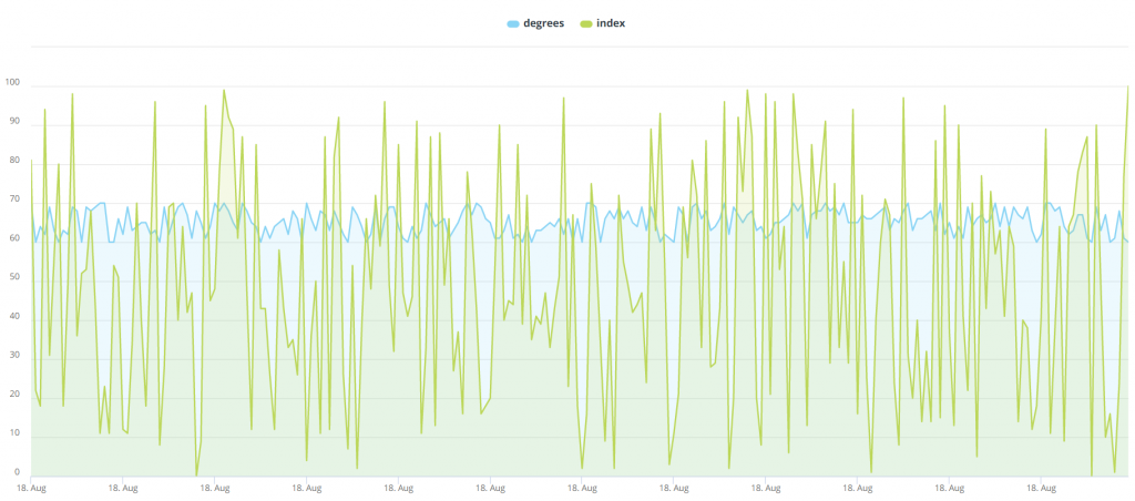
I seriously considered not including this image in this tutorial because it is hideous enough to push viewers away and senseless enough to make viewers question how it could possibly appear in a tutorial on proper data analysis. I ultimately included, though, because I felt the need to show just how volatile water quality index is on the basis of 6 measurements per hour we want to avoid visualizing it in that manner.
我认真考虑过不要在本教程中包括该图像,因为它足够丑陋以至于无法将观看者推开,并且也没有足够的意义使观看者质疑在适当的数据分析中它可能如何出现在教程中。 不过,我最终将其包括在内,因为我觉得有必要根据每小时6次测量来显示挥发性水质指数的大小,我们希望避免以这种方式将其可视化。
The good news here is that unlike water quality over the course of 6 measurements per hour, average water quality index over the course of an entire day is actually rather consistent, and we can absolutely gain valuable insight from analyzing it on that basis. This is where Cloud9QL comes in. Cloud9QL is Knowi’s powerful SQL-style syntax that allows you to apply post-processing on your queries after you’ve set them up, and in this case, Cloud9QL will be used to convert water quality index into daily averages and make your query a bit neater. Now that you know exactly why we need to convert our measurements to average daily water quality index, and how we’re going to do it, you’re ready to move on to step 5:
好消息是,与每小时进行6次测量过程中的水质不同,一整天中的平均水质指数实际上是相当一致的,我们可以在此基础上对其进行分析,从而获得绝对有价值的见解。 这就是Cloud9QL的用处。Cloud9QL是Knowi强大SQL样式语法,可让您在设置查询后对查询进行后处理,在这种情况下,Cloud9QL将用于将水质指数转换为日常用水量。平均,使您的查询更整洁。 既然您已经确切地知道了为什么需要将我们的测量结果转换为平均每日水质指数,以及我们将如何进行,现在就可以继续执行第5步了:
5) Down below the InfluxDB Query that you just set up to query the water quality table, enter the following syntax into Cloud9QL Query:
5)在您刚刚设置为查询水质表的InfluxDB查询下,在Cloud9QL查询中输入以下语法:
select *, day_of_month(time) as Day;
select avg(index) as Index, time as Date, location
group by Day, location;
6) Next, use the eye icon at the top left corner of your query builder to preview the results of this specific query. As you can see, you have daily average water index for each date at two different locations. Now, before we join the water quality table with the water temperature table, we need to apply this same process to the water temperature table. In order to do this, scroll back up to your first query which you set up to query the water temperature table, and enter the following syntax into Cloud9QL Query:
6)接下来,使用查询构建器左上角的眼睛图标预览此特定查询的结果。 如您所见,您在两个不同的位置都有每个日期的每日平均水指数。 现在,在将水质表与水温表结合之前,我们需要对水温表应用相同的过程。 为此,请向上滚动至您设置的用于查询水温表的第一个查询,然后在Cloud9QL Query中输入以下语法:
select *, day_of_month(time) as Day;
select avg(degrees) as Temperature, time as Date, location
group by Day, location;
7) Now, maneuver just a bit down to the join builder in between your two queries. Click “Join Builder.” Set your join type to an inner join, and set location equal to location, and date equal to date. Then select “Save” in order to save your join.
7)现在,在您两个查询之间的联接构建器中进行一些操作。 点击“加入生成器”。 将联接类型设置为内部联接,并将位置设置为location,日期设置为date。 然后选择“保存”以保存您的加入。
8) You’re almost done here, but you’ll need to revert to Cloud9QL one more time to complete our query in the format that we want it. This time, use the “Cloud9QL Post Query” at the bottom of your screen and enter the following syntax:
8)您差不多已经完成了,但是您需要再恢复一次Cloud9QL来以我们想要的格式完成我们的查询。 这次,使用屏幕底部的“ Cloud9QL Post Query”并输入以下语法:
Select Temperature, Index, Date, location as Location
order by Date, location
9) Now, click “Preview” at the bottom left corner of your screen. You should see the daily water temperature and water quality index for Santa Monica and Coyote Creek. If you do, that means you’ve done everything correctly, which means it’s time for you to click “Save & Run Now” in order to run your query.
9)现在,单击屏幕左下角的“预览”。 您应该看到圣莫尼卡和郊狼溪的每日水温和水质指数。 如果这样做,则意味着您已正确完成所有操作,这意味着您是时候单击“保存并立即运行”以运行查询。
Your query has now been officially completed. Nice work!
您的查询现已正式完成。 干得好!
分析和可视化您的数据 (Analyzing & Visualizing Your Data)
Now that you’ve finished your query, it’s time for you to enjoy the fruits of your labor by utilizing Knowi’s visualization capabilities. Once you saved and ran your query, the results were stored as a dataset within Knowi’s elastic data warehouse. Additionally, the data grid referenced that you looked at before saving your query is now stored as a widget. In order to visualize your widget and create more visualizations, follow these steps:
现在,您已经完成了查询,是时候利用Knowi的可视化功能来享受您的劳动成果了。 保存并运行查询后,结果将作为数据集存储在Knowi的弹性数据仓库中。 此外,保存查询之前参考的数据网格现在存储为小部件。 为了可视化您的小部件并创建更多可视化,请按照下列步骤操作:
- Move to the top of the panel on the left side of your screen and select “Dashboards.” Then, select the plus icon, name your new dashboard “InfluxDB Dashboard” and click “OK.” 移动到屏幕左侧面板的顶部,然后选择“仪表板”。 然后,选择加号图标,将新的仪表板命名为“ InfluxDB Dashboard”,然后单击“确定”。
- This dashboard will serve as home for your widget and every other widget that you create. Head back to the panel on the left side of your screen, and select “Widgets” this time. Drag the new “InfluxDB Query” widget that you created over to your Dashboard. 该仪表板将用作您的小部件和您创建的所有其他小部件的主页。 回到屏幕左侧的面板,这次选择“小部件”。 将您创建的新的“ InfluxDB Query”小部件拖到仪表板上。
- Hover over to the top right corner of your new widget in order to reveal the ellipses icon. Select it, then scroll down and select “Analyze.” Drag the “Location” bar over from the top left corner of your new screen to “Filters.” Under value, type “coyote_creek” with the underscore included and click “OK.” 将鼠标悬停在新窗口小部件的右上角,以显示椭圆图标。 选择它,然后向下滚动并选择“分析”。 将“位置”栏从新屏幕的左上角拖到“过滤器”。 在“值”下,键入“ coyote_creek”(带下划线),然后单击“确定”。
- At the top of your screen, select “Visualization.” This will show you your data grid, which isn’t too different from the data that you were analyzing. To change this, click on “Data Grid” under “Visualization Type” in the top left corner of your screen and change your visualization to an “Area” visualization. If you’ve done this right, you should see an area chart which conveys that average water temperature remains remarkably consistent while water quality has a decent amount of day-to-day variance. 在屏幕顶部,选择“可视化”。 这将显示您的数据网格,与您正在分析的数据没有太大不同。 要更改此设置,请单击屏幕左上角“可视化类型”下的“数据网格”,然后将可视化更改为“区域”可视化。 如果您已正确完成此操作,则应该会看到一个面积图,该图表明平均水温保持非常一致,而水质的每日变化却很大。
- Head to the top right corner of your screen and select the “Clone” icon — it looks like two pieces of paper stacked atop one another. Name this new widget “Coyote Creek Daily” and select “Clone.” Then select “Add to Dashboard.” 转到屏幕的右上角,然后选择“克隆”图标-看起来就像两张纸叠在一起。 将此新小部件命名为“ Coyote Creek Daily”,然后选择“ Clone”。 然后选择“添加到仪表板”。
通过基于搜索的分析深入了解 (Diving Deeper with Search-Based Analytics)
While clicking and dragging metrics over to the filter area and manually setting filters isn’t too hard, sometimes you just want to ask questions in plain English and receive results in real-time. That is where Knowi’s Search-Based Analytics feature, built on Natural Language Processing, comes in. Let’s say you wanted to visualize only data from the other location — Santa Monica — and instead of viewing daily averages which are still prone to some fluctuation, you wanted to view weekly averages. Here’s how to do this:
在将指标单击并拖动到过滤器区域并手动设置过滤器并不难,有时您只想用简单的英语提问并实时接收结果。 这就是Knowi基于自然语言处理构建的基于搜索的分析功能的所在。假设您只想可视化来自其他位置(圣塔莫尼卡)的数据,而不是查看仍然容易出现波动的每日平均值,想查看每周平均值。 这样做的方法如下:
- Head back to the top right corner of your first widget, select the ellipses icon, and select “Analyze.” Type “show me temperature, index, and date by week for santa monica” and enter it. This will automatically calculate the weekly average for water temperature and water quality index. 返回第一个窗口小部件的右上角,选择椭圆图标,然后选择“分析”。 键入“按星期显示圣莫尼卡的温度,指数和日期”,然后输入。 这将自动计算每周的水温和水质指数平均值。
- Head over to “Visualization” at the top of your screen and change “Visualization Type” to “Area.” 转到屏幕顶部的“可视化”,然后将“可视化类型”更改为“区域”。
- Select the “Clone” icon and name this new widget “Santa Monica Weekly” and select “Clone.” Then select “Add to Dashboard.” 选择“克隆”图标,并将此新小部件命名为“ Santa Monica Weekly”,然后选择“克隆”。 然后选择“添加到仪表板”。
摘要 (Summary)
To review, you began this tutorial by connecting to an InfluxDB database. Then, you set up a query which pulled daily averages of water temperature and water quality index from two separate tables and used Knowi’s join builders to join them; the results of this query were stored as a dataset within Knowi’s elastic data warehouse. You followed this up by building a dashboard to visualize the raw data that was obtained as a result of your query, and created an area visualization that conveyed some of the results in a manner that was much easier on the eyes. Last, you used search-based analytics to analyze a different portion of your data in a different manner.
为了进行回顾,您通过连接到InfluxDB数据库开始了本教程。 然后,您设置一个查询,该查询从两个单独的表中提取水温和水质指数的每日平均值,并使用Knowi的联接构建器将它们联接起来。 该查询的结果作为数据集存储在Knowi的弹性数据仓库中。 接下来,您将构建一个仪表板以可视化作为查询结果而获得的原始数据,并创建了一个区域可视化效果,该可视化效果以使眼睛看起来更容易的方式传达了一些结果。 最后,您使用了基于搜索的分析,以不同的方式分析了数据的不同部分。
翻译自: https://towardsdatascience.com/influxdb-analytics-tutorial-7bf938317cd5
influxdb 教程


 9589
9589

 被折叠的 条评论
为什么被折叠?
被折叠的 条评论
为什么被折叠?
 到【灌水乐园】发言


