


 本文介绍了在微信小程序中遇到的自定义TabBar问题,即原生TabBar在弹窗场景下层级过高。作者提出通过在onShow时隐藏TabBar以解决弹窗覆盖问题,但这种方法会导致页面闪烁。为解决这个问题,作者选择同时定义原生和自定义TabBar,利用原生TabBar进行平滑页面切换,而自定义TabBar提供更灵活的布局。文章提供了实现步骤和相关代码片段。
先说说遇到的问题
当使用微信原生的tabBar时,tabBar是固定在最下面 ,并且层级最高。当我想做一个弹窗时 tabBar还是会显示在最上面,弹窗覆盖不了。当时想到了显示弹窗时 使用wx.hideTabBar();先隐藏tabbar 当弹窗关闭时在wx.showTabBar();显示;
如果这样会遇到另外一个问题 显示tabbar 和隐藏tabbar 页面page 的高度是不同的 当你这样控制tabbar时 页面就会有闪烁
解决:
在app.json 中还是定义tabbar 在进程序时就先隐藏 onShow(){ wx.hideTabBar(); };
自己定义tabbar组件,切换tabbar页时调用 wx.switchTab({url: ''})
为什么还要定义系统tabbar ,怎么不直接使用自定义的tabbar呢
因为 自定义的tabbar 在页面切换的时候会发现有空白页闪烁 感觉页面的切换不流畅 所以需要有原生tabbar 用它去切换没有空白页闪烁问题。
不知道我遇到的问题,大家有没有遇到过哦,或者是我的代码哪里有问题造成这样的,反正我靠这样的思路解决了我说的问题 下面贴代码
1.app.json中创建tabbar
 "tabBar": {
    "color": "#515151",
    "selectedColor": "#FE6531",
    "borderStyle": "white",
    "list": [
      {
        "selectedIconPath": "images/tabbar/home-active.png",
        "iconPath": "images/tabbar/home.png",
        "pagePath": "pages/index/index",
        "text": "首页"
      },
      {
        "selectedIconPath": "images/tabbar/list-active.png",
        "iconPath": "images/tabbar/list.png",
        "pagePath": "pages/category/category",
        "text": "分类"
      },
      {
        "selectedIconPath": "images/tabbar/cart-active.png",
        "iconPath": "images/tabbar/cart.png",
        "pagePath": "pages/shoppingCart/shoppingCart",
        "text": "购物车"
      },
      {
        "selectedIconPath": "images/tabbar/user-active.png",
        "iconPath": "images/tabbar/user.png",
        "pagePath": "pages/user/user",
        "text": "用户"
      }
    ]
  }
2.自定义tabbar组件 (注意我用到是组件 ,这样想在哪个页面使用都可以)
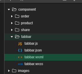
tabbar.wxml
<view class="w-tabbar ">
  <block wx:for="{{tabars}}" wx:key="{{index}}">
    <view bind:tap="onTabbar" data-index="{{index}}">
      <image src="{{activeIndex == index ? item.selectedIconPath : item.iconPath}}"></image>
      <view class="{{activeIndex == index ? 'active' : '' }}">{{item.text}}</view>
      <text class="tabbar-sign" wx:if="{{signIndex == index}}">{{signContent}}</text>
    </view>
  </block>
</view>

注释:activeIndex是传进来的下标  表示显示的是哪个页面 会显示激活的图片 和 激活颜色的文字
    tabbar-sign  是标记  我这里是有购物车 可以在购物车右上角显示一个带数量的标记 大家可以看最后的效果图就明白了
tabbar.js
// component/tabbar/tabbar.js
Component({
  /**
   * 组件的属性列表
   */

 //使用组件页面传递过来的属性
  properties: {
    activeIndex:{       //激活页面的index  (激活会显示带有颜色的图标,带颜色的文字)
      type:String,
      default:''
    },
     signIndex:{  //标记   第几个tabbar右上角有标记
      type: String,
      default: '9'
    },
    signContent: {  //标记的内容
      type: String,
      default: ''
    },
  },

  /**
   * 组件的初始数据
   */
  data: {
    tabars:[
      {
        "selectedIconPath": "/images/tabbar/home-active.png",
        "iconPath": "/images/tabbar/home.png",
        "pagePath": "/pages/index/index",
        "text": "首页"
      },
      {
        "selectedIconPath": "/images/tabbar/list-active.png",
        "iconPath": "/images/tabbar/list.png",
        "pagePath": "/pages/category/category",
        "text": "分类"
      },
      {
        "selectedIconPath": "/images/tabbar/cart-active.png",
        "iconPath": "/images/tabbar/cart.png",
        "pagePath": "/pages/shoppingCart/shoppingCart",
        "text": "购物车"
      },
      {
        "selectedIconPath": "/images/tabbar/user-active.png",
        "iconPath": "/images/tabbar/user.png",
        "pagePath": "/pages/user/user",
        "text": "分类"
      }
    ]
  },

  /**
   * 组件的方法列表
   */
  methods: {
    onTabbar:function(e){

      let index = e.currentTarget.dataset.index;
      //点击tabbar时将事件发送到 使用tabbar的页面  (事件回调)
      this.triggerEvent("onTabbar",
        { data: this.data.tabars[index].pagePath},
        {}
      )
    }
  }
})
tabbar.wxss
/* component/tabbar/tabbar.wxss */
.w-tabbar{
  position: fixed;
  left:0;
  bottom:0;
  width:100%;
  height:100rpx;
  background: #fff;
  display: flex;
  padding-top:14rpx;
}
.w-tabbar>view{
  flex:1;
  text-align: center;
  position: relative
}
.active{
  color:#FE6531;
}
.w-tabbar image{
  width:52rpx;
  height:52rpx;
}
.w-tabbar>view view{
  font-size: 20rpx;
  position: relative;
  top:-6rpx;
}
.tabbar-sign{
  width:30rpx;
  height:30rpx;
  background: #FE6531;
  color:#fff;
  text-align: center;
  line-height:30rpx;
  font-size: 20rpx;
  position: absolute;
  right:60rpx;
  top:-6rpx;
  border-radius: 50%;
}
3.在index.wxml中使用tabbar (使用分两步 1.在index.json中引用 2.使用 )
indxe.json
{
  "usingComponents": {
    "w-product":"/component/product/product",
    "w-share":"/component/share/share",
    "w-tabbar":"/component/tabbar/tabbar"   //在这里  其余代码大家不用管 有这行就可以
  },

  "navigationStyle":"custom"
}
index.wxml (ontabbar是返回的事件)
<w-tabbar signIndex="2" signContent="2" activeIndex="0" bind:onTabbar="onTabbar"/>
index.js
  onShow:function(){
    wx.hideTabBar()   //隐藏原生的tabbar
  },
  onTabbar:function(e){   //自定义tabbar的回调事件
    let path = e.detail.data;
    wx.switchTab({url: path})  // 使用wx.switchTab切换页面 专门用来跳转tabBar的
  },
到这里就结束了 有不足的地方或者有更好的思路 欢迎大家留言 最后贴个效果图吧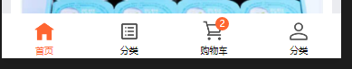


 扫一扫
扫一扫


 8176
8176

 被折叠的 条评论
为什么被折叠?
被折叠的 条评论
为什么被折叠?
 到【灌水乐园】发言


